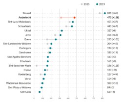
For VGC, Ghent University performed an in-depth study on the status of childcare in Brussels. The results can be found in this 130-page report.
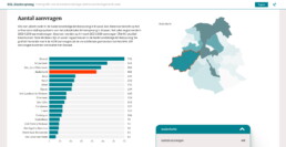
In order to make the results more interactive, Baryon was asked to design and develop an interactive dashboard. The challenge was to keep all the information easily accessible, despite the three different categories, 39 different parameters, 5 different chart types and 2 map levels.
The end result is an easy-to-use dashboard with a focus on clarity and readability. You can access the dashboard here.
Are you also struggling to communicate lots of information in a visual way? Check out how Baryon can help you, or send us a message!
Eager to turn your complex information into a powerful and attractive information graphic?