The challenge
The goal of the Nederlandse Taalunie (‘Dutch Language Union’) is to support the usage of Dutch throughout the world. They do this by developing and stimulating policies, and by assisting Dutch speakers in using the language correctly.
However, the number of resources available for Dutch speakers is large and sometimes confusing. For example, there are websites with tips on writing clearly and accessibly, sites explaining grammar and spelling rules, and sites aimed at specific groups of people, such as young people, or medical professionals.
To bring some order in this chaos, Taalunie asked Baryon to develop an interactive infographic for their website, pointing people with language questions in the right direction.
The process
As a first step, we brought some structure to the many different links by grouping them into four categories: spelling, grammar, language advice, and accessible language. Each link got a short description, and each category also received a textual summary.
In order not to overload the infographic, the client wanted to show as little text as possible, hiding some of the information in tooltips or collapsible blocks. However, during testing, we quickly realized that the link summary was crucial for the user to make an informed decision on where to go. Hiding this text would require many unnecessary clicks in order to uncover this information.
For reasons of accessibility, we decided not to use any tooltips throughout the design, as this would hurt the experience for users using a screen reader. In this case, we opted for collapsible blocks which can be unveiled by clicking an information button for each section.
Finally, we made sure that the entire infographic is responsive, so that it also behaves perfectly on small (smartphone) screens.
The result
You can access the fully interactive infographic at the website of the Taalunie. Feel free to browse and click around, and get some tips on how to use the Dutch language!
Some minor details you might notice:
- Some of the language questions, right above the section titles, slowly iterate between various different versions – this symbolizes doubts users might have about the correct spelling or usage of words.
- As you load the page, the different sections fade in one by one, rather than appearing all at the same time. This makes the infographic a bit more dynamic in a very subtle way!
Do you want to create your own interactive, animated and responsive infographic with us? Find out how we can help you!
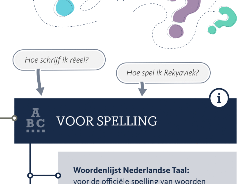
Animated detail from the interactive infographic for Taalunie.

Eager to turn your complex information into a powerful and attractive information graphic?