The idea
Maintaining and improving data visualization skills is hard. It’s a rapidly changing domain, with new tools and new techniques emerging nearly every day. In order to keep up, and to learn new things at the same time, challenges can be a good approach. Someone provides you with a topic, a dataset, and sometimes a set of constraints, and off you go!
The choice of challenges is abundant: the Data Visualization Society has one, there is #ProjectHealthViz, Workout Wednesday, Sports Viz Sunday, Iron Viz (‘Win or learn, you can’t lose’) hosted by Tableau, and many more. I recently participated a few times in the Makeover Monday, a weekly challenge initiated by the Tableau community, however, you are free to use the tools of your own preference.
The process
Every Sunday, the Makeover Monday hosts will post a data visualization they encountered and believe could be improved, together with the dataset behind the visual. The topics are generally ‘social’ in nature, but this can go in all directions: sports, financial, non-profit, entertainment, health,…
On Monday and Tuesday, participants are encouraged to dive into the data, come up with their own data story, and build a data visual around it. On Wednesday, there is a live webinar where hosts Eva Murray and Charlie Hutcheson discuss some entries and provide feedback. On Friday or Saturday the week’s favourites are announced. Data sets are generally rather small, making this a quick and fun challenge, focused more on data design rather than data analysis.

And then the fun starts: diving into the data, trying to uncover an interesting story, and turning it into an aesthetically pleasing infographic.
The result
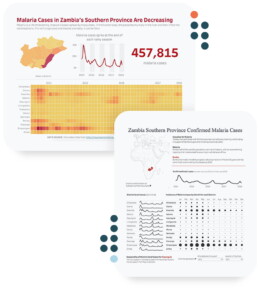
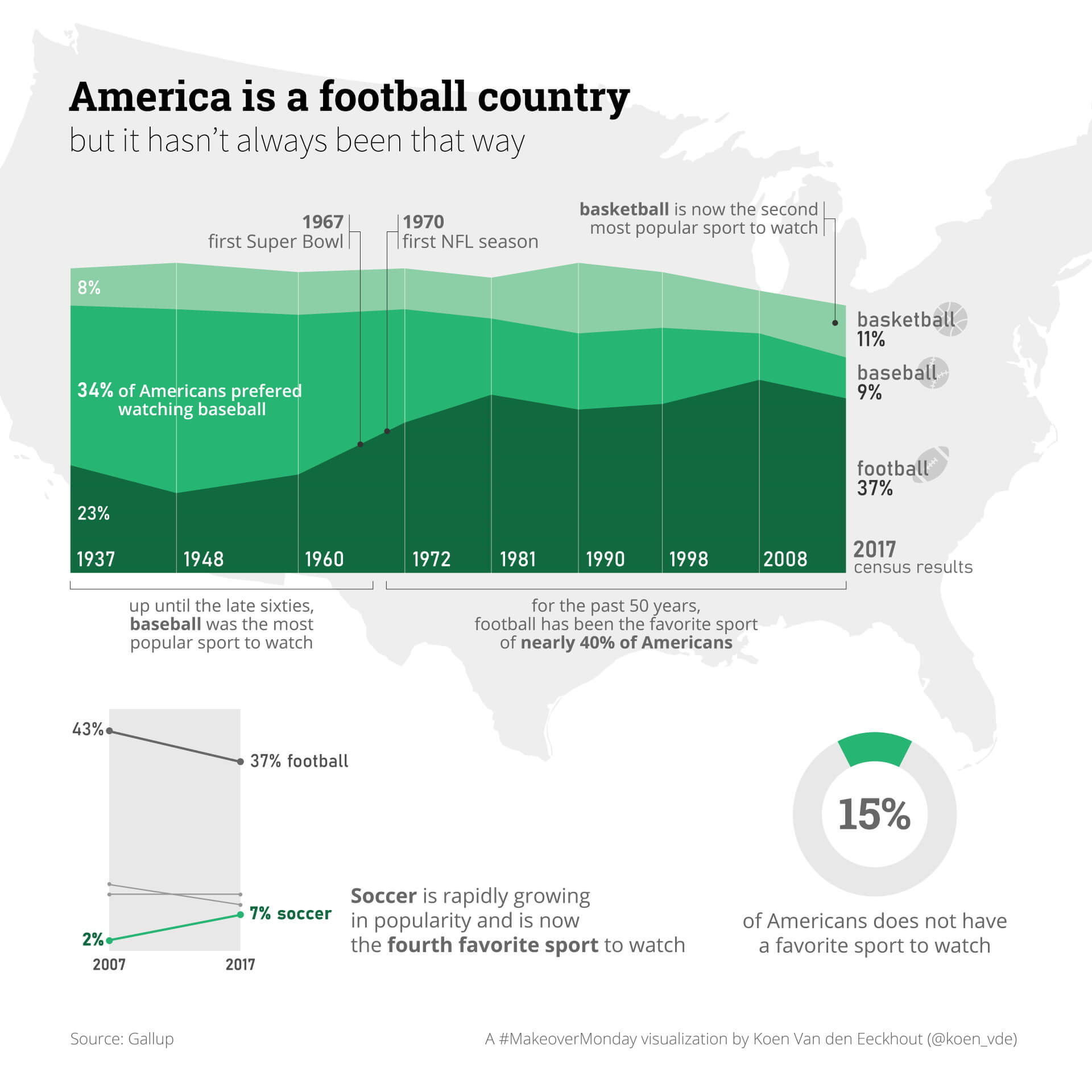
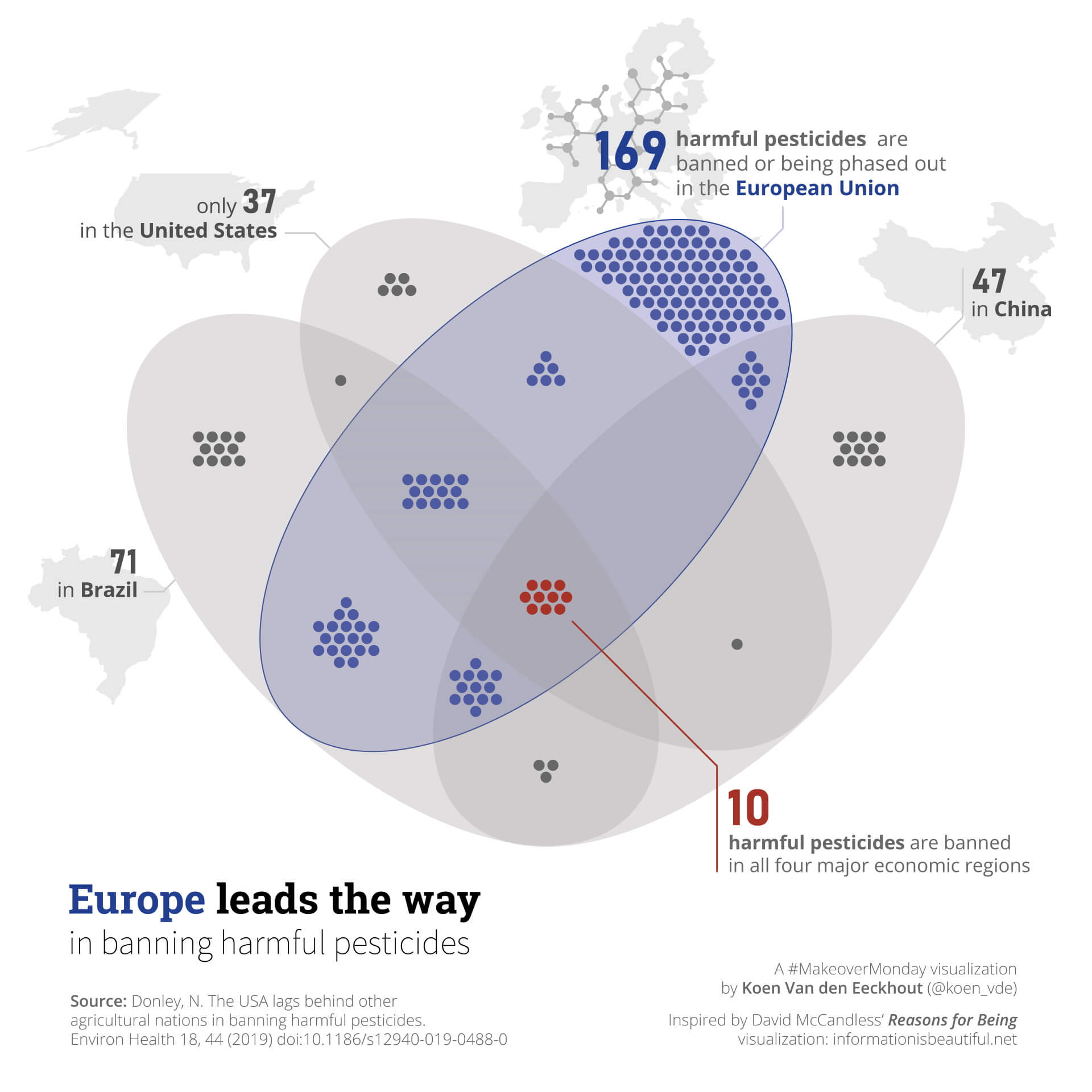
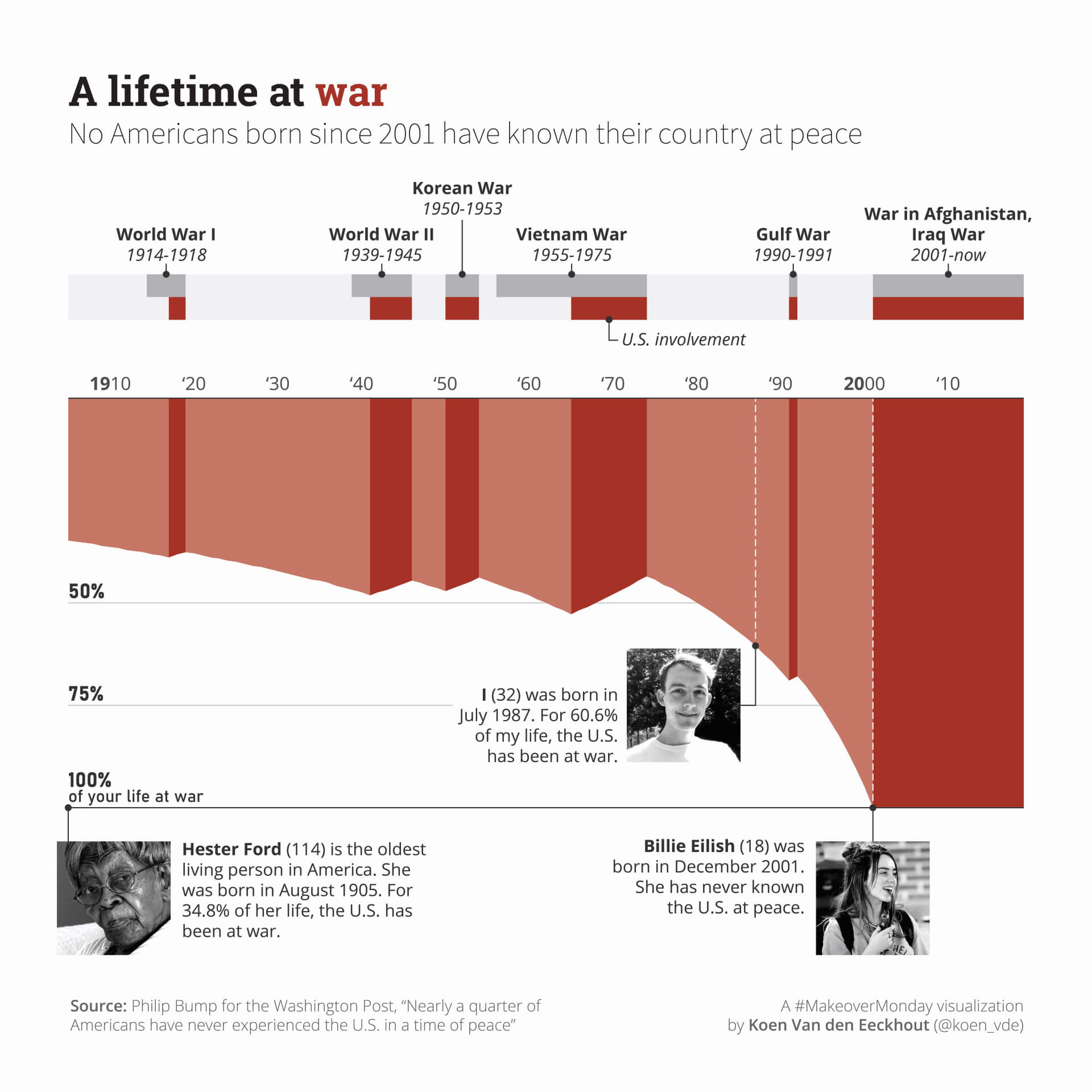
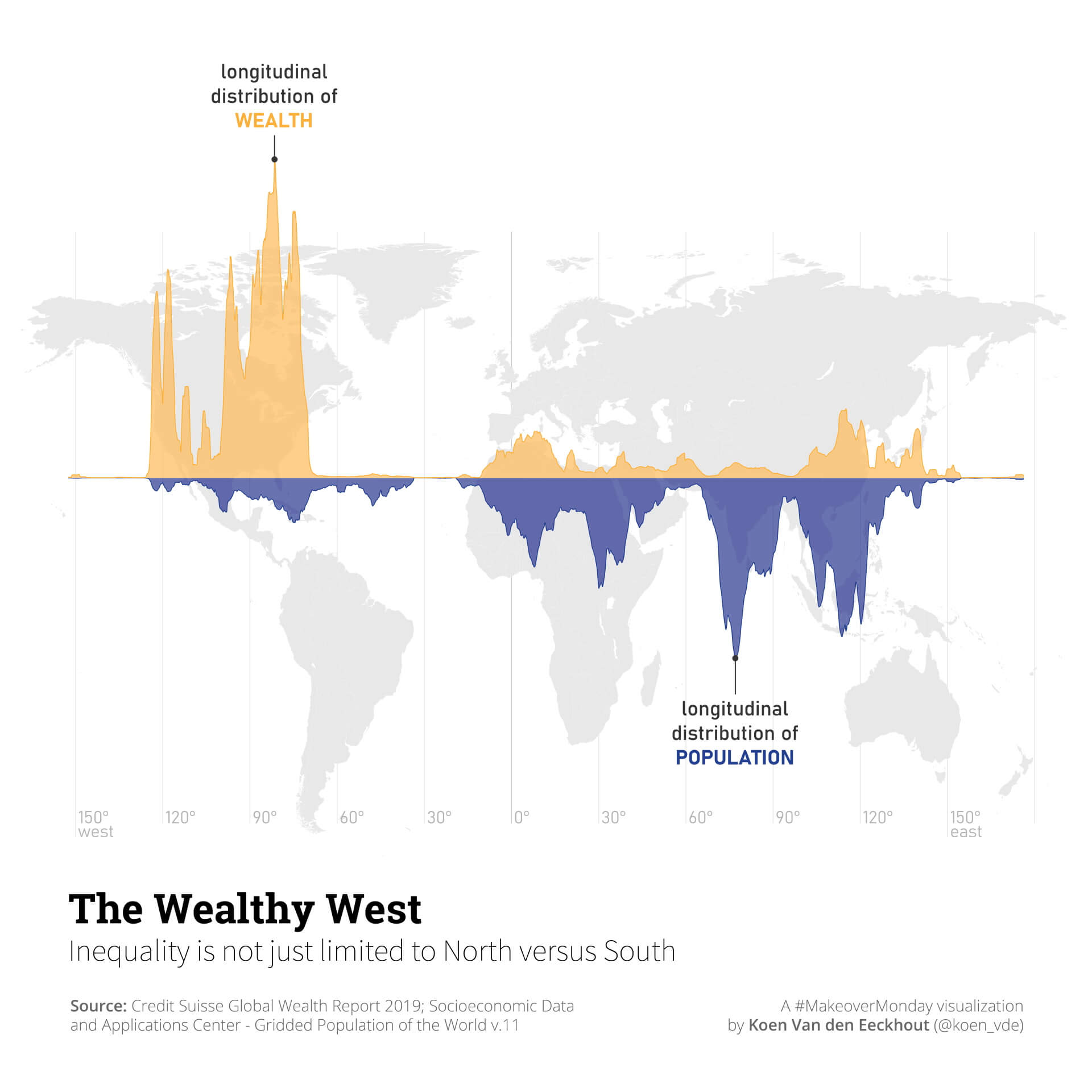
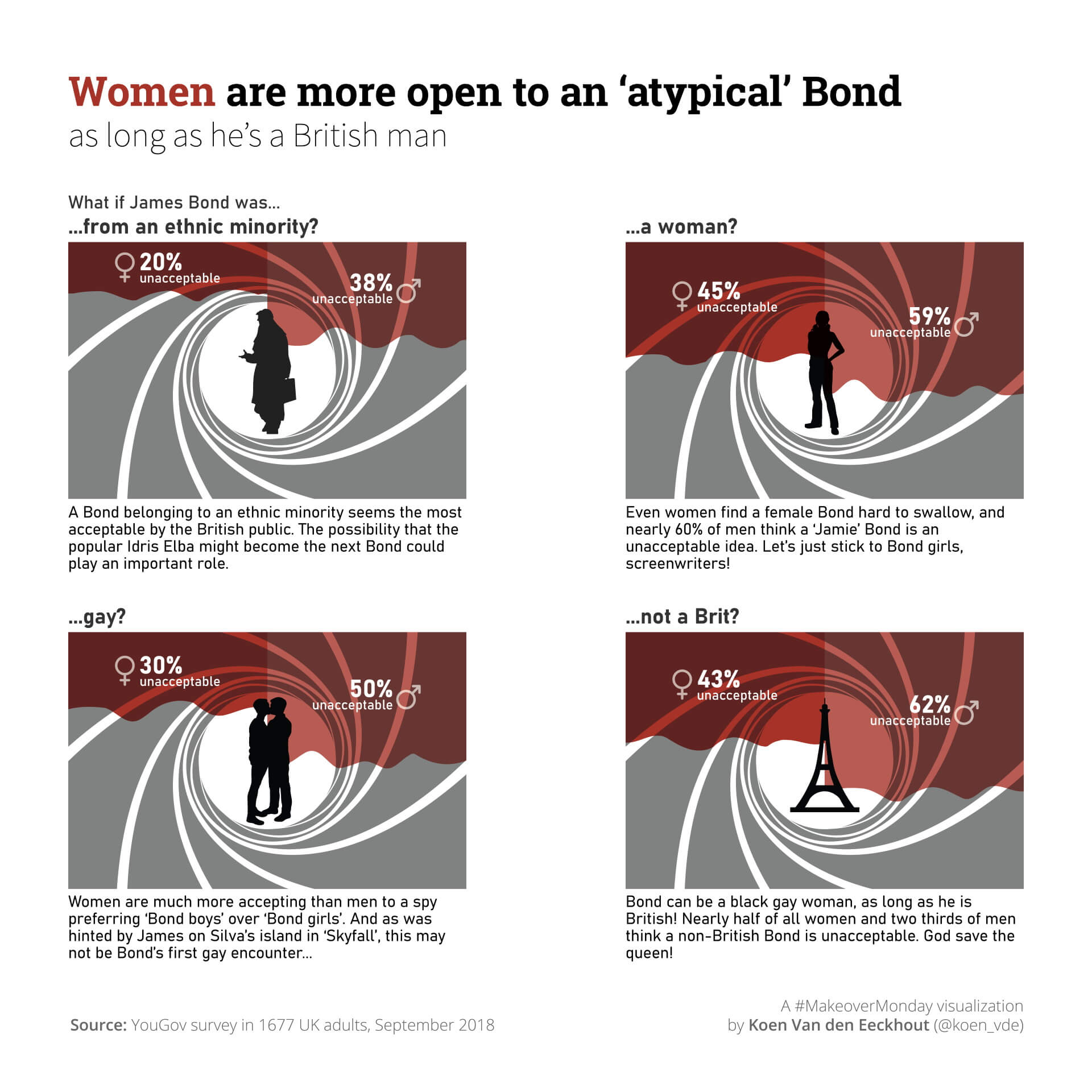
By now, I have participated many times in the Makeover Monday challenge and each time has been a lot of fun. Sometimes the challenge is in cleaning the data and bringing it into a usable format. Sometimes it’s finding a story interesting enough to share with an audience. And sometimes it’s about looking for alternatives to boring line or bar charts. Below is a selection of my personal favorites.
Want your data turned into a pretty and effective infographic? Contact us, and let’s discuss the possibilities!

Eager to turn your complex data into powerful and attractive information graphics?