Review: A History of Data Visualization and Graphic Communication
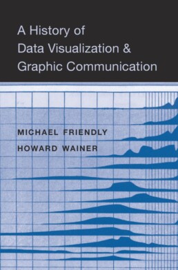
Michael Friendly and Howard Wainer clearly love graphs. But A History of Data Visualization and Graphic Communication isn’t just about graphs — it’s about the stories behind them: the context, the people, the new measurements that made them necessary, and the discoveries they enabled. The authors don’t just show us the end result; they take us through the process that led there, often in a delightful amount of detail.
The structure of the book balances chronology with theme. This keeps the feeling of historical evolution intact, without falling into the trap of a dry timeline. We jump from 17th-century innovators to 20th-century pioneers, always with a clear narrative thread.
What stood out to me most was the variety of examples. While the book is clearly indebted to Edward Tufte’s work, it doesn’t recycle his canon. I encountered many visualizations I hadn’t seen before, and even familiar ones were presented with fresh insight. The ideas on how new data, collected with new measurement techniques, often prompt entirely new kinds of charts were particularly eye-opening for me. It’s a reminder that visualization doesn’t just explain data — it also adapts to it.
That idea was so powerful to me that I used it as one of the foundations for my keynote lecture, Graphs can save the world! This book helped me think more deeply about why visualizations matter — not just aesthetically or functionally, but historically and socially.
That said, not every chapter lands equally well. Some sections feel a bit scattered or lightweight, especially when they only briefly touch on developments that deserve more space. The final chapter, Graphs as Poetry, takes a more philosophical turn, but I wasn’t entirely sure what the authors were trying to argue there.
Also worth noting: while the book is visually rich, it’s a shame that most of it is printed in black and white. Some of the visual clarity and impact is lost as a result. And while the authors occasionally offer “reworked” versions of historical charts to show how they could be improved, these redesigns don’t always convince — sometimes the original speaks more eloquently in its own language.
Despite those minor critiques, this is a generous, well-researched, and deeply informative book. I’d recommend it to anyone interested in the intersection of data, history, and design. It’s a reminder that charts are tools, but also more than tools — they are artifacts of human thought, and sometimes, even acts of discovery.
Rating: ⭐⭐⭐⭐
Read this review, as well as many others, in our complete overview of data visualization books (work in progress).
Read more:
Vreemde plaatsnamen in Vlaanderen
Iedereen kent wellicht 'Kontich' en 'Reet', maar in Vlaanderen hebben we nog veel meer merkwaardige, onverwachte, en vaak grappige plaatsnamen. Heb je bijvoorbeeld ooit al gehoord van Buitenland, Dikkebus, of Grote Homo?
9 June 2024
Small multiples can save your chart
When you're dealing with a chart that has too much information on it, the most straightforward advice to follow is: break it down into multiple charts, each with less information on them. A powerful example of this is a so-called small multiple approach.
5 September 2023
Can you use Excel to create a powerful chart?
Spreadsheet tools such as Microsoft Excel or Numbers might not be the first thing on your mind when considering data visualization tools, but they can be pretty solid choices to build data visuals. Don’t let anyone convince you that using Excel to create data visuals is unprofessional.
9 January 2023
Choosing the right font for your data visual
Fonts evoke emotions: there are very sophisticated fonts, playful fonts, attention-grabbing fonts, and elegant handwritten fonts. Using the wrong type of font can have a lot of impact. In data visualization the implications of typography are mainly focused on readability. Labels and annotations can easily become so small they get hard to read. Above all else, we should choose a font which is readable at small sizes.
2 January 2023
Three roles of colour in a data visual
Colour is one of the most crucial tools we have to turn a normal chart into a powerful chart with a clear message, a chart which tells a story rather than simply presenting the information.
26 December 2022
7 different goals for your chart
A crucial step in building a powerful chart is choosing the right type of chart. A lot of charts don’t work because they simply use the wrong type of chart. To avoid this trap, we must ask ourselves a basic question: what’s the ultimate goal of our data visual? What do we want to show with our data?
19 December 2022
We are really into visual communication!
Every now and then we send out a newsletter with latest work, handpicked inspirational infographics, must-read blog posts, upcoming dates for workshops and presentations, and links to useful tools and tips. Leave your email address here and we’ll add you to our mailing list of awesome people!

