Small multiples can save your chart
When you’re dealing with a chart that has too much information on it, the most straightforward advice to follow is: break it down into multiple charts, each with less information on them.
A powerful example of this is a so-called small multiple approach, in which we repeat (a small version) of a chart multiple times, but each time we highlight a different series. This makes it much easier for your audience to find the data they are looking for, so your chart becomes a lot more powerful. Especially in line charts with lots of lines, small multiples are extremely useful.
Line chart spaghetti
Line charts are pretty straightforward, and there’s not a lot that can go wrong with them. However, they have one major drawback: as soon as we have four or more lines on a single line chart, it quickly becomes messy. It’s suddenly very difficult to distinguish between the different lines, and also to find a color scheme suitable to help you make this distinction (while still being pleasing to look at). This is often called a ‘line chart spaghetti’:
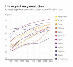
Looking at the above chart: if someone would ask you to order the countries from lowest to highest life expectancy, or what the life expectancy was in Indonesia in 2000, it would be pretty hard to find this information.
A clever and helpful solution to this spaghetti problem is the ‘small multiple’ approach, in which we repeat the same chart multiple times, but each time we highlight a different line. We can do this by making all of our lines gray to send them to the background, and making one of the lines a bit bolder and giving it an accent color. If we repeat this for each of the lines individually, and arrange all these different versions side by side, we get the following result:

Ah, much clearer! We can easily see that the life expectancy in Indonesia grew from 40 years in 1950 to around 72 in 2019, and it was around 65 years in 2000.
Small multiples in real life
A small multiples approach might be somewhat cumbersome and is an inevitable compromise: we’re losing some details by reducing the size of the individual charts, but on the other hand it’s much easier to retrieve the information we need. In many actual cases, the ability to (quickly) retrieve data is more important than having a lot of detail! As a real-life example, at the start of the COVID-19 pandemic, the Financial Times was leading the way in creating insightful data visuals about the spread of the virus in different countries. They used a line chart for this, with a logarithmic vertical axis in order to show exponential growth.
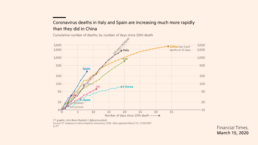
While this approach worked in the early days of the pandemic (when only countries like China, Italy and Spain were dealing with cases), it quickly became unmanageable when the number of countries to visualize grew. After a few weeks it became impossible to find individual countries in the line chart.
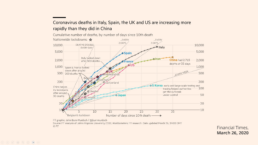
The team at the Financial Times realized this, and quickly changed to a – you guessed it – small multiples approach. The result is a chart with a lot less detail, but now it is very easy for our audience to do what they have to do: find the country they are interested in, and quickly compare its trend with the other countries:

Advantages of a small multiple approach
In summary, a small multiple approach is often the best way to avoid an overloaded chart. Simply create multiple copies of the same chart, and each time highlight one of the series, while sending the other series to the background by making them light grey.
It will be much easier for your audience to find the data they’re interested in, to spot trends and patterns, and to quickly compare the data for a specific series with the ensemble of other series.
What’s not to like?
Read more:

Why I love matrix charts
This one is definitely in my top 5 of favourite chart types: a matrix chart! Super flexible, can provide some great insights into the data, and it will fit well into your beautiful report design.

Vreemde plaatsnamen in Vlaanderen
Iedereen kent wellicht 'Kontich' en 'Reet', maar in Vlaanderen hebben we nog veel meer merkwaardige, onverwachte, en vaak grappige plaatsnamen. Heb je bijvoorbeeld ooit al gehoord van Buitenland, Dikkebus, of Grote Homo?

Can you use Excel to create a powerful chart?
Spreadsheet tools such as Microsoft Excel or Numbers might not be the first thing on your mind when considering data visualization tools, but they can be pretty solid choices to build data visuals. Don’t let anyone convince you that using Excel to create data visuals is unprofessional.

Choosing the right font for your data visual
Fonts evoke emotions: there are very sophisticated fonts, playful fonts, attention-grabbing fonts, and elegant handwritten fonts. Using the wrong type of font can have a lot of impact. In data visualization the implications of typography are mainly focused on readability. Labels and annotations can easily become so small they get hard to read. Above all else, we should choose a font which is readable at small sizes.

Three roles of colour in a data visual
Colour is one of the most crucial tools we have to turn a normal chart into a powerful chart with a clear message, a chart which tells a story rather than simply presenting the information.

7 different goals for your chart
A crucial step in building a powerful chart is choosing the right type of chart. A lot of charts don’t work because they simply use the wrong type of chart. To avoid this trap, we must ask ourselves a basic question: what’s the ultimate goal of our data visual? What do we want to show with our data?
We are really into visual communication!
Every now and then we send out a newsletter with latest work, handpicked inspirational infographics, must-read blog posts, upcoming dates for workshops and presentations, and links to useful tools and tips. Leave your email address here and we’ll add you to our mailing list of awesome people!
