This chart is trying to trick you
⚠ Warning: this chart is lying to you!
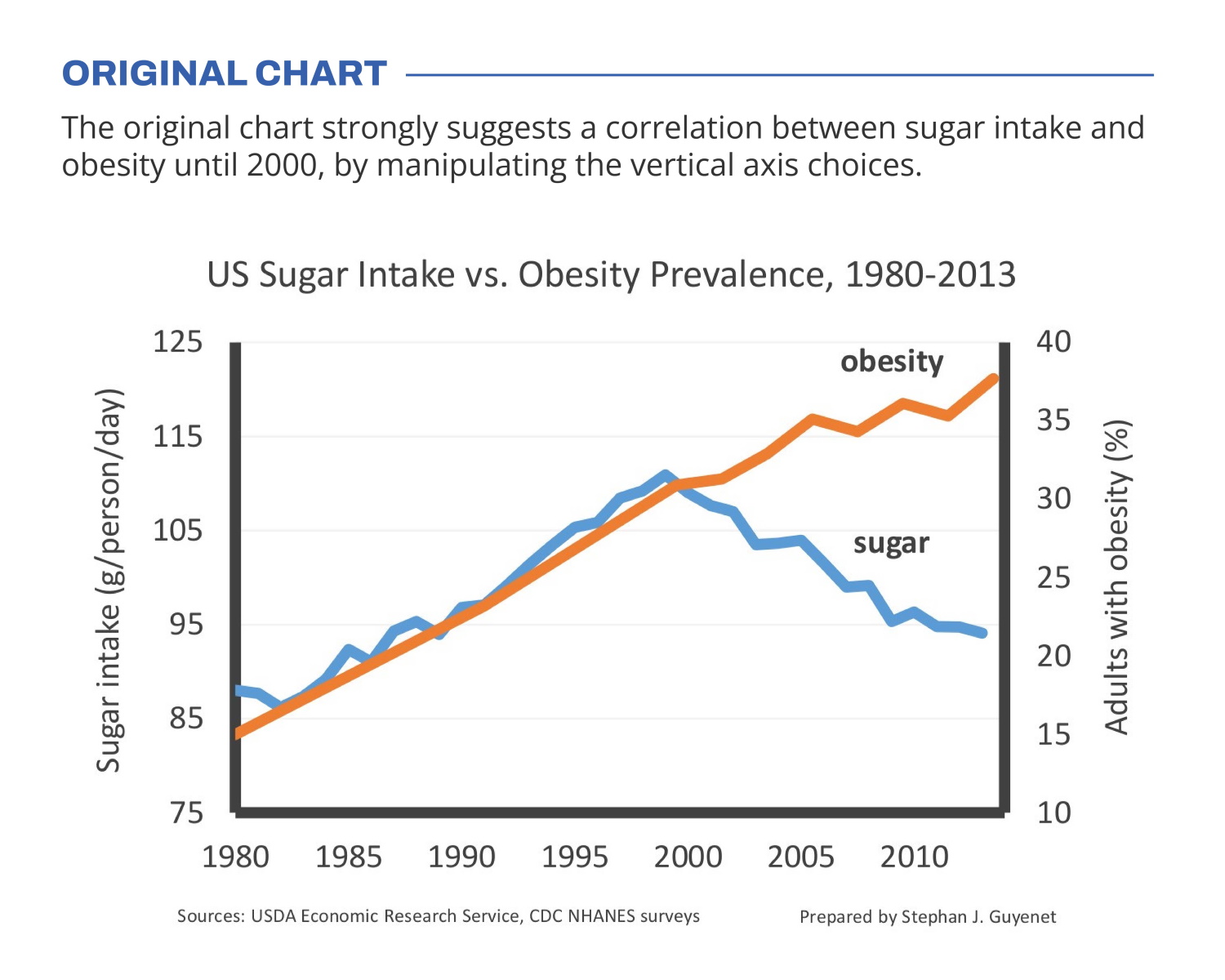
🍬 The original chart in this example is trying to suggest a strong correlation between sugar intake and obesity in the US between 1980 and 2000. It does so by carefully choosing the vertical axis ranges and scaling so both lines nicely fall on top of each other.
But with a closer look we can see something else is going on. Sugar intake levels are rising by 30% (from 85g to 110g), while obesity prevalence is rising by 164% (from 14% to 37% of the population). For an accurate comparison, these lines shouldn’t nicely align at all!
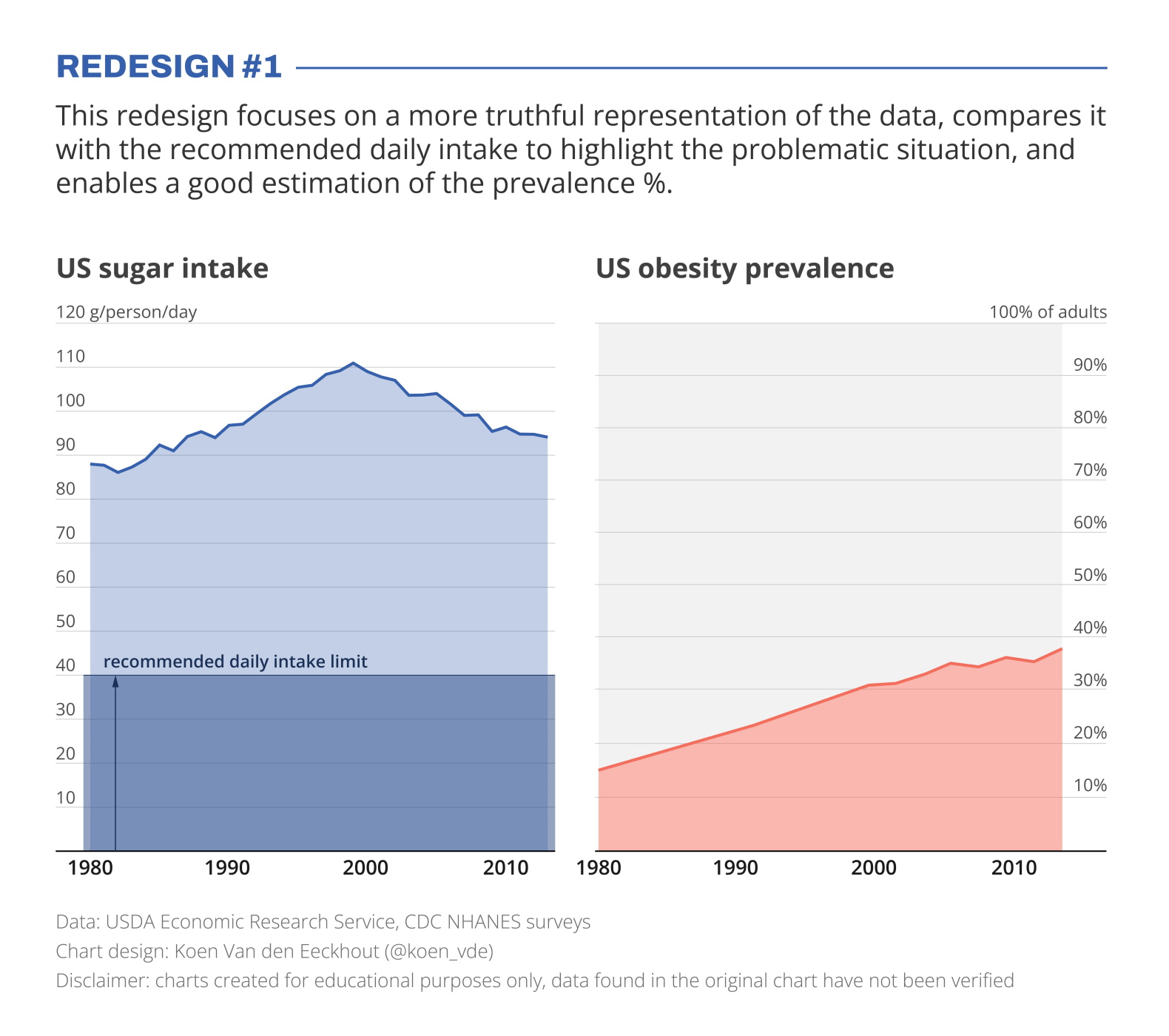
I’ve created two redesigns to present some better solutions for this visualization. In redesign 1 we focus on a presentation which is as truthful as possible, comparing the data with the recommended intake level, and enabling an accurate estimation of the prevalence %.
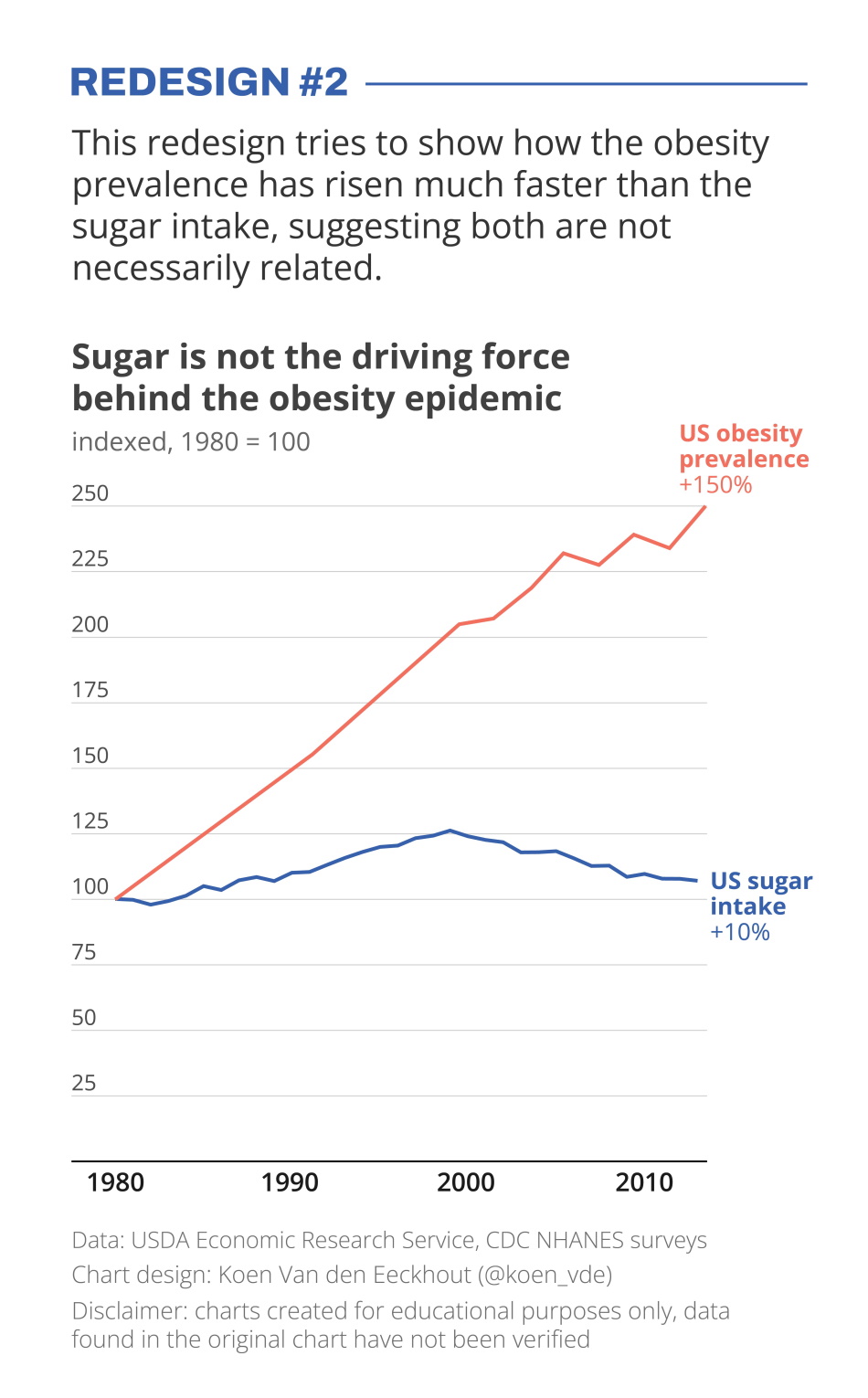
In redesign 2 we focus on showing how much faster the obesity prevalence has grown compared to the sugar intake, which has remained relatively stable.
Depending on the message you want to bring, one presentation might be preferable above the other. But in any case, manipulating your vertical axes to suggest a strong correlation which might not be there, is not very nice!
Still struggling with telling a strong visual message using truthful charts? Find out how we can help you, or reach out to us directly.
Read more:

Why I love matrix charts
This one is definitely in my top 5 of favourite chart types: a matrix chart! Super flexible, can provide some great insights into the data, and it will fit well into your beautiful report design.

Vreemde plaatsnamen in Vlaanderen
Iedereen kent wellicht 'Kontich' en 'Reet', maar in Vlaanderen hebben we nog veel meer merkwaardige, onverwachte, en vaak grappige plaatsnamen. Heb je bijvoorbeeld ooit al gehoord van Buitenland, Dikkebus, of Grote Homo?

Small multiples can save your chart
When you're dealing with a chart that has too much information on it, the most straightforward advice to follow is: break it down into multiple charts, each with less information on them. A powerful example of this is a so-called small multiple approach.

Can you use Excel to create a powerful chart?
Spreadsheet tools such as Microsoft Excel or Numbers might not be the first thing on your mind when considering data visualization tools, but they can be pretty solid choices to build data visuals. Don’t let anyone convince you that using Excel to create data visuals is unprofessional.

Choosing the right font for your data visual
Fonts evoke emotions: there are very sophisticated fonts, playful fonts, attention-grabbing fonts, and elegant handwritten fonts. Using the wrong type of font can have a lot of impact. In data visualization the implications of typography are mainly focused on readability. Labels and annotations can easily become so small they get hard to read. Above all else, we should choose a font which is readable at small sizes.

Three roles of colour in a data visual
Colour is one of the most crucial tools we have to turn a normal chart into a powerful chart with a clear message, a chart which tells a story rather than simply presenting the information.
We are really into visual communication!
Every now and then we send out a newsletter with latest work, handpicked inspirational infographics, must-read blog posts, upcoming dates for workshops and presentations, and links to useful tools and tips. Leave your email address here and we’ll add you to our mailing list of awesome people!
