Why is data visualization so powerful?
The amount of data coming our way is growing exponentially. In 2021 alone, it is estimated that humankind generated 74 zettabytes of data – that’s about 10,000 GB per person. How on earth are we going to keep this manageable?
Visualization: our most powerful tool
Visualization is one of the key solutions to cope with the endless stream of data, content and information – together with other strategies such as filtering and organization. Visualization might very well be the most powerful tool we have to turn complex information into manageable insights. But why is that?
There are three important reasons why data visualization is a very strong way to present information:
- its information density is extremely high,
- it attracts the attention of your audience, and
- visual information is easier to process and memorize.
Reason 1: information density
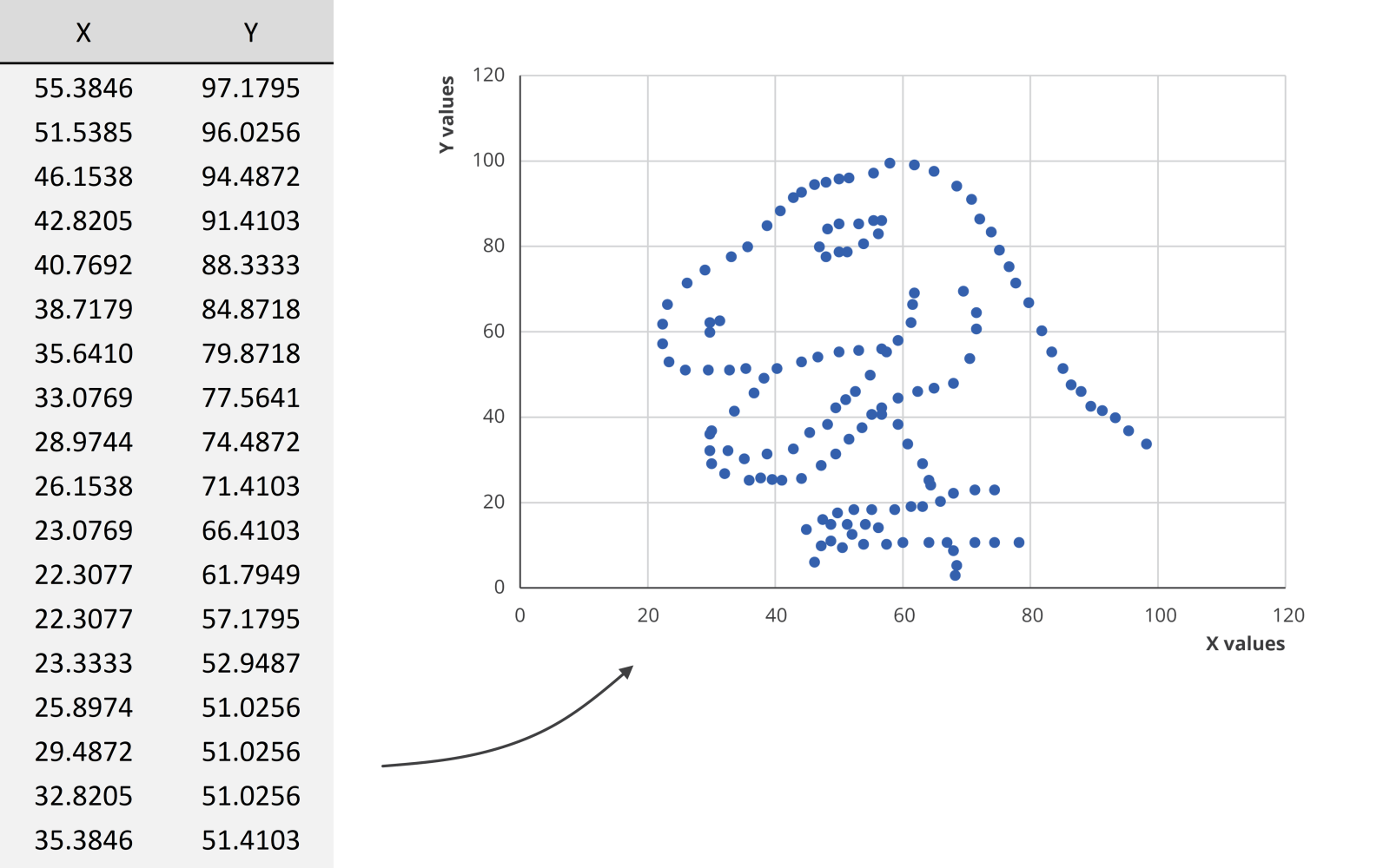
Researchers at MIT have shown that we can detect the meaning of a picture in as little as 13 milliseconds – that’s extremely fast.
We could spend hours looking at this dataset for example, created by visual journalism professor Alberto Cairo, without learning anything. But as soon as we turn the data into a scatter plot, it’s obvious that we’re looking at a dinosaur. In the blink of an eye!
Reason 2: attractiveness
Visual information is also attractive. Not in the sense that it is beautiful to look at (although that’s often also our goal), but literally: it attracts the attention of your audience. In a book or newspaper, people will often look for the pictures first, before they start reading all of the text.
Reason 3: easier to process
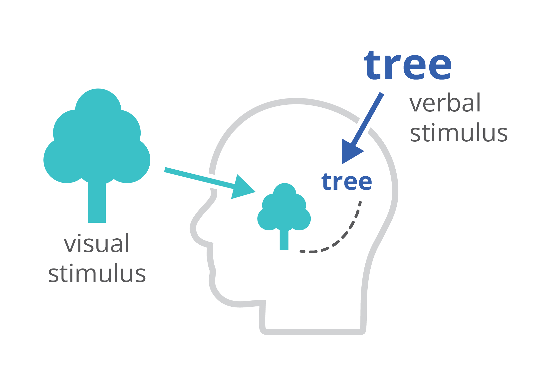
Finally, charts and infographics are easier to process than written text. The dual-coding theory, developed by Allan Paivio, states that our brains process information both in a visual, as well as a verbal way. If we only get verbal stimuli, only a part of our brain is working. That’s why during a long phone call we automatically start doodling – the visual brain is bored and looking for things to do. By providing our audience with a combination of text and images, the entire brain is stimulated, leading to better focus, better understanding, and better memorization.
Harnessing the power of data visualization
So in summary, data visualization is powerful because it combines a high information density, attractiveness, and easier processing and memorization.
If you want to know more about visualizing data in the right way, you can check out the other videos in this series. Or I invite you to read my book, Powerful Charts, that will give you actionable insights and practical guidelines to create data visuals that truly engage and inspire your audience.
Full video series
- 01. Why is data visualization so powerful?
- 02. Why is data visualization so challenging?
- 03. Navigating the landscape of powerful charts
- 04. A powerful chart tells a story
- 05. A powerful chart has a high signal-to-noise ratio
- 06. Making a data visual noise-free
- 07. 7 different goals for your chart
- 08. Three roles of colour in a data visual
- 09. Choosing the right font for your data visual
- 10. Can you use Excel to create a powerful chart? (coming on January 09, 2023)

Read more:

Why I love matrix charts
This one is definitely in my top 5 of favourite chart types: a matrix chart! Super flexible, can provide some great insights into the data, and it will fit well into your beautiful report design.

Vreemde plaatsnamen in Vlaanderen
Iedereen kent wellicht 'Kontich' en 'Reet', maar in Vlaanderen hebben we nog veel meer merkwaardige, onverwachte, en vaak grappige plaatsnamen. Heb je bijvoorbeeld ooit al gehoord van Buitenland, Dikkebus, of Grote Homo?

Small multiples can save your chart
When you're dealing with a chart that has too much information on it, the most straightforward advice to follow is: break it down into multiple charts, each with less information on them. A powerful example of this is a so-called small multiple approach.

Can you use Excel to create a powerful chart?
Spreadsheet tools such as Microsoft Excel or Numbers might not be the first thing on your mind when considering data visualization tools, but they can be pretty solid choices to build data visuals. Don’t let anyone convince you that using Excel to create data visuals is unprofessional.

Choosing the right font for your data visual
Fonts evoke emotions: there are very sophisticated fonts, playful fonts, attention-grabbing fonts, and elegant handwritten fonts. Using the wrong type of font can have a lot of impact. In data visualization the implications of typography are mainly focused on readability. Labels and annotations can easily become so small they get hard to read. Above all else, we should choose a font which is readable at small sizes.

Three roles of colour in a data visual
Colour is one of the most crucial tools we have to turn a normal chart into a powerful chart with a clear message, a chart which tells a story rather than simply presenting the information.
We are really into visual communication!
Every now and then we send out a newsletter with latest work, handpicked inspirational infographics, must-read blog posts, upcoming dates for workshops and presentations, and links to useful tools and tips. Leave your email address here and we’ll add you to our mailing list of awesome people!
