
Data visualization podcasts for 2025
At Baryon, we love a good podcast—especially when it’s about data visualization. They’re a great way to pick up new ideas, hear how others approach design and storytelling, and stay in touch with what’s happening in the field. Whether it’s a deep dive into visual communication, a fresh take on data exploration, or a candid chat about the challenges of bringing complex information to life, there’s always something to learn (and plenty to get inspired by).
Many shows feature conversations with people doing remarkable work—sometimes the big names you already know, sometimes voices you haven’t heard yet but will be glad you did.
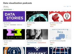
Some of our go-tos are Data Stories, Storytelling with Data, and Data Viz Today, but there’s a whole world of great listening out there.
We’ve pulled together a regularly updated list of our favorite data visualization (and data science) podcasts on Notion. You’ll find them all in one place, with links to Spotify, Apple Podcasts, and Google Podcasts—ready for your next walk, commute, or coffee break.
Read more:

Avoiding abbreviations
People are lazy. Make it as easy as possible for them to see what you are trying to show. There are tons of ways to reduce mental noise in your charts, but one of the easiest is avoiding abbreviations.
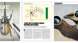
The uncomfortable relationship between scientific illustrations and AI
Scientific journal Nature devoted the headline of its 23 July 2026 issue to “the human art of scientific illustration in the age of artificial intelligence”. Of course, that sparked my attention.

Review: Info We Trust
Info We Trust is an ambitious, visually stunning book that sits somewhere between philosophy, information design, and a collection of visual essays.
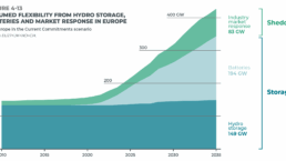
Gridlines are better than axes
Almost always, gridlines are better than axes. Vertical axes are the default option, and they have been around for centuries, so they are very well known. But they also have downsides. My biggest problem with vertical axes is that they’re often so far away from where the action is really happening.
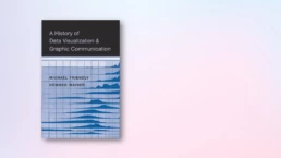
Review: A History of Data Visualization and Graphic Communication
Michael Friendly and Howard Wainer clearly love graphs. But A History of Data Visualization and Graphic Communication isn’t just about graphs — it’s about the stories behind them: the context, the people, the new measurements that made them necessary, and the discoveries they enabled.

Report visuals don’t have to suck
Discover how CREG, Belgium’s electricity regulator, turns complex data into clear and engaging visuals. From smart annotations to small multiples and uncommon chart types, their Monitoring Report shows how thoughtful data visualization makes technical reports easier to read and understand.
We are really into visual communication!
Every now and then we send out a newsletter with latest work, handpicked inspirational infographics, must-read blog posts, upcoming dates for workshops and presentations, and links to useful tools and tips. Leave your email address here and we’ll add you to our mailing list of awesome people!
