Choosing the right font for your data visual
Typography is a fascinating domain. Fonts evoke emotions: there are very sophisticated fonts, playful fonts, attention-grabbing fonts, and elegant handwritten fonts. Using the wrong type of font can have a lot of impact. In data visualization the implications of typography are mainly focused on readability. Labels and annotations can easily become so small they get hard to read. Above all else, we should choose a font which is readable at small sizes.
What influences readability?
The readability of a font at small sizes is mainly determined by three aspects: the x-height, the counter, and the serifs.
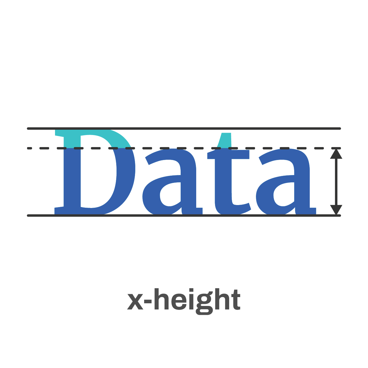
The x-height of a font is the height of the lowercase letters compared to the height of the line itself. Fonts with a lower x-height are more difficult to read than fonts with a higher x-height.
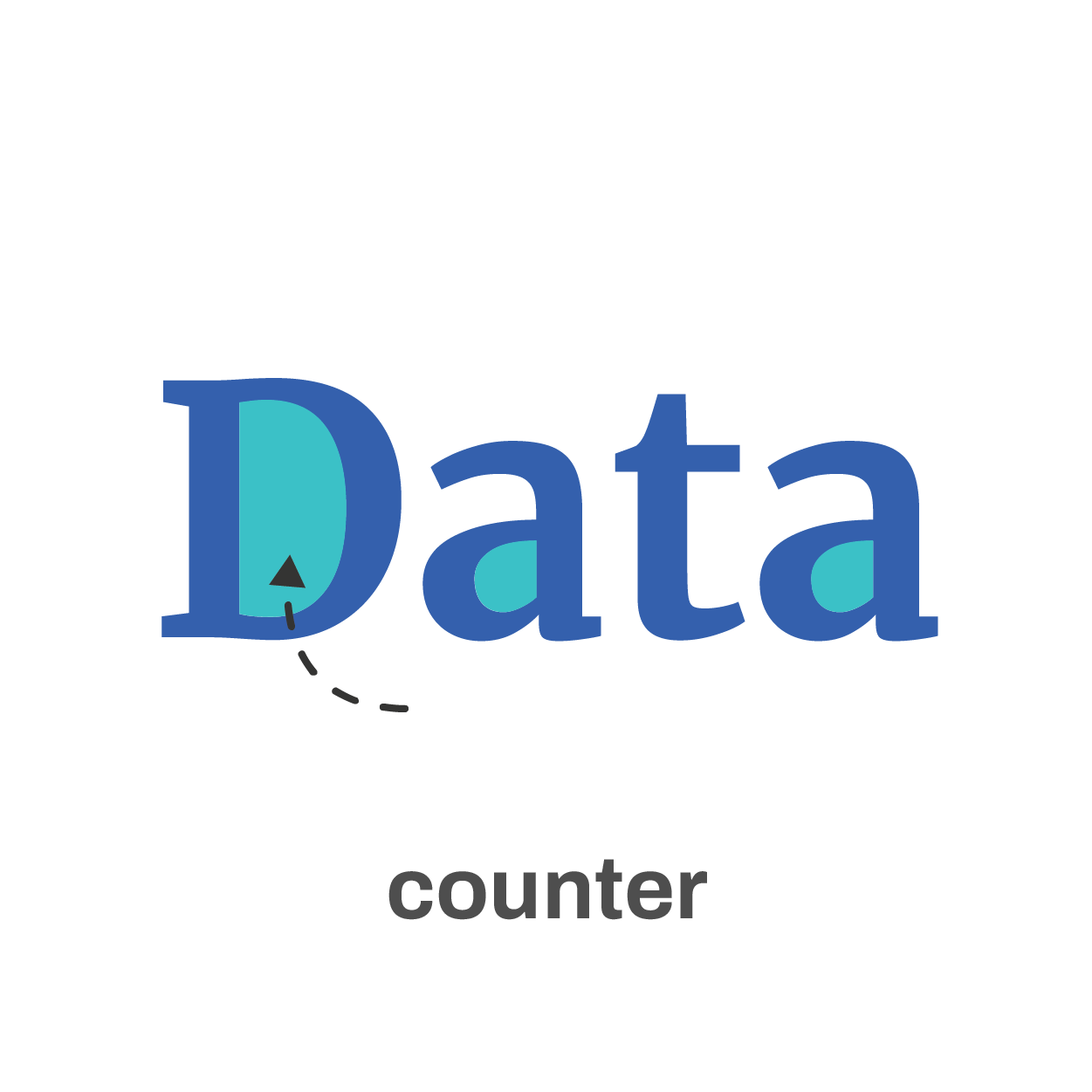
The counter is the enclosed space inside a letter, such as in the letters ‘o’, ‘a’ or ‘e’. The larger the counter size, the easier it becomes to read a font at small sizes.

Finally, the serifs. Sans-serif fonts are generally easier to read at small sizes than serif fonts. The different serifs – the small lines and strokes attached to the end of individual letters – make longer texts easier to read, because our brains can more easily distinguish different letters from each other. That’s why almost any book is set in a serif font. But for small text, the serifs get in the way and sans-serif fonts are the way to go.
Where to find the perfect font?
If you’re struggling to find the perfect font, a good website like Google Fonts can help you out. With over 1300 free font families, there’s always something for every situation. You can enter your own text and immediately see how it will look in all of these different fonts. You can filter by category or you can look specifically for very bold fonts, wide fonts, etc. Once you’ve found the perfect font, all you have to do is download it and install it on your computer.
The best fonts for data visualization
If you still find looking for the perfect font a daunting task, try some of the fonts developed specifically for readability:
Assistant | Lato | Noto Sans | Roboto | Source Sans
If you want to know more about visualizing data in the right way, you can check out the other videos in this series. Or I invite you to read my book, Powerful Charts, that will give you actionable insights and practical guidelines to create data visuals that truly engage and inspire your audience.
Full video series
- 01. Why is data visualization so powerful?
- 02. Why is data visualization so challenging?
- 03. Navigating the landscape of powerful charts
- 04. A powerful chart tells a story
- 05. A powerful chart has a high signal-to-noise ratio
- 06. Making a data visual noise-free
- 07. 7 different goals for your chart
- 08. Three roles of colour in a data visual
- 09. Choosing the right font for your data visual
- 10. Can you use Excel to create a powerful chart? (coming on January 09, 2023)

Read more:

Why I love matrix charts
This one is definitely in my top 5 of favourite chart types: a matrix chart! Super flexible, can provide some great insights into the data, and it will fit well into your beautiful report design.

Vreemde plaatsnamen in Vlaanderen
Iedereen kent wellicht 'Kontich' en 'Reet', maar in Vlaanderen hebben we nog veel meer merkwaardige, onverwachte, en vaak grappige plaatsnamen. Heb je bijvoorbeeld ooit al gehoord van Buitenland, Dikkebus, of Grote Homo?

Small multiples can save your chart
When you're dealing with a chart that has too much information on it, the most straightforward advice to follow is: break it down into multiple charts, each with less information on them. A powerful example of this is a so-called small multiple approach.

Can you use Excel to create a powerful chart?
Spreadsheet tools such as Microsoft Excel or Numbers might not be the first thing on your mind when considering data visualization tools, but they can be pretty solid choices to build data visuals. Don’t let anyone convince you that using Excel to create data visuals is unprofessional.

Three roles of colour in a data visual
Colour is one of the most crucial tools we have to turn a normal chart into a powerful chart with a clear message, a chart which tells a story rather than simply presenting the information.

7 different goals for your chart
A crucial step in building a powerful chart is choosing the right type of chart. A lot of charts don’t work because they simply use the wrong type of chart. To avoid this trap, we must ask ourselves a basic question: what’s the ultimate goal of our data visual? What do we want to show with our data?
We are really into visual communication!
Every now and then we send out a newsletter with latest work, handpicked inspirational infographics, must-read blog posts, upcoming dates for workshops and presentations, and links to useful tools and tips. Leave your email address here and we’ll add you to our mailing list of awesome people!
