Choosing the right font for your data visual
Typography is a fascinating domain. Fonts evoke emotions: there are very sophisticated fonts, playful fonts, attention-grabbing fonts, and elegant handwritten fonts. Using the wrong type of font can have a lot of impact. In data visualization the implications of typography are mainly focused on readability. Labels and annotations can easily become so small they get hard to read. Above all else, we should choose a font which is readable at small sizes.
What influences readability?
The readability of a font at small sizes is mainly determined by three aspects: the x-height, the counter, and the serifs.
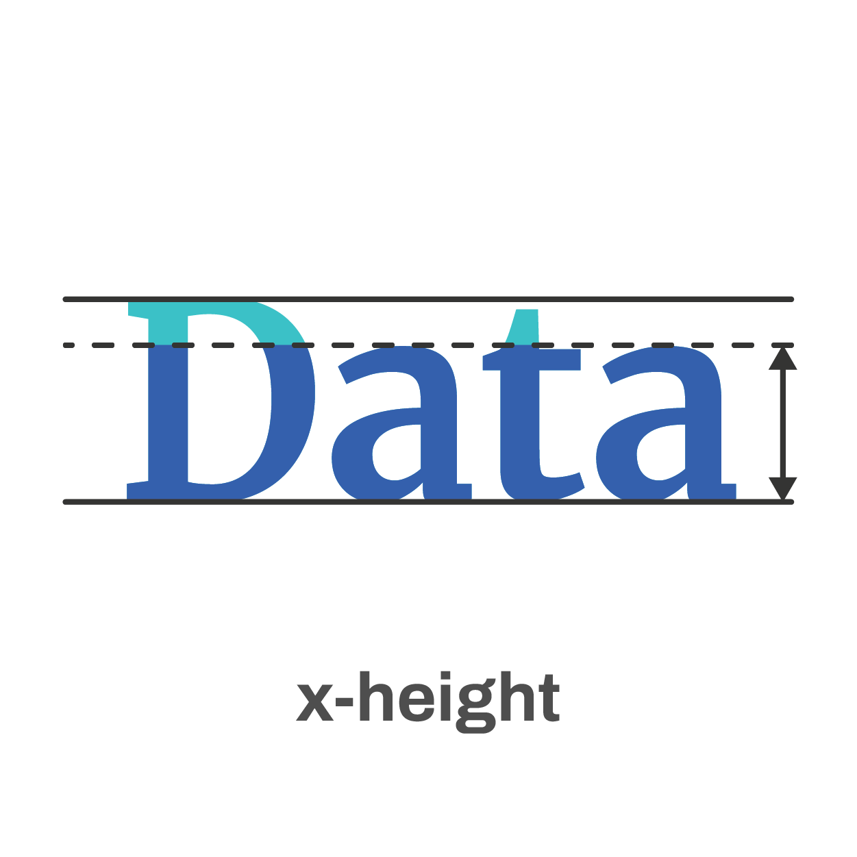
The x-height of a font is the height of the lowercase letters compared to the height of the line itself. Fonts with a lower x-height are more difficult to read than fonts with a higher x-height.
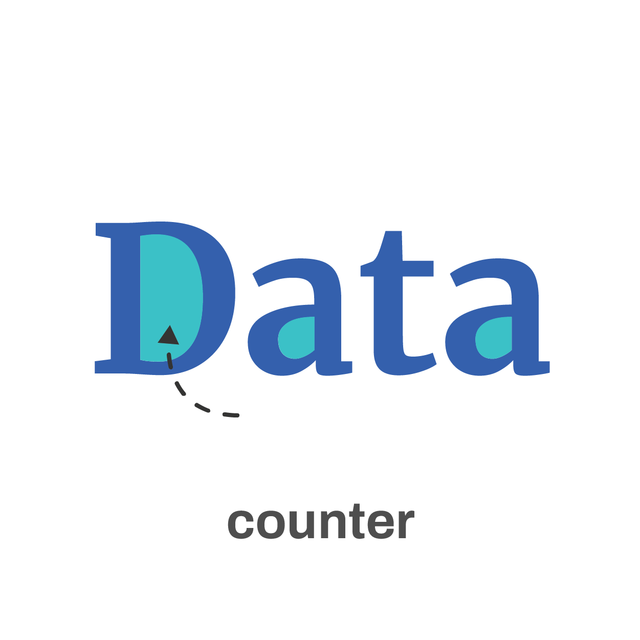
The counter is the enclosed space inside a letter, such as in the letters ‘o’, ‘a’ or ‘e’. The larger the counter size, the easier it becomes to read a font at small sizes.

Finally, the serifs. Sans-serif fonts are generally easier to read at small sizes than serif fonts. The different serifs – the small lines and strokes attached to the end of individual letters – make longer texts easier to read, because our brains can more easily distinguish different letters from each other. That’s why almost any book is set in a serif font. But for small text, the serifs get in the way and sans-serif fonts are the way to go.
Where to find the perfect font?
If you’re struggling to find the perfect font, a good website like Google Fonts can help you out. With over 1300 free font families, there’s always something for every situation. You can enter your own text and immediately see how it will look in all of these different fonts. You can filter by category or you can look specifically for very bold fonts, wide fonts, etc. Once you’ve found the perfect font, all you have to do is download it and install it on your computer.
The best fonts for data visualization
If you still find looking for the perfect font a daunting task, try some of the fonts developed specifically for readability:
Assistant | Lato | Noto Sans | Roboto | Source Sans
If you want to know more about visualizing data in the right way, you can check out the other videos in this series. Or I invite you to read my book, Powerful Charts, that will give you actionable insights and practical guidelines to create data visuals that truly engage and inspire your audience.
Full video series
- 01. Why is data visualization so powerful?
- 02. Why is data visualization so challenging?
- 03. Navigating the landscape of powerful charts
- 04. A powerful chart tells a story
- 05. A powerful chart has a high signal-to-noise ratio
- 06. Making a data visual noise-free
- 07. 7 different goals for your chart
- 08. Three roles of colour in a data visual
- 09. Choosing the right font for your data visual
- 10. Can you use Excel to create a powerful chart? (coming on January 09, 2023)

Read more:

Making a data visual noise-free
Removing noise from a data visual is not only about taking things away such as gridlines, axes or legends. That’s just one part of it, which we could call removing physical noise. Improving the signal-to-noise ratio is often also about adding little things that help our audience better understand the visual. We are helping them by removing mental noise, or mental barriers.

Three tips to create powerful charts in Excel
Creating charts in Excel can be a very powerful tool for making sense of complex data sets, and for visualizing them. But the default options are not always the most pretty or effective ones. Here are our top three tips to create better Excel charts.

A powerful chart has a high signal-to-noise ratio
‘Less is more’. It’s a crucial principle in most of our communication, and in data visualization in particular. Because of my background as a physicist, I prefer to talk about the ‘signal-to-noise ratio’. The message - our signal - should be amplified as much as possible, giving it all of the attention. Everything that can distract from our message - the noise - should be removed.

A powerful chart tells a story
A powerful chart has a clear message. It should be short and meaningful, and obvious in the blink of an eye. If there’s only one thing our audience remembers at the end of the day, this should be it.

Navigating the landscape of powerful charts
Once we’ve decided to create a data visual or infographic, there are a lot of questions we should ask ourselves to determine the most suitable format. These considerations could include size, readability, possible interactive functionality, and the level of detail we need.

How powerful charts can boost your career
An American accountant managed - as the youngest ever! - to win a crucial election in Los Angeles - thanks to the power of data visualization. And you, too, can use powerful charts to boost your career!
We are really into visual communication!
Every now and then we send out a newsletter with latest work, handpicked inspirational infographics, must-read blog posts, upcoming dates for workshops and presentations, and links to useful tools and tips. Leave your email address here and we’ll add you to our mailing list of awesome people!
