
Navigating the landscape of powerful charts
Once we’ve decided to create a data visual or infographic, there are a lot of questions we should ask ourselves to determine the most suitable format. These considerations could include size, readability, possible interactive functionality, and the level of detail we need.
Consider your audience
Our audience is crucial in this: in the end, it’s all about them. Even when we have the most important message in the world, if our audience doesn’t understand it or they’re not interested, it’s all for nothing.
So, take a moment to consider what your audience is trying to achieve. Which decision are they trying to make? What data or information do they need in order to make this decision? And how much time do they have to do so?
The landscape of powerful charts
Depending on our answers to these questions, the charts we create can vary wildly. If time is of the essence, we should build charts which can be interpreted in the blink of an eye. These could be static charts for reports, animated online charts, or interactive charts in mobile applications.
On the other end of the spectrum we have a bit more time for visual storytelling. This includes infographics for print or social media, or maybe breathtaking interactive visual essays. We can take our audience by the hand and guide them, step by step, through a visual story.
In between these two extremes we can create reports or dashboards that can guide our audience through a collection of clearly presented key insights.

Don’t start your computer (yet)
Once we have figured out our place in this landscape of powerful charts, the production of our visual can start. However, I urge you not to open your computer at this point of the workflow. It’s a common mistake: we want to start creating as quickly as possible, so we open our favourite tool right away. But then it hits us – the blank screen is staring us in the face, and we start doubting. Where should we put the first line? What was it again we were trying to achieve?
We’re not there yet. It’s time to first define a clear message.
If you want to know more about visualizing data in the right way, you can check out the other videos in this series. Or I invite you to read my book, Powerful Charts, that will give you actionable insights and practical guidelines to create data visuals that truly engage and inspire your audience.
Full video series
- 01. Why is data visualization so powerful?
- 02. Why is data visualization so challenging?
- 03. Navigating the landscape of powerful charts
- 04. A powerful chart tells a story
- 05. A powerful chart has a high signal-to-noise ratio
- 06. Making a data visual noise-free
- 07. 7 different goals for your chart
- 08. Three roles of colour in a data visual
- 09. Choosing the right font for your data visual
- 10. Can you use Excel to create a powerful chart? (coming on January 09, 2023)

Read more:

Dear Data: Dataviz book review
Last February, on a cold and rainy day, I received the Dear Data book as part of a Dataviz Drawing workshop by Stefanie Posavec. A pretty large and heavy book, the kind you could put on your coffee table to show off (which I did!). Let's review it!
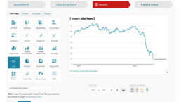
Data visualization tools: Datawrapper
If you are writing articles online and need to quickly insert beautiful, interactive charts, maps or tables, Datawrapper is the tool you are looking for.
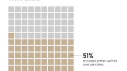
Uncommon chart types: Waffle charts
If you thought a pie chart was the only food-related chart type out there, think again! Waffle charts are a great alternative.

We are really into visual communication!
Every now and then we send out a newsletter with latest work, handpicked inspirational infographics, must-read blog posts, upcoming dates for workshops and presentations, and links to useful tools and tips. Leave your email address here and we’ll add you to our mailing list of awesome people!
