Why is data visualization so challenging?
Data visualization is very powerful, but it can also be hard. That’s because a great data visual combines three different aspects simultaneously.
The three properties of a great data visual
- A great data visual is clear: it communicates a strong message and is easy to understand without too much additional explanation.
- A great data visual is correct: it presents the data in an accurate and appropriate way, and is unambiguous.
- A great data visual is beautiful: it is inviting to look at, and uses colour, typography and other design elements in the right way to support its message.
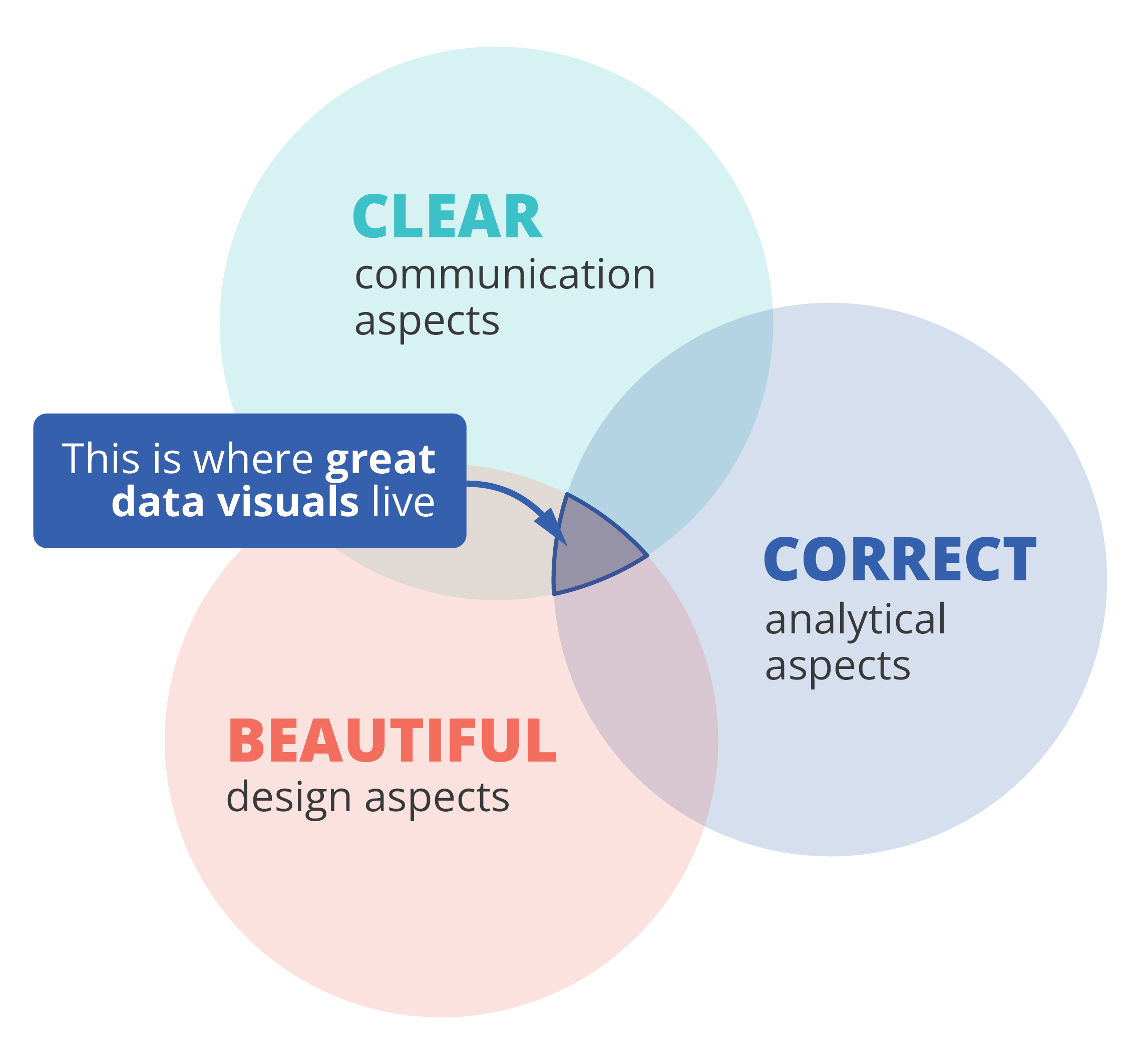
That also implies that we, as data visualizers, need to consider three different aspects when creating a data visual:
- the communication aspect, in order to make our visual clear,
- the analytical aspect, in order to make it correct, and
- the design aspect, in order to make it beautiful.
If one of these aspects is missing, we end up with a suboptimal chart. A chart can be beautiful and correct but confusing to navigate, causing the message to be lost. Or it can be very beautiful and clear, but fall apart because the underlying data or the representation of it is flawed. A lot of charts we encounter are clear and correct, but simply boring or uninviting to look at, because they were not designed to look good.
Three different skills
So, in order to create a powerful chart we must apply our communication, our analytical ánd our design skills. Most people feel comfortable with one or two of these skill sets, but not with all of them. Many people in analytical jobs, such as researchers, engineers or consultants, struggle with the design aspects of a visual. People with a role in communication, such as journalists or marketeers, often feel uncomfortable to dive into data analytics and the theoretical principles behind charts. And professional designers can make their visuals look beautiful, but don’t always succeed in crafting a crystal-clear message.
If you recognize yourself in one of these worries, fear not! I am convinced that anyone can create great data visuals on the intersection of clarity, correctness and beauty.
If you want to know more about visualizing data in the right way, you can check out the other videos in this series. Or I invite you to read my book, Powerful Charts, that will give you actionable insights and practical guidelines to create data visuals that truly engage and inspire your audience.
Full video series
- 01. Why is data visualization so powerful?
- 02. Why is data visualization so challenging?
- 03. Navigating the landscape of powerful charts
- 04. A powerful chart tells a story
- 05. A powerful chart has a high signal-to-noise ratio
- 06. Making a data visual noise-free
- 07. 7 different goals for your chart
- 08. Three roles of colour in a data visual
- 09. Choosing the right font for your data visual
- 10. Can you use Excel to create a powerful chart? (coming on January 09, 2023)

Read more:

7 different goals for your chart
A crucial step in building a powerful chart is choosing the right type of chart. A lot of charts don’t work because they simply use the wrong type of chart. To avoid this trap, we must ask ourselves a basic question: what’s the ultimate goal of our data visual? What do we want to show with our data?

Making a data visual noise-free
Removing noise from a data visual is not only about taking things away such as gridlines, axes or legends. That’s just one part of it, which we could call removing physical noise. Improving the signal-to-noise ratio is often also about adding little things that help our audience better understand the visual. We are helping them by removing mental noise, or mental barriers.

Three tips to create powerful charts in Excel
Creating charts in Excel can be a very powerful tool for making sense of complex data sets, and for visualizing them. But the default options are not always the most pretty or effective ones. Here are our top three tips to create better Excel charts.

A powerful chart has a high signal-to-noise ratio
‘Less is more’. It’s a crucial principle in most of our communication, and in data visualization in particular. Because of my background as a physicist, I prefer to talk about the ‘signal-to-noise ratio’. The message - our signal - should be amplified as much as possible, giving it all of the attention. Everything that can distract from our message - the noise - should be removed.

A powerful chart tells a story
A powerful chart has a clear message. It should be short and meaningful, and obvious in the blink of an eye. If there’s only one thing our audience remembers at the end of the day, this should be it.

Navigating the landscape of powerful charts
Once we’ve decided to create a data visual or infographic, there are a lot of questions we should ask ourselves to determine the most suitable format. These considerations could include size, readability, possible interactive functionality, and the level of detail we need.
We are really into visual communication!
Every now and then we send out a newsletter with latest work, handpicked inspirational infographics, must-read blog posts, upcoming dates for workshops and presentations, and links to useful tools and tips. Leave your email address here and we’ll add you to our mailing list of awesome people!
