Can you use Excel to create a powerful chart?
Spreadsheet tools such as Microsoft Excel or Numbers might not be the first thing on your mind when considering data visualization tools, but they can be pretty solid choices to build data visuals. Don’t let anyone convince you that using Excel to create data visuals is unprofessional. In my practice as an information designer I have created many charts in both Excel and PowerPoint, in particular for clients who wanted some degree of flexibility in modifying the visuals themselves.
Spreadsheet tools are more powerful than you might think
Spreadsheet applications allow us to create almost any type of chart in the family of bar charts, line charts and pie charts – including stacked bar charts, area charts, and so on. But even more ‘exotic’ alternatives such as treemaps, sunburst diagrams, candlestick charts, radar charts and waterfall charts are available.
The strength of spreadsheet tools lies more in building the charts than in polishing their design. We could use Excel to create the basic shapes that will make up the core of the data visual, and then export them to another, more design-oriented tool such as PowerPoint or Adobe Illustrator to further modify the colours, annotations and layout – or to combine multiple graphs into a single chart. Nevertheless, most of these things are possible in spreadsheet tools as well, although they might require a bit more tinkering and clicking around.
Move away from the defaults
The challenge in these situations is to move away from the default options. It takes some time and patience, and maybe some visual trickery, but it pays off!
This is how a default visual might look like: it has no visual hierarchy, boring default colors, the legend takes up a lot of space, and the numbers are hard to read.
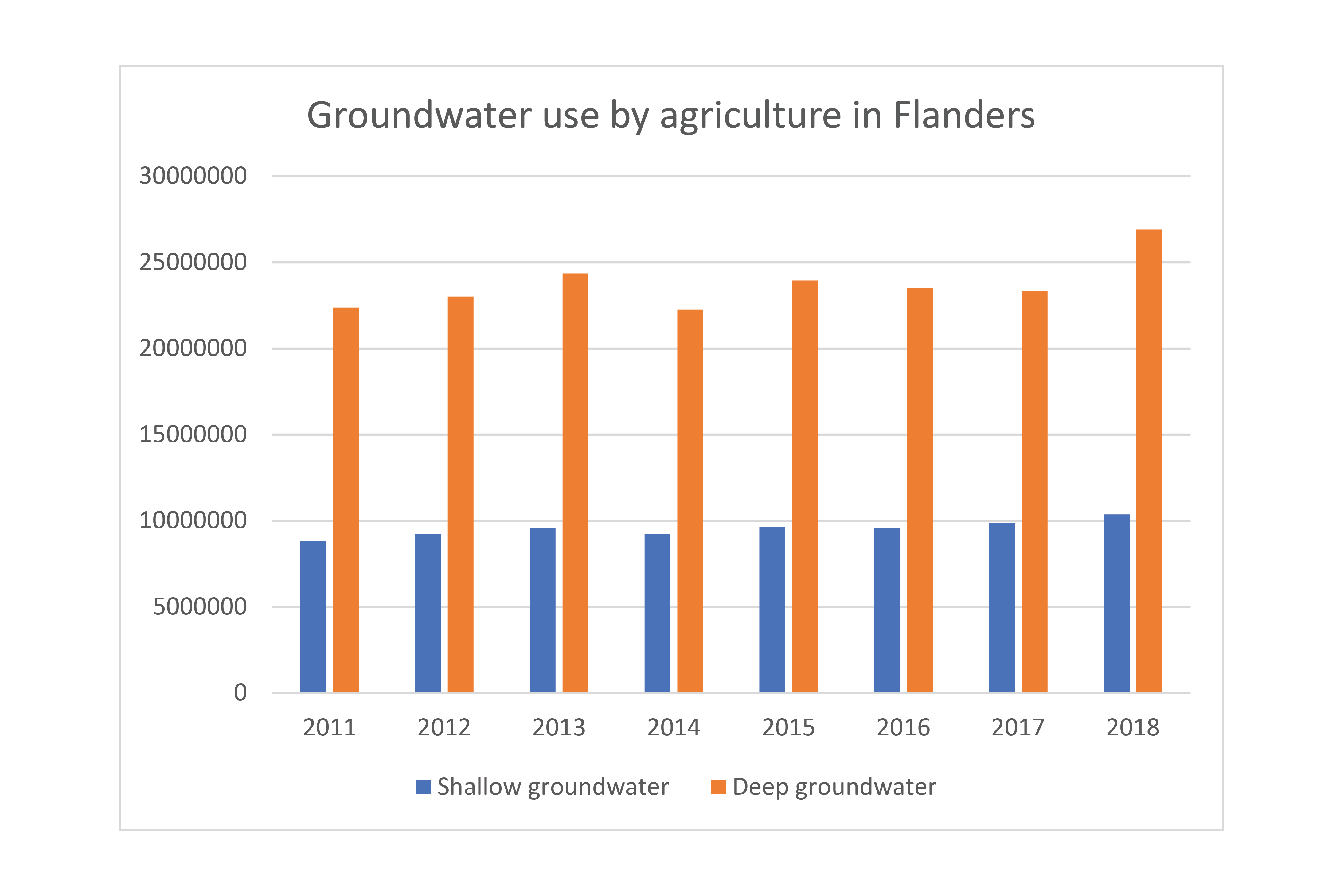
In the reworked visual below we changed the orientation of the bar chart from vertical to horizontal, we chose a better colour scheme, and we used direct labelling to remove the legend and gridlines. The end result contains exactly the same data as the default chart, but presented in a much clearer and more structured way.

Both of these charts were created from scratch using nothing but Microsoft Excel. Creating powerful charts is not about the tools you use, it’s all about applying the right principles!
If you want to know more about visualizing data in the right way, you can check out the other videos in this series. Or I invite you to read my book, Powerful Charts, that will give you actionable insights and practical guidelines to create data visuals that truly engage and inspire your audience.
Full video series
- 01. Why is data visualization so powerful?
- 02. Why is data visualization so challenging?
- 03. Navigating the landscape of powerful charts
- 04. A powerful chart tells a story
- 05. A powerful chart has a high signal-to-noise ratio
- 06. Making a data visual noise-free
- 07. 7 different goals for your chart
- 08. Three roles of colour in a data visual
- 09. Choosing the right font for your data visual
- 10. Can you use Excel to create a powerful chart?

Read more:

Making a data visual noise-free
Removing noise from a data visual is not only about taking things away such as gridlines, axes or legends. That’s just one part of it, which we could call removing physical noise. Improving the signal-to-noise ratio is often also about adding little things that help our audience better understand the visual. We are helping them by removing mental noise, or mental barriers.

Three tips to create powerful charts in Excel
Creating charts in Excel can be a very powerful tool for making sense of complex data sets, and for visualizing them. But the default options are not always the most pretty or effective ones. Here are our top three tips to create better Excel charts.

A powerful chart has a high signal-to-noise ratio
‘Less is more’. It’s a crucial principle in most of our communication, and in data visualization in particular. Because of my background as a physicist, I prefer to talk about the ‘signal-to-noise ratio’. The message - our signal - should be amplified as much as possible, giving it all of the attention. Everything that can distract from our message - the noise - should be removed.

A powerful chart tells a story
A powerful chart has a clear message. It should be short and meaningful, and obvious in the blink of an eye. If there’s only one thing our audience remembers at the end of the day, this should be it.

Navigating the landscape of powerful charts
Once we’ve decided to create a data visual or infographic, there are a lot of questions we should ask ourselves to determine the most suitable format. These considerations could include size, readability, possible interactive functionality, and the level of detail we need.

How powerful charts can boost your career
An American accountant managed - as the youngest ever! - to win a crucial election in Los Angeles - thanks to the power of data visualization. And you, too, can use powerful charts to boost your career!
We are really into visual communication!
Every now and then we send out a newsletter with latest work, handpicked inspirational infographics, must-read blog posts, upcoming dates for workshops and presentations, and links to useful tools and tips. Leave your email address here and we’ll add you to our mailing list of awesome people!
