Why is data visualization so challenging?
Data visualization is very powerful, but it can also be hard. That’s because a great data visual combines three different aspects simultaneously.
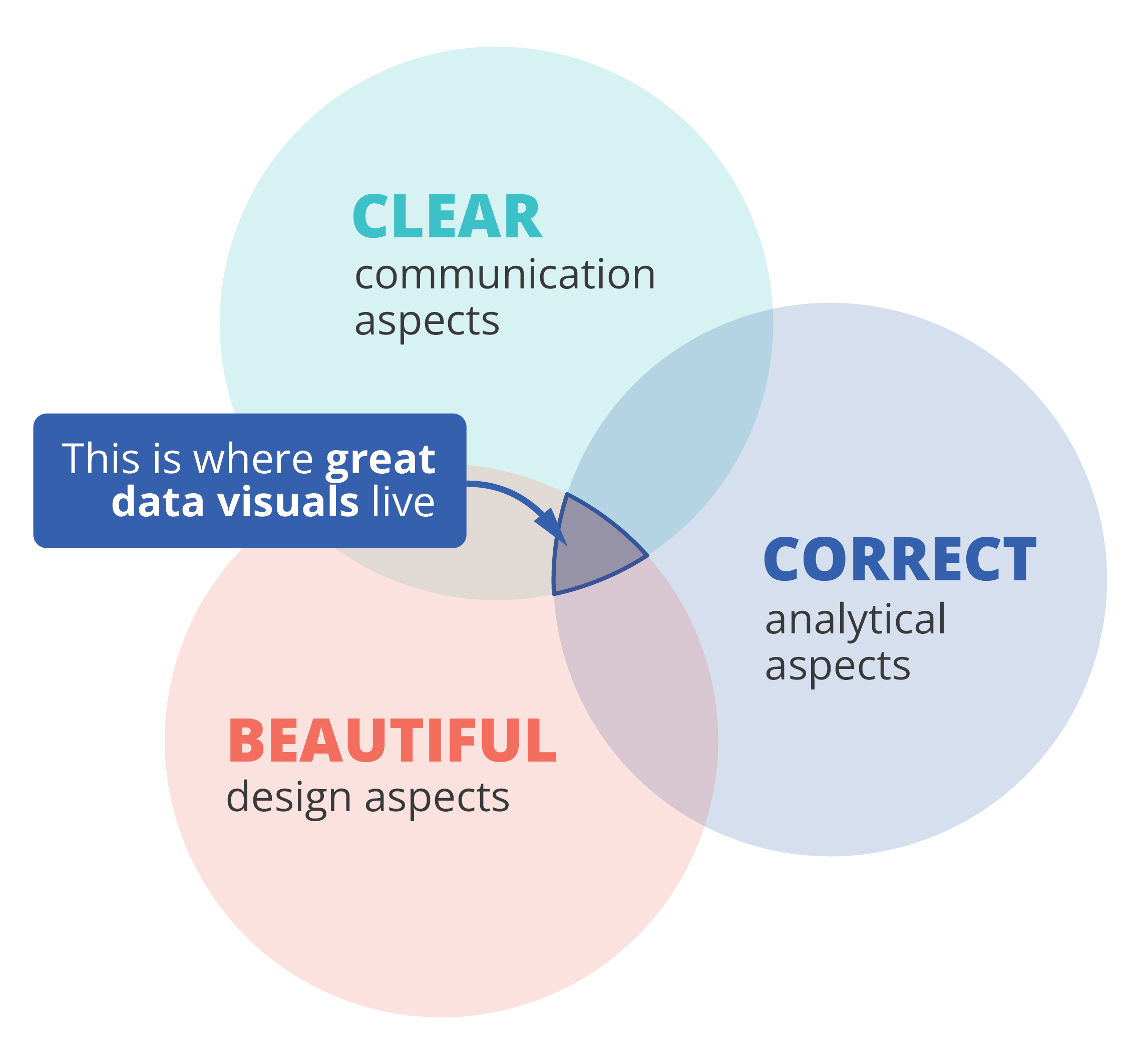
The three properties of a great data visual
- A great data visual is clear: it communicates a strong message and is easy to understand without too much additional explanation.
- A great data visual is correct: it presents the data in an accurate and appropriate way, and is unambiguous.
- A great data visual is beautiful: it is inviting to look at, and uses colour, typography and other design elements in the right way to support its message.
That also implies that we, as data visualizers, need to consider three different aspects when creating a data visual:
- the communication aspect, in order to make our visual clear,
- the analytical aspect, in order to make it correct, and
- the design aspect, in order to make it beautiful.
If one of these aspects is missing, we end up with a suboptimal chart. A chart can be beautiful and correct but confusing to navigate, causing the message to be lost. Or it can be very beautiful and clear, but fall apart because the underlying data or the representation of it is flawed. A lot of charts we encounter are clear and correct, but simply boring or uninviting to look at, because they were not designed to look good.
Three different skills
So, in order to create a powerful chart we must apply our communication, our analytical ánd our design skills. Most people feel comfortable with one or two of these skill sets, but not with all of them. Many people in analytical jobs, such as researchers, engineers or consultants, struggle with the design aspects of a visual. People with a role in communication, such as journalists or marketeers, often feel uncomfortable to dive into data analytics and the theoretical principles behind charts. And professional designers can make their visuals look beautiful, but don’t always succeed in crafting a crystal-clear message.
If you recognize yourself in one of these worries, fear not! I am convinced that anyone can create great data visuals on the intersection of clarity, correctness and beauty.
If you want to know more about visualizing data in the right way, you can check out the other videos in this series. Or I invite you to read my book, Powerful Charts, that will give you actionable insights and practical guidelines to create data visuals that truly engage and inspire your audience.
Full video series
- 01. Why is data visualization so powerful?
- 02. Why is data visualization so challenging?
- 03. Navigating the landscape of powerful charts
- 04. A powerful chart tells a story
- 05. A powerful chart has a high signal-to-noise ratio
- 06. Making a data visual noise-free
- 07. 7 different goals for your chart
- 08. Three roles of colour in a data visual
- 09. Choosing the right font for your data visual
- 10. Can you use Excel to create a powerful chart? (coming on January 09, 2023)

Read more:

Why I love matrix charts
This one is definitely in my top 5 of favourite chart types: a matrix chart! Super flexible, can provide some great insights into the data, and it will fit well into your beautiful report design.

Vreemde plaatsnamen in Vlaanderen
Iedereen kent wellicht 'Kontich' en 'Reet', maar in Vlaanderen hebben we nog veel meer merkwaardige, onverwachte, en vaak grappige plaatsnamen. Heb je bijvoorbeeld ooit al gehoord van Buitenland, Dikkebus, of Grote Homo?

Small multiples can save your chart
When you're dealing with a chart that has too much information on it, the most straightforward advice to follow is: break it down into multiple charts, each with less information on them. A powerful example of this is a so-called small multiple approach.

Can you use Excel to create a powerful chart?
Spreadsheet tools such as Microsoft Excel or Numbers might not be the first thing on your mind when considering data visualization tools, but they can be pretty solid choices to build data visuals. Don’t let anyone convince you that using Excel to create data visuals is unprofessional.

Choosing the right font for your data visual
Fonts evoke emotions: there are very sophisticated fonts, playful fonts, attention-grabbing fonts, and elegant handwritten fonts. Using the wrong type of font can have a lot of impact. In data visualization the implications of typography are mainly focused on readability. Labels and annotations can easily become so small they get hard to read. Above all else, we should choose a font which is readable at small sizes.

Three roles of colour in a data visual
Colour is one of the most crucial tools we have to turn a normal chart into a powerful chart with a clear message, a chart which tells a story rather than simply presenting the information.
We are really into visual communication!
Every now and then we send out a newsletter with latest work, handpicked inspirational infographics, must-read blog posts, upcoming dates for workshops and presentations, and links to useful tools and tips. Leave your email address here and we’ll add you to our mailing list of awesome people!
