Why is data visualization so powerful?
The amount of data coming our way is growing exponentially. In 2021 alone, it is estimated that humankind generated 74 zettabytes of data – that’s about 10,000 GB per person. How on earth are we going to keep this manageable?
Visualization: our most powerful tool
Visualization is one of the key solutions to cope with the endless stream of data, content and information – together with other strategies such as filtering and organization. Visualization might very well be the most powerful tool we have to turn complex information into manageable insights. But why is that?
There are three important reasons why data visualization is a very strong way to present information:
- its information density is extremely high,
- it attracts the attention of your audience, and
- visual information is easier to process and memorize.
Reason 1: information density
Researchers at MIT have shown that we can detect the meaning of a picture in as little as 13 milliseconds – that’s extremely fast.
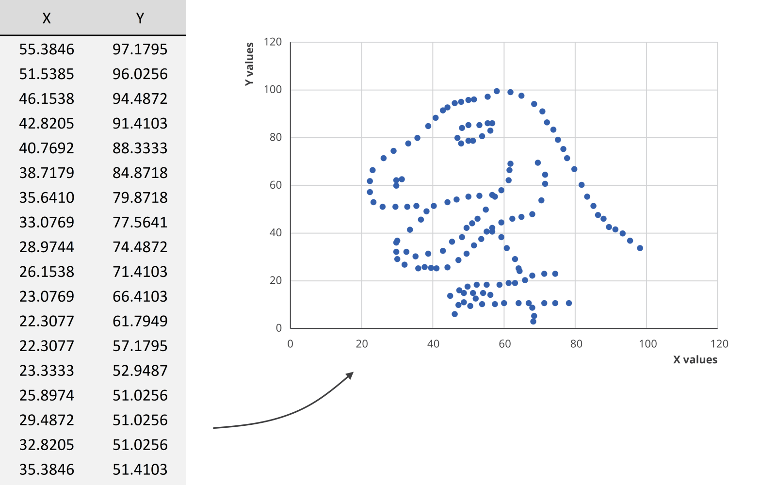
We could spend hours looking at this dataset for example, created by visual journalism professor Alberto Cairo, without learning anything. But as soon as we turn the data into a scatter plot, it’s obvious that we’re looking at a dinosaur. In the blink of an eye!
Reason 2: attractiveness
Visual information is also attractive. Not in the sense that it is beautiful to look at (although that’s often also our goal), but literally: it attracts the attention of your audience. In a book or newspaper, people will often look for the pictures first, before they start reading all of the text.
Reason 3: easier to process
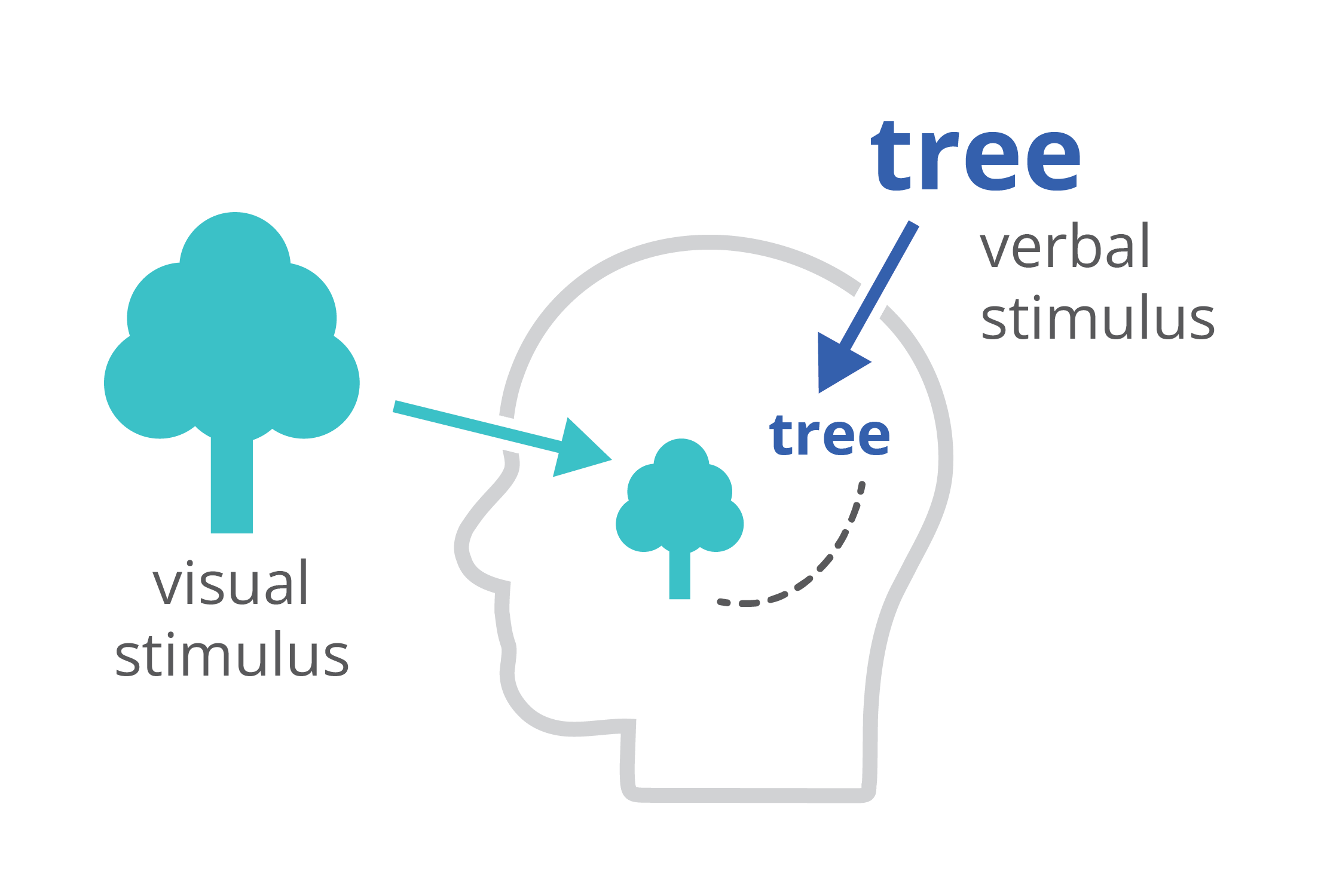
Finally, charts and infographics are easier to process than written text. The dual-coding theory, developed by Allan Paivio, states that our brains process information both in a visual, as well as a verbal way. If we only get verbal stimuli, only a part of our brain is working. That’s why during a long phone call we automatically start doodling – the visual brain is bored and looking for things to do. By providing our audience with a combination of text and images, the entire brain is stimulated, leading to better focus, better understanding, and better memorization.
Harnessing the power of data visualization
So in summary, data visualization is powerful because it combines a high information density, attractiveness, and easier processing and memorization.
If you want to know more about visualizing data in the right way, you can check out the other videos in this series. Or I invite you to read my book, Powerful Charts, that will give you actionable insights and practical guidelines to create data visuals that truly engage and inspire your audience.
Full video series
- 01. Why is data visualization so powerful?
- 02. Why is data visualization so challenging?
- 03. Navigating the landscape of powerful charts
- 04. A powerful chart tells a story
- 05. A powerful chart has a high signal-to-noise ratio
- 06. Making a data visual noise-free
- 07. 7 different goals for your chart
- 08. Three roles of colour in a data visual
- 09. Choosing the right font for your data visual
- 10. Can you use Excel to create a powerful chart? (coming on January 09, 2023)

Read more:

How powerful charts can boost your career
An American accountant managed - as the youngest ever! - to win a crucial election in Los Angeles - thanks to the power of data visualization. And you, too, can use powerful charts to boost your career!

Why is data visualization so challenging?
Data visualization is very powerful, but it can also be hard. That’s because a great data visual combines three different aspects simultaneously: clarity, correctness, and beauty.

Data visualization resources: all the links you\’ll ever need!
Your Data Visualization Toolkit: Practical tips, templates, and inspiration to make your data shine. Explore, adapt, and create work that’s clear, compelling, and unforgettable.

Infographic: Amazing facts about the brain
Did you know that our brain makes up 2% of our body weight, but consumers about 20% of our energy? Did you know that we have a second brain, located in our gut?
Our information designer Sofia made this insightful infographic, giving you an overview of eight amazing facts about the brain!

How common is your birthday?
Not all birthdays are created equal... in fact, for most countries in the north temperate zone, more people are born in summer (May - August) than in winter (October - January). This heatmap allows you to check how popular your birth date is. It shows the number of people in Belgium for each specific birthday.

Visualizing Complexity: Dataviz book review
Visualizing Complexity is a great new data visualization book published by information design Superdot. Here's our verdict.
We are really into visual communication!
Every now and then we send out a newsletter with latest work, handpicked inspirational infographics, must-read blog posts, upcoming dates for workshops and presentations, and links to useful tools and tips. Leave your email address here and we’ll add you to our mailing list of awesome people!
