
Why is data visualization so powerful?
The amount of data coming our way is growing exponentially. In 2021 alone, it is estimated that humankind generated 74 zettabytes of data – that’s about 10,000 GB per person. How on earth are we going to keep this manageable?
Visualization: our most powerful tool
Visualization is one of the key solutions to cope with the endless stream of data, content and information – together with other strategies such as filtering and organization. Visualization might very well be the most powerful tool we have to turn complex information into manageable insights. But why is that?
There are three important reasons why data visualization is a very strong way to present information:
- its information density is extremely high,
- it attracts the attention of your audience, and
- visual information is easier to process and memorize.
Reason 1: information density
Researchers at MIT have shown that we can detect the meaning of a picture in as little as 13 milliseconds – that’s extremely fast.
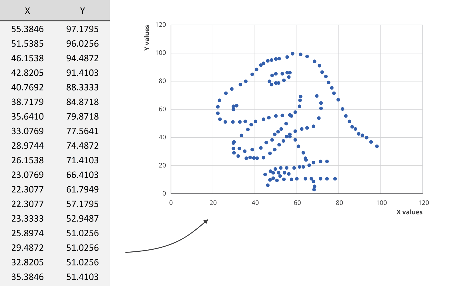
We could spend hours looking at this dataset for example, created by visual journalism professor Alberto Cairo, without learning anything. But as soon as we turn the data into a scatter plot, it’s obvious that we’re looking at a dinosaur. In the blink of an eye!
Reason 2: attractiveness
Visual information is also attractive. Not in the sense that it is beautiful to look at (although that’s often also our goal), but literally: it attracts the attention of your audience. In a book or newspaper, people will often look for the pictures first, before they start reading all of the text.
Reason 3: easier to process
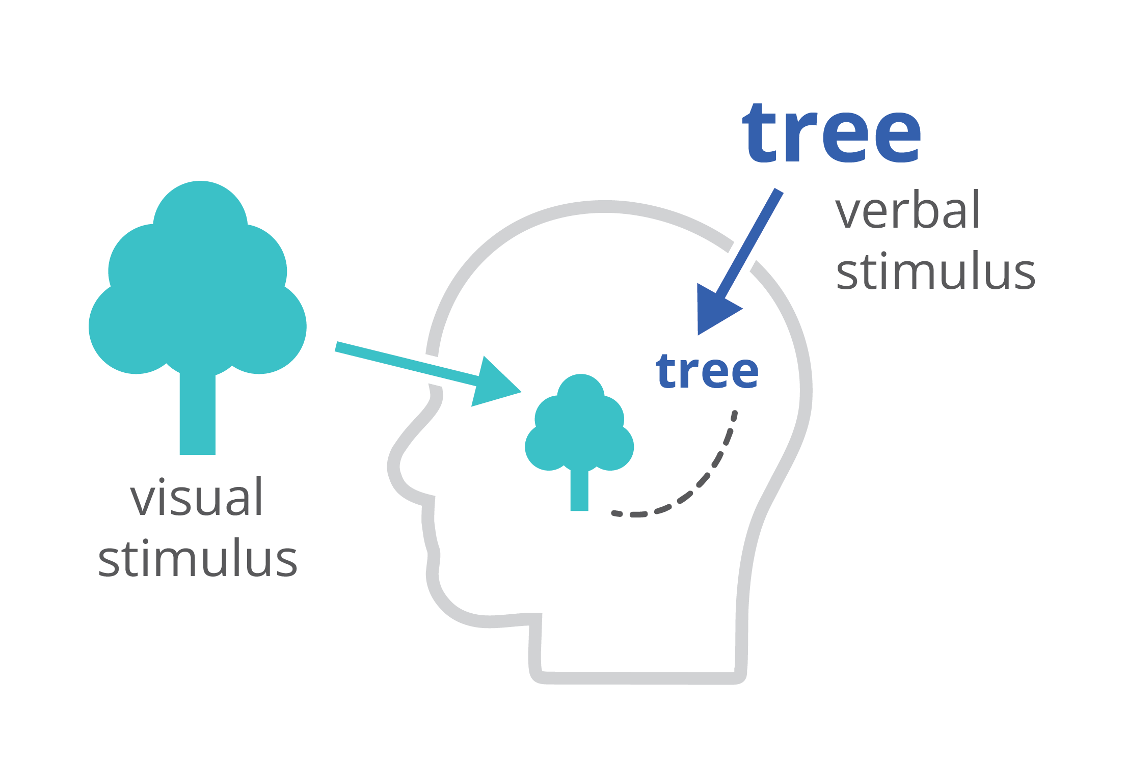
Finally, charts and infographics are easier to process than written text. The dual-coding theory, developed by Allan Paivio, states that our brains process information both in a visual, as well as a verbal way. If we only get verbal stimuli, only a part of our brain is working. That’s why during a long phone call we automatically start doodling – the visual brain is bored and looking for things to do. By providing our audience with a combination of text and images, the entire brain is stimulated, leading to better focus, better understanding, and better memorization.
Harnessing the power of data visualization
So in summary, data visualization is powerful because it combines a high information density, attractiveness, and easier processing and memorization.
If you want to know more about visualizing data in the right way, you can check out the other videos in this series. Or I invite you to read my book, Powerful Charts, that will give you actionable insights and practical guidelines to create data visuals that truly engage and inspire your audience.
Full video series
- 01. Why is data visualization so powerful?
- 02. Why is data visualization so challenging?
- 03. Navigating the landscape of powerful charts
- 04. A powerful chart tells a story
- 05. A powerful chart has a high signal-to-noise ratio
- 06. Making a data visual noise-free
- 07. 7 different goals for your chart
- 08. Three roles of colour in a data visual
- 09. Choosing the right font for your data visual
- 10. Can you use Excel to create a powerful chart? (coming on January 09, 2023)

Read more:

Avoiding abbreviations
People are lazy. Make it as easy as possible for them to see what you are trying to show. There are tons of ways to reduce mental noise in your charts, but one of the easiest is avoiding abbreviations.

The uncomfortable relationship between scientific illustrations and AI
Scientific journal Nature devoted the headline of its 23 July 2026 issue to “the human art of scientific illustration in the age of artificial intelligence”. Of course, that sparked my attention.

Review: Info We Trust
Info We Trust is an ambitious, visually stunning book that sits somewhere between philosophy, information design, and a collection of visual essays.
Gridlines are better than axes
Almost always, gridlines are better than axes. Vertical axes are the default option, and they have been around for centuries, so they are very well known. But they also have downsides. My biggest problem with vertical axes is that they’re often so far away from where the action is really happening.

Review: A History of Data Visualization and Graphic Communication
Michael Friendly and Howard Wainer clearly love graphs. But A History of Data Visualization and Graphic Communication isn’t just about graphs — it’s about the stories behind them: the context, the people, the new measurements that made them necessary, and the discoveries they enabled.

Report visuals don’t have to suck
Discover how CREG, Belgium’s electricity regulator, turns complex data into clear and engaging visuals. From smart annotations to small multiples and uncommon chart types, their Monitoring Report shows how thoughtful data visualization makes technical reports easier to read and understand.
We are really into visual communication!
Every now and then we send out a newsletter with latest work, handpicked inspirational infographics, must-read blog posts, upcoming dates for workshops and presentations, and links to useful tools and tips. Leave your email address here and we’ll add you to our mailing list of awesome people!
