
Data visualization tools: Datawrapper
Data visualization tools: Datawrapper
Let’s not beat around the bush in this blog post. If you are writing articles online and need to quickly insert beautiful, interactive charts, maps or tables, Datawrapper is the tool you are looking for.
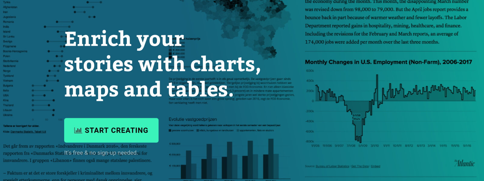
The Datawrapper team, based in Berlin, built an amazing product suitable for everyone who wants to tell stories using data. The free tier is very generous – unlimited visuals, live-updating charts, easy embedding, responsivity… The professional solution is expensive but mainly aims at newsrooms and journalists, removing the Datawrapper attribution and allowing to create print-ready graphics.
No coding skills are required, you can simply copy and paste your data, upload CSV files, or link to a URL or Google Sheet which allows live-updating charts. Obviously, you are limited to a certain set of possible chart types and designs, but the talented design team (led by Lisa Charlotte Rost) has ensured that all the available options and color schemes are well-crafted and elegantly designed.
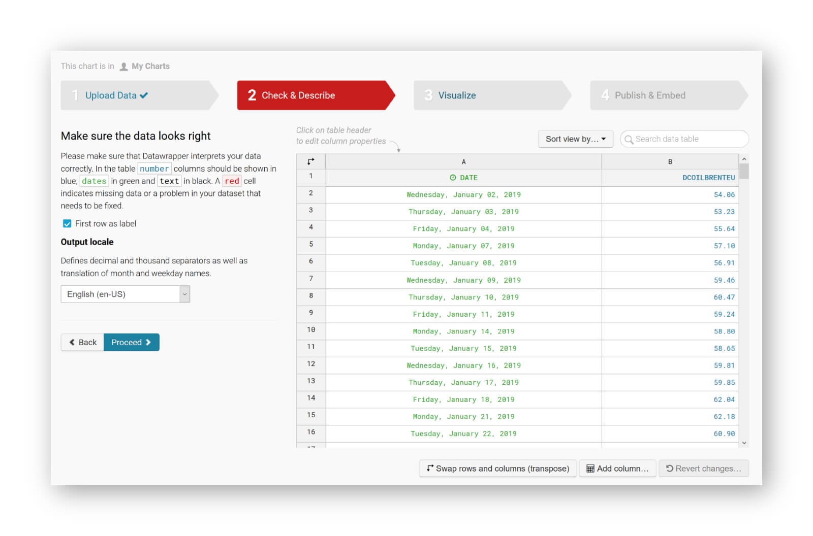
You can find plenty of examples at the Datawrapper website, but of course a blog post about this tool would not be complete without an embedded example. So let’s try to create our own chart of, let’s say, the evolution of the price of Brent Crude Oil since January 2019. Uploading the data, as a CSV file, works very smoothly. Datawrapper automatically recognizes the type of data in each column, and support for different localizations is provided out of the box:
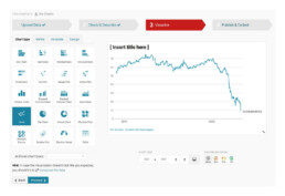
The tool is sufficiently intelligent to suggest the best chart type, and makes some pretty good default decisions regarding axes and grid lines (taking into account Tufte’s guidelines to maximixe data-ink ratio):
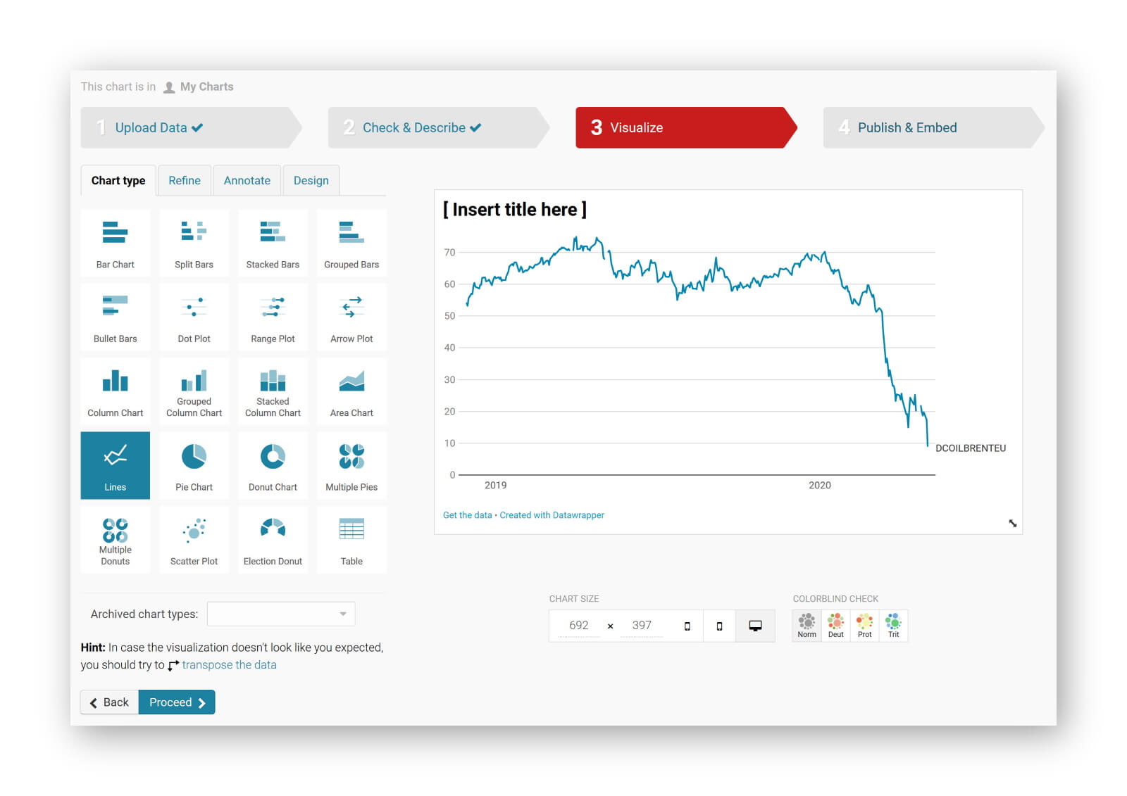
The next steps allow you to quickly finetune any other parameters you would like to change: colours, axes, grid lines, linestyles, hover labels, title, description, source links,… The final result can be downloaded as a PNG image, shared as a link, or simply embedded in your blog post:
It’s magic, it’s simple, and it’s so much fun! Did I already mention I am a fan?
Read more:
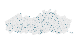
Vreemde plaatsnamen in Vlaanderen
Iedereen kent wellicht 'Kontich' en 'Reet', maar in Vlaanderen hebben we nog veel meer merkwaardige, onverwachte, en vaak grappige plaatsnamen. Heb je bijvoorbeeld ooit al gehoord van Buitenland, Dikkebus, of Grote Homo?
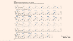
Small multiples can save your chart
When you're dealing with a chart that has too much information on it, the most straightforward advice to follow is: break it down into multiple charts, each with less information on them. A powerful example of this is a so-called small multiple approach.

Data visualization podcasts 2023
At Baryon, we’re huge fans of podcasts! Data visualization podcasts are a great way to stay up to date on the latest trends and techniques in data visualization.

Can you use Excel to create a powerful chart?
Spreadsheet tools such as Microsoft Excel or Numbers might not be the first thing on your mind when considering data visualization tools, but they can be pretty solid choices to build data visuals. Don’t let anyone convince you that using Excel to create data visuals is unprofessional.

Choosing the right font for your data visual
Fonts evoke emotions: there are very sophisticated fonts, playful fonts, attention-grabbing fonts, and elegant handwritten fonts. Using the wrong type of font can have a lot of impact. In data visualization the implications of typography are mainly focused on readability. Labels and annotations can easily become so small they get hard to read. Above all else, we should choose a font which is readable at small sizes.

Three roles of colour in a data visual
Colour is one of the most crucial tools we have to turn a normal chart into a powerful chart with a clear message, a chart which tells a story rather than simply presenting the information.
We are really into visual communication!
Every now and then we send out a newsletter with latest work, handpicked inspirational infographics, must-read blog posts, upcoming dates for workshops and presentations, and links to useful tools and tips. Leave your email address here and we’ll add you to our mailing list of awesome people!


