
A powerful chart tells a story
A powerful chart tells a story
A powerful chart has a clear message. It should be short and meaningful, and obvious in the blink of an eye. If there’s only one thing our audience remembers at the end of the day, this should be it.
Answering the ‘so what’ question
A visual without a clear key message might show the data, but it doesn’t show what’s interesting, surprising or noteworthy about the data. It leaves our audience guessing, they have to do all of the thinking work. Ideally, we want to create a visual that helps them to quickly see what’s important. A visual that not only answers the ‘what’ question, but more importantly also the ‘so what’ question.
Here’s one of my favourite examples to illustrate the importance of visual storytelling. This chart shows the evolution of meat consumption in the US since the 1960s. By itself, this chart is pretty clear. It shows us the data, in a way that is easy to understand. It answers the ‘what’ question. The design is satisfactory, with pleasing colours and good readability. But can it be improved?
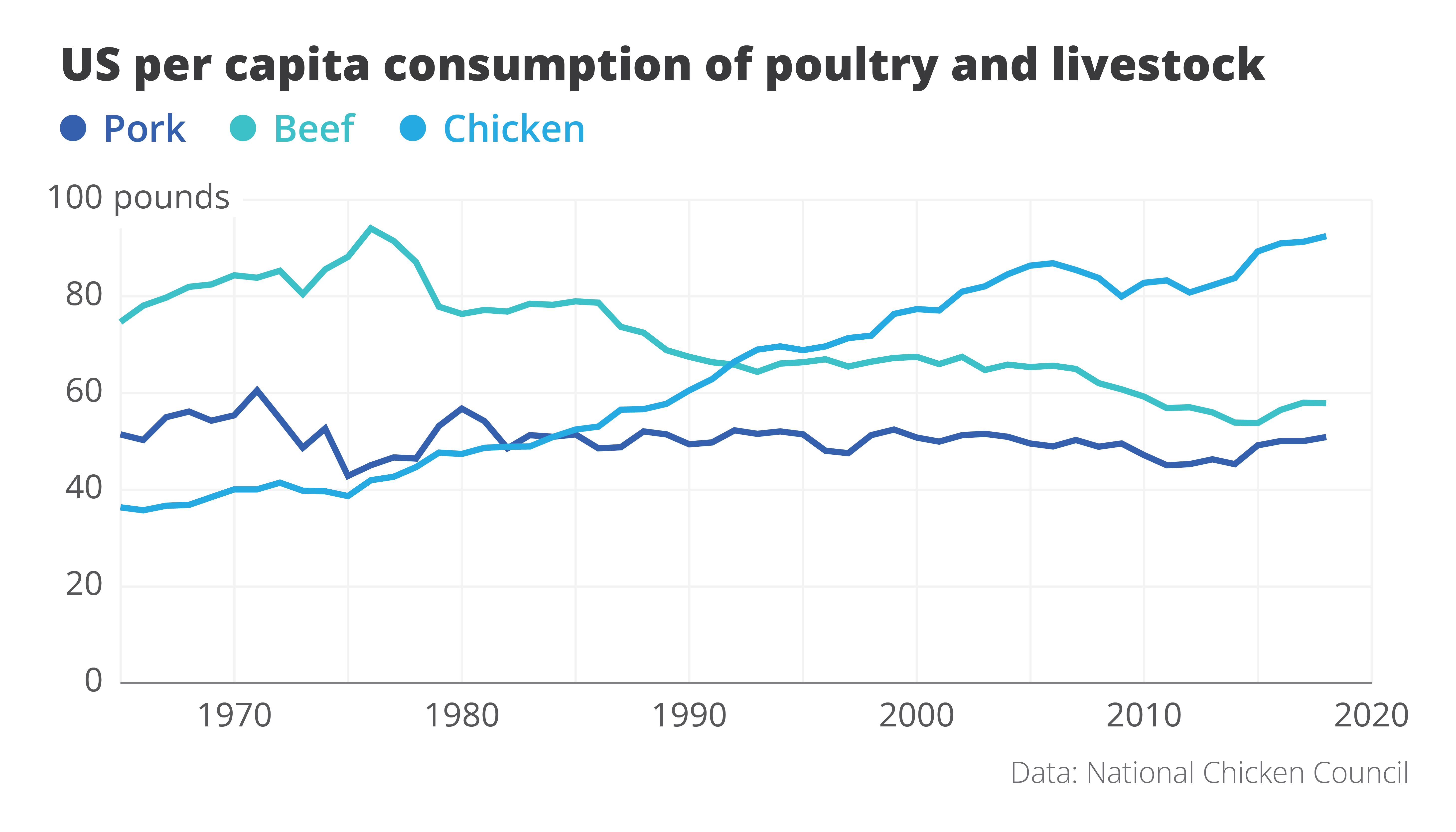
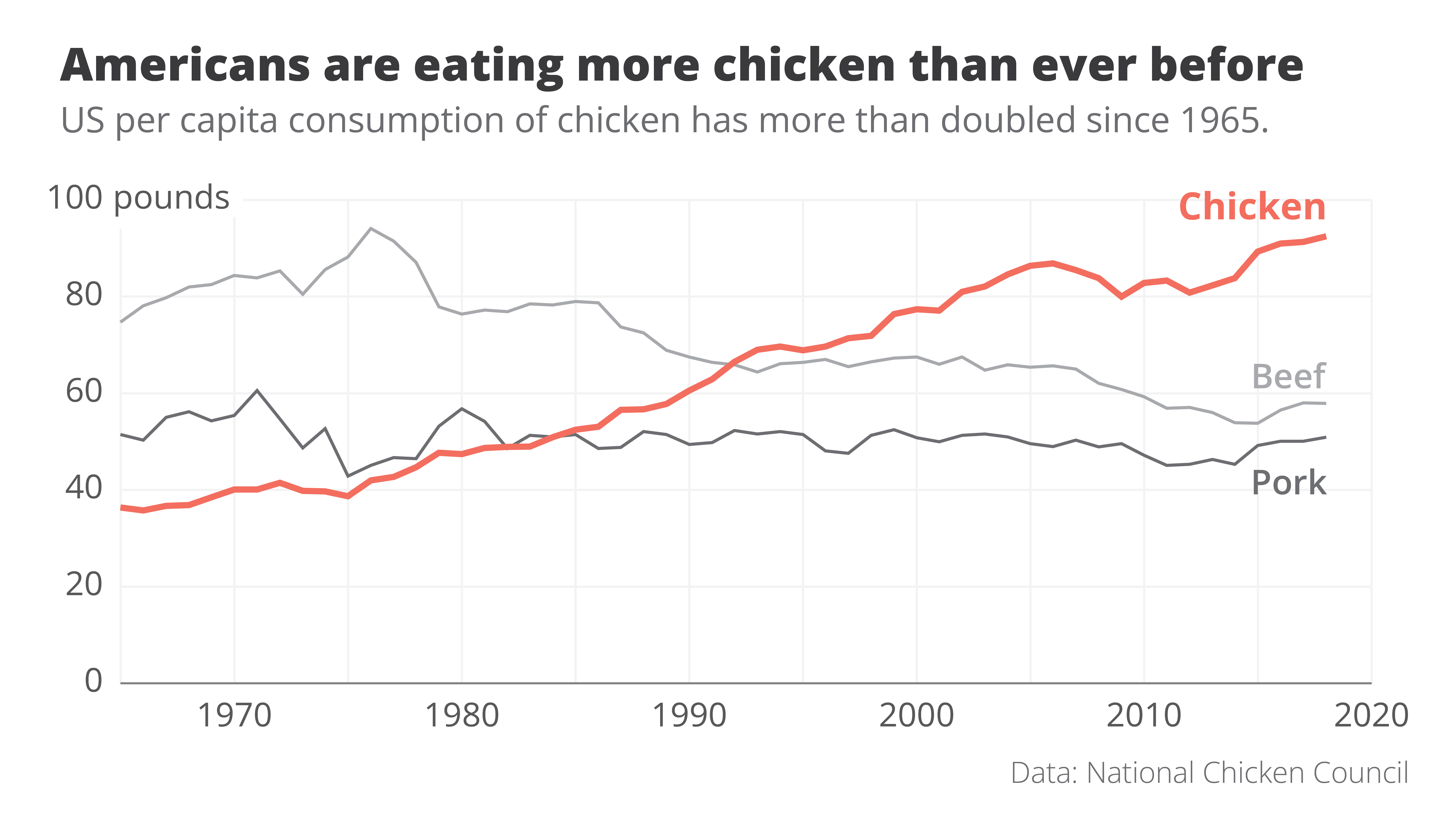
Here is an attempt at a rework. Even though we’re looking at exactly the same data – we wouldn’t want to lie to our audience! – the message in this new visual is loud and clear. It’s right there in the title: Americans are eating more chicken than ever before!
The power of data visualization at work
Two simple changes turned the original ‘what’ visual into this super-clear ‘so what’ visual.
- First of all, clever colour choices: the line that interests us – the one for chicken consumption – gets a bright orange colour, the other two become grey. They’re still there, but pushed a bit to the background.
- Secondly, clever text: the original title was very factual – ‘US per capita consumption of poultry and livestock’. All the thinking work is left for the reader. But what if we simply tell them the interesting part? The new title ‘Americans are eating more chicken than ever before’ is still 100% true, but now it tells us why this visual is actually quite surprising.
These two small but impactful changes turned the original visual, which simply shows the data, into a great visual that actually tells a story. For me, that’s the real power of data visualization at work.
If you want to know more about visualizing data in the right way, you can check out the other videos in this series. Or I invite you to read my book, Powerful Charts, that will give you actionable insights and practical guidelines to create data visuals that truly engage and inspire your audience.
Full video series
- 01. Why is data visualization so powerful?
- 02. Why is data visualization so challenging?
- 03. Navigating the landscape of powerful charts
- 04. A powerful chart tells a story
- 05. A powerful chart has a high signal-to-noise ratio
- 06. Making a data visual noise-free
- 07. 7 different goals for your chart
- 08. Three roles of colour in a data visual
- 09. Choosing the right font for your data visual
- 10. Can you use Excel to create a powerful chart? (coming on January 09, 2023)

Read more:

Review: Info We Trust
Info We Trust is an ambitious, visually stunning book that sits somewhere between philosophy, information design, and a collection of visual essays.

Gridlines are better than axes
Almost always, gridlines are better than axes. Vertical axes are the default option, and they have been around for centuries, so they are very well known. But they also have downsides. My biggest problem with vertical axes is that they’re often so far away from where the action is really happening.

Review: A History of Data Visualization and Graphic Communication
Michael Friendly and Howard Wainer clearly love graphs. But A History of Data Visualization and Graphic Communication isn’t just about graphs — it’s about the stories behind them: the context, the people, the new measurements that made them necessary, and the discoveries they enabled.

Report visuals don’t have to suck
Discover how CREG, Belgium’s electricity regulator, turns complex data into clear and engaging visuals. From smart annotations to small multiples and uncommon chart types, their Monitoring Report shows how thoughtful data visualization makes technical reports easier to read and understand.

Data visualization podcasts 2025
At Baryon, we’re huge fans of podcasts! Data visualization podcasts are a great way to stay up to date on the latest trends and techniques in data visualization.

Tell me why… I don’t like dashboards
I don't like dashboards. Well, most dashboards at least. They're just trying too hard... to do everything, everywhere, all at once. Why is that? And is there a better solution?
We are really into visual communication!
Every now and then we send out a newsletter with latest work, handpicked inspirational infographics, must-read blog posts, upcoming dates for workshops and presentations, and links to useful tools and tips. Leave your email address here and we’ll add you to our mailing list of awesome people!


Navigating the landscape of powerful charts
Navigating the landscape of powerful charts
Once we’ve decided to create a data visual or infographic, there are a lot of questions we should ask ourselves to determine the most suitable format. These considerations could include size, readability, possible interactive functionality, and the level of detail we need.
Consider your audience
Our audience is crucial in this: in the end, it’s all about them. Even when we have the most important message in the world, if our audience doesn’t understand it or they’re not interested, it’s all for nothing.
So, take a moment to consider what your audience is trying to achieve. Which decision are they trying to make? What data or information do they need in order to make this decision? And how much time do they have to do so?
The landscape of powerful charts
Depending on our answers to these questions, the charts we create can vary wildly. If time is of the essence, we should build charts which can be interpreted in the blink of an eye. These could be static charts for reports, animated online charts, or interactive charts in mobile applications.
On the other end of the spectrum we have a bit more time for visual storytelling. This includes infographics for print or social media, or maybe breathtaking interactive visual essays. We can take our audience by the hand and guide them, step by step, through a visual story.
In between these two extremes we can create reports or dashboards that can guide our audience through a collection of clearly presented key insights.

Don’t start your computer (yet)
Once we have figured out our place in this landscape of powerful charts, the production of our visual can start. However, I urge you not to open your computer at this point of the workflow. It’s a common mistake: we want to start creating as quickly as possible, so we open our favourite tool right away. But then it hits us – the blank screen is staring us in the face, and we start doubting. Where should we put the first line? What was it again we were trying to achieve?
We’re not there yet. It’s time to first define a clear message.
If you want to know more about visualizing data in the right way, you can check out the other videos in this series. Or I invite you to read my book, Powerful Charts, that will give you actionable insights and practical guidelines to create data visuals that truly engage and inspire your audience.
Full video series
- 01. Why is data visualization so powerful?
- 02. Why is data visualization so challenging?
- 03. Navigating the landscape of powerful charts
- 04. A powerful chart tells a story
- 05. A powerful chart has a high signal-to-noise ratio
- 06. Making a data visual noise-free
- 07. 7 different goals for your chart
- 08. Three roles of colour in a data visual
- 09. Choosing the right font for your data visual
- 10. Can you use Excel to create a powerful chart? (coming on January 09, 2023)
Read more:
Review: Info We Trust
Info We Trust is an ambitious, visually stunning book that sits somewhere between philosophy, information design, and a collection of visual essays.
Gridlines are better than axes
Almost always, gridlines are better than axes. Vertical axes are the default option, and they have been around for centuries, so they are very well known. But they also have downsides. My biggest problem with vertical axes is that they’re often so far away from where the action is really happening.
Review: A History of Data Visualization and Graphic Communication
Michael Friendly and Howard Wainer clearly love graphs. But A History of Data Visualization and Graphic Communication isn’t just about graphs — it’s about the stories behind them: the context, the people, the new measurements that made them necessary, and the discoveries they enabled.
Report visuals don’t have to suck
Discover how CREG, Belgium’s electricity regulator, turns complex data into clear and engaging visuals. From smart annotations to small multiples and uncommon chart types, their Monitoring Report shows how thoughtful data visualization makes technical reports easier to read and understand.
Data visualization podcasts 2025
At Baryon, we’re huge fans of podcasts! Data visualization podcasts are a great way to stay up to date on the latest trends and techniques in data visualization.
Tell me why… I don’t like dashboards
I don't like dashboards. Well, most dashboards at least. They're just trying too hard... to do everything, everywhere, all at once. Why is that? And is there a better solution?
We are really into visual communication!
Every now and then we send out a newsletter with latest work, handpicked inspirational infographics, must-read blog posts, upcoming dates for workshops and presentations, and links to useful tools and tips. Leave your email address here and we’ll add you to our mailing list of awesome people!
How powerful charts can boost your career
How powerful charts can boost your career
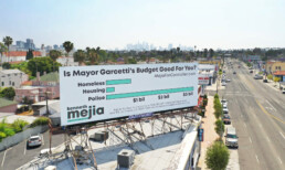
An American accountant managed – as the youngest ever! – to win a crucial election in Los Angeles – thanks to the power of data visualization.
Kenneth Mejia, a 32-year-old accountant of Filipino descent, is very committed to issues of poverty, affordable housing and mobility. In the 2022 elections he ran for “City Controller”, a sort of treasurer, for his hometown of Los Angeles. It’s a department with responsibilities almost as big as those of the city’s mayor and chief justice. For example, the City Controller can commission audits to evaluate the effectiveness of city departments.
Data visualization as election propaganda
Kenneth took a remarkably creative and unusual approach in the run-up to the election: he made imported data about the city instantly accessible and visible. On his campaign website, for example, he created a whole series of interactive maps, reports and searchable databases. He even put up billboards showing with graphs what the anticipated city budget will be used for in 2022-2023.
That transparent communication did not miss its mark. Kenneth won, as the youngest city controller ever. This approach shows how powerful data visualization is to unlock information, which may seem difficult and unfathomable to the general public, in a very accessible way. As a result, citizens not only gain insight but also become more engaged in politics. They become better informed and can vote more knowledgeably.
You too can make a difference thanks to powerful data visualization
Whether you have political ambitions, want to present your scientific research comprehensibly or convince your management of your brilliant ideas… Would you also like to learn how to create powerful graphics that can inform, convince and engage your audience? Charts that not only accurately represent the numbers, but also have a clear message and are attractive to look at?
In the book “Powerful Charts” physicist and Baryon founder Koen Van den Eeckhout explains in an accessible and practical way how this can be done. An indispensable guide for anyone who communicates with and about figures.
This brand new book is available now at Owl Press.
Read more:
Review: Info We Trust
Info We Trust is an ambitious, visually stunning book that sits somewhere between philosophy, information design, and a collection of visual essays.
Gridlines are better than axes
Almost always, gridlines are better than axes. Vertical axes are the default option, and they have been around for centuries, so they are very well known. But they also have downsides. My biggest problem with vertical axes is that they’re often so far away from where the action is really happening.
Review: A History of Data Visualization and Graphic Communication
Michael Friendly and Howard Wainer clearly love graphs. But A History of Data Visualization and Graphic Communication isn’t just about graphs — it’s about the stories behind them: the context, the people, the new measurements that made them necessary, and the discoveries they enabled.
Report visuals don’t have to suck
Discover how CREG, Belgium’s electricity regulator, turns complex data into clear and engaging visuals. From smart annotations to small multiples and uncommon chart types, their Monitoring Report shows how thoughtful data visualization makes technical reports easier to read and understand.
Data visualization podcasts 2025
At Baryon, we’re huge fans of podcasts! Data visualization podcasts are a great way to stay up to date on the latest trends and techniques in data visualization.
Tell me why… I don’t like dashboards
I don't like dashboards. Well, most dashboards at least. They're just trying too hard... to do everything, everywhere, all at once. Why is that? And is there a better solution?
We are really into visual communication!
Every now and then we send out a newsletter with latest work, handpicked inspirational infographics, must-read blog posts, upcoming dates for workshops and presentations, and links to useful tools and tips. Leave your email address here and we’ll add you to our mailing list of awesome people!

Why is data visualization so challenging?
Why is data visualization so challenging?
Data visualization is very powerful, but it can also be hard. That’s because a great data visual combines three different aspects simultaneously.
The three properties of a great data visual
- A great data visual is clear: it communicates a strong message and is easy to understand without too much additional explanation.
- A great data visual is correct: it presents the data in an accurate and appropriate way, and is unambiguous.
- A great data visual is beautiful: it is inviting to look at, and uses colour, typography and other design elements in the right way to support its message.
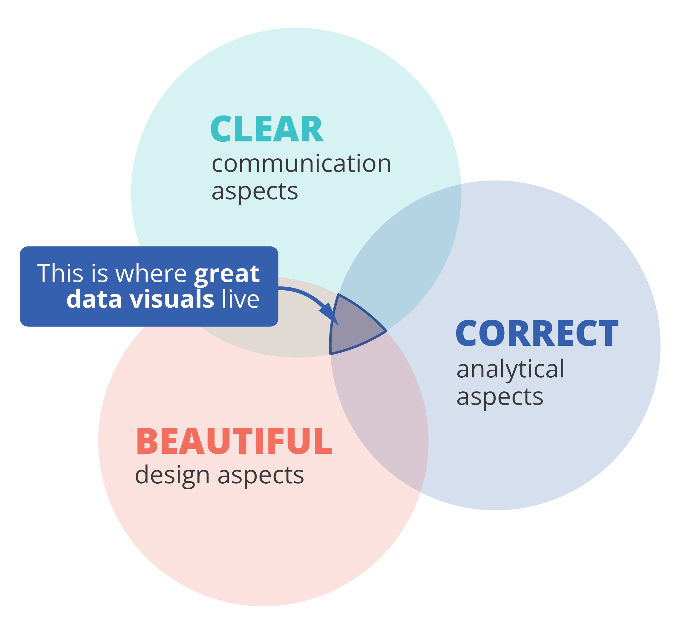
That also implies that we, as data visualizers, need to consider three different aspects when creating a data visual:
- the communication aspect, in order to make our visual clear,
- the analytical aspect, in order to make it correct, and
- the design aspect, in order to make it beautiful.
If one of these aspects is missing, we end up with a suboptimal chart. A chart can be beautiful and correct but confusing to navigate, causing the message to be lost. Or it can be very beautiful and clear, but fall apart because the underlying data or the representation of it is flawed. A lot of charts we encounter are clear and correct, but simply boring or uninviting to look at, because they were not designed to look good.
Three different skills
So, in order to create a powerful chart we must apply our communication, our analytical ánd our design skills. Most people feel comfortable with one or two of these skill sets, but not with all of them. Many people in analytical jobs, such as researchers, engineers or consultants, struggle with the design aspects of a visual. People with a role in communication, such as journalists or marketeers, often feel uncomfortable to dive into data analytics and the theoretical principles behind charts. And professional designers can make their visuals look beautiful, but don’t always succeed in crafting a crystal-clear message.
If you recognize yourself in one of these worries, fear not! I am convinced that anyone can create great data visuals on the intersection of clarity, correctness and beauty.
If you want to know more about visualizing data in the right way, you can check out the other videos in this series. Or I invite you to read my book, Powerful Charts, that will give you actionable insights and practical guidelines to create data visuals that truly engage and inspire your audience.
Full video series
- 01. Why is data visualization so powerful?
- 02. Why is data visualization so challenging?
- 03. Navigating the landscape of powerful charts
- 04. A powerful chart tells a story
- 05. A powerful chart has a high signal-to-noise ratio
- 06. Making a data visual noise-free
- 07. 7 different goals for your chart
- 08. Three roles of colour in a data visual
- 09. Choosing the right font for your data visual
- 10. Can you use Excel to create a powerful chart? (coming on January 09, 2023)
Read more:
Review: Info We Trust
Info We Trust is an ambitious, visually stunning book that sits somewhere between philosophy, information design, and a collection of visual essays.
Gridlines are better than axes
Almost always, gridlines are better than axes. Vertical axes are the default option, and they have been around for centuries, so they are very well known. But they also have downsides. My biggest problem with vertical axes is that they’re often so far away from where the action is really happening.
Review: A History of Data Visualization and Graphic Communication
Michael Friendly and Howard Wainer clearly love graphs. But A History of Data Visualization and Graphic Communication isn’t just about graphs — it’s about the stories behind them: the context, the people, the new measurements that made them necessary, and the discoveries they enabled.
Report visuals don’t have to suck
Discover how CREG, Belgium’s electricity regulator, turns complex data into clear and engaging visuals. From smart annotations to small multiples and uncommon chart types, their Monitoring Report shows how thoughtful data visualization makes technical reports easier to read and understand.
Data visualization podcasts 2025
At Baryon, we’re huge fans of podcasts! Data visualization podcasts are a great way to stay up to date on the latest trends and techniques in data visualization.
Tell me why… I don’t like dashboards
I don't like dashboards. Well, most dashboards at least. They're just trying too hard... to do everything, everywhere, all at once. Why is that? And is there a better solution?
We are really into visual communication!
Every now and then we send out a newsletter with latest work, handpicked inspirational infographics, must-read blog posts, upcoming dates for workshops and presentations, and links to useful tools and tips. Leave your email address here and we’ll add you to our mailing list of awesome people!

Data visualization resources: all the links you\'ll ever need!
Information design resources
Here you’ll find a curated collection of tools, templates, articles, and ideas to help you design and communicate information with clarity. Whether you’re working on a data-heavy report, an engaging infographic, or an interactive chart, these resources are here to guide, inspire, and save you time.
I’ve gathered what I use in my own projects, alongside practical tips and examples you can adapt to your own work. Browse around, take what’s useful, and feel free to share with others who value thoughtful, well-crafted information design.
Finding useful datasets
Looking for reliable, well-structured datasets to jump-start your next data visualization project? Here are some of my favorite starting points:
- Google Dataset Search: datasetsearch.research.google.com
- Kaggle: kaggle.com – they also have a list of beginner-friendly datasets
- data.world: data.world datasets
- Our World in Data
- The NASA Open Data Portal
Looking for more? Read our blogpost: Small datasets to practice your data visualization skills
Inspiration for data visualization
- Information is Beautiful: informationisbeautiful.net
- Information is Beautiful awards: informationisbeautifulawards.com
- Visual.ly: visual.ly/view
- Pinterest: pinterest.com
- Dear data: dear-data.com
Digital tools to create infographics and data visuals
- Canva: canva.com
- Infogram: infogram.com
- Piktochart: piktochart.com
- Visme: visme.co
- Venngage Infographic maker and Graph maker
- Whimsical: whimsical.com
- Adobe Illustrator: adobe.com
- Affinity Designer: affinity.serif.com
- Flowchart tool: draw.io
- BioRender (like Canva, but specifically for life sciences): biorender.com
- List of dataviz tools: creativebloq.com/design-tools/data-visualization
- ggplot2 cheat sheet: https://www.maths.usyd.edu.au/u/UG/SM/STAT3022/r/current/Misc/data-visualization-2.1.pdf
Inkscape tutorials
Learning how to create and edit vector images (rather than bitmap images) is one of the key steps in unlocking your full information design power. Inkscape is a powerful free tool to help you do just that. I personally found the following tutorials very useful, not too long, and to-the-point:
Illustrations and icons
- Freepik: freepik.com
- The noun project: thenounproject.com
Colours
It is undeniable that Lisa Charlotte Muth (Head of Communications at Datawrapper) is the ultimate expert when it comes to color use in data visualization. The list of articles about color on the Datawrapper blog is the best source you’ll ever find on the topic. In particular, the following articles are very worthwhile:
- What to consider when choosing colors for data visualization
- How to find & create good color palettes
- What to consider when visualizing data for colorblind readers
If you’re looking for tools and inspirational places that can help you create color combinations for your visuals, here are some of my favorites:
- Adobe Color CC: color.adobe.com
- Coolors.co: coolors.co
- Pictaculous: digitalinspiration.com/color-palette-generator
- Website color schemes: canva.com/learn/website-color-schemes
- 100 brilliant color combinations: canva.com/learn/100-color-combinations
- Python Color Palette Finder
- Data Viz Color Palette Generator
- ColorBrewer
- Chroma.js Color Palette Helper
Typography
- Dafont: dafont.com
- Google Fonts: fonts.google.com
- FontSquirrel font identifier: fontsquirrel.com/matcherator
- Font Pairing: fontpair.co
Creating graphs
- Dataviz catalogue: datavizcatalogue.com
- Choose and design the perfect chart: chart.guide
- Choosing the right chart: infogram.com/page/choose-the-right-chart-data-visualization
- The Chartmaker Directory: chartmaker.visualisingdata.com
- The Data Viz Project: datavizproject.com
- Datawrapper: datawrapper.de
- Flourish: flourish.studio
- LocalFocus: localfocus.nl
- D3.js: d3js.org
- Notion now has a feature to create charts
Creating maps
- Snazzy maps (Google maps styles): snazzymaps.com
- Mapbox: mapbox.com
- Mapme: mapme.com/stories
- Datawrapper: datawrapper.de
- Leaflet JavaScript Library: leafletjs.com
- 3D maps with QGIS and Aerialod: statsmapsnpix.com
- Read our blogpost: Behind the maps
Creating tables
- The Ultimate Guide to Designing Data Tables
- Table inspiration: fivethirtyeight.com
Ethics in data visualization
- Dealing with outliers
- Visualizing projections and missing data
- Spurious correlations
- About dynamite plots
- Alternatives to box plots
- Visualizing the uncertainty in data (Flowing Data)
- Visualizing uncertainty (Claus Wilke)
Books about infographics and data visualization
Here are some of the books that were foundational for my own career path in data visualization and information design:
- Data visualisation, Andy Kirk
- Dear Data, Giorgia Lupi & Stefanie Posavec
- Information graphics, Taschen
- Infographic designers’ sketchbooks, Steven Heller & Rick Landers
- Storytelling with data, Cole Nussbaumer Knaflic
- The visual display of quantitative information, Edward Tufte
- Trees, maps and theorems, Jean-Luc Doumont
- Visual journalism, Gestalten
- Visual thinking, Willemien Brand
If you’re looking for more, make sure to check our complete list of data visualization books!
People on social media talking about data
- Twitter list: Dataviz world leaders
- Bluesky list: Data visualization community
Videos about data visualization
- The beauty of data visualization (David McCandless)
- Journalism in the age of data (Geoff McGhee)
- Datafest Tbilisi (dozens of free talks)
- Outlier 2021 (62 free talks)
Dataviz blogs and online magazines
- Chartable (by the Datawrapper team)
- Cool Infographics (Randy Krum)
- Flowing Data (Nathan Yau)
- Infographics for the People (John Grimwade)
- The Information is Beautiful blog (David McCandless)
- Junk Charts (Kaiser Fung)
- Nightingale (by the Data Visualization Society)
- The Storytelling with Data blog (Cole Nussbaumer Knaflic)
- The Visme blog on infographics
- Visualising Data (Andy Kirk)
Dataviz podcasts
- Data Journalism Conversations
- Datasaurus Rex
- Data Stories
- Data Viz Today
- Explore Explain
- Storytelling with Data
- The Data Journalism Podcast
These are some of my personal favorites. Looking for more? We have a complete list of podcasts on data visualization and information design!
Read more:
Review: Info We Trust
Info We Trust is an ambitious, visually stunning book that sits somewhere between philosophy, information design, and a collection of visual essays.
Gridlines are better than axes
Almost always, gridlines are better than axes. Vertical axes are the default option, and they have been around for centuries, so they are very well known. But they also have downsides. My biggest problem with vertical axes is that they’re often so far away from where the action is really happening.
Review: A History of Data Visualization and Graphic Communication
Michael Friendly and Howard Wainer clearly love graphs. But A History of Data Visualization and Graphic Communication isn’t just about graphs — it’s about the stories behind them: the context, the people, the new measurements that made them necessary, and the discoveries they enabled.
Report visuals don’t have to suck
Discover how CREG, Belgium’s electricity regulator, turns complex data into clear and engaging visuals. From smart annotations to small multiples and uncommon chart types, their Monitoring Report shows how thoughtful data visualization makes technical reports easier to read and understand.
Data visualization podcasts 2025
At Baryon, we’re huge fans of podcasts! Data visualization podcasts are a great way to stay up to date on the latest trends and techniques in data visualization.
Tell me why… I don’t like dashboards
I don't like dashboards. Well, most dashboards at least. They're just trying too hard... to do everything, everywhere, all at once. Why is that? And is there a better solution?
We are really into visual communication!
Every now and then we send out a newsletter with latest work, handpicked inspirational infographics, must-read blog posts, upcoming dates for workshops and presentations, and links to useful tools and tips. Leave your email address here and we’ll add you to our mailing list of awesome people!

Why is data visualization so powerful?
Why is data visualization so powerful?
The amount of data coming our way is growing exponentially. In 2021 alone, it is estimated that humankind generated 74 zettabytes of data – that’s about 10,000 GB per person. How on earth are we going to keep this manageable?
Visualization: our most powerful tool
Visualization is one of the key solutions to cope with the endless stream of data, content and information – together with other strategies such as filtering and organization. Visualization might very well be the most powerful tool we have to turn complex information into manageable insights. But why is that?
There are three important reasons why data visualization is a very strong way to present information:
- its information density is extremely high,
- it attracts the attention of your audience, and
- visual information is easier to process and memorize.
Reason 1: information density
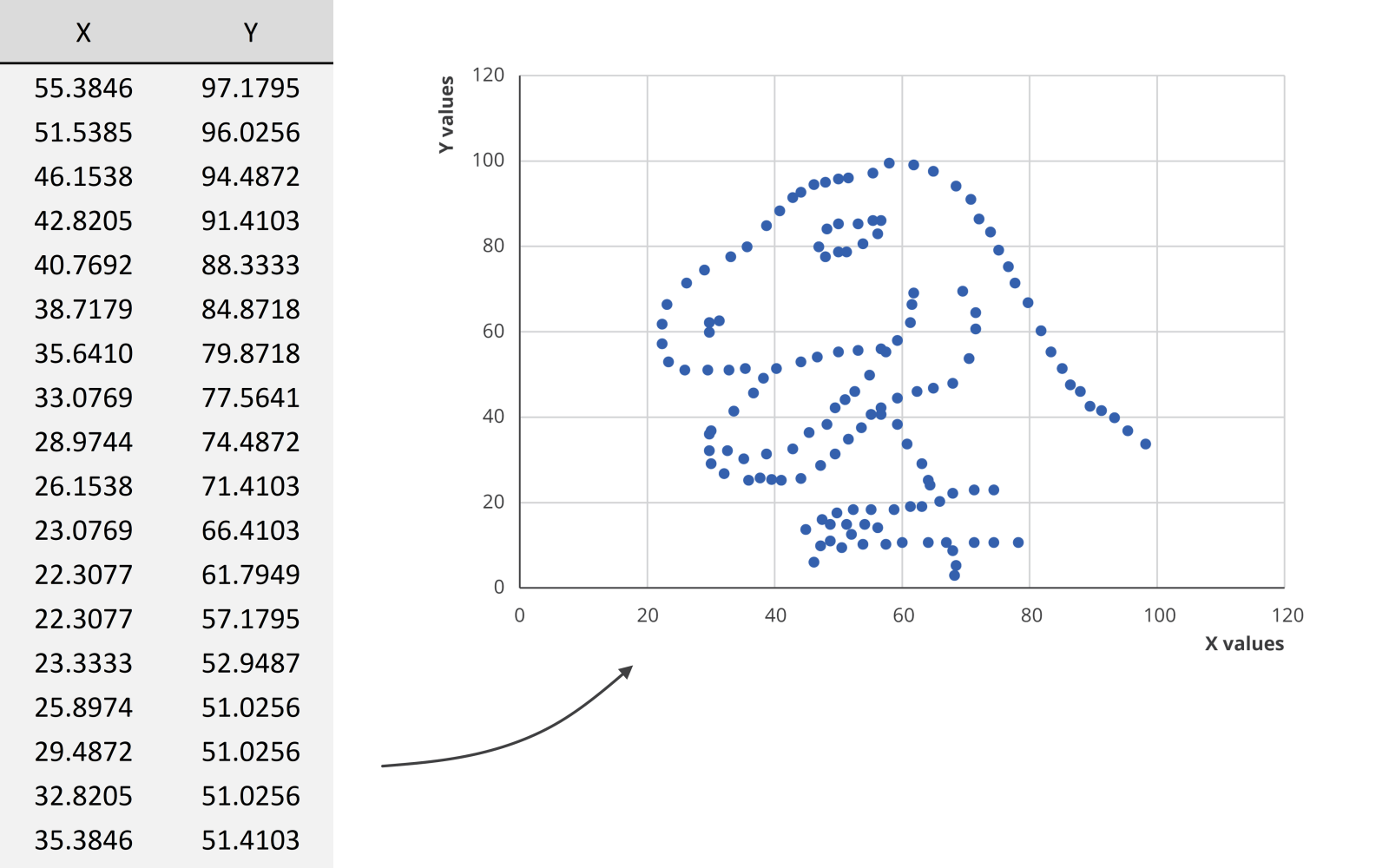
Researchers at MIT have shown that we can detect the meaning of a picture in as little as 13 milliseconds – that’s extremely fast.
We could spend hours looking at this dataset for example, created by visual journalism professor Alberto Cairo, without learning anything. But as soon as we turn the data into a scatter plot, it’s obvious that we’re looking at a dinosaur. In the blink of an eye!
Reason 2: attractiveness
Visual information is also attractive. Not in the sense that it is beautiful to look at (although that’s often also our goal), but literally: it attracts the attention of your audience. In a book or newspaper, people will often look for the pictures first, before they start reading all of the text.
Reason 3: easier to process
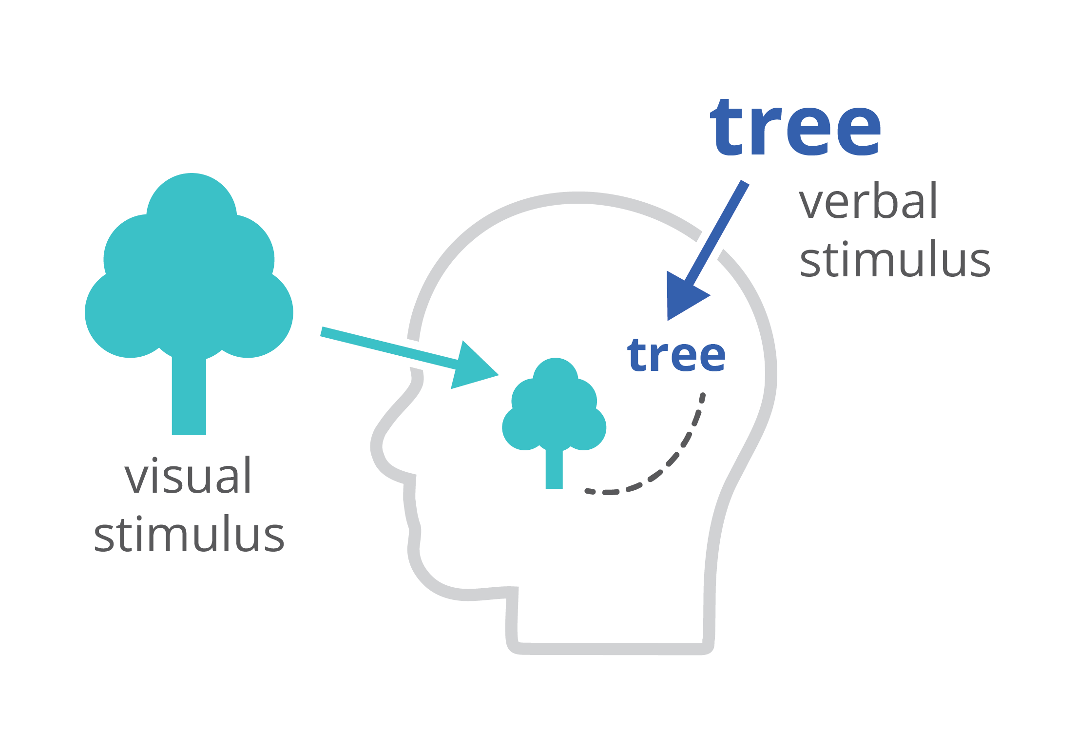
Finally, charts and infographics are easier to process than written text. The dual-coding theory, developed by Allan Paivio, states that our brains process information both in a visual, as well as a verbal way. If we only get verbal stimuli, only a part of our brain is working. That’s why during a long phone call we automatically start doodling – the visual brain is bored and looking for things to do. By providing our audience with a combination of text and images, the entire brain is stimulated, leading to better focus, better understanding, and better memorization.
Harnessing the power of data visualization
So in summary, data visualization is powerful because it combines a high information density, attractiveness, and easier processing and memorization.
If you want to know more about visualizing data in the right way, you can check out the other videos in this series. Or I invite you to read my book, Powerful Charts, that will give you actionable insights and practical guidelines to create data visuals that truly engage and inspire your audience.
Full video series
- 01. Why is data visualization so powerful?
- 02. Why is data visualization so challenging?
- 03. Navigating the landscape of powerful charts
- 04. A powerful chart tells a story
- 05. A powerful chart has a high signal-to-noise ratio
- 06. Making a data visual noise-free
- 07. 7 different goals for your chart
- 08. Three roles of colour in a data visual
- 09. Choosing the right font for your data visual
- 10. Can you use Excel to create a powerful chart? (coming on January 09, 2023)
Read more:
Review: Info We Trust
Info We Trust is an ambitious, visually stunning book that sits somewhere between philosophy, information design, and a collection of visual essays.
Gridlines are better than axes
Almost always, gridlines are better than axes. Vertical axes are the default option, and they have been around for centuries, so they are very well known. But they also have downsides. My biggest problem with vertical axes is that they’re often so far away from where the action is really happening.
Review: A History of Data Visualization and Graphic Communication
Michael Friendly and Howard Wainer clearly love graphs. But A History of Data Visualization and Graphic Communication isn’t just about graphs — it’s about the stories behind them: the context, the people, the new measurements that made them necessary, and the discoveries they enabled.
Report visuals don’t have to suck
Discover how CREG, Belgium’s electricity regulator, turns complex data into clear and engaging visuals. From smart annotations to small multiples and uncommon chart types, their Monitoring Report shows how thoughtful data visualization makes technical reports easier to read and understand.
Data visualization podcasts 2025
At Baryon, we’re huge fans of podcasts! Data visualization podcasts are a great way to stay up to date on the latest trends and techniques in data visualization.
Tell me why… I don’t like dashboards
I don't like dashboards. Well, most dashboards at least. They're just trying too hard... to do everything, everywhere, all at once. Why is that? And is there a better solution?
We are really into visual communication!
Every now and then we send out a newsletter with latest work, handpicked inspirational infographics, must-read blog posts, upcoming dates for workshops and presentations, and links to useful tools and tips. Leave your email address here and we’ll add you to our mailing list of awesome people!