Five steps towards improving your dashboard
Five steps towards improving your dashboard
Do you know the feeling? You spent days, weeks, maybe months to build the perfect dashboard for your clients. But when you share it, the results are underwhelming. Your users say they appreciate the dashboard, but you notice that they are not using it often, or not to its full capacity. They sometimes have a hard time finding what they are looking for. Or maybe something just feels not optimal and you want to improve your dashboard, but you can’t put your finger on what exactly is wrong.
Today I would like to share with you the five steps I usually follow when I analyze and improve dashboards. If you are planning to analyze and improve your own dashboard, or maybe the dashboard someone else created and you want to provide feedback on, I advise you to follow these five steps as well.
Step 1: Getting familiar
First of all, I like to dive right into the dashboard without any prior knowledge. Of course, we will unavoidably already know a little bit: who created the dashboard and what general area it is in, such as marketing, business intelligence, product performance, et cetera.
But in this phase I prefer not to worry about the end users and what they might be looking for when using the dashboard. I just fiddle around, visit every page, push every button, in short I try to mess up as much as possible. I will explore hover messages and have a look at how the dashboard behaves on different screens or in different browsers. I will judge if the right type of graph is shown to display specific data, and if tables are formatted in an optimal way. I will probably take a closer look at the source code to find out where the data is coming from and which technologies are being used, whether it is Tableau, Microsoft Power BI, Google Data Studio, one of the other dozens of solutions out there, or maybe something custom created with React and different JavaScript charting libraries.
In this initial phase it is important to write down everything you notice, either good or bad. In short, we will start to get a feel for how the dashboard is structured, what works and what doesn’t work.
Step 2: Discuss use cases
The second step is possibly the most important one. Together with the person or team who built the dashboard, I will discuss who it is designed for and what purpose it is serving. This involves talking about different user personas, user flows, and use cases.
In this second step, rather than immediately sharing first opinions about the dashboards, it is important to ask as many questions as possible. Who is the typical user of your dashboard? Is it a C-level executive who needs to take an important strategic decision, or is it maybe someone at the production line of a factory who needs to check the status of a specific machine? What information are they looking for? What decision are they trying to make, based on the information they can see on the dashboard? Are they under pressure to quickly find exactly what they are looking for, or do they have plenty of time to explore the information which is available?
All of these questions are crucial to be able to move on to the third step: our deep dive.
Step 3: Deep dive
In the deep dive, we put ourselves in the position of the end user. For example, imagine we are the marketing manager at a fashion company, and we want to use this specific dashboard to assess how effective our online marketing campaigns are. Or, another use case, we are a plant manager trying to figure out why a specific production line is not operating at full efficiency. Or maybe we are a CEO looking at some financial figures, worrying if our company will make a profit at the end of the month.
This allows us to basically repeat the first step, closely inspecting every chart, every button and every number on the dashboards. But now, our analysis is much more focused, because we know what our user will typically be looking for.
We can answer the following questions in this phase: how much time or how many clicks does it take for a user the find the key information needed to take a decision? Does the dashboard show only the information which is needed, or does it also show a lot of needless clutter? Are the colors guiding the user’s attention in the right direction? Will the user easily understand everything what’s on the screen, or does he need a lot of prior knowledge?
In step 3, we can get back to the list of good and bad things we started in the first step, and add all this additional information. This typically leads to a list of pages and pages filled with ideas to improve your dashboard. In the next step, we will turn this list of remarks into something actionable.
Step 4: Action plan
Step 4 is all about bringing some structure to our long list of bullet points. Personally, I like to group my remarks into three different categories.
- Category 1: Goal misalignment – when the information on the dashboard does not serve the end user’s goal,
- Category 2: Too much noise – when there’s too much clutter or useless information on the dashboard, and
- Category 3: Death by a thousand papercuts – when a large amount of very minor design details, which at first sight don’t seem important, make the dashboard look sloppy and unattractive.
I will go into more depth into these three categories in a later blog post, so no worries. If you want to be notified when it’s available, make sure to leave your email address at the bottom of this page!
A second way to order the possible improvements is by difficulty level. On one hand, you will have the low-hanging fruit, the quick wins to rapidly improve the effectiveness of your dashboard with only a little effort. For example, changing the chart type from a pie chart to a more easily readable bar chart, improving font sizes, or moving some blocks to create a better visual hierarchy.
On the other hand, there will be improvements which are a lot more difficult – generally depending on the specific tools used to build the dashboard. For example, improving the grid lines or the axis labels in a chart typically requires writing some custom JavaScript code and finding a way to plug it into your dashboard software. You will want to evaluate if these harder modifications are worth the effort.
A third and final way to turn my list of remarks into an action plan is by creating some mock-ups for my clients. In these mock-ups, I show how an improved version of the dashboard could look like and compare it with the current version. This immediately shows visually how just a few – often minor – modifications can drastically improve the readibility and effectiveness of your dashboard.
Step 5: Co-creation
And then it’s time for the final step! To really turn my improvement suggestions into actions, I prefer to sit down with the team behind the dashboard and go through the report together. This gives me the opportunity to explain and discuss each of the different points on the list. We can then immediately apply some quick wins and see first-hand how it improves the look and feel of the dashboard. Of course, as our list of potential improvements is usually rather long, this co-creation session can take multiple hours, so make sure to bring some coffee to make it to the end ;). But this time investment will directly translate into a much more efficient dashboard, and a lot of insights on how to structure future iterations and improvements.
So, this is my 5-step approach I tend to follow when clients ask me to analyze their dashboards and make them more effective. I hope this will help you as well to make your dashboards more valuable. Make sure to let me know if you found this post useful, I would love to hear your ideas about dashboard improvement!
And oh, if you think we can help you to improve your dashboard, you know where to find us!
Read more:
Vreemde plaatsnamen in Vlaanderen
Iedereen kent wellicht 'Kontich' en 'Reet', maar in Vlaanderen hebben we nog veel meer merkwaardige, onverwachte, en vaak grappige plaatsnamen. Heb je bijvoorbeeld ooit al gehoord van Buitenland, Dikkebus, of Grote Homo?
9 June 2024
Small multiples can save your chart
When you're dealing with a chart that has too much information on it, the most straightforward advice to follow is: break it down into multiple charts, each with less information on them. A powerful example of this is a so-called small multiple approach.
5 September 2023
Data visualization podcasts 2023
At Baryon, we’re huge fans of podcasts! Data visualization podcasts are a great way to stay up to date on the latest trends and techniques in data visualization.
4 September 2023
Can you use Excel to create a powerful chart?
Spreadsheet tools such as Microsoft Excel or Numbers might not be the first thing on your mind when considering data visualization tools, but they can be pretty solid choices to build data visuals. Don’t let anyone convince you that using Excel to create data visuals is unprofessional.
9 January 2023
Choosing the right font for your data visual
Fonts evoke emotions: there are very sophisticated fonts, playful fonts, attention-grabbing fonts, and elegant handwritten fonts. Using the wrong type of font can have a lot of impact. In data visualization the implications of typography are mainly focused on readability. Labels and annotations can easily become so small they get hard to read. Above all else, we should choose a font which is readable at small sizes.
2 January 2023
Three roles of colour in a data visual
Colour is one of the most crucial tools we have to turn a normal chart into a powerful chart with a clear message, a chart which tells a story rather than simply presenting the information.
26 December 2022
We are really into visual communication!
Every now and then we send out a newsletter with latest work, handpicked inspirational infographics, must-read blog posts, upcoming dates for workshops and presentations, and links to useful tools and tips. Leave your email address here and we’ll add you to our mailing list of awesome people!

Dear Data: Dataviz book review
Dear Data: Dataviz book review
The book
Last February, on a cold and rainy day, I received the Dear Data book as part of a Dataviz Drawing workshop by Stefanie Posavec. The workshop was hosted by Graphic Hunters in a beautiful space in central Amsterdam.
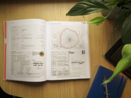
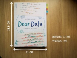
It is a pretty large and heavy book, containing nearly 300 pages on sturdy, qualitative paper. It is not the kind of book you would take with you into bed at night, but definitely one you could put on your coffee table to show off (which I did!). There are two alternative covers, one designed by Giorgia and one by Stefanie (this is the latter one).
In Dear Data, Giorgia and Stefanie document their project of sending each other hand-drawn postcards, every week, over the course of an entire year (2014-15). Each week, they would decide on a topic on which they would gather personal data – ranging from the contents of their wardrobes, over the sounds they heared, to the emotions and desires they experienced that week.
At the end of the week, they both sat down with their data, drew it onto a postcard, wrote a detailed legend on how to interpret it, and sent it to each other (Stefanie lives in London, and Giorgia in New York).
This book is a summary of their one-year project, with high-quality images of each of the postcards, additional details about the (practical and thought) process behind it, and tips to create your own personal data drawings.
Oh yes, the project also has its own dedicated webpage.
The authors
Giorgia Lupi and Stefanie Posavec are two well-known names in data visualization, but their Dear Data project truly made them world-famous.
Giorgia Lupi (°1981), originally from Italy, founded the design firm Accurat in 2011. They worked for an impressive list of clients including Google, IBM, Starbucks, and the United Nations. She introduced the concept of Data Humanism. In short, we should not simply focus on numbers, technologies and algorithms, but on the underlying things they represent: people, stories and ideas. She has won several awards, including multiple Information is Beautiful Awards Gold Medals, and in 2019 she joined design firm Pentagram as a partner.
Stefanie Posavec (°1981) was born in Colorado (US) and later moved to London. In 2013 she was one of Facebook’s earliest Artists in Residence, creating the piece Relationship Dance Steps. She aims to make data accessible, memorable and impactful using highly original approaches. For example, she puts health data art on hospital walls as a form of interior design, or she creates jewellery from air pollution data.
In 2016, Dear Data was acquired by the Museum of Modern Art as a part of its permanent collection, so they are both official MoMA artists!
The verdict
⭐⭐⭐⭐
I absolutely love this crossover between a data visualization book and an art book. Definitely not something to read in one go, but a book to pick up from time to time to browse through the pages. I’m convinced it can be a great source of inspiration when you are stuck on a particular project and are looking for a novel, creative approach.
The differences between Giorgia’s more ‘technical’ and Stefanie’s more ‘artistic’ drawing is interesting, and throughout the project we see both evolving and experimenting in different directions. Personally I love unraveling Giorgia’s complicated legends and decyphering her complex diagrams, and I am amazed at how much information she can compress into a single small postcard. However, in certain weeks, the level of detail can become too complicated and cumbersome. Stefanie’s drawings are usually simpler to absorb, but this often leads to gorgeous patterns, designs or metaphors.
Despite being a collection of 104 hand-drawn postcards, it never gets boring. I especially appreciate how they manage to alternate between very light-hearted, practical topics (e.g. a week of drinks) and deeply emotional, personal topics (e.g. a week of negative thoughts).
The postcards are regulary interspersed with simple but adorable illustrations that make the book a bit easier to digest (too much data can be overwhelming!).
My personal favorites are:
- By Giorgia: a week of media and a week of urban wildlife (so many parameters!)
- By Stefanie: a week of indecision and a week of distractions (so simple, so strong!)
Applying the knowledge
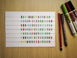
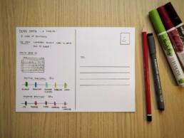
Some of these stunning postcards are really inspiring to draw for myself. So I went ahead and collected some data. I chose to recreate Stefanie’s design for week eleven: a week of emotions.
Every hour during the past week, I have written down the main emotion I was experiencing at that moment. As we are in the midst of crazy pandemic times, you will notice some of my emotions are a bit, well, all over the place. 😬
So without further ado, here is the final result!
If you are also inspired, go ahead and start drawing your own data! And feel free to share it with me, or with the rest of the world! Looking forward to seeing what you are up to 😊
And of course, if you have some data visualization challenges you think we could help you with, let me know as well – we are always happy to assist!
More dataviz book reviews? We have already covered:
- Dear Data
- Storytelling with Data
- Visualizing Complexity
Read more:
Vreemde plaatsnamen in Vlaanderen
Iedereen kent wellicht 'Kontich' en 'Reet', maar in Vlaanderen hebben we nog veel meer merkwaardige, onverwachte, en vaak grappige plaatsnamen. Heb je bijvoorbeeld ooit al gehoord van Buitenland, Dikkebus, of Grote Homo?
9 June 2024
Small multiples can save your chart
When you're dealing with a chart that has too much information on it, the most straightforward advice to follow is: break it down into multiple charts, each with less information on them. A powerful example of this is a so-called small multiple approach.
5 September 2023
Data visualization podcasts 2023
At Baryon, we’re huge fans of podcasts! Data visualization podcasts are a great way to stay up to date on the latest trends and techniques in data visualization.
4 September 2023
Can you use Excel to create a powerful chart?
Spreadsheet tools such as Microsoft Excel or Numbers might not be the first thing on your mind when considering data visualization tools, but they can be pretty solid choices to build data visuals. Don’t let anyone convince you that using Excel to create data visuals is unprofessional.
9 January 2023
Choosing the right font for your data visual
Fonts evoke emotions: there are very sophisticated fonts, playful fonts, attention-grabbing fonts, and elegant handwritten fonts. Using the wrong type of font can have a lot of impact. In data visualization the implications of typography are mainly focused on readability. Labels and annotations can easily become so small they get hard to read. Above all else, we should choose a font which is readable at small sizes.
2 January 2023
Three roles of colour in a data visual
Colour is one of the most crucial tools we have to turn a normal chart into a powerful chart with a clear message, a chart which tells a story rather than simply presenting the information.
26 December 2022
We are really into visual communication!
Every now and then we send out a newsletter with latest work, handpicked inspirational infographics, must-read blog posts, upcoming dates for workshops and presentations, and links to useful tools and tips. Leave your email address here and we’ll add you to our mailing list of awesome people!

