Storytelling with Data: Dataviz book review
Storytelling with Data: Dataviz book review
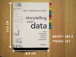
The book
This dataviz book has been on my wishlist for a very long time! So many people have added it into their recommendations that I have lost track. It’s in nearly every list of ‘must read books on data visualization’ you will find. So it was about time for me to read, and review, Storytelling with Data by Cole Nussbaumer Knaflic.

Storytelling with Data, published in 2015, is presented as a practical guide for business professionals (think managers or consultants) who regularly need to present data, or findings based on data. People who have no prior experience with data visualization, except maybe for the occasional default bar or pie chart in Microsoft Excel.
Knaflic wrote this book to teach how – as Nancy Duarte described it in her review – it’s not about the data, it’s about the meaning of the data. Or, as Jean-Luc Doumont would put it: it’s not about the what, but about the so what.
This book offers hands-on advice to turn mind-numbing default charts into powerful, convincing graphs telling a story. This way, rather than just ‘looking fancy’, data visualization becomes a tool to actually change people’s minds.
The author
Cole Nussbaumer Knaflic is the perfect woman to teach us these techniques. Not only is she an excellent teacher in Information Visualization at the Maryland Institute College of Art, she also has an MBA and has worked as a manager on the Google People Analytics team for more than 5 years.
She is the founder and CEO of Storytelling with Data, where she has built a team to do exactly the things she describes in the book: she helps people and organizations to create graphs that tell compelling, action-inspiring stories.
In 2019 she wrote a companion book to this one, titled ‘Storytelling with Data: Let’s Practice‘, with even more examples, and with hands-on exercises.

The verdict
⭐⭐⭐
Storytelling with Data is definitely a dataviz book aimed at an audience of true business professionals, the kind of people you will find at large consulting firms, banks, or big tech companies, rather than die-hard fans of beautiful visualization art or information graphics. The author has (successfully) to convey the very simple, basic principles of building an excellent graph. She avoided adding complicated or jaw-droppingly beautiful examples, as this might discourage data visualization novices to try these principles for themselves.

This is the perfect book to pick up for your first encounter with data visualization. You will learn what’s wrong with default Excel charts and why they don’t work to convey your message. Knaflic shows how clever chart, font styling or color choices will dramatically improve the effectiveness of data visuals in your presentations. And she does it very well.
On the other hand, if you are a seasoned dataviz lover or admirer of infographics, this is not really the book for you. At times it will feel more like an academic syllabus or business report rather than a book you’ll read for fun or inspiration. But it could be the perfect gift for your colleague or friend who is just starting out and could use some basic, very practical advice!
Do you consider yourself a dataviz novice, or a true data wizard? What did you learn from this book?
And of course, if you have some data visualization challenges you think we could help you with, let me know as well – we are always happy to assist!
More dataviz book reviews? We have already covered:
- Dear Data
- Storytelling with Data
- Visualizing Complexity
Read more:

Review: Info We Trust
Info We Trust is an ambitious, visually stunning book that sits somewhere between philosophy, information design, and a collection of visual essays.

Gridlines are better than axes
Almost always, gridlines are better than axes. Vertical axes are the default option, and they have been around for centuries, so they are very well known. But they also have downsides. My biggest problem with vertical axes is that they’re often so far away from where the action is really happening.

Review: A History of Data Visualization and Graphic Communication
Michael Friendly and Howard Wainer clearly love graphs. But A History of Data Visualization and Graphic Communication isn’t just about graphs — it’s about the stories behind them: the context, the people, the new measurements that made them necessary, and the discoveries they enabled.

Report visuals don’t have to suck
Discover how CREG, Belgium’s electricity regulator, turns complex data into clear and engaging visuals. From smart annotations to small multiples and uncommon chart types, their Monitoring Report shows how thoughtful data visualization makes technical reports easier to read and understand.

Data visualization podcasts 2025
At Baryon, we’re huge fans of podcasts! Data visualization podcasts are a great way to stay up to date on the latest trends and techniques in data visualization.

Tell me why… I don’t like dashboards
I don't like dashboards. Well, most dashboards at least. They're just trying too hard... to do everything, everywhere, all at once. Why is that? And is there a better solution?
We are really into visual communication!
Every now and then we send out a newsletter with latest work, handpicked inspirational infographics, must-read blog posts, upcoming dates for workshops and presentations, and links to useful tools and tips. Leave your email address here and we’ll add you to our mailing list of awesome people!

Uncommon chart types: Slopegraphs
Uncommon chart types: Slopegraphs
Maybe you have never heard the term ‘slopegraph’, but chances are high that you have seen one before. They appear in serious newspapers such as De Tijd or the Financial Times, but you can easily create them yourself (yes, even in Excel!) and use them for your own data communication purposes. They work particularly well due to their insanely high data-ink ratio… as long as you don’t overdo it!
What is a slopegraph?
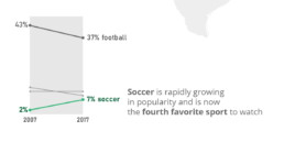
At its core, a slopegraph is a linegraph with just two data points for each category. In the majority of cases, such a graph will be used to compare between two different points in time, such as in the following example. This slopegraph shows how Americans’ favourite sports (to watch) have evolved between 2007 and 2017:
Slopegraphs are still a rather niche chart type. They were first suggested by Edward Tufte in his 1983 classical work ‘The visual display of quantitative information‘ – although at that time they were still nameless. I must admit I cannot trace back when the term ‘slopegraph’ first appeared. This was Tufte’s original design, showing the evolution of government tax collection in different countries, between 1970 and 1979:
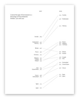
Original slopegraph design by Edward Tufte in 1983 (The Visual Display of Quantitative Information)
Here, we can immediately see why the data-ink ratio is so high: we can easily scan and understand the graph even without axes, ticks, axes labels or gridlines. Data points can be labeled directly, and no legend is needed, so we can quickly make a link between a line and the associated country.
Apparently, our brain is very good at comparing slopes of different lines. In the above examples, we can easily identify the strongest growers and fastest decliners, even for rather large sets of categories. For example, we can quickly see that Britain is the only country (from the given set) where tax collection went down between 1970 and 1979. And it grew pretty fast in the Nordics, Belgium and Switzerland.
Creating slopegraphs
As slopegraphs are basically just line graphs, they are very easy to create with basically any graphing software, including Excel. Because of this, Cole Nussbaumer Knaflic has dedicated an entire section to them in Storytelling with data (one of the best dataviz books for absolute beginners). She has even created a template for them here.
If you want to get your hands dirty and create a slopegraph yourself, there are two things to keep in mind:
- Try to remove as much ‘noise’ as possible: axes, gridlines and labels can usually be easily removed without harming interpretation.
- If you have many lines, make your message stand out by coloring most of the lines gray (or another neutral color), and highlight just the few you want to bring attention to, such as in the following example by Oliver Uberti for National Geographic:
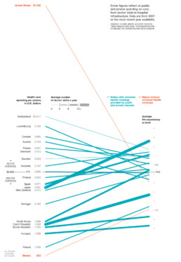
Notice that this is a very interesting example, as we are not comparing two different points in time, but two different metrics. On the left, we have the health care spending per person, on the right, the average life expectancy. The coloring draws our attention to the US and Mexico, two countries without universal health coverage. But the US is clearly an outlier: a very high health care spending which does not really reflect in the (below-average) life expectancy.
Some final things to remark about this very fine example, before we move on:
- Notice how the average of the health care spending (on the left side) is perfectly aligned with the average life expectancy (on the right side), shown with a dashed horizontal line. Clever!
- There is a third metric introduced into the chart by modifying the line thickness. The thicker the line, the more often people in these countries visit their doctor. Very clever again, although unfortunately it also counters some of the coloring effect: in countries without universal health coverage (in orange), people will visit their doctors much less frequently, resulting in very thin slopegraph lines.
Final slopegraph thoughts
Nothing is absolute when it comes to slopegraphs. In fact, we have already seen that the comparison can be between completely different metrics, such as in the National Geographic example above. And that you can introduce additional information by playing around with colors or line thickness.
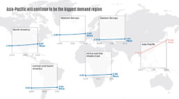
Finally I would like to show that, even when we’re talking about comparing dates, you don’t have to stick to just two points in time. This is a graphic I created showing the evolution of a certain market in different regions between 2009 and 2019, but with an intermediate value given for 2014:
Also here, rather, than showing all the lines in a single slopegraph, I opted to separate them in a kind of small multiples approach. This allows me to arrange the charts spatially on top of a world map, and it makes even more clear how much of an outlier the Asia-Pacific region is for this data. As you can see, nothing is set in stone. Slopegraphs are so easy to create that you can easily play around with them, find what works best for your data and message, or even invent completely new approaches!
Got any more great examples of slopegraphs? Make sure to share them with me at koen@baryon.be !
Or maybe we can help you make a slopegraph?
Read more:
Review: Info We Trust
Info We Trust is an ambitious, visually stunning book that sits somewhere between philosophy, information design, and a collection of visual essays.
Gridlines are better than axes
Almost always, gridlines are better than axes. Vertical axes are the default option, and they have been around for centuries, so they are very well known. But they also have downsides. My biggest problem with vertical axes is that they’re often so far away from where the action is really happening.
Review: A History of Data Visualization and Graphic Communication
Michael Friendly and Howard Wainer clearly love graphs. But A History of Data Visualization and Graphic Communication isn’t just about graphs — it’s about the stories behind them: the context, the people, the new measurements that made them necessary, and the discoveries they enabled.
Report visuals don’t have to suck
Discover how CREG, Belgium’s electricity regulator, turns complex data into clear and engaging visuals. From smart annotations to small multiples and uncommon chart types, their Monitoring Report shows how thoughtful data visualization makes technical reports easier to read and understand.
Data visualization podcasts 2025
At Baryon, we’re huge fans of podcasts! Data visualization podcasts are a great way to stay up to date on the latest trends and techniques in data visualization.
Tell me why… I don’t like dashboards
I don't like dashboards. Well, most dashboards at least. They're just trying too hard... to do everything, everywhere, all at once. Why is that? And is there a better solution?
We are really into visual communication!
Every now and then we send out a newsletter with latest work, handpicked inspirational infographics, must-read blog posts, upcoming dates for workshops and presentations, and links to useful tools and tips. Leave your email address here and we’ll add you to our mailing list of awesome people!

Data visualization in a time of pandemic - #6: Viral scrollytelling
Data visualization in a time of pandemic - #6: Viral scrollytelling
This is a multi-chapter post! Read the other chapters here:
- Chapter 1: Finding reliable data
- Chapter 2: Visualizing exponential growth
- Chapter 3: Mapping the virus
- Chapter 4: We need to talk about flattening the curve
- Chapter 5: On top of the outbreak with daunting dashboards
- Chapter 6: Viral scrollytelling

Chapter 6: Viral scrollytelling
In this final chapter, we’ll dive deeper into some of the insightful stories which have been published about the novel coronavirus and the COVID-19 pandemic. Rather than looking at single charts, we’ll highlight some long-form stories about the origin of the virus, how it works, and how it spread.
Two concepts should be explained beforehand: visual storytelling, and scrollytelling. Lorenzo Amabili explains both of them very well in his Nightingale article ‘From Storytelling To Scrollytelling: A Short Introduction and Beyond‘ (unfortunately a premium article):
- Visual storytelling, also called narrative visualisation, consists of creating a logical sequence of related (data-driven) visualisations, or visual elements, needed to convey a message to an audience in an engaging and effective way.
In other words, different visuals are strung together to form a logical story, which will keep readers more engaged and increase their understanding. It also allows you to discuss more complex topics by breaking them down into multiple easily understood visuals. These visuals will often be data-driven, but they can also be illustrations, videos, maps,… the possibilities are virtually endless!

- Scrollytelling is visual storytelling for the web: a powerful technique based on a simple concept: new content and visuals appear or change through transitions as users scroll down or up the web page.
This way of presenting information keeps the reader actively engaged with the content and the story. Furthermore, people can easily control the pace by scrolling up and down, back and forth through the story if they choose to re-read difficult sections or skip certain less interesting parts.
I must admit, I absolutely LOVE ❤ scrollytelling, and particularly well-executed examples are appearing more and more regularly in journalism. These advances are fueled by more innovative newsrooms such as the New York Times or the Washington Post, but quickly spreading throughout the world. For example, in Belgium, De Tijd regularly brings engaging scrollytelling stories by the team of Thomas Roelens and, before that, Maarten Lambrechts.
The remainder of this text is dedicated to some remarkable and marvelous examples of visual storytelling and scrollytelling about the coronavirus pandemic. This is absolutely not intended to be an exhaustive list, but rather a collection of interesting examples I encountered during my background research for these blog posts.
Anatomy of a killer
In March, The Economist published ‘Understanding SARS-CoV-2 and the drugs that might lessen its power‘, an in-depth story about the science behind the virus: how is SARS-CoV-2 built, how does it work and replicate itself, what does its genetic sequence look like, and which drugs might have a serious shot at eliminating it. A pretty hardcore scientific explanation, but made easily digestible thanks to some very clear and beautiful illustrations, such as this one by infographer Manuel Bortoletti:

Flattening the curve, revisited
Several scrollytelling articles have been created to explain the reasoning behind the epidemiological curve, how we can flatten it, and differences between different countries’ strategies to do so.
- ‘What Happens Next?‘ by epidemiologist Marcel Salathé and coder/designer Nicky Case explains the curve, SIR and SEIR models using playable simulations.
- ‘What we can learn from the countries winning the coronavirus fight‘ by ABC News uses scrollytelling to explain in detail what exponential growth is, how logarithmic charts work, and what flattening the curve really means.
- At this point, it might be useful to bring up again the infamous Washington Post article ‘Why outbreaks like coronavirus spread exponentially, and how to “flatten the curve”‘ by Harry Stevens, which we discussed in chapter 4, and is a great example of visual storytelling in itself.
- Another Washington Post article worth mentioning, on a similar note, is ‘How epidemics like covid-19 end (and how to end them faster)‘, also showing the effectiveness of wearing facemasks, or enforcing quarantaine.

Detail from ‘How epidemics like covid-19 end (and how to end them faster)’ (Washington Post)
- Or, if you prefer the Spanish version, ‘Cómo el confinamiento frena la cadena de contagios‘ by El País.
How the virus got out
‘How the Virus Got Out‘ by the New York Times uses mesmerizing animations and crystal-clear maps to show how the virus spread from Wuhan, through long-distance train and air travel, to other parts of China and other countries throughout the world. They end with Donald Trump’s quote ‘The virus will not have a chance against us’ on March 11, placed next to a visual showing how by then, the virus already had a secure foothold in the US, with just over 1000 cases.

Detail from ‘How the Virus Got Out’ (New York Times)
This detailed look at how the virus spreads is taken one step further by Reuters Graphics in ‘The Korean Clusters‘. Thanks to insanely accurate contact tracing data being gathered in South Korea, the authorities were able to identify each individual case and how they infected each other. During the first four weeks, the disease was relatively contained, but then ‘patient 31’ emerged, who had at least 1160 traced contacts and went to crowded places such as churches and a hotel buffet while being infected. This is by far one of the most captivating visual stories I have encountered over the past few months!
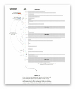
Detail from ‘The Korean Clusters’ (Reuters Graphics), an amazing piece of visual storytelling.
How bad will it get?
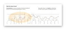
It is worth mentioning two stories detailing how the virus can spread, in particular in public transport or between people passing by each other outside:
- South China Morning Post describes a situation where a sick traveler on a four-hour bus journey (feeling sick but not wearing a mask) infected 9 other passengers – complete with detailed seating plans of the bus in question.
- The New York Times describes 6 key factors determining how bad the epidemic will get, including how contagious and deadly the virus is, and how long it will take before a treatment or vaccine is developed. They also indicate how far the virus can typically travel in a public transport environment.
Detail from ‘How Bad Will the Coronavirus Outbreak Get?’ (New York Times)
Remembering lives lost
In the end, it’s all about people. In his article ‘The Workers Who Face the Greatest Coronavirus Risk‘ for the New York Times, Lazaro Gamio uses scrollytelling to guide readers through a stunning scatterplot, showing which professions are most at risk during the pandemic, either because they come in close contact with others (such as hairdressers), or because they have a high exposure to diseases (such as garbage collectors or healthcare workers). The article ends with an interactive version of the graph, enabling readers to explore the data themselves.
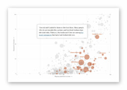
Detail from ‘The Workers Who Face the Greatest Coronavirus Risk’ (New York Times). Did I already mention that I ❤ scrollytelling stories like this?
Let’s end this exploration into pandemic data visualization with one of the most heartbreaking visual stories, published by the New York Times on May 24, 2020. ‘An Incalculable Loss‘ visually shows the 100 000 lives lost to COVID-19 in the US up to that point. 100 000 figures, many of them with additional information making it all the more real. “Marion Krueger, 85, Kirkland, Washington. Great-grandmother with an easy laugh.” Or “Torrin Jamal Howard, 26, Waterbury, Connecticut. Gentle giant, athlete and musician.”

100 000 times.
Cherish the people you love and the present moment, as scary as it is. It is all we have for certain.
– Daily Stoic
Stay safe, everyone. ❤
This is a multi-chapter blog post!
Continue reading:
- Chapter 1: Finding reliable data
- Chapter 2: Visualizing exponential growth
- Chapter 3: Mapping the virus
- Chapter 4: We need to talk about flattening the curve
- Chapter 5: On top of the outbreak with daunting dashboards
- Chapter 6: Viral scrollytelling
For all your comments, suggestions, errors, links and additional information, you can contact me at koen@baryon.be or via Twitter at @koen_vde.
Disclaimer: I am not a medical doctor or a virologist. I am a physicist running my own business (Baryon) focused on information design.
Read more:
Review: Info We Trust
Info We Trust is an ambitious, visually stunning book that sits somewhere between philosophy, information design, and a collection of visual essays.
Gridlines are better than axes
Almost always, gridlines are better than axes. Vertical axes are the default option, and they have been around for centuries, so they are very well known. But they also have downsides. My biggest problem with vertical axes is that they’re often so far away from where the action is really happening.
Review: A History of Data Visualization and Graphic Communication
Michael Friendly and Howard Wainer clearly love graphs. But A History of Data Visualization and Graphic Communication isn’t just about graphs — it’s about the stories behind them: the context, the people, the new measurements that made them necessary, and the discoveries they enabled.
Report visuals don’t have to suck
Discover how CREG, Belgium’s electricity regulator, turns complex data into clear and engaging visuals. From smart annotations to small multiples and uncommon chart types, their Monitoring Report shows how thoughtful data visualization makes technical reports easier to read and understand.
Data visualization podcasts 2025
At Baryon, we’re huge fans of podcasts! Data visualization podcasts are a great way to stay up to date on the latest trends and techniques in data visualization.
Tell me why… I don’t like dashboards
I don't like dashboards. Well, most dashboards at least. They're just trying too hard... to do everything, everywhere, all at once. Why is that? And is there a better solution?
We are really into visual communication!
Every now and then we send out a newsletter with latest work, handpicked inspirational infographics, must-read blog posts, upcoming dates for workshops and presentations, and links to useful tools and tips. Leave your email address here and we’ll add you to our mailing list of awesome people!