Data visualization tools: Datawrapper
Data visualization tools: Datawrapper
Let’s not beat around the bush in this blog post. If you are writing articles online and need to quickly insert beautiful, interactive charts, maps or tables, Datawrapper is the tool you are looking for.
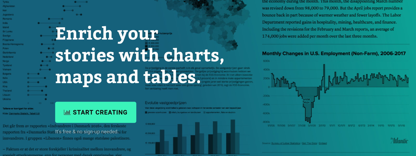
The Datawrapper team, based in Berlin, built an amazing product suitable for everyone who wants to tell stories using data. The free tier is very generous – unlimited visuals, live-updating charts, easy embedding, responsivity… The professional solution is expensive but mainly aims at newsrooms and journalists, removing the Datawrapper attribution and allowing to create print-ready graphics.
No coding skills are required, you can simply copy and paste your data, upload CSV files, or link to a URL or Google Sheet which allows live-updating charts. Obviously, you are limited to a certain set of possible chart types and designs, but the talented design team (led by Lisa Charlotte Rost) has ensured that all the available options and color schemes are well-crafted and elegantly designed.
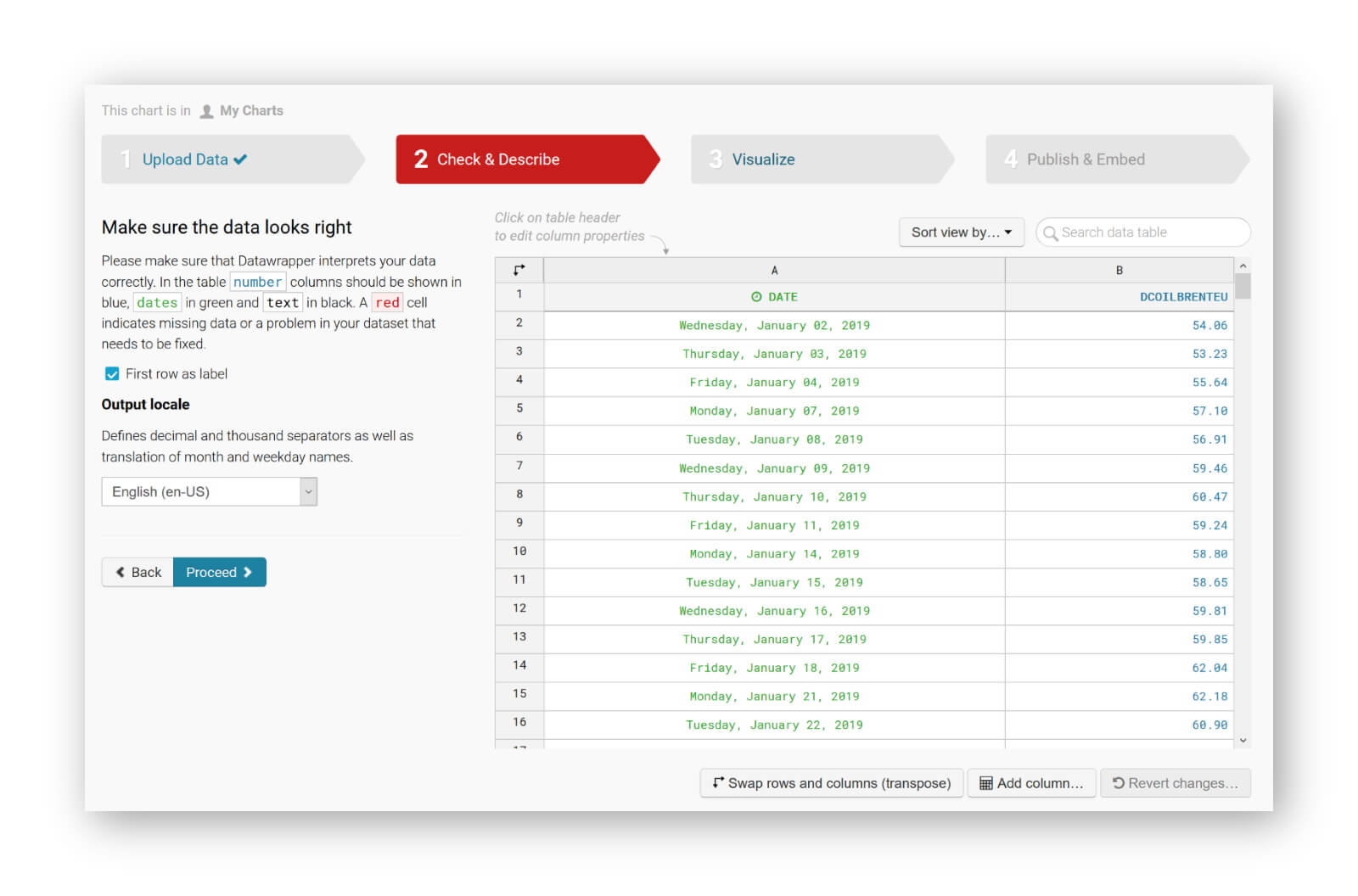
You can find plenty of examples at the Datawrapper website, but of course a blog post about this tool would not be complete without an embedded example. So let’s try to create our own chart of, let’s say, the evolution of the price of Brent Crude Oil since January 2019. Uploading the data, as a CSV file, works very smoothly. Datawrapper automatically recognizes the type of data in each column, and support for different localizations is provided out of the box:
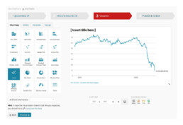
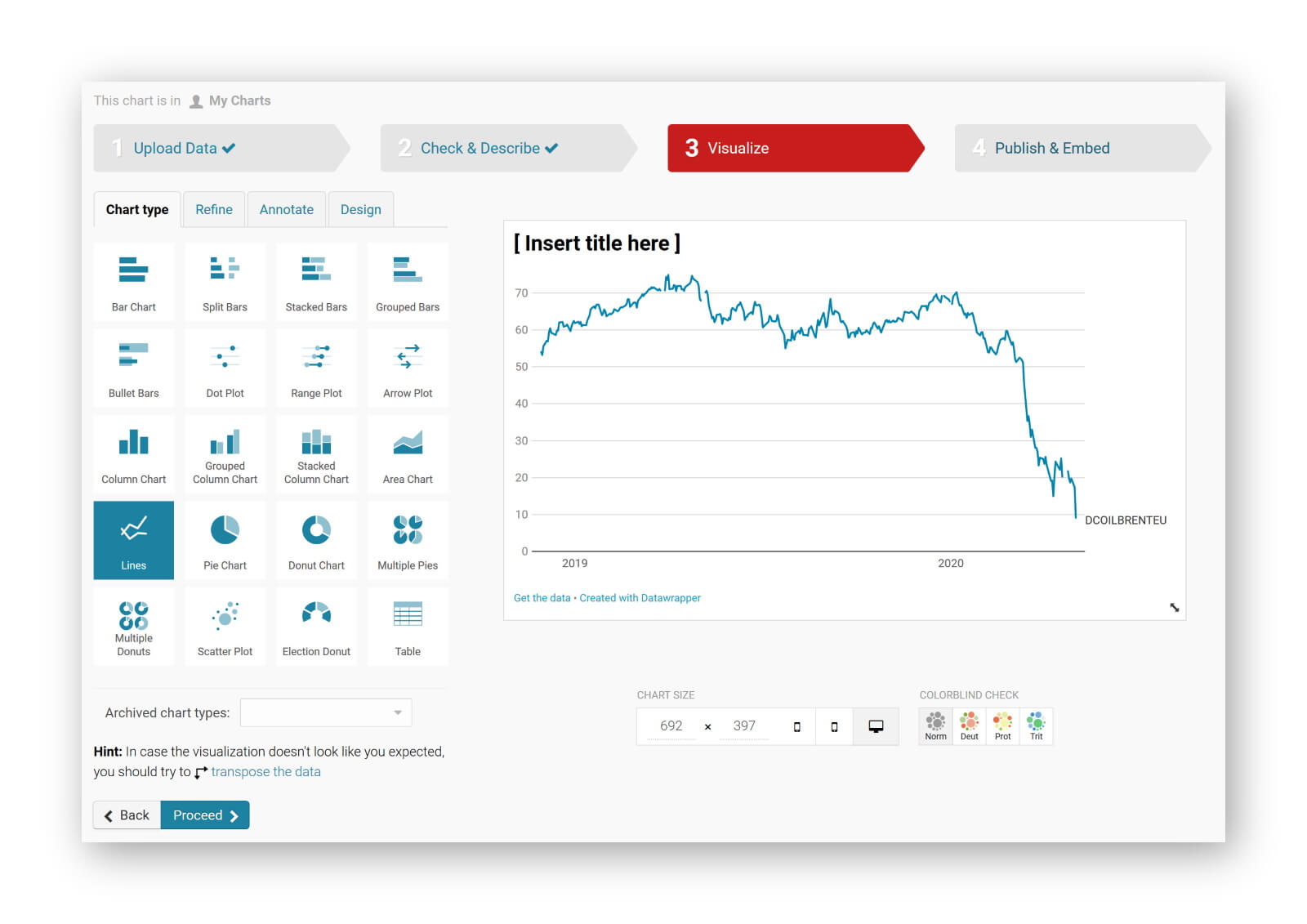
The tool is sufficiently intelligent to suggest the best chart type, and makes some pretty good default decisions regarding axes and grid lines (taking into account Tufte’s guidelines to maximixe data-ink ratio):
The next steps allow you to quickly finetune any other parameters you would like to change: colours, axes, grid lines, linestyles, hover labels, title, description, source links,… The final result can be downloaded as a PNG image, shared as a link, or simply embedded in your blog post:
It’s magic, it’s simple, and it’s so much fun! Did I already mention I am a fan?
Read more:

Review: Info We Trust
Info We Trust is an ambitious, visually stunning book that sits somewhere between philosophy, information design, and a collection of visual essays.

Gridlines are better than axes
Almost always, gridlines are better than axes. Vertical axes are the default option, and they have been around for centuries, so they are very well known. But they also have downsides. My biggest problem with vertical axes is that they’re often so far away from where the action is really happening.

Review: A History of Data Visualization and Graphic Communication
Michael Friendly and Howard Wainer clearly love graphs. But A History of Data Visualization and Graphic Communication isn’t just about graphs — it’s about the stories behind them: the context, the people, the new measurements that made them necessary, and the discoveries they enabled.

Report visuals don’t have to suck
Discover how CREG, Belgium’s electricity regulator, turns complex data into clear and engaging visuals. From smart annotations to small multiples and uncommon chart types, their Monitoring Report shows how thoughtful data visualization makes technical reports easier to read and understand.

Data visualization podcasts 2025
At Baryon, we’re huge fans of podcasts! Data visualization podcasts are a great way to stay up to date on the latest trends and techniques in data visualization.

Tell me why… I don’t like dashboards
I don't like dashboards. Well, most dashboards at least. They're just trying too hard... to do everything, everywhere, all at once. Why is that? And is there a better solution?
We are really into visual communication!
Every now and then we send out a newsletter with latest work, handpicked inspirational infographics, must-read blog posts, upcoming dates for workshops and presentations, and links to useful tools and tips. Leave your email address here and we’ll add you to our mailing list of awesome people!

Uncommon chart types: Waffle charts
Uncommon chart types: Waffle charts
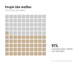
If you thought a pie chart was the only food-related chart type out there, think again! There is the donut chart – basically just a pie chart with a hole in the middle – but as a Belgian, I am particularly fond of what’s called a waffle chart. It’s a great alternative to a pie chart, and very easy to make. Oh dear, my stomach’s growling already!
What is a waffle chart?
A waffle chart is basically a square display, usually consisting of 100 smaller squares arranged in a 10-by-10 layout. The squares are colored according to the proportions you are aiming to visualize, similarly to how you would color different slices of a pie chart. As this square layout somewhat resembles a delicious waffle, this immediately explains the name of the chart:
However, compared to a pie chart, a waffle chart is much easier to read – our brain is not well suited to compare different angles and slices, but we can quite easily compare different areas.
Alternative waffle charts
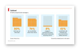
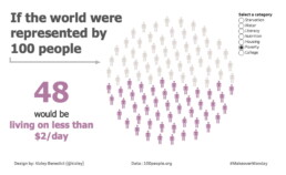
You will notice that many waffle charts are not made up of squares, but of alternative shapes, usually circles. Other shapes, such as small icons, are also possible – in this case we are approaching the realm of pictogram charts.
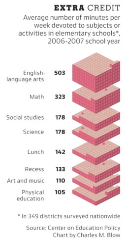
Another alternative are waffle charts consisting of more (or less) than 100 units, where the items represent actual numbers rather than fractions or percentages:
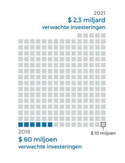
Here, each square represents $10 million, rather than 1%.
In the latter case, there are some similarities with charts we typically see after elections, showing the distribution of the different seats. One could argue that these kind of charts (‘Parliament charts’) are just a form of ‘warped’ waffle charts:
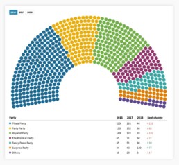
A Parliament Chart created using Flourish.
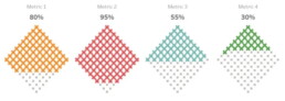
Some people prefer to turn their waffle charts by 45°, simply for design purposes, but well, some people are just weird:
Creating waffle charts
Making waffle charts is maybe a little bit tedious, but very simple! For example, you could create square cells in Excel, and color them using intelligent cell formatting to recreate the effect. If you google ‘waffle chart Excel‘ you will immediately get hundreds of blog posts and video tutorials describing the necessary steps.
Or you could take your favourite graphics software (such as Paint.NET, GIMP, or Inkscape), draw 100 identical shapes and color them according to your data.
And some people have managed to do it in Infogram, apparently.
More waffles than you'll ever need
To conclude, some wonderful things people have done with waffle charts, including this tile grid map of waffle charts about internet use in Africa:
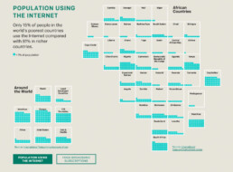
Apparently created by one.org, but I can’t find the exact source!
Oh, and a circular waffle chart is sometimes called a plum pudding chart, after J.J. Thomson’s plum pudding model for the atom, which is in turn named after a Christmas cake. The more you know!
Finally, if you would ever think about creating a 3D waffle chart… it’s not impossible, but let’s say it’s frowned upon. Maybe we should keep that 3rd dimension for real waffles only?
Read more:
Review: Info We Trust
Info We Trust is an ambitious, visually stunning book that sits somewhere between philosophy, information design, and a collection of visual essays.
Gridlines are better than axes
Almost always, gridlines are better than axes. Vertical axes are the default option, and they have been around for centuries, so they are very well known. But they also have downsides. My biggest problem with vertical axes is that they’re often so far away from where the action is really happening.
Review: A History of Data Visualization and Graphic Communication
Michael Friendly and Howard Wainer clearly love graphs. But A History of Data Visualization and Graphic Communication isn’t just about graphs — it’s about the stories behind them: the context, the people, the new measurements that made them necessary, and the discoveries they enabled.
Report visuals don’t have to suck
Discover how CREG, Belgium’s electricity regulator, turns complex data into clear and engaging visuals. From smart annotations to small multiples and uncommon chart types, their Monitoring Report shows how thoughtful data visualization makes technical reports easier to read and understand.
Data visualization podcasts 2025
At Baryon, we’re huge fans of podcasts! Data visualization podcasts are a great way to stay up to date on the latest trends and techniques in data visualization.
Tell me why… I don’t like dashboards
I don't like dashboards. Well, most dashboards at least. They're just trying too hard... to do everything, everywhere, all at once. Why is that? And is there a better solution?
We are really into visual communication!
Every now and then we send out a newsletter with latest work, handpicked inspirational infographics, must-read blog posts, upcoming dates for workshops and presentations, and links to useful tools and tips. Leave your email address here and we’ll add you to our mailing list of awesome people!
Data visualization in a time of pandemic - #5: On top of the outbreak with daunting dashboards
Data visualization in a time of pandemic - #5: On top of the outbreak with daunting dashboards
This is a multi-chapter post!
- Chapter 1: Finding reliable data
- Chapter 2: Visualizing exponential growth
- Chapter 3: Mapping the virus
- Chapter 4: We need to talk about flattening the curve
- Chapter 5: On top of the outbreak with daunting dashboards
- Chapter 6: Viral scrollytelling

Chapter 5: On top of the outbreak with daunting dashboards
There’s so much coronavirus data out there – and more is being generated every second. In order to keep the overview, or at least keep some of our sanity, many organizations and individuals have created dashboards. Rather than being a lengthy, descriptive overview, this chapter will point you to some of the best dashboards out there. For those who want to stay on top of things, even during these crazy times.
Dashboards by official organizations
The WHO maintains a Situation Dashboard. This one was recently updated to a much brighter and cleaner design. Make sure to scroll down to see more than just the map! Especially the breakdowns by country are a great addition:
Country breakdowns for the number of cases on the WHO Situation Dashboard.
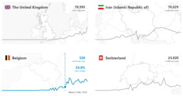
The WHO Regional Office for Europe also maintains a dashboard, albeit of somewhat dubious design quality. Nevertheless, it contains some interesting gauge graphs (created with Infogram) to illustrate how much the most affected countries contribute to the total number of cases in Europe:
Gauge graphs indicating the contribution of the most affected countries to the total number of cases and deaths (Source: WHO Regional Office for Europe).
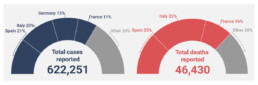
The European CDC (Centre for Disease Prevention and Control) has its own dashboard, although in my experience, it is rather difficult to navigate, with a complex layout, a few visual bugs and some counterintuitive (sideways) scrolling which makes it difficult to quickly find the numbers you are looking for.

Dashboards by experts
No, we are not talking about the many armchair virologists or epidemiologists popping up on social media or Medium. This is the real stuff: dashboards created by universities, groups of universities, or teams of experts.
Johns Hopkins University – of course, who else – has probably the most well-known dashboard on COVID-19, built in Ember.js. The focal point of this rather gloomy-colored dashboard is a bubble world map with different viewing options including confirmed cases, active cases, incidence rate and case-fatality ratio. The map is somewhat difficult to read for certain heavily affected regions, but can easily be zoomed in on:
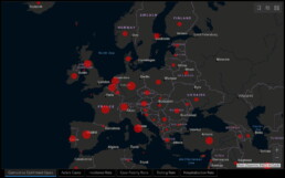
Cumulative confirmed cases in Europe as visualized on the JHU dashboard.
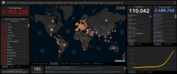
General overview of the JHU dashboard.
The Johns Hopkins dashboard also has a mobile-friendly version.
Other noteworthy expert dashboards include:
- University of Virginia COVID-19 Surveillance Dashboard
- The dashboard by Edward Parker and Quentin Leclerc at the London School of Hygiene & Tropical Medicine which, as a nice bonus, also allows you to visualize past outbreaks of SARS (2003), swine flu (2009) or Ebola (2014).
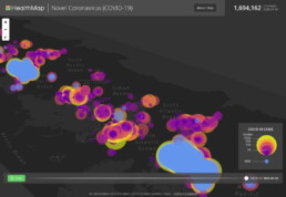
- The Novel Coronavirus HealthMap by the Open COVID-19 Data Curation Group, an initiative including many famous universities such as the University of Oxford and Harvard Medical School. With even a publication in The Lancet, this will be as expert-y as it gets! Basically a (somewhat difficult to read) bubble map, but with some weird navigation tools for you to play around with:
Article-like dashboards
As you probably know by now I’m a sucker for beautiful examples of data journalism. An overview of dashboards would not be complete without mentioning some excellent articles summarizing our information about the outbreak:
- Coronavirus Map: Tracking the Global Outbreak in the New York Times
- Mapping the worldwide spread of the coronavirus in the Washington Post
- Sorry for the patriotism, but I should mention the excellent visuals by the dataviz team at Belgian newspaper De Tijd.
- Coronavirus tracked: the latest figures as the pandemic spreads in the Financial Times. Here, I especially like the bold choice to visualize the spread using small multiples – I don’t usually like this approach, but here I must admit it works really well:
More small multiples! MOAR! (Source: Financial Times)
Other initiatives
And finally, some other noteworthy initiatives:
- The Coronavirus Dashboard by Avi Schiffmann and Jensen. Currently at the top of the Google results if you’re looking for coronavirus dashboards, well done!
- Vinícius Henrique Neves created a dashboard in Microsoft Power BI.
- Bing created their own dashboard, which adds some relevant news items and videos to the mix, as well as some interesting treemaps and strip charts:
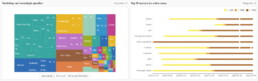
Treemap and strip chart on the Bing COVID-19 dashboard.
This is a multi-chapter blog post!
Continue reading:
- Chapter 1: Finding reliable data
- Chapter 2: Visualizing exponential growth
- Chapter 3: Mapping the virus
- Chapter 4: We need to talk about flattening the curve
- Chapter 5: On top of the outbreak with daunting dashboards
- Chapter 6: Viral scrollytelling
For all your comments, suggestions, errors, links and additional information, you can contact me at koen@baryon.be or via Twitter at @koen_vde.
Disclaimer: I am not a medical doctor or a virologist. I am a physicist running my own business (Baryon) focused on information design.
Read more:
Review: Info We Trust
Info We Trust is an ambitious, visually stunning book that sits somewhere between philosophy, information design, and a collection of visual essays.
Gridlines are better than axes
Almost always, gridlines are better than axes. Vertical axes are the default option, and they have been around for centuries, so they are very well known. But they also have downsides. My biggest problem with vertical axes is that they’re often so far away from where the action is really happening.
Review: A History of Data Visualization and Graphic Communication
Michael Friendly and Howard Wainer clearly love graphs. But A History of Data Visualization and Graphic Communication isn’t just about graphs — it’s about the stories behind them: the context, the people, the new measurements that made them necessary, and the discoveries they enabled.
Report visuals don’t have to suck
Discover how CREG, Belgium’s electricity regulator, turns complex data into clear and engaging visuals. From smart annotations to small multiples and uncommon chart types, their Monitoring Report shows how thoughtful data visualization makes technical reports easier to read and understand.
Data visualization podcasts 2025
At Baryon, we’re huge fans of podcasts! Data visualization podcasts are a great way to stay up to date on the latest trends and techniques in data visualization.
Tell me why… I don’t like dashboards
I don't like dashboards. Well, most dashboards at least. They're just trying too hard... to do everything, everywhere, all at once. Why is that? And is there a better solution?
We are really into visual communication!
Every now and then we send out a newsletter with latest work, handpicked inspirational infographics, must-read blog posts, upcoming dates for workshops and presentations, and links to useful tools and tips. Leave your email address here and we’ll add you to our mailing list of awesome people!
Data visualization in a time of pandemic - #4: We need to talk about flattening the curve
Data visualization in a time of pandemic - #4: We need to talk about flattening the curve
This is a multi-chapter post!
- Chapter 1: Finding reliable data
- Chapter 2: Visualizing exponential growth
- Chapter 3: Mapping the virus
- Chapter 4: We need to talk about flattening the curve
- Chapter 5: On top of the outbreak with daunting dashboards
- Chapter 6: Viral scrollytelling
Chapter 4: We need to talk about flattening the curve
Data visualizations rarely become hugely popular among the general public. But recently, a visual appeared which quickly spread on social media, in newspapers and magazines, and even in press conferences and on television. Hundreds of millions have probably seen it by now. Yes, the Flattening the Curve visual is truly a remarkable success story in the dataviz world. So let’s dive into it!
What curve are we flattening?
Let’s start by looking at a prime example of a ‘flatten the curve’ visual, the one in the COVID-19 #Coronavirus Data Pack at Information is Beautiful, as it combines a simple and clean curve design with a lot of additional information:
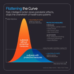
Flattening the curve visual from the Information is Beautiful COVID-19 #Coronavirus Data Pack.
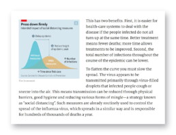
We are looking at how the expected number of daily infections will evolve over time since the date of the first case. As described in chapter 2, the shape of these curves is expected to be more or less Gaussian in nature, with an exponential growth phase at the start of the outbreak and reaching a peak at a certain point in time, typically several weeks since the date of the first case. The crux of the graph is the dotted line – the capacity of our healthcare system. There is only a certain number of patients we can treat simultaneously in an effective way, be it due to a lack of equipment (intensive care beds, ventilators,…) or a lack of personnel.
The color choice is very smart here. Orange is related to the curve we want to avoid: an outbreak without protective measures being taken. In this case the number of daily infections will quickly outpace the capacity of our healthcare system, leading to a high fatality rate because patients cannot all be treated effectively.
Blue indicates the scenario we aim for when protective measures are taken (the protective measures are also listed in the figure above). In this case, the spread of the disease will be slowed down. This implies that the outbreak might take longer to die down, but more importantly, the peak in the number of daily infections will not (or not by much) exceed the capacity of our healthcare system. This enables us to treat all patients as effectively as possible and lower the fatality rate.
In one sentence: we need to take protective measures to flatten the curve.
Many visualizers have come up with their own version of the ‘flatten the curve’ graphic. One of the more popular examples was the following animation by illustrator Toby Morris and microbiologist Siouxsie Wiles for The Spinoff, an online magazine from New Zealand:
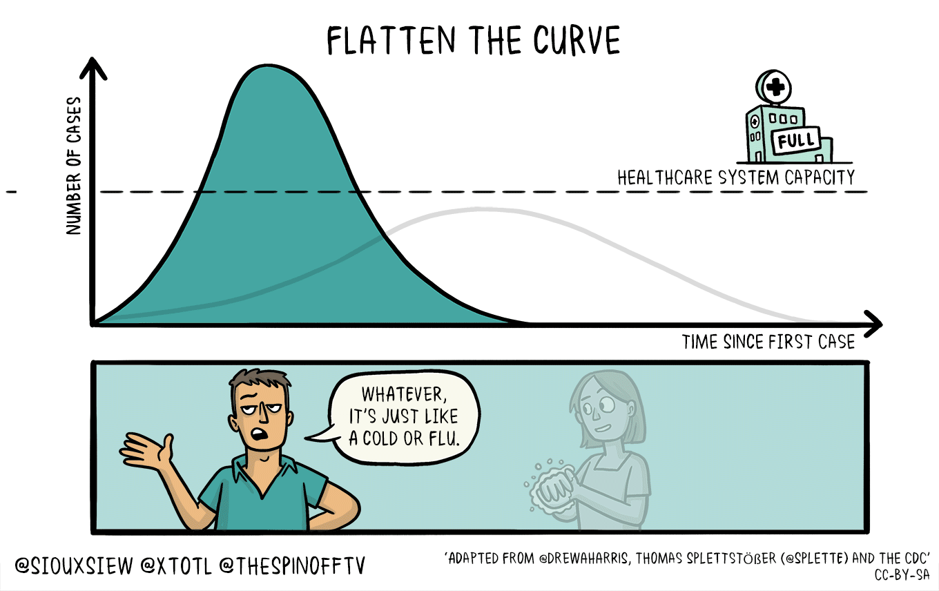
Flattening the curve visual by illustrator Toby Morris and microbiologist Siouxsie Wiles for The Spinoff.
Before we dive into the many different variations of this curve, we need to briefly discuss a more technical point: should both graphs have the same area, or not?
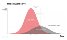
When looking at both visuals above, this is not very clear. In the Information is Beautiful version, it might seem that the blue, flat curve has a somewhat smaller surface area compared to the orange version, but it is not very extreme. In the animated version, both appear to have a similar area. In some visuals, the difference is much more extreme, such as in this one by Vox:
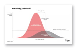
Flattening the curve visual by Vox on March 10, 2020.
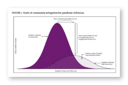
‘Curve 0’: the original Flattening the Curve visual as it appeared in the CDC report ‘Community Mitigation Guidelines to Prevent Pandemic Influenza‘ in 2017.
And what happens after the curve? When strict protective measures, such as a lockdown, are released, will we not simply see a ‘restart’ of the outbreak as people start having more social contacts again? In that case, we will have only delayed the outbreak (at a very high economic – and possibliy psychological – cost) and still end up with millions of deaths. Not really, as we will have gained one unbelievably major advantage: time. Time to do more research, bring us closer to effective drugs or even a vaccine, time to build up capacity, time to educate the public.
Tomas Pueyo describes this very convincingly in his article ‘The Hammer and the Dance‘, so I will not go into further detail here. Just one word of advice: proceed with caution. Tomas Pueyo is a great and convincing writer, but he is not a doctor or microbiologist. He is an engineer, ex-consultant and entrepreneur (hmm, that sounds familiar to my own story). He is also the guy who wrote an entire book about the amazing Star Wars Ring Theory without even crediting Mike Klimo, the person who originally came up with it. That’s a pretty douche move, Tomas. But hey, let’s get back to visualizing data, shall we?
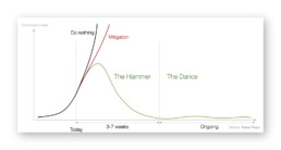
Key visual from Tomas Pueyo’s article ‘The Hammer and the Dance‘ on how to use protective measures to fight the epidemic.
When flattening the curve got out of hand
This is one of those rare times in history when a data visualization goes, well, viral (ugh!). I can hardly come up with data visuals which have reached the same level of fame as Flattening the Curve. It has popped up in press conferences, in newspapers and on television in nearly every country on earth. Millions of people have seen it. That’s quite an achievement!
If we try to trace this visual back to its origins, probably the first time it appeared in the media was in The Economist at the end of February, recreated from the CDC original by visual-data journalist Rosamund Pearce:
Probably the first appearance of the Flattening the Curve visual in the media. (The Economist)
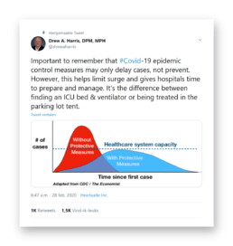
Thanks for sharing your wisdom, Drew. (Source)
The New York Times explains it very well in this article.
By now, Flattening the Curve adaptations have exploded. Maybe we should start talking about flattening the curve of Flattening the Curve visuals? (Not my joke, sorry, credits go to Andy Kirk.)
Ok, maybe this is getting just a tiny bit out of hand. (Source: Google Image Search)

Source: Rob Dubbin
Curve alternatives
Ah, the curve. It just works so well in educating the people! It convinces us in a single glance why staying at home serves the greater good. Never before was chilling in my couch such a great way to save millions of lives, right?
Nevertheless, there are some great curve alternatives (alcurvatives?) to the by now overused visual. The one I must highlight comes from (again, these guys are simply great visualizers) the Washington Post. I like it so much that maybe ‘One Visuals to Rule Them All’ is a more appropriate way to describe it. Rather than showing the same old curves, Harry Stevens decided to simulate the effects of protective measures and social distancing, and show the impact through a series of animations. This is the pandemic spreading with an enforced quarantine, which is starting to ‘leak’:
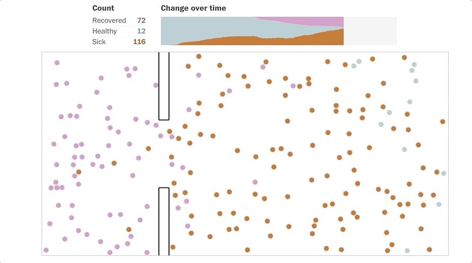
Animated simulation of a disease outbreak with quarantine enforced. (Source: Washington Post)
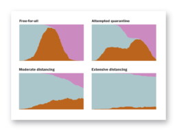
Simulation results showing the differences between different suppression strategies on the number of sick (brown), healthy (blue) and recovered (pink) people. (Washington Post)
It quickly became Washington Post’s most popular story ever.
To wrap up this chapter on curves, there is one final visual I would like to share with you. Don’t worry, it’s an alternative to the Flattening the Curve overload, so no curves this time. In fact, it’s another animated illustration by Toby Morris for The Spinoff, the same guy we started our chapter with. It shows how only one person avoiding contact with others can have a dramatic impact on the total number of infections:

Animated illustration by Siouxsie Wiles and Toby Morris, showing the impact of social distancing on the spread of an infection. (Source: The Spinoff)
I love it.
This is a multi-chapter blog post!
Continue reading:
- Chapter 1: Finding reliable data
- Chapter 2: Visualizing exponential growth
- Chapter 3: Mapping the virus
- Chapter 4: We need to talk about flattening the curve
- Chapter 5: On top of the outbreak with daunting dashboards
- Chapter 6: Viral scrollytelling
For all your comments, suggestions, errors, links and additional information, you can contact me at koen@baryon.be or via Twitter at @koen_vde.
Disclaimer: I am not a medical doctor or a virologist. I am a physicist running my own business (Baryon) focused on information design.
Read more:
Review: Info We Trust
Info We Trust is an ambitious, visually stunning book that sits somewhere between philosophy, information design, and a collection of visual essays.
Gridlines are better than axes
Almost always, gridlines are better than axes. Vertical axes are the default option, and they have been around for centuries, so they are very well known. But they also have downsides. My biggest problem with vertical axes is that they’re often so far away from where the action is really happening.
Review: A History of Data Visualization and Graphic Communication
Michael Friendly and Howard Wainer clearly love graphs. But A History of Data Visualization and Graphic Communication isn’t just about graphs — it’s about the stories behind them: the context, the people, the new measurements that made them necessary, and the discoveries they enabled.
Report visuals don’t have to suck
Discover how CREG, Belgium’s electricity regulator, turns complex data into clear and engaging visuals. From smart annotations to small multiples and uncommon chart types, their Monitoring Report shows how thoughtful data visualization makes technical reports easier to read and understand.
Data visualization podcasts 2025
At Baryon, we’re huge fans of podcasts! Data visualization podcasts are a great way to stay up to date on the latest trends and techniques in data visualization.
Tell me why… I don’t like dashboards
I don't like dashboards. Well, most dashboards at least. They're just trying too hard... to do everything, everywhere, all at once. Why is that? And is there a better solution?
We are really into visual communication!
Every now and then we send out a newsletter with latest work, handpicked inspirational infographics, must-read blog posts, upcoming dates for workshops and presentations, and links to useful tools and tips. Leave your email address here and we’ll add you to our mailing list of awesome people!