
Tell me why... I don't like dashboards
Tell me why... I don't like dashboards
😶 I don’t like dashboards. There, I said it.
Ok, some nuance: I don’t like _most_ dashboards. The main reason: they’re trying to do everything, everywhere, all at once.
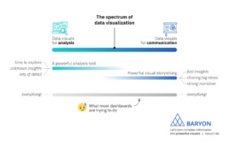
On the spectrum of data visualization, two main clusters of powerful visuals exist:
1️⃣ Data visuals for analysis: useful for data analysts, who have time to explore the data in full detail, with lots of filters, offering many different perspectives on the data. Their goal: extracting the insights from the data.
2️⃣ Data visuals for communication: useful for managers, or a more general audience. They don’t have a lot of time and want to know the major insights, fast, loud and clear. For more complicated stuff, we can craft a strong narrative to guide them through the major insights.
What most dashboards are trying to do, is both of these things simultaneously: raw data goes in, crystal-clear insights come out – or so people expect.
The solution? We make a full-fledged dashboard for the analysts, and a dedicated light-weight version for the management, showing only what they need to know for their decision-making. Or we do our analysis first, and translate those insights into an engaging visual storytelling piece, or an attractive visual report.
As always, we have to think about the audience and their goals. Not just dump the data on top of them, and hope they will figure it out!
Read more:

How to create a graphical abstract
Graphical abstracts are becoming more and more important. Journal publishers such as Elsevier encourage you to create a concise visual summary of the main findings of your research. But where to start? What steps should you follow to create the perfect graphical abstract for your article? What tools can you use?

Behind the maps
In the 30-day Map Challenge, you are challenged to design a new map every day around a certain topic. I participated in November 2020, and wrote this post to share my thought processes, data sources, tools and results!

Data visualization resources: all the links you’ll ever need!
You want to start creating clear and attractive data visuals, but don't know where to start? No worries, here's a complete overview of tools, resources and inspiration you can use as a starting point for your designs.
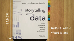
Storytelling with Data: Dataviz book review
The Storytelling with Data book has been on my wishlist as long as I can remember, because so many people recommend it as one of the must read dataviz books. So let's see what the fuzz is all about - here's my review!
Uncommon chart types: Slopegraphs
Slopegraphs appear in 'serious' newspapers, but they are very easy to create yourself. Use them if you want to compare how values have changed between two different points in time!

Data visualization in a time of pandemic – #6: Viral scrollytelling
In this final chapter, we’ll dive deeper into some of the insightful stories which have been published about the novel coronavirus and the COVID-19 pandemic. Rather than looking at single charts, we’ll highlight some long-form stories about the origin of the virus, how it works, and how it spread.
We are really into visual communication!
Every now and then we send out a newsletter with latest work, handpicked inspirational infographics, must-read blog posts, upcoming dates for workshops and presentations, and links to useful tools and tips. Leave your email address here and we’ll add you to our mailing list of awesome people!


Why I love matrix charts
Why I love matrix charts
🥰 This one is definitely in my top 5 of favourite chart types: a matrix chart!
🤔 What is it? A matrix chart is similar to a heatmap, and it has the same compact design. But rather than relying on color differences, we use bubbles with different sizes to show the data. It is cleaner and less visually cluttered than a heatmap, making it easier to fit in a stylish report design.
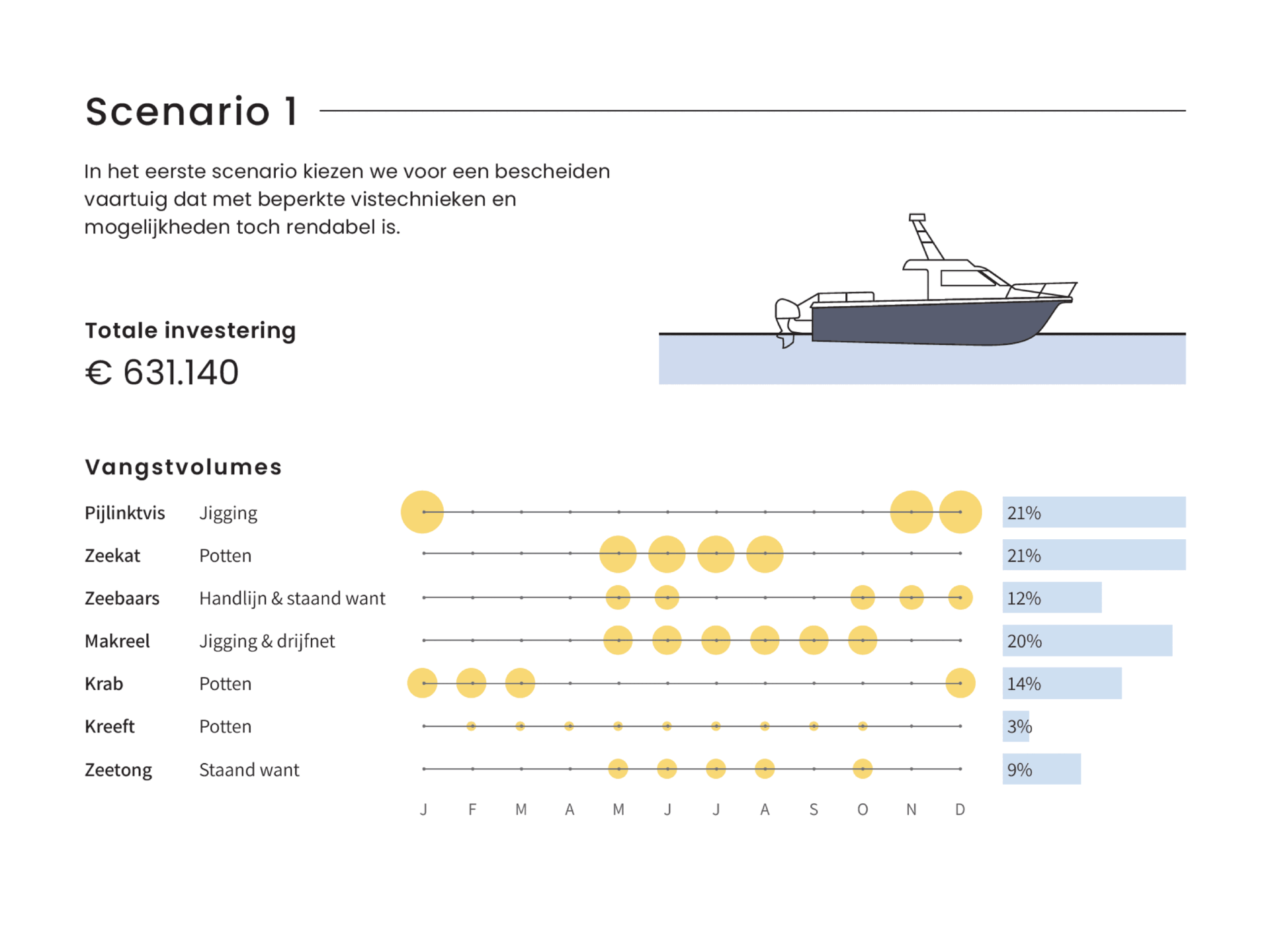
⚠️ Potential downside: this chart type works well only when there is sufficient variation between the data points. Otherwise it will be hard to see small differences between the bubble sizes.
💡 Worth noting: not everyone uses the term ‘matrix chart’. Some people prefer ‘proportional area chart’, or in this specific example – because the horizontal axis represents time – a ‘bubble timeline’. I like the term ‘matrix chart’ because it is a visual matrix of data, and it is also how RAWGraphs – my favourite tool to create these charts – calls it.
🐟 Example from the report ‘Toekomstvisie voor de kustvisserij 2024’ (Vision for the future of inshore fishing 2024) that we made for ILVO earlier this year.

Read more:
How to create a graphical abstract
Graphical abstracts are becoming more and more important. Journal publishers such as Elsevier encourage you to create a concise visual summary of the main findings of your research. But where to start? What steps should you follow to create the perfect graphical abstract for your article? What tools can you use?
Behind the maps
In the 30-day Map Challenge, you are challenged to design a new map every day around a certain topic. I participated in November 2020, and wrote this post to share my thought processes, data sources, tools and results!
Data visualization resources: all the links you’ll ever need!
You want to start creating clear and attractive data visuals, but don't know where to start? No worries, here's a complete overview of tools, resources and inspiration you can use as a starting point for your designs.
Storytelling with Data: Dataviz book review
The Storytelling with Data book has been on my wishlist as long as I can remember, because so many people recommend it as one of the must read dataviz books. So let's see what the fuzz is all about - here's my review!
Uncommon chart types: Slopegraphs
Slopegraphs appear in 'serious' newspapers, but they are very easy to create yourself. Use them if you want to compare how values have changed between two different points in time!
Data visualization in a time of pandemic – #6: Viral scrollytelling
In this final chapter, we’ll dive deeper into some of the insightful stories which have been published about the novel coronavirus and the COVID-19 pandemic. Rather than looking at single charts, we’ll highlight some long-form stories about the origin of the virus, how it works, and how it spread.
We are really into visual communication!
Every now and then we send out a newsletter with latest work, handpicked inspirational infographics, must-read blog posts, upcoming dates for workshops and presentations, and links to useful tools and tips. Leave your email address here and we’ll add you to our mailing list of awesome people!
