Data visualization tools: Datawrapper
Data visualization tools: Datawrapper
Let’s not beat around the bush in this blog post. If you are writing articles online and need to quickly insert beautiful, interactive charts, maps or tables, Datawrapper is the tool you are looking for.
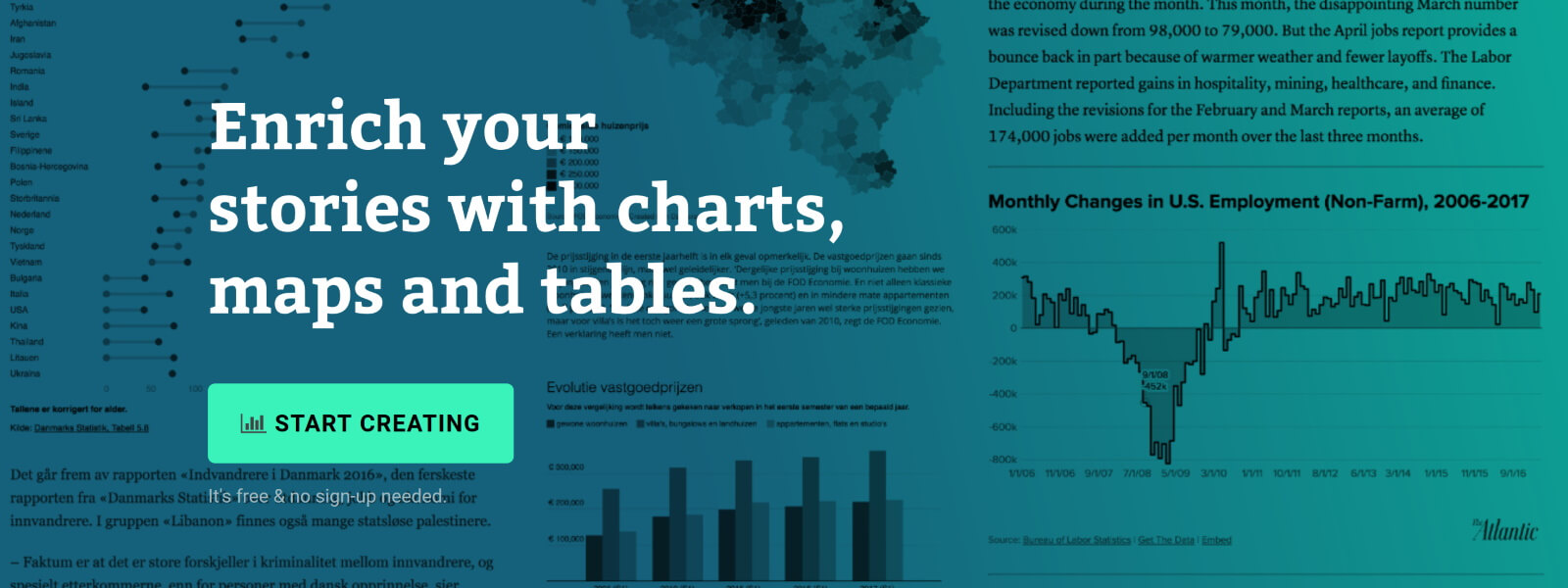
The Datawrapper team, based in Berlin, built an amazing product suitable for everyone who wants to tell stories using data. The free tier is very generous – unlimited visuals, live-updating charts, easy embedding, responsivity… The professional solution is expensive but mainly aims at newsrooms and journalists, removing the Datawrapper attribution and allowing to create print-ready graphics.
No coding skills are required, you can simply copy and paste your data, upload CSV files, or link to a URL or Google Sheet which allows live-updating charts. Obviously, you are limited to a certain set of possible chart types and designs, but the talented design team (led by Lisa Charlotte Rost) has ensured that all the available options and color schemes are well-crafted and elegantly designed.
You can find plenty of examples at the Datawrapper website, but of course a blog post about this tool would not be complete without an embedded example. So let’s try to create our own chart of, let’s say, the evolution of the price of Brent Crude Oil since January 2019. Uploading the data, as a CSV file, works very smoothly. Datawrapper automatically recognizes the type of data in each column, and support for different localizations is provided out of the box:
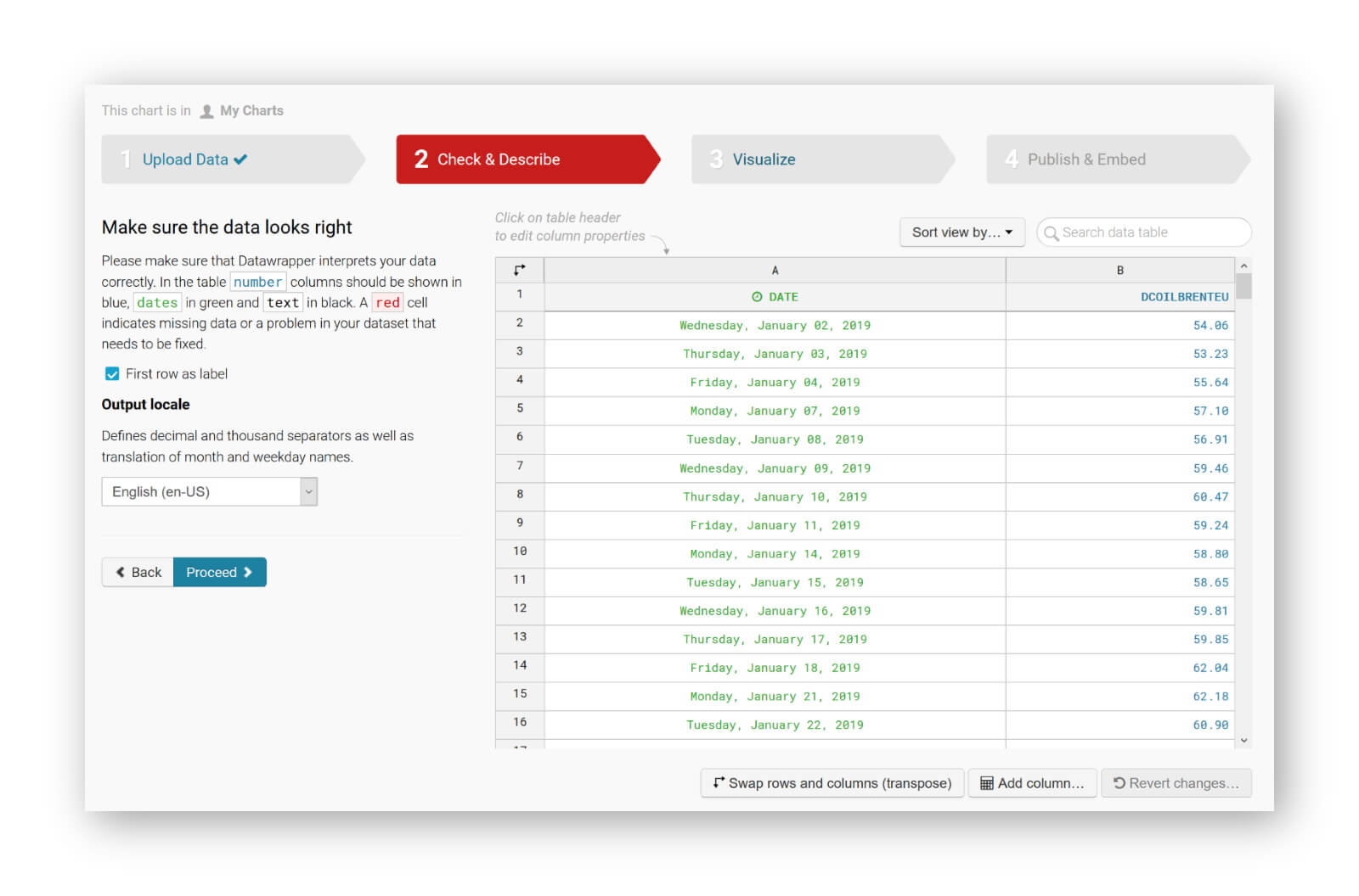
The tool is sufficiently intelligent to suggest the best chart type, and makes some pretty good default decisions regarding axes and grid lines (taking into account Tufte’s guidelines to maximixe data-ink ratio):
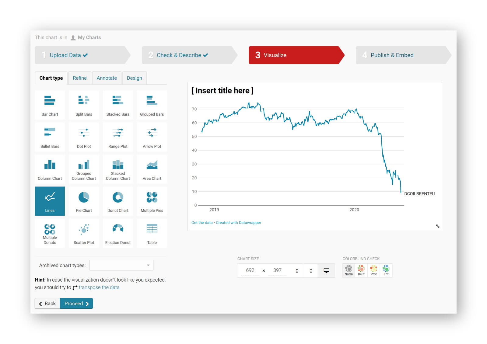
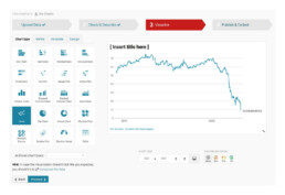
The next steps allow you to quickly finetune any other parameters you would like to change: colours, axes, grid lines, linestyles, hover labels, title, description, source links,… The final result can be downloaded as a PNG image, shared as a link, or simply embedded in your blog post:
It’s magic, it’s simple, and it’s so much fun! Did I already mention I am a fan?
Read more:

How to create a graphical abstract
Graphical abstracts are becoming more and more important. Journal publishers such as Elsevier encourage you to create a concise visual summary of the main findings of your research. But where to start? What steps should you follow to create the perfect graphical abstract for your article? What tools can you use?

Behind the maps
In the 30-day Map Challenge, you are challenged to design a new map every day around a certain topic. I participated in November 2020, and wrote this post to share my thought processes, data sources, tools and results!

Data visualization resources: all the links you’ll ever need!
You want to start creating clear and attractive data visuals, but don't know where to start? No worries, here's a complete overview of tools, resources and inspiration you can use as a starting point for your designs.
Storytelling with Data: Dataviz book review
The Storytelling with Data book has been on my wishlist as long as I can remember, because so many people recommend it as one of the must read dataviz books. So let's see what the fuzz is all about - here's my review!
Uncommon chart types: Slopegraphs
Slopegraphs appear in 'serious' newspapers, but they are very easy to create yourself. Use them if you want to compare how values have changed between two different points in time!

Data visualization in a time of pandemic – #6: Viral scrollytelling
In this final chapter, we’ll dive deeper into some of the insightful stories which have been published about the novel coronavirus and the COVID-19 pandemic. Rather than looking at single charts, we’ll highlight some long-form stories about the origin of the virus, how it works, and how it spread.
We are really into visual communication!
Every now and then we send out a newsletter with latest work, handpicked inspirational infographics, must-read blog posts, upcoming dates for workshops and presentations, and links to useful tools and tips. Leave your email address here and we’ll add you to our mailing list of awesome people!

