How to create a graphical abstract
How to create a graphical abstract
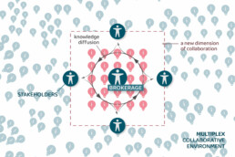
Graphical abstracts are becoming more and more important. Journal publishers such as Elsevier encourage you to create a concise visual summary of the main findings of your research.
But where to start? What steps should you follow to create the perfect graphical abstract for your article? What tools can you use?
On this page, you’ll find an overview of tips, tools and inspiration to create your own graphical abstract for your next article. Let’s show the world what your research is all about!
Digital tools to create graphical abstracts
You can use almost any graphical tool you want to create a graphical abstract. You could even use just pen and paper, if you like – the story is the most important part of the visual, not the artistic quality. Use the tool you know best, or feel the most comfortable with!
Here is a list of tools to get you started:
- Adobe Illustrator: adobe.com
- Affinity Designer: affinity.serif.com
- BioRender (for life sciences): biorender.com
- Canva: canva.com
- Diagrams: diagrams.net
- Infogram: infogram.com
- Microsoft PowerPoint
- Paint.NET: getpaint.net
- Piktochart: piktochart.com
- Venngage Infographic maker
- Whimsical: whimsical.com
Illustrations and icons to use in infographics
- Figshare (plants and more, for biologists): figshare.com/authors/Plant_Illustrations
- Freepik: freepik.com
- SMART (life sciences): smart.servier.com
- The noun project (icons): thenounproject.com
Photos to use in graphical abstracts
- Burst: burst.shopify.com
- Cathopic (catholic pictures): cathopic.com
- Flickr: flickr.com/
- Picography: picography.co
- Pixabay: pixabay.com
- Reshot: reshot.com
- Unsplash: unsplash.com
- Visual Hunt: visualhunt.com
Color schemes for graphical abstracts
- Adobe Color CC: color.adobe.com
- Coolors.co: coolors.co
- Pictaculous: digitalinspiration.com/color-palette-generator
- Website color schemes: canva.com/learn/website-color-schemes
- 100 brilliant color combinations: canva.com/learn/100-color-combinations
Creating graphs and maps for graphical abstracts
- Choose and design the perfect chart: chart.guide
- Choosing the right chart: infogram.com/page/choose-the-right-chart-data-visualization
- D3.js: d3js.org
- Dataviz catalogue: datavizcatalogue.com
- Datawrapper: datawrapper.de
- Flourish: flourish.studio
- LocalFocus: localfocus.nl
- Mapbox: mapbox.com
- Mapme: mapme.com/stories
- Snazzy maps (Google maps styles): snazzymaps.com
Books that can help you create better visuals
- Infographic designers’ sketchbooks, Steven Heller & Rick Landers
- Storytelling with data, Cole Nussbaumer Knaflic
- Trees, maps and theorems, Jean-Luc Doumont
- Visual thinking, Willemien Brand
Blogs about information design
- Chartable (Datawrapper)
- Cool Infographics (Randy Krum)
- Flowing Data (Nathan Yau)
- Infographics for the People (John Grimwade)
- The Information is Beautiful blog (David McCandless)
- Junk Charts (Kaiser Fung)
- Nightingale (on Medium, mostly paid articles)
- The Storytelling with Data blog (Cole Nussbaumer Knaflic)
- The Visme blog on infographics
- Visualising Data (Andy Kirk)
Wrapping up
Did we miss something? Which indispensable resource did we miss? Make sure to let us know at koen@baryon.be!
Also, feel free to check out our other resource guides:
- Data visualization: all the resources you’ll ever need
- Infographics: all the resources you’ll ever need

Read more:

Data visualization resources: all the links you’ll ever need!
You want to start creating clear and attractive data visuals, but don't know where to start? No worries, here's a complete overview of tools, resources and inspiration you can use as a starting point for your designs.
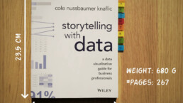
Storytelling with Data: Dataviz book review
The Storytelling with Data book has been on my wishlist as long as I can remember, because so many people recommend it as one of the must read dataviz books. So let's see what the fuzz is all about - here's my review!
Uncommon chart types: Slopegraphs
Slopegraphs appear in 'serious' newspapers, but they are very easy to create yourself. Use them if you want to compare how values have changed between two different points in time!
Data visualization in a time of pandemic – #6: Viral scrollytelling
In this final chapter, we’ll dive deeper into some of the insightful stories which have been published about the novel coronavirus and the COVID-19 pandemic. Rather than looking at single charts, we’ll highlight some long-form stories about the origin of the virus, how it works, and how it spread.
Five steps towards improving your dashboard
Today I would like to share with you the five steps I usually follow when I analyze and improve dashboards. If you are planning to analyze and improve your own dashboard, or maybe the dashboard someone else created and you want to provide feedback on, you could follow these five steps as well.

Dear Data: Dataviz book review
Last February, on a cold and rainy day, I received the Dear Data book as part of a Dataviz Drawing workshop by Stefanie Posavec. A pretty large and heavy book, the kind you could put on your coffee table to show off (which I did!). Let's review it!
We are really into visual communication!
Every now and then we send out a newsletter with latest work, handpicked inspirational infographics, must-read blog posts, upcoming dates for workshops and presentations, and links to useful tools and tips. Leave your email address here and we’ll add you to our mailing list of awesome people!
