
Small datasets to practice your data visualization skills
Small datasets to practice your data visualization skills
When you’re teaching data analysis or data visualization, or when you’re learning new data visualization tools and techniques, you might be looking for datasets to practice with.
But such datasets are not always easy to find. They should be sufficiently small, so they are manageable with common analysis tools for beginners, such as Microsoft Excel. On the other hand, they should have sufficient depth to allow you to find interesting insights – the data should have at least a few different parameters and dimensions. Finally, the data should cover an interesting topic to keep your students (or yourself) engaged throughout the practice.
This page gives you some starting points to find interesting small datasets, which you can use for data analysis and data visualization teaching and practicing!
General dataset sources
- The wonderful chart creation tool RAWGraphs has an interesting set of data samples from various sources. Topics include wine aromas, cat classification, FIFA players statistics, letter frequency, and much more.
- Kaggle user Rachael Tatman has compiled a list of fun, beginner-friendly datasets specifically suited for statistical testing, but they can be used for data visualization as well.
- The weekly Makeover Monday challenge (initiated by the Tableau community) has generated an extensive list of datasets covering a wide variety of topics. Most of them are hosted on data.world.
- Looking for global, trustworthy data on societal topics such as health, education, food, or development? Our World In Data is the place to be – all of there (great!) data visuals have the option to download the raw data.
Some personal favorites

Here are some of the datasets I regularly use in my data analytics and visualization teaching and trainings:
- The Titanic Disaster Dataset listing, among other parameters, the age, gender and travel class of this famous ship’s passengers – including whether they survived the event or not.
- A list of Nobel Prize laureates from 1901 to 2020, including information on gender, country, age and category. I often use this as part of a Datawrapper exercise – you can see the finished visual at the bottom of this page!
- The results of the annual Stack Overflow Developer surveys. This is a pretty extensive dataset (over 83.000 rows and 49 columns) providing information on salary, tools used, level of experience, and much, much more.
- An overview of Summer Olympics medal winners, unfortunately only between 1976 and 2008, with information on discipline, country, gender, and type of medal received.
- Responses to the Ask a Manager Salary Survey 2021, with lots of opportunities for practicing data cleaning techniques.
- A pretty extensive but fictituous spreadsheet of US Regional Sales Data, excellent to demonstrate and practice basic data analysis techniques.
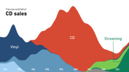
- I use this Makeover Monday dataset of 40 Years of Music Industry Sales often during my trainings as a way to demonstrate RAWGraphs.
What are your personal favorite datasets to use in data analytics or data visualization teaching? Let us know, and we’ll add them to this list!
Read more:

Review: Info We Trust
Info We Trust is an ambitious, visually stunning book that sits somewhere between philosophy, information design, and a collection of visual essays.

Gridlines are better than axes
Almost always, gridlines are better than axes. Vertical axes are the default option, and they have been around for centuries, so they are very well known. But they also have downsides. My biggest problem with vertical axes is that they’re often so far away from where the action is really happening.

Review: A History of Data Visualization and Graphic Communication
Michael Friendly and Howard Wainer clearly love graphs. But A History of Data Visualization and Graphic Communication isn’t just about graphs — it’s about the stories behind them: the context, the people, the new measurements that made them necessary, and the discoveries they enabled.

Report visuals don’t have to suck
Discover how CREG, Belgium’s electricity regulator, turns complex data into clear and engaging visuals. From smart annotations to small multiples and uncommon chart types, their Monitoring Report shows how thoughtful data visualization makes technical reports easier to read and understand.

Data visualization podcasts 2025
At Baryon, we’re huge fans of podcasts! Data visualization podcasts are a great way to stay up to date on the latest trends and techniques in data visualization.

Tell me why… I don’t like dashboards
I don't like dashboards. Well, most dashboards at least. They're just trying too hard... to do everything, everywhere, all at once. Why is that? And is there a better solution?
We are really into visual communication!
Every now and then we send out a newsletter with latest work, handpicked inspirational infographics, must-read blog posts, upcoming dates for workshops and presentations, and links to useful tools and tips. Leave your email address here and we’ll add you to our mailing list of awesome people!
