
Small datasets to practice your data visualization skills
Small datasets to practice your data visualization skills
When you’re teaching data analysis or data visualization, or when you’re learning new data visualization tools and techniques, you might be looking for datasets to practice with.
But such datasets are not always easy to find. They should be sufficiently small, so they are manageable with common analysis tools for beginners, such as Microsoft Excel. On the other hand, they should have sufficient depth to allow you to find interesting insights – the data should have at least a few different parameters and dimensions. Finally, the data should cover an interesting topic to keep your students (or yourself) engaged throughout the practice.
This page gives you some starting points to find interesting small datasets, which you can use for data analysis and data visualization teaching and practicing!
General dataset sources
- The wonderful chart creation tool RAWGraphs has an interesting set of data samples from various sources. Topics include wine aromas, cat classification, FIFA players statistics, letter frequency, and much more.
- Kaggle user Rachael Tatman has compiled a list of fun, beginner-friendly datasets specifically suited for statistical testing, but they can be used for data visualization as well.
- The weekly Makeover Monday challenge (initiated by the Tableau community) has generated an extensive list of datasets covering a wide variety of topics. Most of them are hosted on data.world.
Some personal favorites

Here are some of the datasets I regularly use in my data analytics and visualization teaching and trainings:
- The Titanic Disaster Dataset listing, among other parameters, the age, gender and travel class of this famous ship’s passengers – including whether they survived the event or not.
- A list of Nobel Prize laureates from 1901 to 2020, including information on gender, country, age and category. I often use this as part of a Datawrapper exercise – you can see the finished visual at the bottom of this page!
- The results of the annual Stack Overflow Developer surveys. This is a pretty extensive dataset (over 83.000 rows and 49 columns) providing information on salary, tools used, level of experience, and much, much more.
- An overview of Summer Olympics medal winners, unfortunately only between 1976 and 2008, with information on discipline, country, gender, and type of medal received.
- Responses to the Ask a Manager Salary Survey 2021, with lots of opportunities for practicing data cleaning techniques.
- A pretty extensive but fictituous spreadsheet of US Regional Sales Data, excellent to demonstrate and practice basic data analysis techniques.
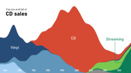
- I use this Makeover Monday dataset of 40 Years of Music Industry Sales often during my trainings as a way to demonstrate RAWGraphs.
What are your personal favorite datasets to use in data analytics or data visualization teaching? Let us know, and we’ll add them to this list!
Read more:

A powerful chart tells a story
A powerful chart has a clear message. It should be short and meaningful, and obvious in the blink of an eye. If there’s only one thing our audience remembers at the end of the day, this should be it.

Navigating the landscape of powerful charts
Once we’ve decided to create a data visual or infographic, there are a lot of questions we should ask ourselves to determine the most suitable format. These considerations could include size, readability, possible interactive functionality, and the level of detail we need.

How powerful charts can boost your career
An American accountant managed - as the youngest ever! - to win a crucial election in Los Angeles - thanks to the power of data visualization. And you, too, can use powerful charts to boost your career!

Why is data visualization so challenging?
Data visualization is very powerful, but it can also be hard. That’s because a great data visual combines three different aspects simultaneously: clarity, correctness, and beauty.

Data visualization resources: all the links you’ll ever need!
You want to start creating clear and attractive data visuals, but don't know where to start? No worries, here's a complete overview of tools, resources and inspiration you can use as a starting point for your designs.

Why is data visualization so powerful?
The amount of data coming our way is growing exponentially. In 2021 alone, it is estimated that humankind generated 74 zettabytes of data – that’s about 10,000 GB per person. How on earth are we going to keep this manageable?
We are really into visual communication!
Every now and then we send out a newsletter with latest work, handpicked inspirational infographics, must-read blog posts, upcoming dates for workshops and presentations, and links to useful tools and tips. Leave your email address here and we’ll add you to our mailing list of awesome people!

