Vreemde plaatsnamen in Vlaanderen
Vreemde plaatsnamen in Vlaanderen
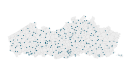
Iedereen kent wellicht ‘Kontich’ en ‘Reet’, maar in Vlaanderen hebben we nog veel meer merkwaardige, onverwachte, en vaak grappige plaatsnamen. Heb je bijvoorbeeld ooit al gehoord van Buitenland, Dikkebus, of Grote Homo?
In dit kaartje zetten we de vreemdste namen van Vlaamse gemeenten, dorpen of gehuchten voor jou op een rijtje. Veel zoekplezier!
Ontbreekt er nog een merkwaardige plaatsnaam? Laat het me dan zeker weten op koen@baryon.be.
Read more:
A powerful chart tells a story
A powerful chart has a clear message. It should be short and meaningful, and obvious in the blink of an eye. If there’s only one thing our audience remembers at the end of the day, this should be it.
28 November 2022
Navigating the landscape of powerful charts
Once we’ve decided to create a data visual or infographic, there are a lot of questions we should ask ourselves to determine the most suitable format. These considerations could include size, readability, possible interactive functionality, and the level of detail we need.
21 November 2022
How powerful charts can boost your career
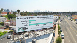
An American accountant managed - as the youngest ever! - to win a crucial election in Los Angeles - thanks to the power of data visualization. And you, too, can use powerful charts to boost your career!
16 November 2022
Why is data visualization so challenging?
Data visualization is very powerful, but it can also be hard. That’s because a great data visual combines three different aspects simultaneously: clarity, correctness, and beauty.
14 November 2022
Data visualization resources: all the links you’ll ever need!
You want to start creating clear and attractive data visuals, but don't know where to start? No worries, here's a complete overview of tools, resources and inspiration you can use as a starting point for your designs.
13 November 2022
Why is data visualization so powerful?
The amount of data coming our way is growing exponentially. In 2021 alone, it is estimated that humankind generated 74 zettabytes of data – that’s about 10,000 GB per person. How on earth are we going to keep this manageable?
7 November 2022
We are really into visual communication!
Every now and then we send out a newsletter with latest work, handpicked inspirational infographics, must-read blog posts, upcoming dates for workshops and presentations, and links to useful tools and tips. Leave your email address here and we’ll add you to our mailing list of awesome people!

