
Tell me why... I don't like dashboards
Tell me why... I don't like dashboards
😶 I don’t like dashboards. There, I said it.
Ok, some nuance: I don’t like _most_ dashboards. The main reason: they’re trying to do everything, everywhere, all at once.
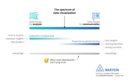
On the spectrum of data visualization, two main clusters of powerful visuals exist:
1️⃣ Data visuals for analysis: useful for data analysts, who have time to explore the data in full detail, with lots of filters, offering many different perspectives on the data. Their goal: extracting the insights from the data.
2️⃣ Data visuals for communication: useful for managers, or a more general audience. They don’t have a lot of time and want to know the major insights, fast, loud and clear. For more complicated stuff, we can craft a strong narrative to guide them through the major insights.
What most dashboards are trying to do, is both of these things simultaneously: raw data goes in, crystal-clear insights come out – or so people expect.
The solution? We make a full-fledged dashboard for the analysts, and a dedicated light-weight version for the management, showing only what they need to know for their decision-making. Or we do our analysis first, and translate those insights into an engaging visual storytelling piece, or an attractive visual report.

As always, we have to think about the audience and their goals. Not just dump the data on top of them, and hope they will figure it out!
Read more:

7 different goals for your chart
A crucial step in building a powerful chart is choosing the right type of chart. A lot of charts don’t work because they simply use the wrong type of chart. To avoid this trap, we must ask ourselves a basic question: what’s the ultimate goal of our data visual? What do we want to show with our data?

Making a data visual noise-free
Removing noise from a data visual is not only about taking things away such as gridlines, axes or legends. That’s just one part of it, which we could call removing physical noise. Improving the signal-to-noise ratio is often also about adding little things that help our audience better understand the visual. We are helping them by removing mental noise, or mental barriers.

Three tips to create powerful charts in Excel
Creating charts in Excel can be a very powerful tool for making sense of complex data sets, and for visualizing them. But the default options are not always the most pretty or effective ones. Here are our top three tips to create better Excel charts.

A powerful chart has a high signal-to-noise ratio
‘Less is more’. It’s a crucial principle in most of our communication, and in data visualization in particular. Because of my background as a physicist, I prefer to talk about the ‘signal-to-noise ratio’. The message - our signal - should be amplified as much as possible, giving it all of the attention. Everything that can distract from our message - the noise - should be removed.

A powerful chart tells a story
A powerful chart has a clear message. It should be short and meaningful, and obvious in the blink of an eye. If there’s only one thing our audience remembers at the end of the day, this should be it.

Navigating the landscape of powerful charts
Once we’ve decided to create a data visual or infographic, there are a lot of questions we should ask ourselves to determine the most suitable format. These considerations could include size, readability, possible interactive functionality, and the level of detail we need.
We are really into visual communication!
Every now and then we send out a newsletter with latest work, handpicked inspirational infographics, must-read blog posts, upcoming dates for workshops and presentations, and links to useful tools and tips. Leave your email address here and we’ll add you to our mailing list of awesome people!


Why I love matrix charts
Why I love matrix charts
🥰 This one is definitely in my top 5 of favourite chart types: a matrix chart!
🤔 What is it? A matrix chart is similar to a heatmap, and it has the same compact design. But rather than relying on color differences, we use bubbles with different sizes to show the data. It is cleaner and less visually cluttered than a heatmap, making it easier to fit in a stylish report design.
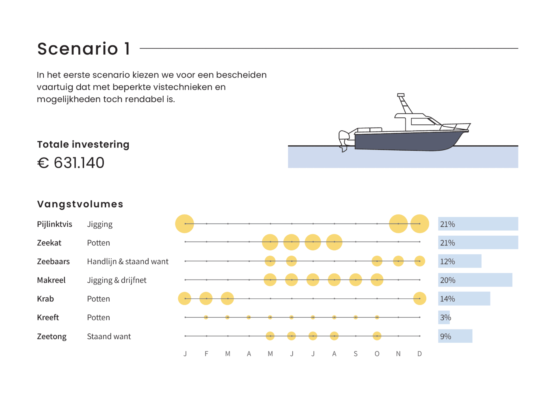
⚠️ Potential downside: this chart type works well only when there is sufficient variation between the data points. Otherwise it will be hard to see small differences between the bubble sizes.
💡 Worth noting: not everyone uses the term ‘matrix chart’. Some people prefer ‘proportional area chart’, or in this specific example – because the horizontal axis represents time – a ‘bubble timeline’. I like the term ‘matrix chart’ because it is a visual matrix of data, and it is also how RAWGraphs – my favourite tool to create these charts – calls it.
🐟 Example from the report ‘Toekomstvisie voor de kustvisserij 2024’ (Vision for the future of inshore fishing 2024) that we made for ILVO earlier this year.

Read more:
7 different goals for your chart
A crucial step in building a powerful chart is choosing the right type of chart. A lot of charts don’t work because they simply use the wrong type of chart. To avoid this trap, we must ask ourselves a basic question: what’s the ultimate goal of our data visual? What do we want to show with our data?
Making a data visual noise-free
Removing noise from a data visual is not only about taking things away such as gridlines, axes or legends. That’s just one part of it, which we could call removing physical noise. Improving the signal-to-noise ratio is often also about adding little things that help our audience better understand the visual. We are helping them by removing mental noise, or mental barriers.
Three tips to create powerful charts in Excel
Creating charts in Excel can be a very powerful tool for making sense of complex data sets, and for visualizing them. But the default options are not always the most pretty or effective ones. Here are our top three tips to create better Excel charts.
A powerful chart has a high signal-to-noise ratio
‘Less is more’. It’s a crucial principle in most of our communication, and in data visualization in particular. Because of my background as a physicist, I prefer to talk about the ‘signal-to-noise ratio’. The message - our signal - should be amplified as much as possible, giving it all of the attention. Everything that can distract from our message - the noise - should be removed.
A powerful chart tells a story
A powerful chart has a clear message. It should be short and meaningful, and obvious in the blink of an eye. If there’s only one thing our audience remembers at the end of the day, this should be it.
Navigating the landscape of powerful charts
Once we’ve decided to create a data visual or infographic, there are a lot of questions we should ask ourselves to determine the most suitable format. These considerations could include size, readability, possible interactive functionality, and the level of detail we need.
We are really into visual communication!
Every now and then we send out a newsletter with latest work, handpicked inspirational infographics, must-read blog posts, upcoming dates for workshops and presentations, and links to useful tools and tips. Leave your email address here and we’ll add you to our mailing list of awesome people!