

Data visualization podcasts 2025
Data visualization podcasts for 2025
At Baryon, we love a good podcast—especially when it’s about data visualization. They’re a great way to pick up new ideas, hear how others approach design and storytelling, and stay in touch with what’s happening in the field. Whether it’s a deep dive into visual communication, a fresh take on data exploration, or a candid chat about the challenges of bringing complex information to life, there’s always something to learn (and plenty to get inspired by).
Many shows feature conversations with people doing remarkable work—sometimes the big names you already know, sometimes voices you haven’t heard yet but will be glad you did.
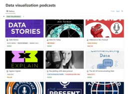
Some of our go-tos are Data Stories, Storytelling with Data, and Data Viz Today, but there’s a whole world of great listening out there.
We’ve pulled together a regularly updated list of our favorite data visualization (and data science) podcasts on Notion. You’ll find them all in one place, with links to Spotify, Apple Podcasts, and Google Podcasts—ready for your next walk, commute, or coffee break.
Read more:

Five steps towards improving your dashboard
Today I would like to share with you the five steps I usually follow when I analyze and improve dashboards. If you are planning to analyze and improve your own dashboard, or maybe the dashboard someone else created and you want to provide feedback on, you could follow these five steps as well.

Dear Data: Dataviz book review
Last February, on a cold and rainy day, I received the Dear Data book as part of a Dataviz Drawing workshop by Stefanie Posavec. A pretty large and heavy book, the kind you could put on your coffee table to show off (which I did!). Let's review it!
Data visualization tools: Datawrapper
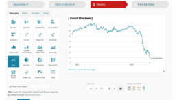
If you are writing articles online and need to quickly insert beautiful, interactive charts, maps or tables, Datawrapper is the tool you are looking for.
Uncommon chart types: Waffle charts
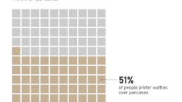
If you thought a pie chart was the only food-related chart type out there, think again! Waffle charts are a great alternative.

We are really into visual communication!
Every now and then we send out a newsletter with latest work, handpicked inspirational infographics, must-read blog posts, upcoming dates for workshops and presentations, and links to useful tools and tips. Leave your email address here and we’ll add you to our mailing list of awesome people!

