Storytelling with Data: Dataviz book review
Storytelling with Data: Dataviz book review
The book
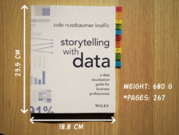
This dataviz book has been on my wishlist for a very long time! So many people have added it into their recommendations that I have lost track. It’s in nearly every list of ‘must read books on data visualization’ you will find. So it was about time for me to read, and review, Storytelling with Data by Cole Nussbaumer Knaflic.

Storytelling with Data, published in 2015, is presented as a practical guide for business professionals (think managers or consultants) who regularly need to present data, or findings based on data. People who have no prior experience with data visualization, except maybe for the occasional default bar or pie chart in Microsoft Excel.
Knaflic wrote this book to teach how – as Nancy Duarte described it in her review – it’s not about the data, it’s about the meaning of the data. Or, as Jean-Luc Doumont would put it: it’s not about the what, but about the so what.
This book offers hands-on advice to turn mind-numbing default charts into powerful, convincing graphs telling a story. This way, rather than just ‘looking fancy’, data visualization becomes a tool to actually change people’s minds.
The author
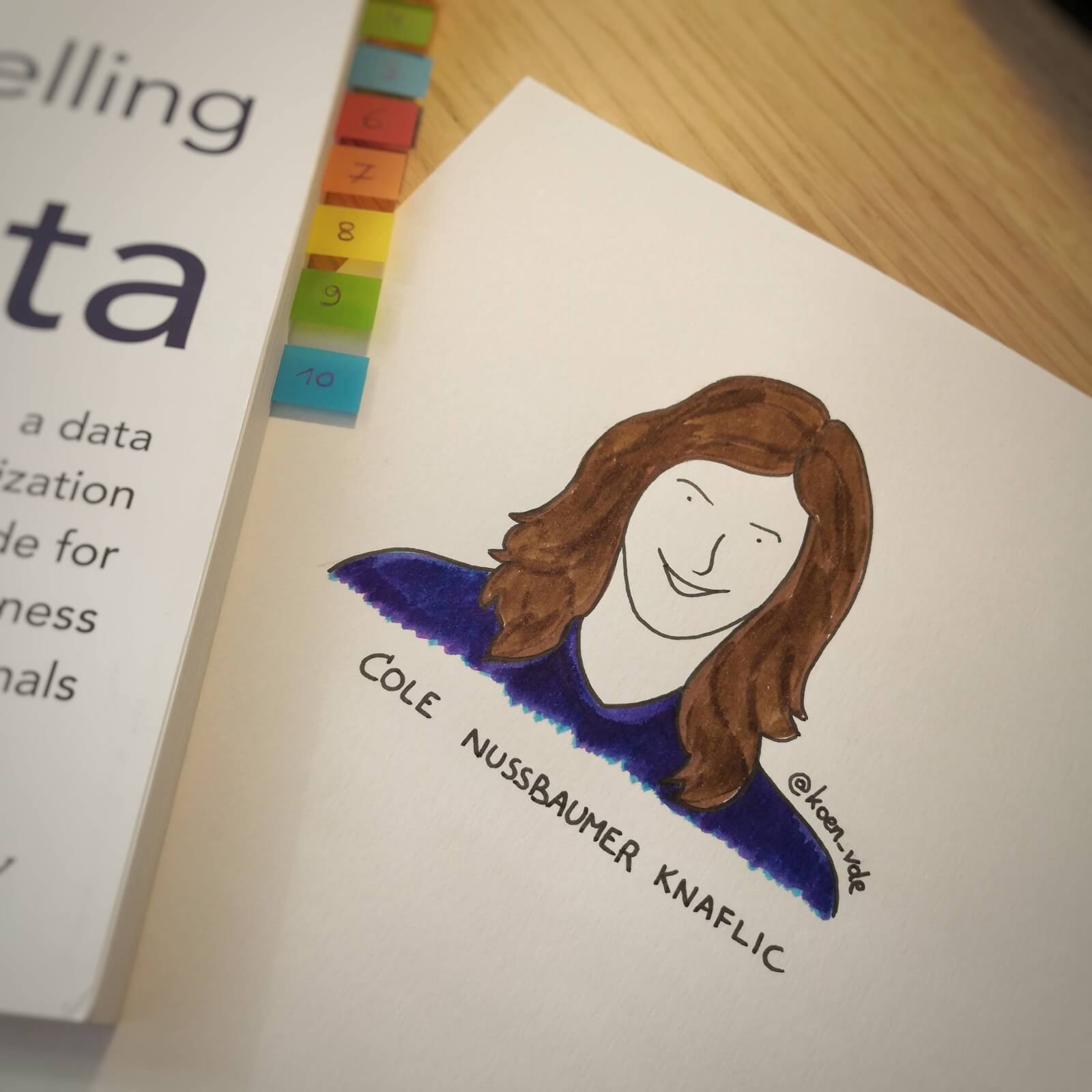
Cole Nussbaumer Knaflic is the perfect woman to teach us these techniques. Not only is she an excellent teacher in Information Visualization at the Maryland Institute College of Art, she also has an MBA and has worked as a manager on the Google People Analytics team for more than 5 years.
She is the founder and CEO of Storytelling with Data, where she has built a team to do exactly the things she describes in the book: she helps people and organizations to create graphs that tell compelling, action-inspiring stories.
In 2019 she wrote a companion book to this one, titled ‘Storytelling with Data: Let’s Practice‘, with even more examples, and with hands-on exercises.
The verdict
⭐⭐⭐
Storytelling with Data is definitely a dataviz book aimed at an audience of true business professionals, the kind of people you will find at large consulting firms, banks, or big tech companies, rather than die-hard fans of beautiful visualization art or information graphics. The author has (successfully) to convey the very simple, basic principles of building an excellent graph. She avoided adding complicated or jaw-droppingly beautiful examples, as this might discourage data visualization novices to try these principles for themselves.

This is the perfect book to pick up for your first encounter with data visualization. You will learn what’s wrong with default Excel charts and why they don’t work to convey your message. Knaflic shows how clever chart, font styling or color choices will dramatically improve the effectiveness of data visuals in your presentations. And she does it very well.
On the other hand, if you are a seasoned dataviz lover or admirer of infographics, this is not really the book for you. At times it will feel more like an academic syllabus or business report rather than a book you’ll read for fun or inspiration. But it could be the perfect gift for your colleague or friend who is just starting out and could use some basic, very practical advice!
Do you consider yourself a dataviz novice, or a true data wizard? What did you learn from this book?
And of course, if you have some data visualization challenges you think we could help you with, let me know as well – we are always happy to assist!
More dataviz book reviews? We have already covered:
- Dear Data
- Storytelling with Data
- Visualizing Complexity
Read more:

How powerful charts can boost your career
An American accountant managed - as the youngest ever! - to win a crucial election in Los Angeles - thanks to the power of data visualization. And you, too, can use powerful charts to boost your career!

Why is data visualization so challenging?
Data visualization is very powerful, but it can also be hard. That’s because a great data visual combines three different aspects simultaneously: clarity, correctness, and beauty.

Data visualization resources: all the links you\’ll ever need!
Your Data Visualization Toolkit: Practical tips, templates, and inspiration to make your data shine. Explore, adapt, and create work that’s clear, compelling, and unforgettable.

Why is data visualization so powerful?
The amount of data coming our way is growing exponentially. In 2021 alone, it is estimated that humankind generated 74 zettabytes of data – that’s about 10,000 GB per person. How on earth are we going to keep this manageable?

Infographic: Amazing facts about the brain
Did you know that our brain makes up 2% of our body weight, but consumers about 20% of our energy? Did you know that we have a second brain, located in our gut?
Our information designer Sofia made this insightful infographic, giving you an overview of eight amazing facts about the brain!

How common is your birthday?
Not all birthdays are created equal... in fact, for most countries in the north temperate zone, more people are born in summer (May - August) than in winter (October - January). This heatmap allows you to check how popular your birth date is. It shows the number of people in Belgium for each specific birthday.
We are really into visual communication!
Every now and then we send out a newsletter with latest work, handpicked inspirational infographics, must-read blog posts, upcoming dates for workshops and presentations, and links to useful tools and tips. Leave your email address here and we’ll add you to our mailing list of awesome people!

Dear Data: Dataviz book review
Dear Data: Dataviz book review
The book
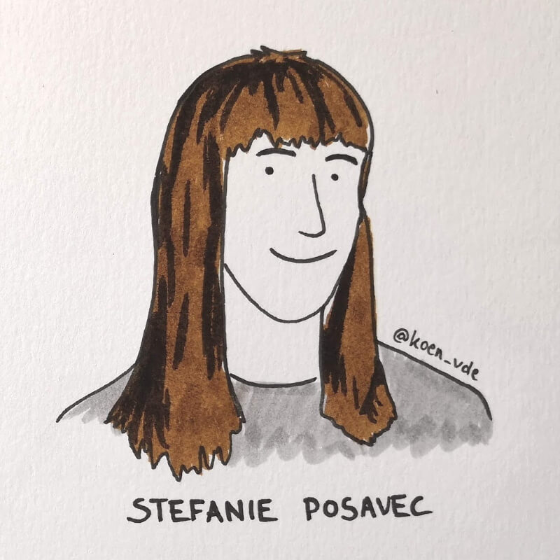
Last February, on a cold and rainy day, I received the Dear Data book as part of a Dataviz Drawing workshop by Stefanie Posavec. The workshop was hosted by Graphic Hunters in a beautiful space in central Amsterdam.
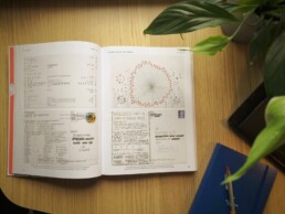
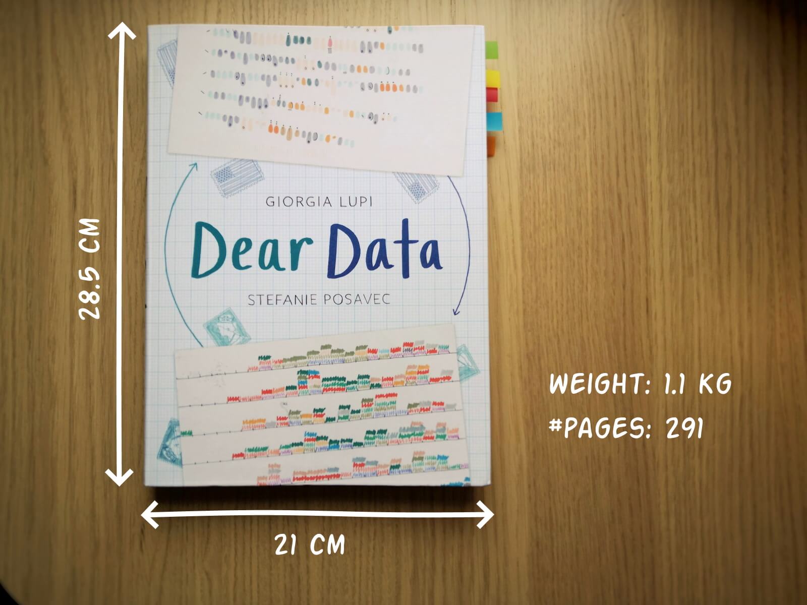
It is a pretty large and heavy book, containing nearly 300 pages on sturdy, qualitative paper. It is not the kind of book you would take with you into bed at night, but definitely one you could put on your coffee table to show off (which I did!). There are two alternative covers, one designed by Giorgia and one by Stefanie (this is the latter one).
In Dear Data, Giorgia and Stefanie document their project of sending each other hand-drawn postcards, every week, over the course of an entire year (2014-15). Each week, they would decide on a topic on which they would gather personal data – ranging from the contents of their wardrobes, over the sounds they heared, to the emotions and desires they experienced that week.
At the end of the week, they both sat down with their data, drew it onto a postcard, wrote a detailed legend on how to interpret it, and sent it to each other (Stefanie lives in London, and Giorgia in New York).
This book is a summary of their one-year project, with high-quality images of each of the postcards, additional details about the (practical and thought) process behind it, and tips to create your own personal data drawings.
Oh yes, the project also has its own dedicated webpage.
The authors
Giorgia Lupi and Stefanie Posavec are two well-known names in data visualization, but their Dear Data project truly made them world-famous.
Giorgia Lupi (°1981), originally from Italy, founded the design firm Accurat in 2011. They worked for an impressive list of clients including Google, IBM, Starbucks, and the United Nations. She introduced the concept of Data Humanism. In short, we should not simply focus on numbers, technologies and algorithms, but on the underlying things they represent: people, stories and ideas. She has won several awards, including multiple Information is Beautiful Awards Gold Medals, and in 2019 she joined design firm Pentagram as a partner.

Stefanie Posavec (°1981) was born in Colorado (US) and later moved to London. In 2013 she was one of Facebook’s earliest Artists in Residence, creating the piece Relationship Dance Steps. She aims to make data accessible, memorable and impactful using highly original approaches. For example, she puts health data art on hospital walls as a form of interior design, or she creates jewellery from air pollution data.
In 2016, Dear Data was acquired by the Museum of Modern Art as a part of its permanent collection, so they are both official MoMA artists!
The verdict
⭐⭐⭐⭐
I absolutely love this crossover between a data visualization book and an art book. Definitely not something to read in one go, but a book to pick up from time to time to browse through the pages. I’m convinced it can be a great source of inspiration when you are stuck on a particular project and are looking for a novel, creative approach.
The differences between Giorgia’s more ‘technical’ and Stefanie’s more ‘artistic’ drawing is interesting, and throughout the project we see both evolving and experimenting in different directions. Personally I love unraveling Giorgia’s complicated legends and decyphering her complex diagrams, and I am amazed at how much information she can compress into a single small postcard. However, in certain weeks, the level of detail can become too complicated and cumbersome. Stefanie’s drawings are usually simpler to absorb, but this often leads to gorgeous patterns, designs or metaphors.

Despite being a collection of 104 hand-drawn postcards, it never gets boring. I especially appreciate how they manage to alternate between very light-hearted, practical topics (e.g. a week of drinks) and deeply emotional, personal topics (e.g. a week of negative thoughts).
The postcards are regulary interspersed with simple but adorable illustrations that make the book a bit easier to digest (too much data can be overwhelming!).
My personal favorites are:
- By Giorgia: a week of media and a week of urban wildlife (so many parameters!)
- By Stefanie: a week of indecision and a week of distractions (so simple, so strong!)
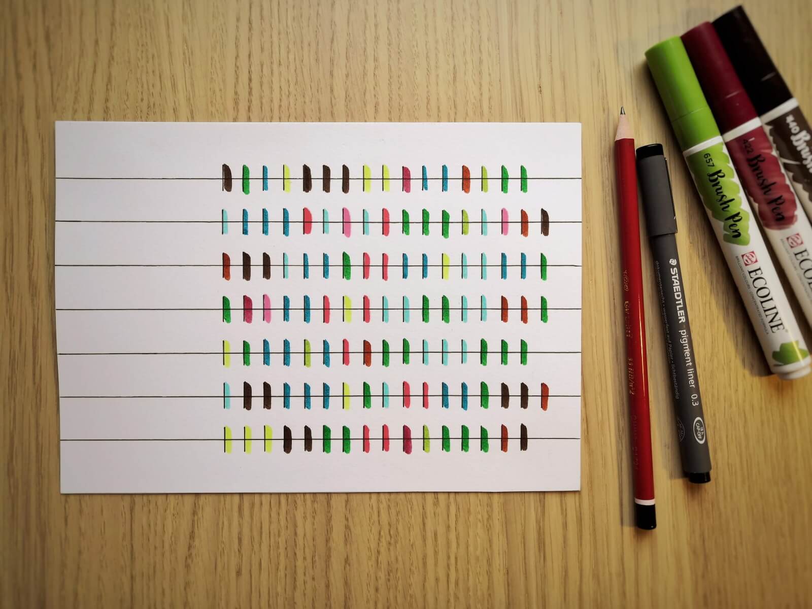
Applying the knowledge
Some of these stunning postcards are really inspiring to draw for myself. So I went ahead and collected some data. I chose to recreate Stefanie’s design for week eleven: a week of emotions.
Every hour during the past week, I have written down the main emotion I was experiencing at that moment. As we are in the midst of crazy pandemic times, you will notice some of my emotions are a bit, well, all over the place. 😬
So without further ado, here is the final result!
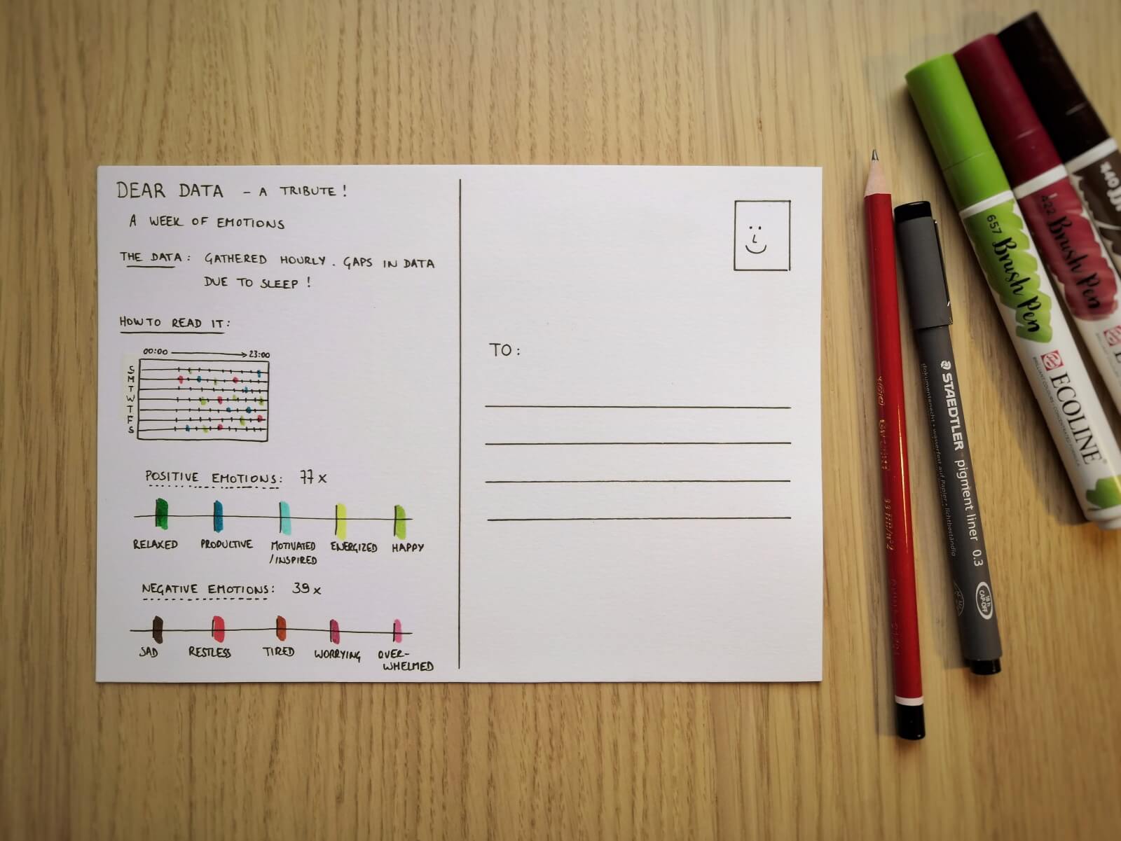
If you are also inspired, go ahead and start drawing your own data! And feel free to share it with me, or with the rest of the world! Looking forward to seeing what you are up to 😊
And of course, if you have some data visualization challenges you think we could help you with, let me know as well – we are always happy to assist!
More dataviz book reviews? We have already covered:
- Dear Data
- Storytelling with Data
- Visualizing Complexity
Read more:
How powerful charts can boost your career
An American accountant managed - as the youngest ever! - to win a crucial election in Los Angeles - thanks to the power of data visualization. And you, too, can use powerful charts to boost your career!
Why is data visualization so challenging?
Data visualization is very powerful, but it can also be hard. That’s because a great data visual combines three different aspects simultaneously: clarity, correctness, and beauty.
Data visualization resources: all the links you\’ll ever need!
Your Data Visualization Toolkit: Practical tips, templates, and inspiration to make your data shine. Explore, adapt, and create work that’s clear, compelling, and unforgettable.
Why is data visualization so powerful?
The amount of data coming our way is growing exponentially. In 2021 alone, it is estimated that humankind generated 74 zettabytes of data – that’s about 10,000 GB per person. How on earth are we going to keep this manageable?
Infographic: Amazing facts about the brain
Did you know that our brain makes up 2% of our body weight, but consumers about 20% of our energy? Did you know that we have a second brain, located in our gut?
Our information designer Sofia made this insightful infographic, giving you an overview of eight amazing facts about the brain!
How common is your birthday?
Not all birthdays are created equal... in fact, for most countries in the north temperate zone, more people are born in summer (May - August) than in winter (October - January). This heatmap allows you to check how popular your birth date is. It shows the number of people in Belgium for each specific birthday.
We are really into visual communication!
Every now and then we send out a newsletter with latest work, handpicked inspirational infographics, must-read blog posts, upcoming dates for workshops and presentations, and links to useful tools and tips. Leave your email address here and we’ll add you to our mailing list of awesome people!