Uncommon chart types: Slopegraphs
Uncommon chart types: Slopegraphs
Maybe you have never heard the term ‘slopegraph’, but chances are high that you have seen one before. They appear in serious newspapers such as De Tijd or the Financial Times, but you can easily create them yourself (yes, even in Excel!) and use them for your own data communication purposes. They work particularly well due to their insanely high data-ink ratio… as long as you don’t overdo it!
What is a slopegraph?
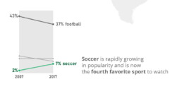
At its core, a slopegraph is a linegraph with just two data points for each category. In the majority of cases, such a graph will be used to compare between two different points in time, such as in the following example. This slopegraph shows how Americans’ favourite sports (to watch) have evolved between 2007 and 2017:
Slopegraphs are still a rather niche chart type. They were first suggested by Edward Tufte in his 1983 classical work ‘The visual display of quantitative information‘ – although at that time they were still nameless. I must admit I cannot trace back when the term ‘slopegraph’ first appeared. This was Tufte’s original design, showing the evolution of government tax collection in different countries, between 1970 and 1979:
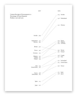
Original slopegraph design by Edward Tufte in 1983 (The Visual Display of Quantitative Information)
Here, we can immediately see why the data-ink ratio is so high: we can easily scan and understand the graph even without axes, ticks, axes labels or gridlines. Data points can be labeled directly, and no legend is needed, so we can quickly make a link between a line and the associated country.
Apparently, our brain is very good at comparing slopes of different lines. In the above examples, we can easily identify the strongest growers and fastest decliners, even for rather large sets of categories. For example, we can quickly see that Britain is the only country (from the given set) where tax collection went down between 1970 and 1979. And it grew pretty fast in the Nordics, Belgium and Switzerland.
Creating slopegraphs
As slopegraphs are basically just line graphs, they are very easy to create with basically any graphing software, including Excel. Because of this, Cole Nussbaumer Knaflic has dedicated an entire section to them in Storytelling with data (one of the best dataviz books for absolute beginners). She has even created a template for them here.
If you want to get your hands dirty and create a slopegraph yourself, there are two things to keep in mind:
- Try to remove as much ‘noise’ as possible: axes, gridlines and labels can usually be easily removed without harming interpretation.
- If you have many lines, make your message stand out by coloring most of the lines gray (or another neutral color), and highlight just the few you want to bring attention to, such as in the following example by Oliver Uberti for National Geographic:
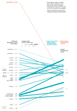
Notice that this is a very interesting example, as we are not comparing two different points in time, but two different metrics. On the left, we have the health care spending per person, on the right, the average life expectancy. The coloring draws our attention to the US and Mexico, two countries without universal health coverage. But the US is clearly an outlier: a very high health care spending which does not really reflect in the (below-average) life expectancy.
Some final things to remark about this very fine example, before we move on:
- Notice how the average of the health care spending (on the left side) is perfectly aligned with the average life expectancy (on the right side), shown with a dashed horizontal line. Clever!
- There is a third metric introduced into the chart by modifying the line thickness. The thicker the line, the more often people in these countries visit their doctor. Very clever again, although unfortunately it also counters some of the coloring effect: in countries without universal health coverage (in orange), people will visit their doctors much less frequently, resulting in very thin slopegraph lines.
Final slopegraph thoughts
Nothing is absolute when it comes to slopegraphs. In fact, we have already seen that the comparison can be between completely different metrics, such as in the National Geographic example above. And that you can introduce additional information by playing around with colors or line thickness.
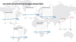
Finally I would like to show that, even when we’re talking about comparing dates, you don’t have to stick to just two points in time. This is a graphic I created showing the evolution of a certain market in different regions between 2009 and 2019, but with an intermediate value given for 2014:
Also here, rather, than showing all the lines in a single slopegraph, I opted to separate them in a kind of small multiples approach. This allows me to arrange the charts spatially on top of a world map, and it makes even more clear how much of an outlier the Asia-Pacific region is for this data. As you can see, nothing is set in stone. Slopegraphs are so easy to create that you can easily play around with them, find what works best for your data and message, or even invent completely new approaches!
Got any more great examples of slopegraphs? Make sure to share them with me at koen@baryon.be !
Or maybe we can help you make a slopegraph?
Read more:

Infographic: Amazing facts about the brain
Did you know that our brain makes up 2% of our body weight, but consumers about 20% of our energy? Did you know that we have a second brain, located in our gut?
Our information designer Sofia made this insightful infographic, giving you an overview of eight amazing facts about the brain!

How common is your birthday?
Not all birthdays are created equal... in fact, for most countries in the north temperate zone, more people are born in summer (May - August) than in winter (October - January). This heatmap allows you to check how popular your birth date is. It shows the number of people in Belgium for each specific birthday.

Visualizing Complexity: Dataviz book review
Visualizing Complexity is a great new data visualization book published by information design Superdot. Here's our verdict.

This chart is trying to trick you
The original chart in this example is trying to suggest a strong correlation between sugar intake and obesity in the US between 1980 and 2000. It does so by carefully choosing the vertical axis ranges and scaling so both lines nicely fall on top of each other.

Research visuals: all the resources you’ll ever need!
If you want to start creating clear and attractive visuals about your research, but don't know where to start, this page is for you! Here's a complete overview of tools, resources and inspiration you can use as a starting point for your designs.

Small datasets to practice your data visualization skills
When you're teaching data analysis or data visualization, or when you're learning new data visualization tools and techniques, you might be looking for datasets to practice with. Here are some great starting points.
We are really into visual communication!
Every now and then we send out a newsletter with latest work, handpicked inspirational infographics, must-read blog posts, upcoming dates for workshops and presentations, and links to useful tools and tips. Leave your email address here and we’ll add you to our mailing list of awesome people!

Uncommon chart types: Waffle charts
Uncommon chart types: Waffle charts
If you thought a pie chart was the only food-related chart type out there, think again! There is the donut chart – basically just a pie chart with a hole in the middle – but as a Belgian, I am particularly fond of what’s called a waffle chart. It’s a great alternative to a pie chart, and very easy to make. Oh dear, my stomach’s growling already!
What is a waffle chart?
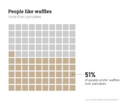
A waffle chart is basically a square display, usually consisting of 100 smaller squares arranged in a 10-by-10 layout. The squares are colored according to the proportions you are aiming to visualize, similarly to how you would color different slices of a pie chart. As this square layout somewhat resembles a delicious waffle, this immediately explains the name of the chart:
However, compared to a pie chart, a waffle chart is much easier to read – our brain is not well suited to compare different angles and slices, but we can quite easily compare different areas.
Alternative waffle charts
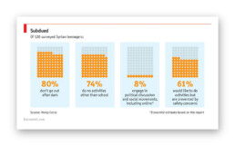
You will notice that many waffle charts are not made up of squares, but of alternative shapes, usually circles. Other shapes, such as small icons, are also possible – in this case we are approaching the realm of pictogram charts.
Another alternative are waffle charts consisting of more (or less) than 100 units, where the items represent actual numbers rather than fractions or percentages:
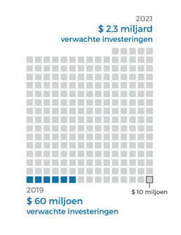
Here, each square represents $10 million, rather than 1%.
In the latter case, there are some similarities with charts we typically see after elections, showing the distribution of the different seats. One could argue that these kind of charts (‘Parliament charts’) are just a form of ‘warped’ waffle charts:
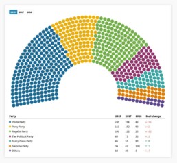
A Parliament Chart created using Flourish.
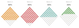
Some people prefer to turn their waffle charts by 45°, simply for design purposes, but well, some people are just weird:
Creating waffle charts
Making waffle charts is maybe a little bit tedious, but very simple! For example, you could create square cells in Excel, and color them using intelligent cell formatting to recreate the effect. If you google ‘waffle chart Excel‘ you will immediately get hundreds of blog posts and video tutorials describing the necessary steps.
Or you could take your favourite graphics software (such as Paint.NET, GIMP, or Inkscape), draw 100 identical shapes and color them according to your data.
And some people have managed to do it in Infogram, apparently.
More waffles than you'll ever need
To conclude, some wonderful things people have done with waffle charts, including this tile grid map of waffle charts about internet use in Africa:
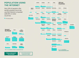
Apparently created by one.org, but I can’t find the exact source!
Oh, and a circular waffle chart is sometimes called a plum pudding chart, after J.J. Thomson’s plum pudding model for the atom, which is in turn named after a Christmas cake. The more you know!
Finally, if you would ever think about creating a 3D waffle chart… it’s not impossible, but let’s say it’s frowned upon. Maybe we should keep that 3rd dimension for real waffles only?
Read more:
Infographic: Amazing facts about the brain
Did you know that our brain makes up 2% of our body weight, but consumers about 20% of our energy? Did you know that we have a second brain, located in our gut?
Our information designer Sofia made this insightful infographic, giving you an overview of eight amazing facts about the brain!
How common is your birthday?
Not all birthdays are created equal... in fact, for most countries in the north temperate zone, more people are born in summer (May - August) than in winter (October - January). This heatmap allows you to check how popular your birth date is. It shows the number of people in Belgium for each specific birthday.
Visualizing Complexity: Dataviz book review
Visualizing Complexity is a great new data visualization book published by information design Superdot. Here's our verdict.
This chart is trying to trick you
The original chart in this example is trying to suggest a strong correlation between sugar intake and obesity in the US between 1980 and 2000. It does so by carefully choosing the vertical axis ranges and scaling so both lines nicely fall on top of each other.
Research visuals: all the resources you’ll ever need!
If you want to start creating clear and attractive visuals about your research, but don't know where to start, this page is for you! Here's a complete overview of tools, resources and inspiration you can use as a starting point for your designs.
Small datasets to practice your data visualization skills
When you're teaching data analysis or data visualization, or when you're learning new data visualization tools and techniques, you might be looking for datasets to practice with. Here are some great starting points.
We are really into visual communication!
Every now and then we send out a newsletter with latest work, handpicked inspirational infographics, must-read blog posts, upcoming dates for workshops and presentations, and links to useful tools and tips. Leave your email address here and we’ll add you to our mailing list of awesome people!
