Storytelling with Data: Dataviz book review
Storytelling with Data: Dataviz book review
The book
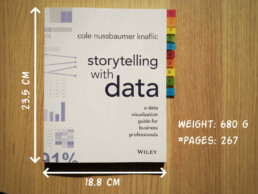
This dataviz book has been on my wishlist for a very long time! So many people have added it into their recommendations that I have lost track. It’s in nearly every list of ‘must read books on data visualization’ you will find. So it was about time for me to read, and review, Storytelling with Data by Cole Nussbaumer Knaflic.

Storytelling with Data, published in 2015, is presented as a practical guide for business professionals (think managers or consultants) who regularly need to present data, or findings based on data. People who have no prior experience with data visualization, except maybe for the occasional default bar or pie chart in Microsoft Excel.
Knaflic wrote this book to teach how – as Nancy Duarte described it in her review – it’s not about the data, it’s about the meaning of the data. Or, as Jean-Luc Doumont would put it: it’s not about the what, but about the so what.
This book offers hands-on advice to turn mind-numbing default charts into powerful, convincing graphs telling a story. This way, rather than just ‘looking fancy’, data visualization becomes a tool to actually change people’s minds.
The author
Cole Nussbaumer Knaflic is the perfect woman to teach us these techniques. Not only is she an excellent teacher in Information Visualization at the Maryland Institute College of Art, she also has an MBA and has worked as a manager on the Google People Analytics team for more than 5 years.
She is the founder and CEO of Storytelling with Data, where she has built a team to do exactly the things she describes in the book: she helps people and organizations to create graphs that tell compelling, action-inspiring stories.
In 2019 she wrote a companion book to this one, titled ‘Storytelling with Data: Let’s Practice‘, with even more examples, and with hands-on exercises.

The verdict
⭐⭐⭐
Storytelling with Data is definitely a dataviz book aimed at an audience of true business professionals, the kind of people you will find at large consulting firms, banks, or big tech companies, rather than die-hard fans of beautiful visualization art or information graphics. The author has (successfully) to convey the very simple, basic principles of building an excellent graph. She avoided adding complicated or jaw-droppingly beautiful examples, as this might discourage data visualization novices to try these principles for themselves.

This is the perfect book to pick up for your first encounter with data visualization. You will learn what’s wrong with default Excel charts and why they don’t work to convey your message. Knaflic shows how clever chart, font styling or color choices will dramatically improve the effectiveness of data visuals in your presentations. And she does it very well.
On the other hand, if you are a seasoned dataviz lover or admirer of infographics, this is not really the book for you. At times it will feel more like an academic syllabus or business report rather than a book you’ll read for fun or inspiration. But it could be the perfect gift for your colleague or friend who is just starting out and could use some basic, very practical advice!
Do you consider yourself a dataviz novice, or a true data wizard? What did you learn from this book?
And of course, if you have some data visualization challenges you think we could help you with, let me know as well – we are always happy to assist!
More dataviz book reviews? We have already covered:
- Dear Data
- Storytelling with Data
- Visualizing Complexity
Read more:

Vreemde plaatsnamen in Vlaanderen
Iedereen kent wellicht 'Kontich' en 'Reet', maar in Vlaanderen hebben we nog veel meer merkwaardige, onverwachte, en vaak grappige plaatsnamen. Heb je bijvoorbeeld ooit al gehoord van Buitenland, Dikkebus, of Grote Homo?

Small multiples can save your chart
When you're dealing with a chart that has too much information on it, the most straightforward advice to follow is: break it down into multiple charts, each with less information on them. A powerful example of this is a so-called small multiple approach.

Data visualization podcasts 2023
At Baryon, we’re huge fans of podcasts! Data visualization podcasts are a great way to stay up to date on the latest trends and techniques in data visualization.

Can you use Excel to create a powerful chart?
Spreadsheet tools such as Microsoft Excel or Numbers might not be the first thing on your mind when considering data visualization tools, but they can be pretty solid choices to build data visuals. Don’t let anyone convince you that using Excel to create data visuals is unprofessional.

Choosing the right font for your data visual
Fonts evoke emotions: there are very sophisticated fonts, playful fonts, attention-grabbing fonts, and elegant handwritten fonts. Using the wrong type of font can have a lot of impact. In data visualization the implications of typography are mainly focused on readability. Labels and annotations can easily become so small they get hard to read. Above all else, we should choose a font which is readable at small sizes.

Three roles of colour in a data visual
Colour is one of the most crucial tools we have to turn a normal chart into a powerful chart with a clear message, a chart which tells a story rather than simply presenting the information.
We are really into visual communication!
Every now and then we send out a newsletter with latest work, handpicked inspirational infographics, must-read blog posts, upcoming dates for workshops and presentations, and links to useful tools and tips. Leave your email address here and we’ll add you to our mailing list of awesome people!

Uncommon chart types: Slopegraphs
Uncommon chart types: Slopegraphs
Maybe you have never heard the term ‘slopegraph’, but chances are high that you have seen one before. They appear in serious newspapers such as De Tijd or the Financial Times, but you can easily create them yourself (yes, even in Excel!) and use them for your own data communication purposes. They work particularly well due to their insanely high data-ink ratio… as long as you don’t overdo it!
What is a slopegraph?
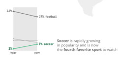
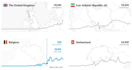
At its core, a slopegraph is a linegraph with just two data points for each category. In the majority of cases, such a graph will be used to compare between two different points in time, such as in the following example. This slopegraph shows how Americans’ favourite sports (to watch) have evolved between 2007 and 2017:
Slopegraphs are still a rather niche chart type. They were first suggested by Edward Tufte in his 1983 classical work ‘The visual display of quantitative information‘ – although at that time they were still nameless. I must admit I cannot trace back when the term ‘slopegraph’ first appeared. This was Tufte’s original design, showing the evolution of government tax collection in different countries, between 1970 and 1979:
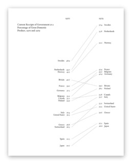
Original slopegraph design by Edward Tufte in 1983 (The Visual Display of Quantitative Information)
Here, we can immediately see why the data-ink ratio is so high: we can easily scan and understand the graph even without axes, ticks, axes labels or gridlines. Data points can be labeled directly, and no legend is needed, so we can quickly make a link between a line and the associated country.
Apparently, our brain is very good at comparing slopes of different lines. In the above examples, we can easily identify the strongest growers and fastest decliners, even for rather large sets of categories. For example, we can quickly see that Britain is the only country (from the given set) where tax collection went down between 1970 and 1979. And it grew pretty fast in the Nordics, Belgium and Switzerland.
Creating slopegraphs
As slopegraphs are basically just line graphs, they are very easy to create with basically any graphing software, including Excel. Because of this, Cole Nussbaumer Knaflic has dedicated an entire section to them in Storytelling with data (one of the best dataviz books for absolute beginners). She has even created a template for them here.
If you want to get your hands dirty and create a slopegraph yourself, there are two things to keep in mind:
- Try to remove as much ‘noise’ as possible: axes, gridlines and labels can usually be easily removed without harming interpretation.
- If you have many lines, make your message stand out by coloring most of the lines gray (or another neutral color), and highlight just the few you want to bring attention to, such as in the following example by Oliver Uberti for National Geographic:
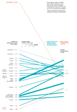
Notice that this is a very interesting example, as we are not comparing two different points in time, but two different metrics. On the left, we have the health care spending per person, on the right, the average life expectancy. The coloring draws our attention to the US and Mexico, two countries without universal health coverage. But the US is clearly an outlier: a very high health care spending which does not really reflect in the (below-average) life expectancy.
Some final things to remark about this very fine example, before we move on:
- Notice how the average of the health care spending (on the left side) is perfectly aligned with the average life expectancy (on the right side), shown with a dashed horizontal line. Clever!
- There is a third metric introduced into the chart by modifying the line thickness. The thicker the line, the more often people in these countries visit their doctor. Very clever again, although unfortunately it also counters some of the coloring effect: in countries without universal health coverage (in orange), people will visit their doctors much less frequently, resulting in very thin slopegraph lines.
Final slopegraph thoughts
Nothing is absolute when it comes to slopegraphs. In fact, we have already seen that the comparison can be between completely different metrics, such as in the National Geographic example above. And that you can introduce additional information by playing around with colors or line thickness.
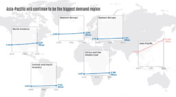
Finally I would like to show that, even when we’re talking about comparing dates, you don’t have to stick to just two points in time. This is a graphic I created showing the evolution of a certain market in different regions between 2009 and 2019, but with an intermediate value given for 2014:
Also here, rather, than showing all the lines in a single slopegraph, I opted to separate them in a kind of small multiples approach. This allows me to arrange the charts spatially on top of a world map, and it makes even more clear how much of an outlier the Asia-Pacific region is for this data. As you can see, nothing is set in stone. Slopegraphs are so easy to create that you can easily play around with them, find what works best for your data and message, or even invent completely new approaches!
Got any more great examples of slopegraphs? Make sure to share them with me at koen@baryon.be !
Or maybe we can help you make a slopegraph?
Read more:
Vreemde plaatsnamen in Vlaanderen
Iedereen kent wellicht 'Kontich' en 'Reet', maar in Vlaanderen hebben we nog veel meer merkwaardige, onverwachte, en vaak grappige plaatsnamen. Heb je bijvoorbeeld ooit al gehoord van Buitenland, Dikkebus, of Grote Homo?
Small multiples can save your chart
When you're dealing with a chart that has too much information on it, the most straightforward advice to follow is: break it down into multiple charts, each with less information on them. A powerful example of this is a so-called small multiple approach.
Data visualization podcasts 2023
At Baryon, we’re huge fans of podcasts! Data visualization podcasts are a great way to stay up to date on the latest trends and techniques in data visualization.
Can you use Excel to create a powerful chart?
Spreadsheet tools such as Microsoft Excel or Numbers might not be the first thing on your mind when considering data visualization tools, but they can be pretty solid choices to build data visuals. Don’t let anyone convince you that using Excel to create data visuals is unprofessional.
Choosing the right font for your data visual
Fonts evoke emotions: there are very sophisticated fonts, playful fonts, attention-grabbing fonts, and elegant handwritten fonts. Using the wrong type of font can have a lot of impact. In data visualization the implications of typography are mainly focused on readability. Labels and annotations can easily become so small they get hard to read. Above all else, we should choose a font which is readable at small sizes.
Three roles of colour in a data visual
Colour is one of the most crucial tools we have to turn a normal chart into a powerful chart with a clear message, a chart which tells a story rather than simply presenting the information.
We are really into visual communication!
Every now and then we send out a newsletter with latest work, handpicked inspirational infographics, must-read blog posts, upcoming dates for workshops and presentations, and links to useful tools and tips. Leave your email address here and we’ll add you to our mailing list of awesome people!

Data visualization in a time of pandemic - #6: Viral scrollytelling
Data visualization in a time of pandemic - #6: Viral scrollytelling
This is a multi-chapter post! Read the other chapters here:
- Chapter 1: Finding reliable data
- Chapter 2: Visualizing exponential growth
- Chapter 3: Mapping the virus
- Chapter 4: We need to talk about flattening the curve
- Chapter 5: On top of the outbreak with daunting dashboards
- Chapter 6: Viral scrollytelling

Chapter 6: Viral scrollytelling
In this final chapter, we’ll dive deeper into some of the insightful stories which have been published about the novel coronavirus and the COVID-19 pandemic. Rather than looking at single charts, we’ll highlight some long-form stories about the origin of the virus, how it works, and how it spread.
Two concepts should be explained beforehand: visual storytelling, and scrollytelling. Lorenzo Amabili explains both of them very well in his Nightingale article ‘From Storytelling To Scrollytelling: A Short Introduction and Beyond‘ (unfortunately a premium article):
- Visual storytelling, also called narrative visualisation, consists of creating a logical sequence of related (data-driven) visualisations, or visual elements, needed to convey a message to an audience in an engaging and effective way.
In other words, different visuals are strung together to form a logical story, which will keep readers more engaged and increase their understanding. It also allows you to discuss more complex topics by breaking them down into multiple easily understood visuals. These visuals will often be data-driven, but they can also be illustrations, videos, maps,… the possibilities are virtually endless!

- Scrollytelling is visual storytelling for the web: a powerful technique based on a simple concept: new content and visuals appear or change through transitions as users scroll down or up the web page.
This way of presenting information keeps the reader actively engaged with the content and the story. Furthermore, people can easily control the pace by scrolling up and down, back and forth through the story if they choose to re-read difficult sections or skip certain less interesting parts.
I must admit, I absolutely LOVE ❤ scrollytelling, and particularly well-executed examples are appearing more and more regularly in journalism. These advances are fueled by more innovative newsrooms such as the New York Times or the Washington Post, but quickly spreading throughout the world. For example, in Belgium, De Tijd regularly brings engaging scrollytelling stories by the team of Thomas Roelens and, before that, Maarten Lambrechts.
The remainder of this text is dedicated to some remarkable and marvelous examples of visual storytelling and scrollytelling about the coronavirus pandemic. This is absolutely not intended to be an exhaustive list, but rather a collection of interesting examples I encountered during my background research for these blog posts.
Anatomy of a killer
In March, The Economist published ‘Understanding SARS-CoV-2 and the drugs that might lessen its power‘, an in-depth story about the science behind the virus: how is SARS-CoV-2 built, how does it work and replicate itself, what does its genetic sequence look like, and which drugs might have a serious shot at eliminating it. A pretty hardcore scientific explanation, but made easily digestible thanks to some very clear and beautiful illustrations, such as this one by infographer Manuel Bortoletti:

Flattening the curve, revisited
Several scrollytelling articles have been created to explain the reasoning behind the epidemiological curve, how we can flatten it, and differences between different countries’ strategies to do so.
- ‘What Happens Next?‘ by epidemiologist Marcel Salathé and coder/designer Nicky Case explains the curve, SIR and SEIR models using playable simulations.
- ‘What we can learn from the countries winning the coronavirus fight‘ by ABC News uses scrollytelling to explain in detail what exponential growth is, how logarithmic charts work, and what flattening the curve really means.
- At this point, it might be useful to bring up again the infamous Washington Post article ‘Why outbreaks like coronavirus spread exponentially, and how to “flatten the curve”‘ by Harry Stevens, which we discussed in chapter 4, and is a great example of visual storytelling in itself.
- Another Washington Post article worth mentioning, on a similar note, is ‘How epidemics like covid-19 end (and how to end them faster)‘, also showing the effectiveness of wearing facemasks, or enforcing quarantaine.
Detail from ‘How epidemics like covid-19 end (and how to end them faster)’ (Washington Post)
- Or, if you prefer the Spanish version, ‘Cómo el confinamiento frena la cadena de contagios‘ by El País.
How the virus got out
‘How the Virus Got Out‘ by the New York Times uses mesmerizing animations and crystal-clear maps to show how the virus spread from Wuhan, through long-distance train and air travel, to other parts of China and other countries throughout the world. They end with Donald Trump’s quote ‘The virus will not have a chance against us’ on March 11, placed next to a visual showing how by then, the virus already had a secure foothold in the US, with just over 1000 cases.
Detail from ‘How the Virus Got Out’ (New York Times)
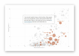
This detailed look at how the virus spreads is taken one step further by Reuters Graphics in ‘The Korean Clusters‘. Thanks to insanely accurate contact tracing data being gathered in South Korea, the authorities were able to identify each individual case and how they infected each other. During the first four weeks, the disease was relatively contained, but then ‘patient 31’ emerged, who had at least 1160 traced contacts and went to crowded places such as churches and a hotel buffet while being infected. This is by far one of the most captivating visual stories I have encountered over the past few months!
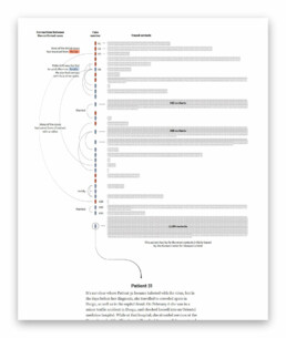
Detail from ‘The Korean Clusters’ (Reuters Graphics), an amazing piece of visual storytelling.
How bad will it get?
It is worth mentioning two stories detailing how the virus can spread, in particular in public transport or between people passing by each other outside:
- South China Morning Post describes a situation where a sick traveler on a four-hour bus journey (feeling sick but not wearing a mask) infected 9 other passengers – complete with detailed seating plans of the bus in question.
- The New York Times describes 6 key factors determining how bad the epidemic will get, including how contagious and deadly the virus is, and how long it will take before a treatment or vaccine is developed. They also indicate how far the virus can typically travel in a public transport environment.
Detail from ‘How Bad Will the Coronavirus Outbreak Get?’ (New York Times)
Remembering lives lost
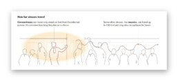
In the end, it’s all about people. In his article ‘The Workers Who Face the Greatest Coronavirus Risk‘ for the New York Times, Lazaro Gamio uses scrollytelling to guide readers through a stunning scatterplot, showing which professions are most at risk during the pandemic, either because they come in close contact with others (such as hairdressers), or because they have a high exposure to diseases (such as garbage collectors or healthcare workers). The article ends with an interactive version of the graph, enabling readers to explore the data themselves.
Detail from ‘The Workers Who Face the Greatest Coronavirus Risk’ (New York Times). Did I already mention that I ❤ scrollytelling stories like this?
Let’s end this exploration into pandemic data visualization with one of the most heartbreaking visual stories, published by the New York Times on May 24, 2020. ‘An Incalculable Loss‘ visually shows the 100 000 lives lost to COVID-19 in the US up to that point. 100 000 figures, many of them with additional information making it all the more real. “Marion Krueger, 85, Kirkland, Washington. Great-grandmother with an easy laugh.” Or “Torrin Jamal Howard, 26, Waterbury, Connecticut. Gentle giant, athlete and musician.”

100 000 times.
Cherish the people you love and the present moment, as scary as it is. It is all we have for certain.
– Daily Stoic
Stay safe, everyone. ❤
This is a multi-chapter blog post!
Continue reading:
- Chapter 1: Finding reliable data
- Chapter 2: Visualizing exponential growth
- Chapter 3: Mapping the virus
- Chapter 4: We need to talk about flattening the curve
- Chapter 5: On top of the outbreak with daunting dashboards
- Chapter 6: Viral scrollytelling
For all your comments, suggestions, errors, links and additional information, you can contact me at koen@baryon.be or via Twitter at @koen_vde.
Disclaimer: I am not a medical doctor or a virologist. I am a physicist running my own business (Baryon) focused on information design.
Read more:
Vreemde plaatsnamen in Vlaanderen
Iedereen kent wellicht 'Kontich' en 'Reet', maar in Vlaanderen hebben we nog veel meer merkwaardige, onverwachte, en vaak grappige plaatsnamen. Heb je bijvoorbeeld ooit al gehoord van Buitenland, Dikkebus, of Grote Homo?
Small multiples can save your chart
When you're dealing with a chart that has too much information on it, the most straightforward advice to follow is: break it down into multiple charts, each with less information on them. A powerful example of this is a so-called small multiple approach.
Data visualization podcasts 2023
At Baryon, we’re huge fans of podcasts! Data visualization podcasts are a great way to stay up to date on the latest trends and techniques in data visualization.
Can you use Excel to create a powerful chart?
Spreadsheet tools such as Microsoft Excel or Numbers might not be the first thing on your mind when considering data visualization tools, but they can be pretty solid choices to build data visuals. Don’t let anyone convince you that using Excel to create data visuals is unprofessional.
Choosing the right font for your data visual
Fonts evoke emotions: there are very sophisticated fonts, playful fonts, attention-grabbing fonts, and elegant handwritten fonts. Using the wrong type of font can have a lot of impact. In data visualization the implications of typography are mainly focused on readability. Labels and annotations can easily become so small they get hard to read. Above all else, we should choose a font which is readable at small sizes.
Three roles of colour in a data visual
Colour is one of the most crucial tools we have to turn a normal chart into a powerful chart with a clear message, a chart which tells a story rather than simply presenting the information.
We are really into visual communication!
Every now and then we send out a newsletter with latest work, handpicked inspirational infographics, must-read blog posts, upcoming dates for workshops and presentations, and links to useful tools and tips. Leave your email address here and we’ll add you to our mailing list of awesome people!

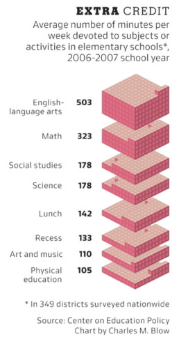
Five steps towards improving your dashboard
Five steps towards improving your dashboard
Do you know the feeling? You spent days, weeks, maybe months to build the perfect dashboard for your clients. But when you share it, the results are underwhelming. Your users say they appreciate the dashboard, but you notice that they are not using it often, or not to its full capacity. They sometimes have a hard time finding what they are looking for. Or maybe something just feels not optimal and you want to improve your dashboard, but you can’t put your finger on what exactly is wrong.
Today I would like to share with you the five steps I usually follow when I analyze and improve dashboards. If you are planning to analyze and improve your own dashboard, or maybe the dashboard someone else created and you want to provide feedback on, I advise you to follow these five steps as well.

Step 1: Getting familiar
First of all, I like to dive right into the dashboard without any prior knowledge. Of course, we will unavoidably already know a little bit: who created the dashboard and what general area it is in, such as marketing, business intelligence, product performance, et cetera.
But in this phase I prefer not to worry about the end users and what they might be looking for when using the dashboard. I just fiddle around, visit every page, push every button, in short I try to mess up as much as possible. I will explore hover messages and have a look at how the dashboard behaves on different screens or in different browsers. I will judge if the right type of graph is shown to display specific data, and if tables are formatted in an optimal way. I will probably take a closer look at the source code to find out where the data is coming from and which technologies are being used, whether it is Tableau, Microsoft Power BI, Google Data Studio, one of the other dozens of solutions out there, or maybe something custom created with React and different JavaScript charting libraries.
In this initial phase it is important to write down everything you notice, either good or bad. In short, we will start to get a feel for how the dashboard is structured, what works and what doesn’t work.
Step 2: Discuss use cases
The second step is possibly the most important one. Together with the person or team who built the dashboard, I will discuss who it is designed for and what purpose it is serving. This involves talking about different user personas, user flows, and use cases.
In this second step, rather than immediately sharing first opinions about the dashboards, it is important to ask as many questions as possible. Who is the typical user of your dashboard? Is it a C-level executive who needs to take an important strategic decision, or is it maybe someone at the production line of a factory who needs to check the status of a specific machine? What information are they looking for? What decision are they trying to make, based on the information they can see on the dashboard? Are they under pressure to quickly find exactly what they are looking for, or do they have plenty of time to explore the information which is available?
All of these questions are crucial to be able to move on to the third step: our deep dive.

Step 3: Deep dive
In the deep dive, we put ourselves in the position of the end user. For example, imagine we are the marketing manager at a fashion company, and we want to use this specific dashboard to assess how effective our online marketing campaigns are. Or, another use case, we are a plant manager trying to figure out why a specific production line is not operating at full efficiency. Or maybe we are a CEO looking at some financial figures, worrying if our company will make a profit at the end of the month.
This allows us to basically repeat the first step, closely inspecting every chart, every button and every number on the dashboards. But now, our analysis is much more focused, because we know what our user will typically be looking for.
We can answer the following questions in this phase: how much time or how many clicks does it take for a user the find the key information needed to take a decision? Does the dashboard show only the information which is needed, or does it also show a lot of needless clutter? Are the colors guiding the user’s attention in the right direction? Will the user easily understand everything what’s on the screen, or does he need a lot of prior knowledge?
In step 3, we can get back to the list of good and bad things we started in the first step, and add all this additional information. This typically leads to a list of pages and pages filled with ideas to improve your dashboard. In the next step, we will turn this list of remarks into something actionable.
Step 4: Action plan
Step 4 is all about bringing some structure to our long list of bullet points. Personally, I like to group my remarks into three different categories.
- Category 1: Goal misalignment – when the information on the dashboard does not serve the end user’s goal,
- Category 2: Too much noise – when there’s too much clutter or useless information on the dashboard, and
- Category 3: Death by a thousand papercuts – when a large amount of very minor design details, which at first sight don’t seem important, make the dashboard look sloppy and unattractive.
I will go into more depth into these three categories in a later blog post, so no worries. If you want to be notified when it’s available, make sure to leave your email address at the bottom of this page!
A second way to order the possible improvements is by difficulty level. On one hand, you will have the low-hanging fruit, the quick wins to rapidly improve the effectiveness of your dashboard with only a little effort. For example, changing the chart type from a pie chart to a more easily readable bar chart, improving font sizes, or moving some blocks to create a better visual hierarchy.
On the other hand, there will be improvements which are a lot more difficult – generally depending on the specific tools used to build the dashboard. For example, improving the grid lines or the axis labels in a chart typically requires writing some custom JavaScript code and finding a way to plug it into your dashboard software. You will want to evaluate if these harder modifications are worth the effort.
A third and final way to turn my list of remarks into an action plan is by creating some mock-ups for my clients. In these mock-ups, I show how an improved version of the dashboard could look like and compare it with the current version. This immediately shows visually how just a few – often minor – modifications can drastically improve the readibility and effectiveness of your dashboard.

Step 5: Co-creation
And then it’s time for the final step! To really turn my improvement suggestions into actions, I prefer to sit down with the team behind the dashboard and go through the report together. This gives me the opportunity to explain and discuss each of the different points on the list. We can then immediately apply some quick wins and see first-hand how it improves the look and feel of the dashboard. Of course, as our list of potential improvements is usually rather long, this co-creation session can take multiple hours, so make sure to bring some coffee to make it to the end ;). But this time investment will directly translate into a much more efficient dashboard, and a lot of insights on how to structure future iterations and improvements.
So, this is my 5-step approach I tend to follow when clients ask me to analyze their dashboards and make them more effective. I hope this will help you as well to make your dashboards more valuable. Make sure to let me know if you found this post useful, I would love to hear your ideas about dashboard improvement!
And oh, if you think we can help you to improve your dashboard, you know where to find us!
Read more:
Vreemde plaatsnamen in Vlaanderen
Iedereen kent wellicht 'Kontich' en 'Reet', maar in Vlaanderen hebben we nog veel meer merkwaardige, onverwachte, en vaak grappige plaatsnamen. Heb je bijvoorbeeld ooit al gehoord van Buitenland, Dikkebus, of Grote Homo?
Small multiples can save your chart
When you're dealing with a chart that has too much information on it, the most straightforward advice to follow is: break it down into multiple charts, each with less information on them. A powerful example of this is a so-called small multiple approach.
Data visualization podcasts 2023
At Baryon, we’re huge fans of podcasts! Data visualization podcasts are a great way to stay up to date on the latest trends and techniques in data visualization.
Can you use Excel to create a powerful chart?
Spreadsheet tools such as Microsoft Excel or Numbers might not be the first thing on your mind when considering data visualization tools, but they can be pretty solid choices to build data visuals. Don’t let anyone convince you that using Excel to create data visuals is unprofessional.
Choosing the right font for your data visual
Fonts evoke emotions: there are very sophisticated fonts, playful fonts, attention-grabbing fonts, and elegant handwritten fonts. Using the wrong type of font can have a lot of impact. In data visualization the implications of typography are mainly focused on readability. Labels and annotations can easily become so small they get hard to read. Above all else, we should choose a font which is readable at small sizes.
Three roles of colour in a data visual
Colour is one of the most crucial tools we have to turn a normal chart into a powerful chart with a clear message, a chart which tells a story rather than simply presenting the information.
We are really into visual communication!
Every now and then we send out a newsletter with latest work, handpicked inspirational infographics, must-read blog posts, upcoming dates for workshops and presentations, and links to useful tools and tips. Leave your email address here and we’ll add you to our mailing list of awesome people!

Dear Data: Dataviz book review
Dear Data: Dataviz book review
The book
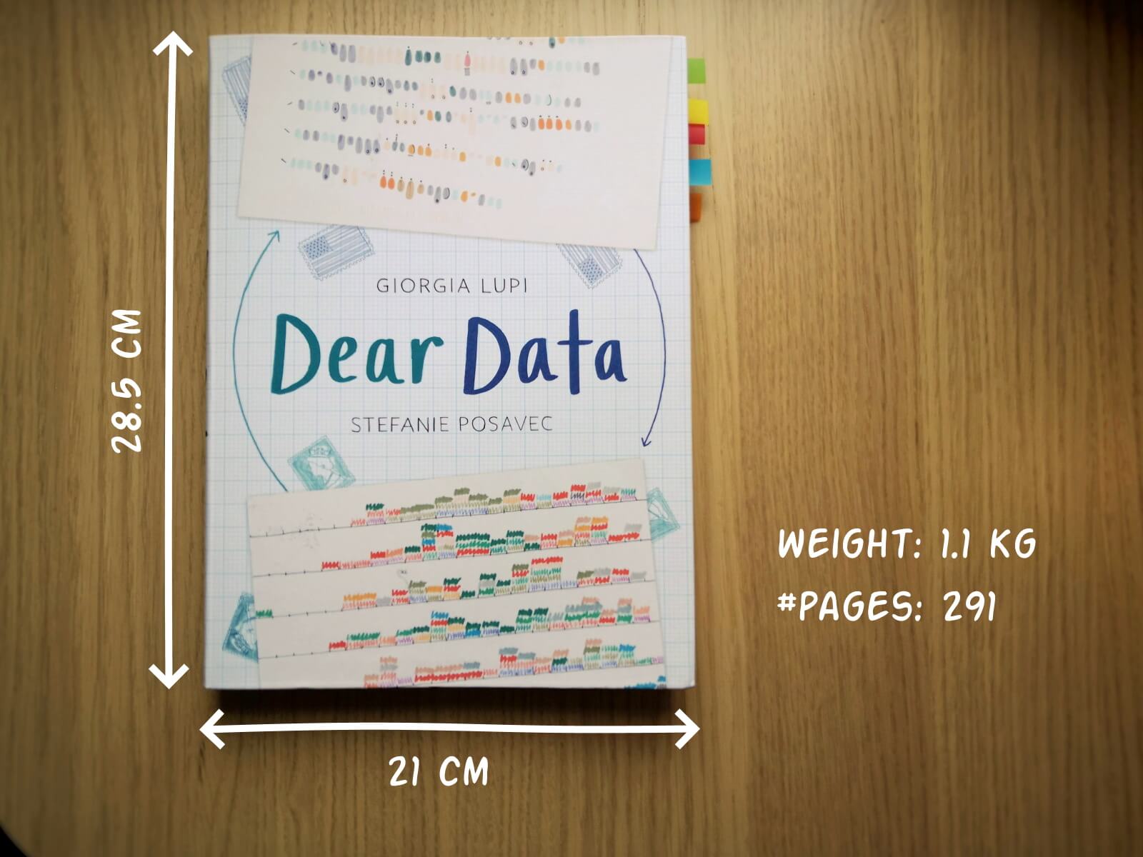
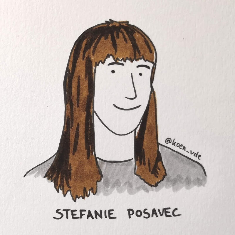
Last February, on a cold and rainy day, I received the Dear Data book as part of a Dataviz Drawing workshop by Stefanie Posavec. The workshop was hosted by Graphic Hunters in a beautiful space in central Amsterdam.
It is a pretty large and heavy book, containing nearly 300 pages on sturdy, qualitative paper. It is not the kind of book you would take with you into bed at night, but definitely one you could put on your coffee table to show off (which I did!). There are two alternative covers, one designed by Giorgia and one by Stefanie (this is the latter one).
In Dear Data, Giorgia and Stefanie document their project of sending each other hand-drawn postcards, every week, over the course of an entire year (2014-15). Each week, they would decide on a topic on which they would gather personal data – ranging from the contents of their wardrobes, over the sounds they heared, to the emotions and desires they experienced that week.
At the end of the week, they both sat down with their data, drew it onto a postcard, wrote a detailed legend on how to interpret it, and sent it to each other (Stefanie lives in London, and Giorgia in New York).
This book is a summary of their one-year project, with high-quality images of each of the postcards, additional details about the (practical and thought) process behind it, and tips to create your own personal data drawings.
Oh yes, the project also has its own dedicated webpage.
The authors
Giorgia Lupi and Stefanie Posavec are two well-known names in data visualization, but their Dear Data project truly made them world-famous.
Giorgia Lupi (°1981), originally from Italy, founded the design firm Accurat in 2011. They worked for an impressive list of clients including Google, IBM, Starbucks, and the United Nations. She introduced the concept of Data Humanism. In short, we should not simply focus on numbers, technologies and algorithms, but on the underlying things they represent: people, stories and ideas. She has won several awards, including multiple Information is Beautiful Awards Gold Medals, and in 2019 she joined design firm Pentagram as a partner.

Stefanie Posavec (°1981) was born in Colorado (US) and later moved to London. In 2013 she was one of Facebook’s earliest Artists in Residence, creating the piece Relationship Dance Steps. She aims to make data accessible, memorable and impactful using highly original approaches. For example, she puts health data art on hospital walls as a form of interior design, or she creates jewellery from air pollution data.
In 2016, Dear Data was acquired by the Museum of Modern Art as a part of its permanent collection, so they are both official MoMA artists!
The verdict
⭐⭐⭐⭐
I absolutely love this crossover between a data visualization book and an art book. Definitely not something to read in one go, but a book to pick up from time to time to browse through the pages. I’m convinced it can be a great source of inspiration when you are stuck on a particular project and are looking for a novel, creative approach.
The differences between Giorgia’s more ‘technical’ and Stefanie’s more ‘artistic’ drawing is interesting, and throughout the project we see both evolving and experimenting in different directions. Personally I love unraveling Giorgia’s complicated legends and decyphering her complex diagrams, and I am amazed at how much information she can compress into a single small postcard. However, in certain weeks, the level of detail can become too complicated and cumbersome. Stefanie’s drawings are usually simpler to absorb, but this often leads to gorgeous patterns, designs or metaphors.

Despite being a collection of 104 hand-drawn postcards, it never gets boring. I especially appreciate how they manage to alternate between very light-hearted, practical topics (e.g. a week of drinks) and deeply emotional, personal topics (e.g. a week of negative thoughts).
The postcards are regulary interspersed with simple but adorable illustrations that make the book a bit easier to digest (too much data can be overwhelming!).
My personal favorites are:
- By Giorgia: a week of media and a week of urban wildlife (so many parameters!)
- By Stefanie: a week of indecision and a week of distractions (so simple, so strong!)
Applying the knowledge
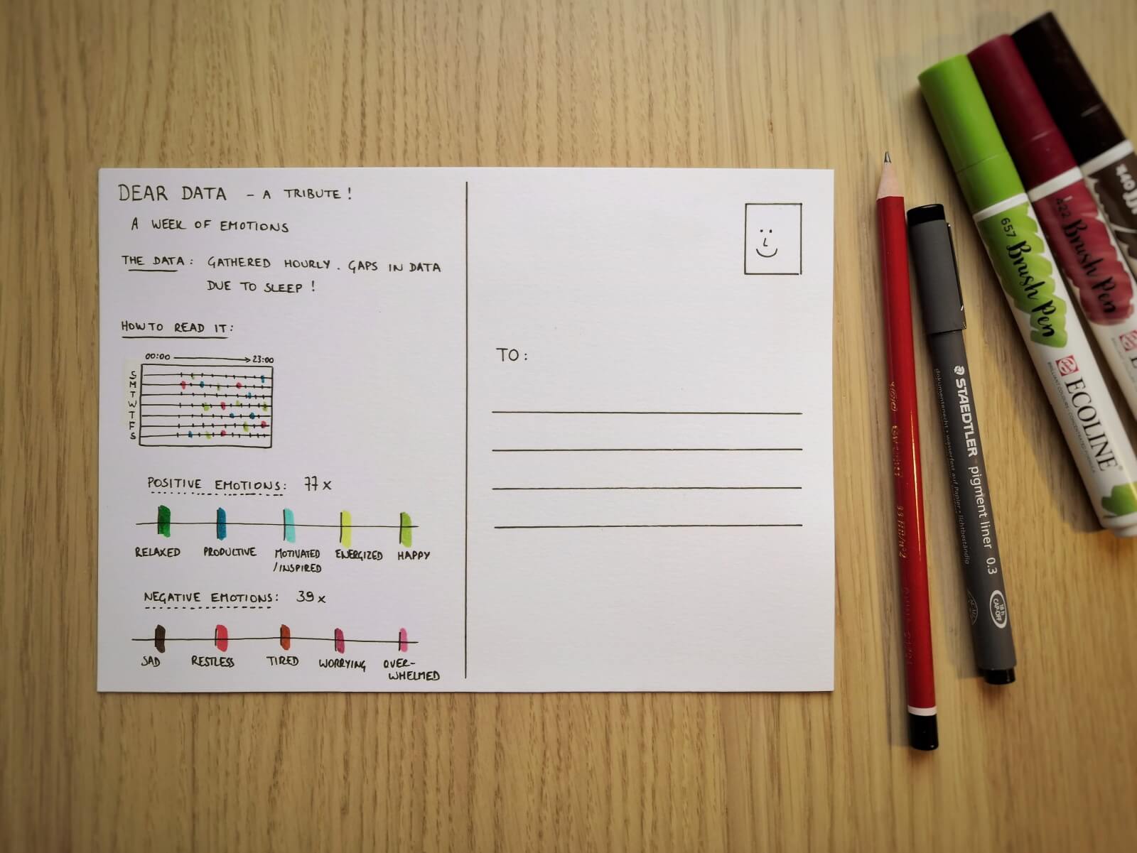
Some of these stunning postcards are really inspiring to draw for myself. So I went ahead and collected some data. I chose to recreate Stefanie’s design for week eleven: a week of emotions.
Every hour during the past week, I have written down the main emotion I was experiencing at that moment. As we are in the midst of crazy pandemic times, you will notice some of my emotions are a bit, well, all over the place. 😬
So without further ado, here is the final result!

If you are also inspired, go ahead and start drawing your own data! And feel free to share it with me, or with the rest of the world! Looking forward to seeing what you are up to 😊
And of course, if you have some data visualization challenges you think we could help you with, let me know as well – we are always happy to assist!
More dataviz book reviews? We have already covered:
- Dear Data
- Storytelling with Data
- Visualizing Complexity
Read more:
Vreemde plaatsnamen in Vlaanderen
Iedereen kent wellicht 'Kontich' en 'Reet', maar in Vlaanderen hebben we nog veel meer merkwaardige, onverwachte, en vaak grappige plaatsnamen. Heb je bijvoorbeeld ooit al gehoord van Buitenland, Dikkebus, of Grote Homo?
Small multiples can save your chart
When you're dealing with a chart that has too much information on it, the most straightforward advice to follow is: break it down into multiple charts, each with less information on them. A powerful example of this is a so-called small multiple approach.
Data visualization podcasts 2023
At Baryon, we’re huge fans of podcasts! Data visualization podcasts are a great way to stay up to date on the latest trends and techniques in data visualization.
Can you use Excel to create a powerful chart?
Spreadsheet tools such as Microsoft Excel or Numbers might not be the first thing on your mind when considering data visualization tools, but they can be pretty solid choices to build data visuals. Don’t let anyone convince you that using Excel to create data visuals is unprofessional.
Choosing the right font for your data visual
Fonts evoke emotions: there are very sophisticated fonts, playful fonts, attention-grabbing fonts, and elegant handwritten fonts. Using the wrong type of font can have a lot of impact. In data visualization the implications of typography are mainly focused on readability. Labels and annotations can easily become so small they get hard to read. Above all else, we should choose a font which is readable at small sizes.
Three roles of colour in a data visual
Colour is one of the most crucial tools we have to turn a normal chart into a powerful chart with a clear message, a chart which tells a story rather than simply presenting the information.
We are really into visual communication!
Every now and then we send out a newsletter with latest work, handpicked inspirational infographics, must-read blog posts, upcoming dates for workshops and presentations, and links to useful tools and tips. Leave your email address here and we’ll add you to our mailing list of awesome people!
Data visualization tools: Datawrapper
Data visualization tools: Datawrapper
Let’s not beat around the bush in this blog post. If you are writing articles online and need to quickly insert beautiful, interactive charts, maps or tables, Datawrapper is the tool you are looking for.
The Datawrapper team, based in Berlin, built an amazing product suitable for everyone who wants to tell stories using data. The free tier is very generous – unlimited visuals, live-updating charts, easy embedding, responsivity… The professional solution is expensive but mainly aims at newsrooms and journalists, removing the Datawrapper attribution and allowing to create print-ready graphics.
No coding skills are required, you can simply copy and paste your data, upload CSV files, or link to a URL or Google Sheet which allows live-updating charts. Obviously, you are limited to a certain set of possible chart types and designs, but the talented design team (led by Lisa Charlotte Rost) has ensured that all the available options and color schemes are well-crafted and elegantly designed.
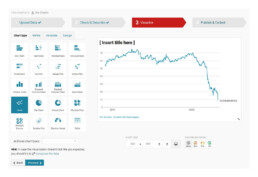
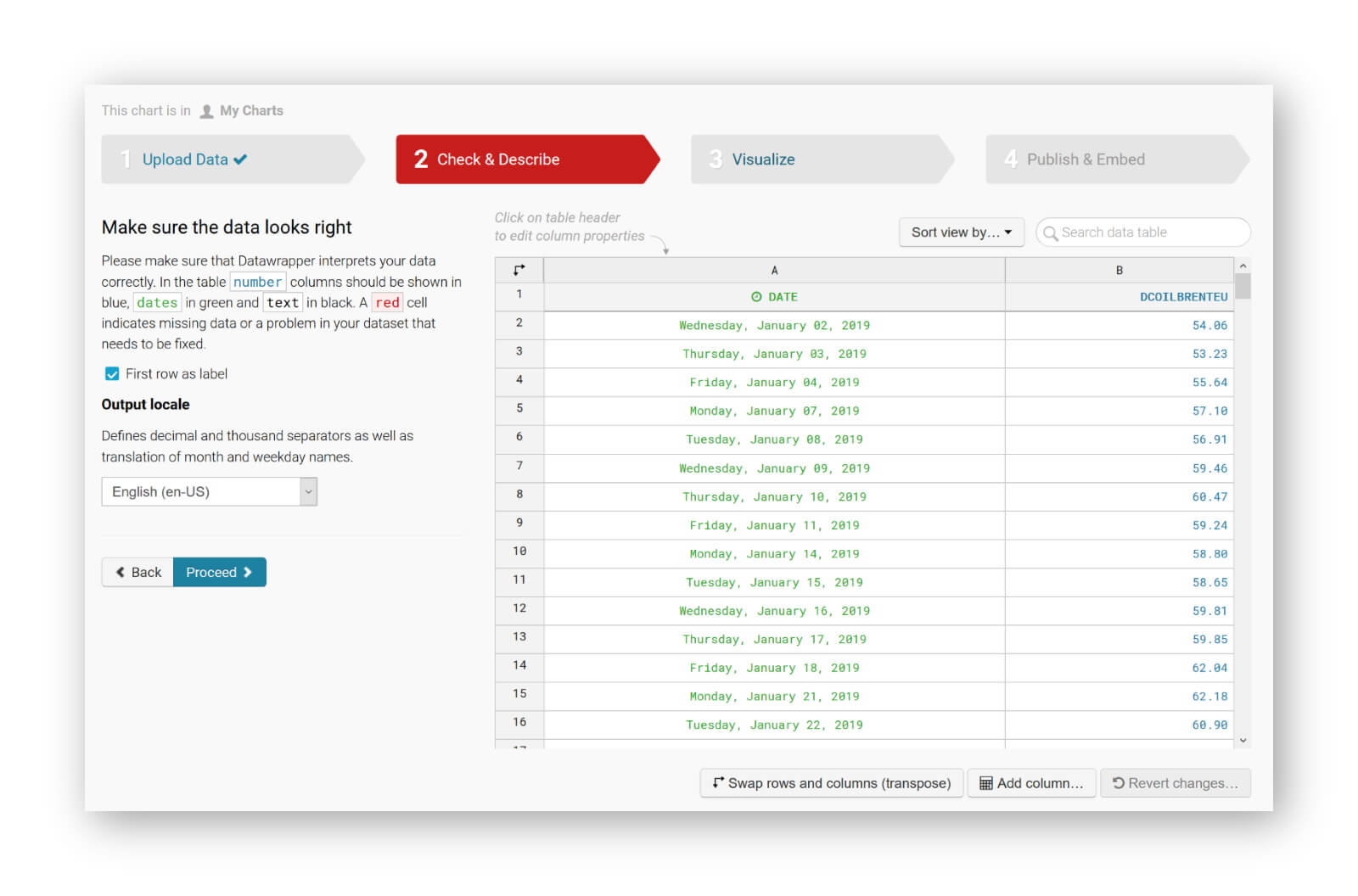
You can find plenty of examples at the Datawrapper website, but of course a blog post about this tool would not be complete without an embedded example. So let’s try to create our own chart of, let’s say, the evolution of the price of Brent Crude Oil since January 2019. Uploading the data, as a CSV file, works very smoothly. Datawrapper automatically recognizes the type of data in each column, and support for different localizations is provided out of the box:
The tool is sufficiently intelligent to suggest the best chart type, and makes some pretty good default decisions regarding axes and grid lines (taking into account Tufte’s guidelines to maximixe data-ink ratio):
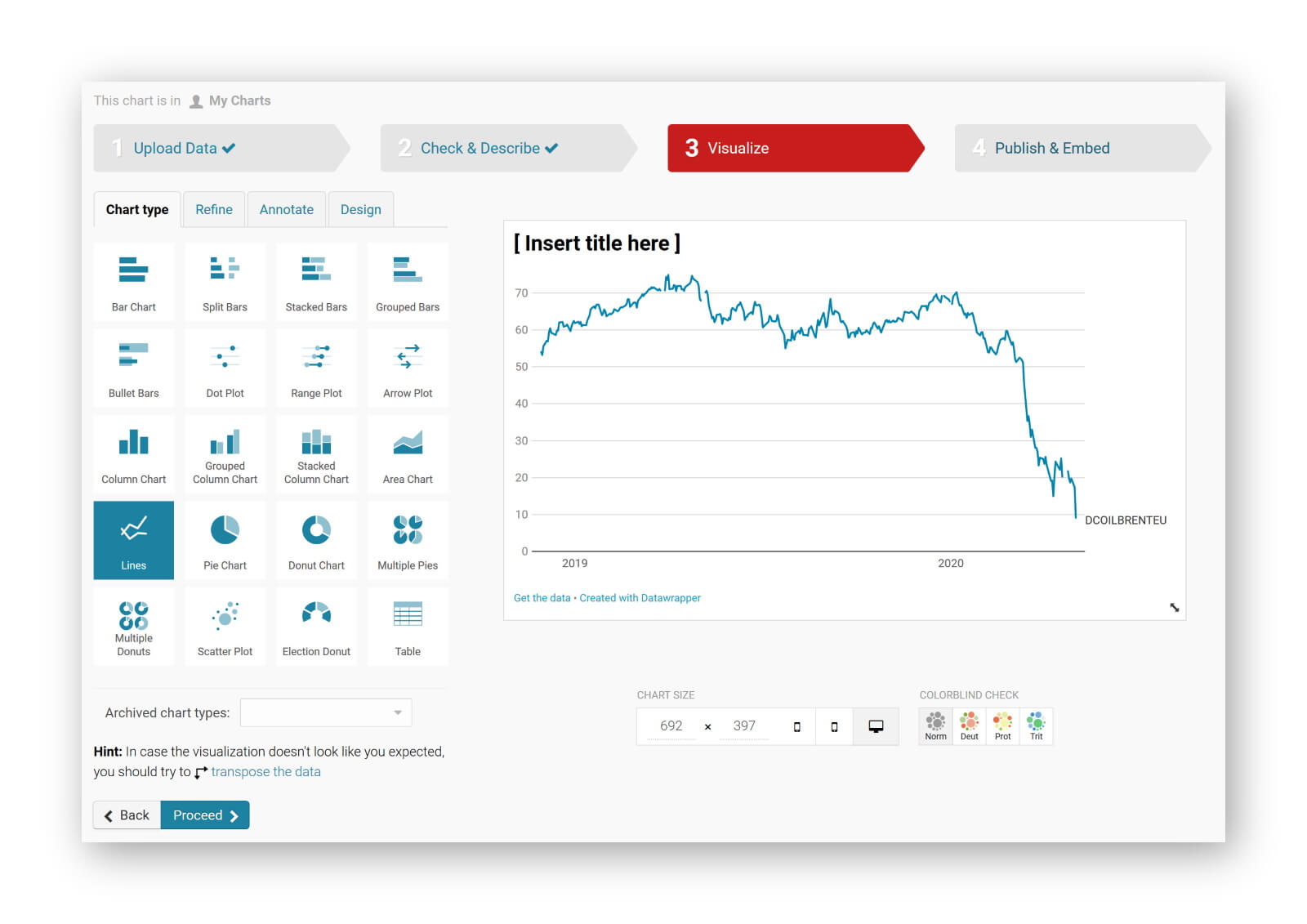
The next steps allow you to quickly finetune any other parameters you would like to change: colours, axes, grid lines, linestyles, hover labels, title, description, source links,… The final result can be downloaded as a PNG image, shared as a link, or simply embedded in your blog post:
It’s magic, it’s simple, and it’s so much fun! Did I already mention I am a fan?
Read more:
Vreemde plaatsnamen in Vlaanderen
Iedereen kent wellicht 'Kontich' en 'Reet', maar in Vlaanderen hebben we nog veel meer merkwaardige, onverwachte, en vaak grappige plaatsnamen. Heb je bijvoorbeeld ooit al gehoord van Buitenland, Dikkebus, of Grote Homo?
Small multiples can save your chart
When you're dealing with a chart that has too much information on it, the most straightforward advice to follow is: break it down into multiple charts, each with less information on them. A powerful example of this is a so-called small multiple approach.
Data visualization podcasts 2023
At Baryon, we’re huge fans of podcasts! Data visualization podcasts are a great way to stay up to date on the latest trends and techniques in data visualization.
Can you use Excel to create a powerful chart?
Spreadsheet tools such as Microsoft Excel or Numbers might not be the first thing on your mind when considering data visualization tools, but they can be pretty solid choices to build data visuals. Don’t let anyone convince you that using Excel to create data visuals is unprofessional.
Choosing the right font for your data visual
Fonts evoke emotions: there are very sophisticated fonts, playful fonts, attention-grabbing fonts, and elegant handwritten fonts. Using the wrong type of font can have a lot of impact. In data visualization the implications of typography are mainly focused on readability. Labels and annotations can easily become so small they get hard to read. Above all else, we should choose a font which is readable at small sizes.
Three roles of colour in a data visual
Colour is one of the most crucial tools we have to turn a normal chart into a powerful chart with a clear message, a chart which tells a story rather than simply presenting the information.
We are really into visual communication!
Every now and then we send out a newsletter with latest work, handpicked inspirational infographics, must-read blog posts, upcoming dates for workshops and presentations, and links to useful tools and tips. Leave your email address here and we’ll add you to our mailing list of awesome people!
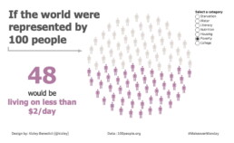
Uncommon chart types: Waffle charts
Uncommon chart types: Waffle charts
If you thought a pie chart was the only food-related chart type out there, think again! There is the donut chart – basically just a pie chart with a hole in the middle – but as a Belgian, I am particularly fond of what’s called a waffle chart. It’s a great alternative to a pie chart, and very easy to make. Oh dear, my stomach’s growling already!
What is a waffle chart?
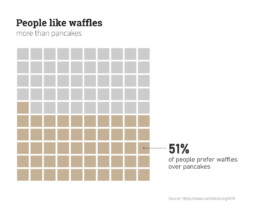
A waffle chart is basically a square display, usually consisting of 100 smaller squares arranged in a 10-by-10 layout. The squares are colored according to the proportions you are aiming to visualize, similarly to how you would color different slices of a pie chart. As this square layout somewhat resembles a delicious waffle, this immediately explains the name of the chart:
However, compared to a pie chart, a waffle chart is much easier to read – our brain is not well suited to compare different angles and slices, but we can quite easily compare different areas.
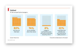
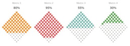
Alternative waffle charts
You will notice that many waffle charts are not made up of squares, but of alternative shapes, usually circles. Other shapes, such as small icons, are also possible – in this case we are approaching the realm of pictogram charts.
Another alternative are waffle charts consisting of more (or less) than 100 units, where the items represent actual numbers rather than fractions or percentages:
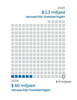
Here, each square represents $10 million, rather than 1%.
In the latter case, there are some similarities with charts we typically see after elections, showing the distribution of the different seats. One could argue that these kind of charts (‘Parliament charts’) are just a form of ‘warped’ waffle charts:
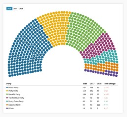
A Parliament Chart created using Flourish.
Some people prefer to turn their waffle charts by 45°, simply for design purposes, but well, some people are just weird:
Creating waffle charts
Making waffle charts is maybe a little bit tedious, but very simple! For example, you could create square cells in Excel, and color them using intelligent cell formatting to recreate the effect. If you google ‘waffle chart Excel‘ you will immediately get hundreds of blog posts and video tutorials describing the necessary steps.
Or you could take your favourite graphics software (such as Paint.NET, GIMP, or Inkscape), draw 100 identical shapes and color them according to your data.
And some people have managed to do it in Infogram, apparently.
More waffles than you'll ever need
To conclude, some wonderful things people have done with waffle charts, including this tile grid map of waffle charts about internet use in Africa:
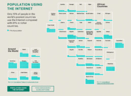
Apparently created by one.org, but I can’t find the exact source!
Oh, and a circular waffle chart is sometimes called a plum pudding chart, after J.J. Thomson’s plum pudding model for the atom, which is in turn named after a Christmas cake. The more you know!
Finally, if you would ever think about creating a 3D waffle chart… it’s not impossible, but let’s say it’s frowned upon. Maybe we should keep that 3rd dimension for real waffles only?
Read more:
Vreemde plaatsnamen in Vlaanderen
Iedereen kent wellicht 'Kontich' en 'Reet', maar in Vlaanderen hebben we nog veel meer merkwaardige, onverwachte, en vaak grappige plaatsnamen. Heb je bijvoorbeeld ooit al gehoord van Buitenland, Dikkebus, of Grote Homo?
Small multiples can save your chart
When you're dealing with a chart that has too much information on it, the most straightforward advice to follow is: break it down into multiple charts, each with less information on them. A powerful example of this is a so-called small multiple approach.
Data visualization podcasts 2023
At Baryon, we’re huge fans of podcasts! Data visualization podcasts are a great way to stay up to date on the latest trends and techniques in data visualization.
Can you use Excel to create a powerful chart?
Spreadsheet tools such as Microsoft Excel or Numbers might not be the first thing on your mind when considering data visualization tools, but they can be pretty solid choices to build data visuals. Don’t let anyone convince you that using Excel to create data visuals is unprofessional.
Choosing the right font for your data visual
Fonts evoke emotions: there are very sophisticated fonts, playful fonts, attention-grabbing fonts, and elegant handwritten fonts. Using the wrong type of font can have a lot of impact. In data visualization the implications of typography are mainly focused on readability. Labels and annotations can easily become so small they get hard to read. Above all else, we should choose a font which is readable at small sizes.
Three roles of colour in a data visual
Colour is one of the most crucial tools we have to turn a normal chart into a powerful chart with a clear message, a chart which tells a story rather than simply presenting the information.
We are really into visual communication!
Every now and then we send out a newsletter with latest work, handpicked inspirational infographics, must-read blog posts, upcoming dates for workshops and presentations, and links to useful tools and tips. Leave your email address here and we’ll add you to our mailing list of awesome people!
Data visualization in a time of pandemic - #5: On top of the outbreak with daunting dashboards
Data visualization in a time of pandemic - #5: On top of the outbreak with daunting dashboards
This is a multi-chapter post!
- Chapter 1: Finding reliable data
- Chapter 2: Visualizing exponential growth
- Chapter 3: Mapping the virus
- Chapter 4: We need to talk about flattening the curve
- Chapter 5: On top of the outbreak with daunting dashboards
- Chapter 6: Viral scrollytelling
Chapter 5: On top of the outbreak with daunting dashboards
There’s so much coronavirus data out there – and more is being generated every second. In order to keep the overview, or at least keep some of our sanity, many organizations and individuals have created dashboards. Rather than being a lengthy, descriptive overview, this chapter will point you to some of the best dashboards out there. For those who want to stay on top of things, even during these crazy times.
Dashboards by official organizations
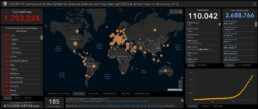
The WHO maintains a Situation Dashboard. This one was recently updated to a much brighter and cleaner design. Make sure to scroll down to see more than just the map! Especially the breakdowns by country are a great addition:
Country breakdowns for the number of cases on the WHO Situation Dashboard.
The WHO Regional Office for Europe also maintains a dashboard, albeit of somewhat dubious design quality. Nevertheless, it contains some interesting gauge graphs (created with Infogram) to illustrate how much the most affected countries contribute to the total number of cases in Europe:
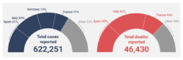
Gauge graphs indicating the contribution of the most affected countries to the total number of cases and deaths (Source: WHO Regional Office for Europe).
The European CDC (Centre for Disease Prevention and Control) has its own dashboard, although in my experience, it is rather difficult to navigate, with a complex layout, a few visual bugs and some counterintuitive (sideways) scrolling which makes it difficult to quickly find the numbers you are looking for.

Dashboards by experts
No, we are not talking about the many armchair virologists or epidemiologists popping up on social media or Medium. This is the real stuff: dashboards created by universities, groups of universities, or teams of experts.
Johns Hopkins University – of course, who else – has probably the most well-known dashboard on COVID-19, built in Ember.js. The focal point of this rather gloomy-colored dashboard is a bubble world map with different viewing options including confirmed cases, active cases, incidence rate and case-fatality ratio. The map is somewhat difficult to read for certain heavily affected regions, but can easily be zoomed in on:
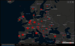
Cumulative confirmed cases in Europe as visualized on the JHU dashboard.
General overview of the JHU dashboard.
The Johns Hopkins dashboard also has a mobile-friendly version.
Other noteworthy expert dashboards include:
- University of Virginia COVID-19 Surveillance Dashboard
- The dashboard by Edward Parker and Quentin Leclerc at the London School of Hygiene & Tropical Medicine which, as a nice bonus, also allows you to visualize past outbreaks of SARS (2003), swine flu (2009) or Ebola (2014).
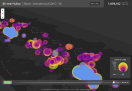
- The Novel Coronavirus HealthMap by the Open COVID-19 Data Curation Group, an initiative including many famous universities such as the University of Oxford and Harvard Medical School. With even a publication in The Lancet, this will be as expert-y as it gets! Basically a (somewhat difficult to read) bubble map, but with some weird navigation tools for you to play around with:
Article-like dashboards
As you probably know by now I’m a sucker for beautiful examples of data journalism. An overview of dashboards would not be complete without mentioning some excellent articles summarizing our information about the outbreak:
- Coronavirus Map: Tracking the Global Outbreak in the New York Times
- Mapping the worldwide spread of the coronavirus in the Washington Post
- Sorry for the patriotism, but I should mention the excellent visuals by the dataviz team at Belgian newspaper De Tijd.
- Coronavirus tracked: the latest figures as the pandemic spreads in the Financial Times. Here, I especially like the bold choice to visualize the spread using small multiples – I don’t usually like this approach, but here I must admit it works really well:
More small multiples! MOAR! (Source: Financial Times)
Other initiatives
And finally, some other noteworthy initiatives:
- The Coronavirus Dashboard by Avi Schiffmann and Jensen. Currently at the top of the Google results if you’re looking for coronavirus dashboards, well done!
- Vinícius Henrique Neves created a dashboard in Microsoft Power BI.
- Bing created their own dashboard, which adds some relevant news items and videos to the mix, as well as some interesting treemaps and strip charts:
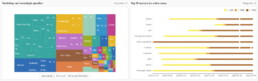
Treemap and strip chart on the Bing COVID-19 dashboard.
This is a multi-chapter blog post!
Continue reading:
- Chapter 1: Finding reliable data
- Chapter 2: Visualizing exponential growth
- Chapter 3: Mapping the virus
- Chapter 4: We need to talk about flattening the curve
- Chapter 5: On top of the outbreak with daunting dashboards
- Chapter 6: Viral scrollytelling
For all your comments, suggestions, errors, links and additional information, you can contact me at koen@baryon.be or via Twitter at @koen_vde.
Disclaimer: I am not a medical doctor or a virologist. I am a physicist running my own business (Baryon) focused on information design.
Read more:
Vreemde plaatsnamen in Vlaanderen
Iedereen kent wellicht 'Kontich' en 'Reet', maar in Vlaanderen hebben we nog veel meer merkwaardige, onverwachte, en vaak grappige plaatsnamen. Heb je bijvoorbeeld ooit al gehoord van Buitenland, Dikkebus, of Grote Homo?
Small multiples can save your chart
When you're dealing with a chart that has too much information on it, the most straightforward advice to follow is: break it down into multiple charts, each with less information on them. A powerful example of this is a so-called small multiple approach.
Data visualization podcasts 2023
At Baryon, we’re huge fans of podcasts! Data visualization podcasts are a great way to stay up to date on the latest trends and techniques in data visualization.
Can you use Excel to create a powerful chart?
Spreadsheet tools such as Microsoft Excel or Numbers might not be the first thing on your mind when considering data visualization tools, but they can be pretty solid choices to build data visuals. Don’t let anyone convince you that using Excel to create data visuals is unprofessional.
Choosing the right font for your data visual
Fonts evoke emotions: there are very sophisticated fonts, playful fonts, attention-grabbing fonts, and elegant handwritten fonts. Using the wrong type of font can have a lot of impact. In data visualization the implications of typography are mainly focused on readability. Labels and annotations can easily become so small they get hard to read. Above all else, we should choose a font which is readable at small sizes.
Three roles of colour in a data visual
Colour is one of the most crucial tools we have to turn a normal chart into a powerful chart with a clear message, a chart which tells a story rather than simply presenting the information.
We are really into visual communication!
Every now and then we send out a newsletter with latest work, handpicked inspirational infographics, must-read blog posts, upcoming dates for workshops and presentations, and links to useful tools and tips. Leave your email address here and we’ll add you to our mailing list of awesome people!
Data visualization in a time of pandemic - #4: We need to talk about flattening the curve
Data visualization in a time of pandemic - #4: We need to talk about flattening the curve
This is a multi-chapter post!
- Chapter 1: Finding reliable data
- Chapter 2: Visualizing exponential growth
- Chapter 3: Mapping the virus
- Chapter 4: We need to talk about flattening the curve
- Chapter 5: On top of the outbreak with daunting dashboards
- Chapter 6: Viral scrollytelling
Chapter 4: We need to talk about flattening the curve
Data visualizations rarely become hugely popular among the general public. But recently, a visual appeared which quickly spread on social media, in newspapers and magazines, and even in press conferences and on television. Hundreds of millions have probably seen it by now. Yes, the Flattening the Curve visual is truly a remarkable success story in the dataviz world. So let’s dive into it!
What curve are we flattening?
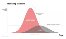
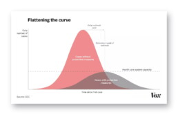
Let’s start by looking at a prime example of a ‘flatten the curve’ visual, the one in the COVID-19 #Coronavirus Data Pack at Information is Beautiful, as it combines a simple and clean curve design with a lot of additional information:
Flattening the curve visual from the Information is Beautiful COVID-19 #Coronavirus Data Pack.
We are looking at how the expected number of daily infections will evolve over time since the date of the first case. As described in chapter 2, the shape of these curves is expected to be more or less Gaussian in nature, with an exponential growth phase at the start of the outbreak and reaching a peak at a certain point in time, typically several weeks since the date of the first case. The crux of the graph is the dotted line – the capacity of our healthcare system. There is only a certain number of patients we can treat simultaneously in an effective way, be it due to a lack of equipment (intensive care beds, ventilators,…) or a lack of personnel.
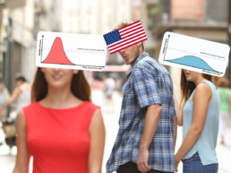
The color choice is very smart here. Orange is related to the curve we want to avoid: an outbreak without protective measures being taken. In this case the number of daily infections will quickly outpace the capacity of our healthcare system, leading to a high fatality rate because patients cannot all be treated effectively.
Blue indicates the scenario we aim for when protective measures are taken (the protective measures are also listed in the figure above). In this case, the spread of the disease will be slowed down. This implies that the outbreak might take longer to die down, but more importantly, the peak in the number of daily infections will not (or not by much) exceed the capacity of our healthcare system. This enables us to treat all patients as effectively as possible and lower the fatality rate.
In one sentence: we need to take protective measures to flatten the curve.
Many visualizers have come up with their own version of the ‘flatten the curve’ graphic. One of the more popular examples was the following animation by illustrator Toby Morris and microbiologist Siouxsie Wiles for The Spinoff, an online magazine from New Zealand:
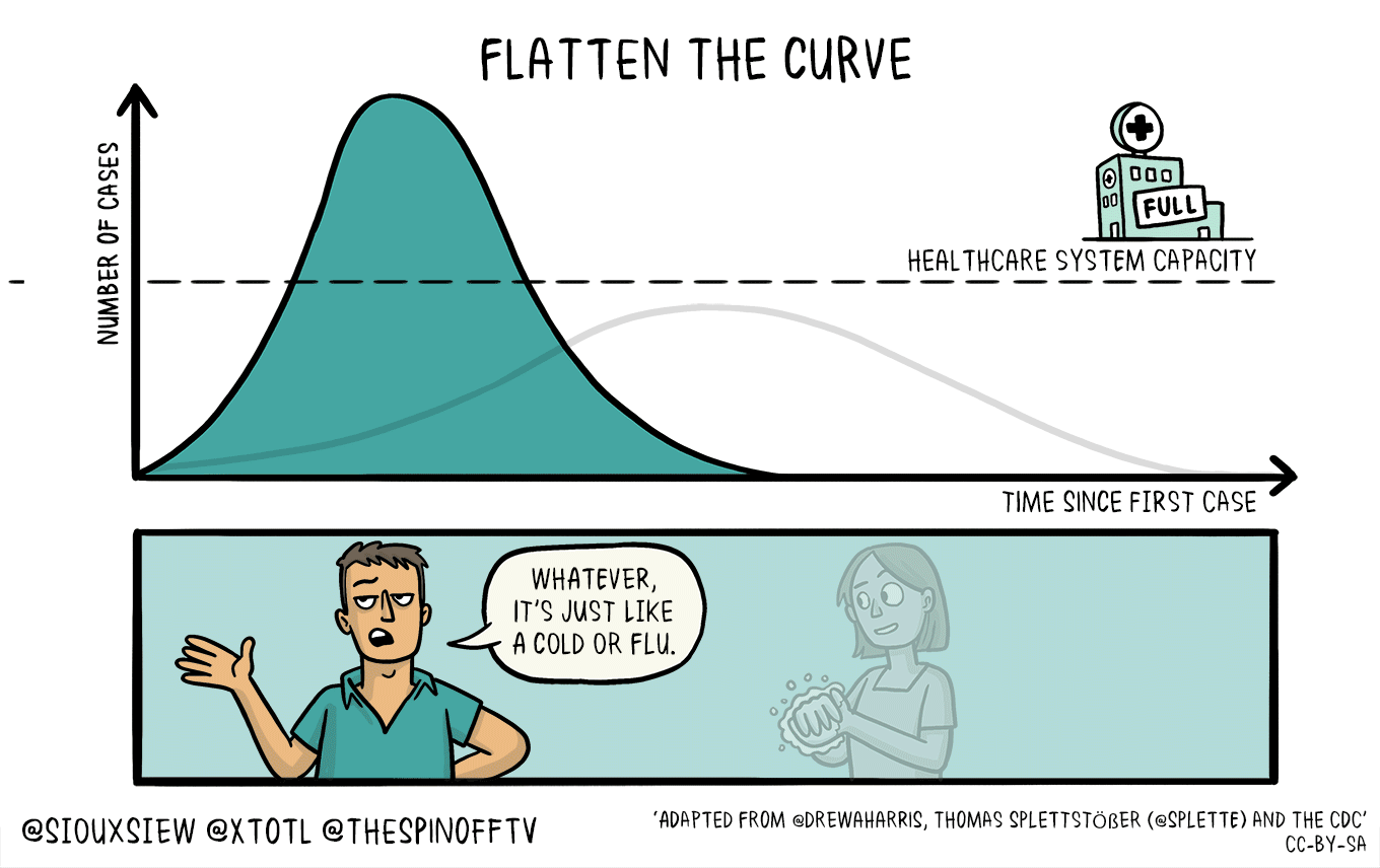
Flattening the curve visual by illustrator Toby Morris and microbiologist Siouxsie Wiles for The Spinoff.
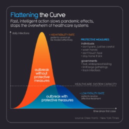
Before we dive into the many different variations of this curve, we need to briefly discuss a more technical point: should both graphs have the same area, or not?
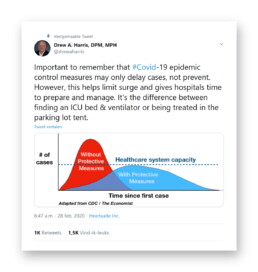
When looking at both visuals above, this is not very clear. In the Information is Beautiful version, it might seem that the blue, flat curve has a somewhat smaller surface area compared to the orange version, but it is not very extreme. In the animated version, both appear to have a similar area. In some visuals, the difference is much more extreme, such as in this one by Vox:
Flattening the curve visual by Vox on March 10, 2020.

‘Curve 0’: the original Flattening the Curve visual as it appeared in the CDC report ‘Community Mitigation Guidelines to Prevent Pandemic Influenza‘ in 2017.
And what happens after the curve? When strict protective measures, such as a lockdown, are released, will we not simply see a ‘restart’ of the outbreak as people start having more social contacts again? In that case, we will have only delayed the outbreak (at a very high economic – and possibliy psychological – cost) and still end up with millions of deaths. Not really, as we will have gained one unbelievably major advantage: time. Time to do more research, bring us closer to effective drugs or even a vaccine, time to build up capacity, time to educate the public.
Tomas Pueyo describes this very convincingly in his article ‘The Hammer and the Dance‘, so I will not go into further detail here. Just one word of advice: proceed with caution. Tomas Pueyo is a great and convincing writer, but he is not a doctor or microbiologist. He is an engineer, ex-consultant and entrepreneur (hmm, that sounds familiar to my own story). He is also the guy who wrote an entire book about the amazing Star Wars Ring Theory without even crediting Mike Klimo, the person who originally came up with it. That’s a pretty douche move, Tomas. But hey, let’s get back to visualizing data, shall we?
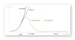
Key visual from Tomas Pueyo’s article ‘The Hammer and the Dance‘ on how to use protective measures to fight the epidemic.
When flattening the curve got out of hand
This is one of those rare times in history when a data visualization goes, well, viral (ugh!). I can hardly come up with data visuals which have reached the same level of fame as Flattening the Curve. It has popped up in press conferences, in newspapers and on television in nearly every country on earth. Millions of people have seen it. That’s quite an achievement!
If we try to trace this visual back to its origins, probably the first time it appeared in the media was in The Economist at the end of February, recreated from the CDC original by visual-data journalist Rosamund Pearce:

Probably the first appearance of the Flattening the Curve visual in the media. (The Economist)
Thanks for sharing your wisdom, Drew. (Source)
The New York Times explains it very well in this article.
By now, Flattening the Curve adaptations have exploded. Maybe we should start talking about flattening the curve of Flattening the Curve visuals? (Not my joke, sorry, credits go to Andy Kirk.)
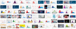
Ok, maybe this is getting just a tiny bit out of hand. (Source: Google Image Search)
Source: Rob Dubbin
Curve alternatives
Ah, the curve. It just works so well in educating the people! It convinces us in a single glance why staying at home serves the greater good. Never before was chilling in my couch such a great way to save millions of lives, right?
Nevertheless, there are some great curve alternatives (alcurvatives?) to the by now overused visual. The one I must highlight comes from (again, these guys are simply great visualizers) the Washington Post. I like it so much that maybe ‘One Visuals to Rule Them All’ is a more appropriate way to describe it. Rather than showing the same old curves, Harry Stevens decided to simulate the effects of protective measures and social distancing, and show the impact through a series of animations. This is the pandemic spreading with an enforced quarantine, which is starting to ‘leak’:
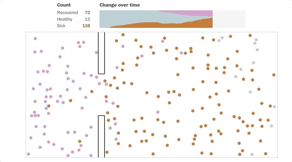
Animated simulation of a disease outbreak with quarantine enforced. (Source: Washington Post)
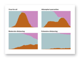
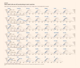
Simulation results showing the differences between different suppression strategies on the number of sick (brown), healthy (blue) and recovered (pink) people. (Washington Post)
It quickly became Washington Post’s most popular story ever.
To wrap up this chapter on curves, there is one final visual I would like to share with you. Don’t worry, it’s an alternative to the Flattening the Curve overload, so no curves this time. In fact, it’s another animated illustration by Toby Morris for The Spinoff, the same guy we started our chapter with. It shows how only one person avoiding contact with others can have a dramatic impact on the total number of infections:

Animated illustration by Siouxsie Wiles and Toby Morris, showing the impact of social distancing on the spread of an infection. (Source: The Spinoff)
I love it.
This is a multi-chapter blog post!
Continue reading:
- Chapter 1: Finding reliable data
- Chapter 2: Visualizing exponential growth
- Chapter 3: Mapping the virus
- Chapter 4: We need to talk about flattening the curve
- Chapter 5: On top of the outbreak with daunting dashboards
- Chapter 6: Viral scrollytelling
For all your comments, suggestions, errors, links and additional information, you can contact me at koen@baryon.be or via Twitter at @koen_vde.
Disclaimer: I am not a medical doctor or a virologist. I am a physicist running my own business (Baryon) focused on information design.
Read more:
Vreemde plaatsnamen in Vlaanderen
Iedereen kent wellicht 'Kontich' en 'Reet', maar in Vlaanderen hebben we nog veel meer merkwaardige, onverwachte, en vaak grappige plaatsnamen. Heb je bijvoorbeeld ooit al gehoord van Buitenland, Dikkebus, of Grote Homo?
Small multiples can save your chart
When you're dealing with a chart that has too much information on it, the most straightforward advice to follow is: break it down into multiple charts, each with less information on them. A powerful example of this is a so-called small multiple approach.
Data visualization podcasts 2023
At Baryon, we’re huge fans of podcasts! Data visualization podcasts are a great way to stay up to date on the latest trends and techniques in data visualization.
Can you use Excel to create a powerful chart?
Spreadsheet tools such as Microsoft Excel or Numbers might not be the first thing on your mind when considering data visualization tools, but they can be pretty solid choices to build data visuals. Don’t let anyone convince you that using Excel to create data visuals is unprofessional.
Choosing the right font for your data visual
Fonts evoke emotions: there are very sophisticated fonts, playful fonts, attention-grabbing fonts, and elegant handwritten fonts. Using the wrong type of font can have a lot of impact. In data visualization the implications of typography are mainly focused on readability. Labels and annotations can easily become so small they get hard to read. Above all else, we should choose a font which is readable at small sizes.
Three roles of colour in a data visual
Colour is one of the most crucial tools we have to turn a normal chart into a powerful chart with a clear message, a chart which tells a story rather than simply presenting the information.
We are really into visual communication!
Every now and then we send out a newsletter with latest work, handpicked inspirational infographics, must-read blog posts, upcoming dates for workshops and presentations, and links to useful tools and tips. Leave your email address here and we’ll add you to our mailing list of awesome people!
Data visualization in a time of pandemic - #3: Mapping the virus
Data visualization in a time of pandemic - #3: Mapping the virus
This is a multi-chapter post!
- Chapter 1: Finding reliable data
- Chapter 2: Visualizing exponential growth
- Chapter 3: Mapping the virus
- Chapter 4: We need to talk about flattening the curve
- Chapter 5: On top of the outbreak with daunting dashboards
- Chapter 6: Viral scrollytelling
Chapter 3: Mapping the virus
A pandemic has a strong geographical factor attached to it, so obviously we are drawn to using maps to visualize how the virus is spreading. Both data visualizers and their audience simply love maps, and I personally do to. As a child, my (geographical, historical, biological, even biblical) atlases where my favourite books and I could browse through them for days. However, pretty as they may be, maps have their own pitfalls and caveats. So be prepared!

Beauty in times of despair
Let’s start with some of the most well-designed examples of maps I have encountered during my research for this chapter. The absolute winner, in my opinion, are these clean but very effective maps by the Washington Post:
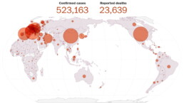
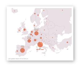
Map showing the global spread of the coronavirus on March 27, 2020 (Washington Post).
To further clarify things, these maps are complemented by a simple table detailing the exact number of confirmed infections or deaths. This gives the reader the choice to look at the broader picture, dive into the detailed numbers, or both.
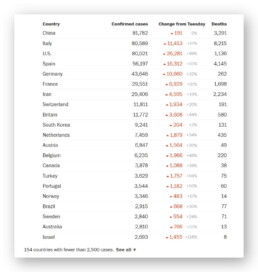
Table showing the global spread of the coronavirus on March 27, 2020 (Washington Post).
It should be noted that the BBC uses very similar, equally beautiful maps. These are examples of proportional symbol maps, or what most normal people simply call bubble maps. But why exactly do these bubble maps work so well?
Mapping issues

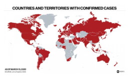
Countries and territories with confirmed cases on March 10, 2020 (ABC News).
Although somewhat helpful, such a map may say more about how connected a country is to the rest of the world, rather than showing how the virus has spread. In any case, it does not provide information about the number of cases. From this map on March 10, we cannot deduct that there was only one confirmed case in Burkina Faso, but over 10.000 in Italy, and over 80.000 in China.
A typical approach to avoid this issue are choropleth maps, a complicated name for something very simple. Blame the Greeks, choros means ‘region’ and plethos means ‘multitude’, hence the name. My scientific brain always tricks me into saying ‘chloropleth maps’, probably because it thinks about chloroplasts in plant cells. But don’t get your hopes up, there’s no connection at all — just my stupid brain. The ‘chloro-’ in chloroplasts also comes from Greek, but from chloros, ‘green’. The same origin, it turns out, as chlorine (because of its pale green color) or chloroform (which contains chlorine). But my apologies, I digress… I might have been reading too much Stephen Fry lately, who would probably love this kind of etymological exploratory ramblings.
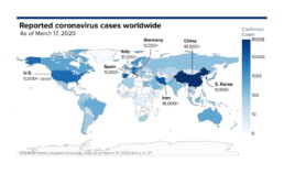
So, a choropleth map. In such a map, regions are again colored, but the value of the color (lightness or darkness) depends on the underlying parameter, for example the number of infections in a country. In its most basic form it looks like this example by CNBC:
Choropleth map of reported coronavirus cases worldwide as of March 17, 2020 (CNBC).
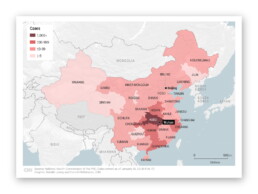
Choropleth map of the spread of the coronavirus in China as of January 26, 2020 (CNN).
However, choropleth maps have their own unfortunate downsides and pitfalls. I will not go into much detail here, as everything was already written down excellently by ‘cartonerd’ Kenneth Field. Let me just summarize:
- choose your colors or color scheme responsibly,
- choose your categories responsibly, and
- use relative numbers to avoid population density distortion.
Or, just maybe, a bar chart might be a better choice:
🎵 The map isn’t the best way to show your data, so the bar chart is where I go. (Source: Kenneth Field)
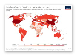
Choropleth map of the total confirmed COVID-19 cases as of March 26, 2020 (Our World in Data)
Bubble maps, such as the ones by the Washington Post shown above, avoid this trap because each nation gets its own bubble, independent of area, population, or population density. This is what makes this kind of chart so successful to map a wide range of values in a wide range of countries around the globe.
There is only one minor downside: bubbles can start overlapping each other when two neighbouring regions have very large values (or one of them has a large value while the other only a small one). Then your bubble chart might start looking like this:
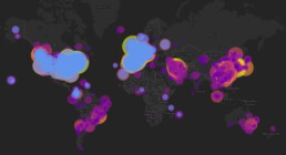
Bubble map on the nCoV-2019 Data Working Group dashboard.
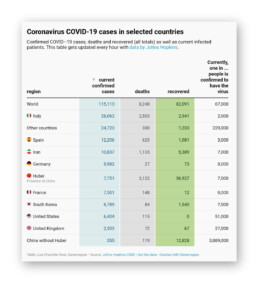
Bubble chart showing confirmed coronavirus cases throughout Europe as of March 27, 2020 (Washington Post)
The return of the table
I already hinted earlier that in some cases, a simple bar chart might be a better option than a complicated map. As Leonardo Da Vinci said: “Simplicity is the ultimate sophistication” (except that he never said that). Another simple but effective alternative might just be… a table.
Many great examples can be found, including the Washington Post ones at the beginning of this chapter, but I was particularly charmed by the Datawrapper ones by Lisa Charlotte Rost, with a clever use of color to bring a touch of optimism to this heavy subject matter:
Datawrapper tables by Lisa Charlotte Rost (screenshot: March 18, 2020).
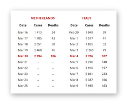
Table comparing the number of infections and deaths between the Netherlands and Italy.
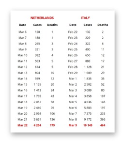
Same data (well, more or less), different story.
Also, differences in age distribution among the population have an impact on the death rate, so it’s rarely a good idea to blindly start comparing different columns or rows with each other, without thinking things through. Remember: if creating panic is your goal, you will always find some data somewhere presented in such a way that you can do so.
There are many, mány more amazing things you can do with tables, also in coronavirus times, but that will be something for another chapter!
Nightmare maps


BBC, by the way, has written an interesting story on an old map showing air travel routes going viral (pun not intended) and causing panic because of poor journalism, such as this badly chosen tweet by the Sun:
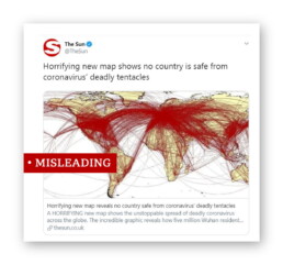
Journalism: you’re doing it wrong.
Finally, if you would ever think about using a pie chart as an alternative to a map… just don’t:
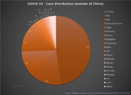
I like pies — Pecan pie! Frangipane pie! Key lime pie! — but not this kind, thanks. (Source: European Scientist)
This is a multi-chapter blog post!
Continue reading:
- Chapter 1: Finding reliable data
- Chapter 2: Visualizing exponential growth
- Chapter 3: Mapping the virus
- Chapter 4: We need to talk about flattening the curve
- Chapter 5: On top of the outbreak with daunting dashboards
- Chapter 6: Viral scrollytelling
For all your comments, suggestions, errors, links and additional information, you can contact me at koen@baryon.be or via Twitter at @koen_vde.
Disclaimer: I am not a medical doctor or a virologist. I am a physicist running my own business (Baryon) focused on information design.
Read more:
Vreemde plaatsnamen in Vlaanderen
Iedereen kent wellicht 'Kontich' en 'Reet', maar in Vlaanderen hebben we nog veel meer merkwaardige, onverwachte, en vaak grappige plaatsnamen. Heb je bijvoorbeeld ooit al gehoord van Buitenland, Dikkebus, of Grote Homo?
Small multiples can save your chart
When you're dealing with a chart that has too much information on it, the most straightforward advice to follow is: break it down into multiple charts, each with less information on them. A powerful example of this is a so-called small multiple approach.
Data visualization podcasts 2023
At Baryon, we’re huge fans of podcasts! Data visualization podcasts are a great way to stay up to date on the latest trends and techniques in data visualization.
Can you use Excel to create a powerful chart?
Spreadsheet tools such as Microsoft Excel or Numbers might not be the first thing on your mind when considering data visualization tools, but they can be pretty solid choices to build data visuals. Don’t let anyone convince you that using Excel to create data visuals is unprofessional.
Choosing the right font for your data visual
Fonts evoke emotions: there are very sophisticated fonts, playful fonts, attention-grabbing fonts, and elegant handwritten fonts. Using the wrong type of font can have a lot of impact. In data visualization the implications of typography are mainly focused on readability. Labels and annotations can easily become so small they get hard to read. Above all else, we should choose a font which is readable at small sizes.
Three roles of colour in a data visual
Colour is one of the most crucial tools we have to turn a normal chart into a powerful chart with a clear message, a chart which tells a story rather than simply presenting the information.
We are really into visual communication!
Every now and then we send out a newsletter with latest work, handpicked inspirational infographics, must-read blog posts, upcoming dates for workshops and presentations, and links to useful tools and tips. Leave your email address here and we’ll add you to our mailing list of awesome people!
