Data visualization tools: Datawrapper
Data visualization tools: Datawrapper
Let’s not beat around the bush in this blog post. If you are writing articles online and need to quickly insert beautiful, interactive charts, maps or tables, Datawrapper is the tool you are looking for.
The Datawrapper team, based in Berlin, built an amazing product suitable for everyone who wants to tell stories using data. The free tier is very generous – unlimited visuals, live-updating charts, easy embedding, responsivity… The professional solution is expensive but mainly aims at newsrooms and journalists, removing the Datawrapper attribution and allowing to create print-ready graphics.
No coding skills are required, you can simply copy and paste your data, upload CSV files, or link to a URL or Google Sheet which allows live-updating charts. Obviously, you are limited to a certain set of possible chart types and designs, but the talented design team (led by Lisa Charlotte Rost) has ensured that all the available options and color schemes are well-crafted and elegantly designed.
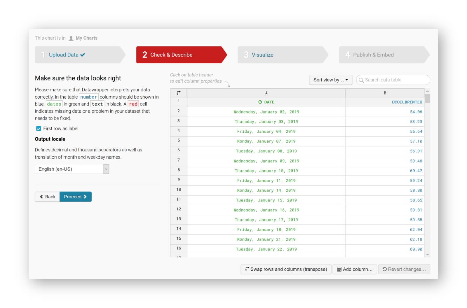
You can find plenty of examples at the Datawrapper website, but of course a blog post about this tool would not be complete without an embedded example. So let’s try to create our own chart of, let’s say, the evolution of the price of Brent Crude Oil since January 2019. Uploading the data, as a CSV file, works very smoothly. Datawrapper automatically recognizes the type of data in each column, and support for different localizations is provided out of the box:
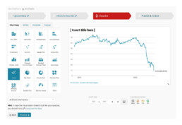
The tool is sufficiently intelligent to suggest the best chart type, and makes some pretty good default decisions regarding axes and grid lines (taking into account Tufte’s guidelines to maximixe data-ink ratio):
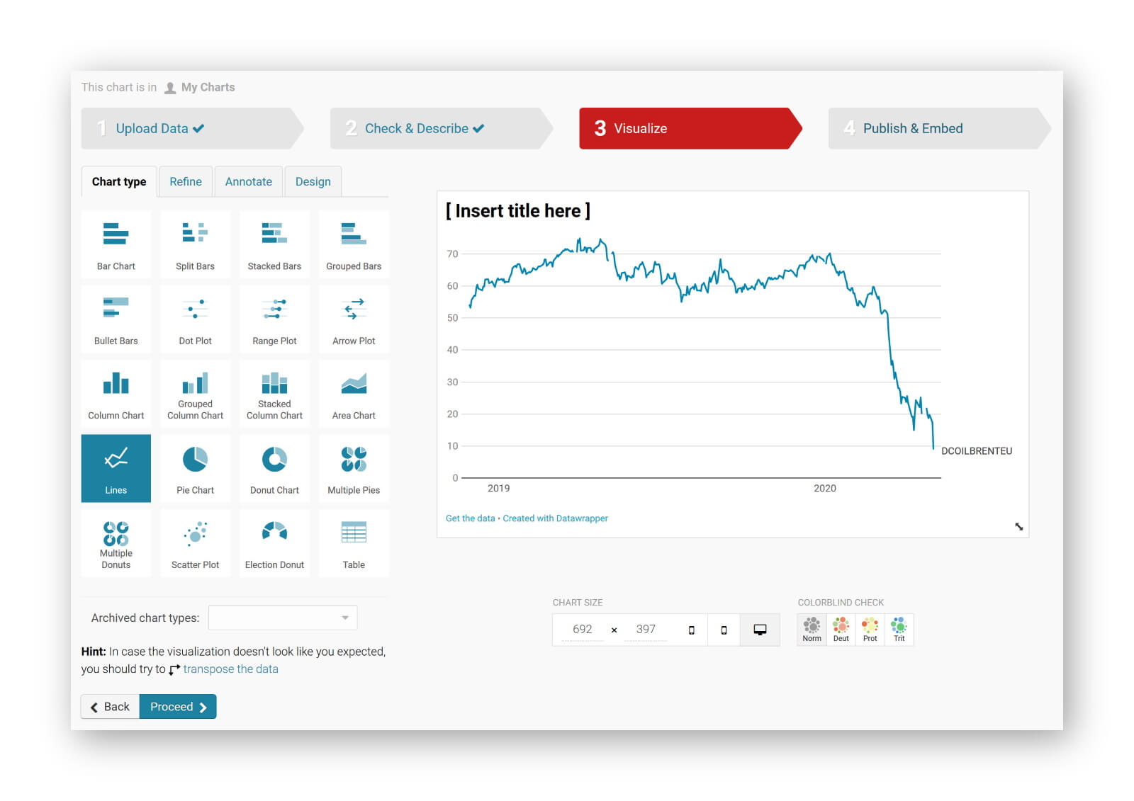
The next steps allow you to quickly finetune any other parameters you would like to change: colours, axes, grid lines, linestyles, hover labels, title, description, source links,… The final result can be downloaded as a PNG image, shared as a link, or simply embedded in your blog post:
It’s magic, it’s simple, and it’s so much fun! Did I already mention I am a fan?
Read more:

A powerful chart tells a story
A powerful chart has a clear message. It should be short and meaningful, and obvious in the blink of an eye. If there’s only one thing our audience remembers at the end of the day, this should be it.

Navigating the landscape of powerful charts
Once we’ve decided to create a data visual or infographic, there are a lot of questions we should ask ourselves to determine the most suitable format. These considerations could include size, readability, possible interactive functionality, and the level of detail we need.

How powerful charts can boost your career
An American accountant managed - as the youngest ever! - to win a crucial election in Los Angeles - thanks to the power of data visualization. And you, too, can use powerful charts to boost your career!

Why is data visualization so challenging?
Data visualization is very powerful, but it can also be hard. That’s because a great data visual combines three different aspects simultaneously: clarity, correctness, and beauty.

Data visualization resources: all the links you’ll ever need!
You want to start creating clear and attractive data visuals, but don't know where to start? No worries, here's a complete overview of tools, resources and inspiration you can use as a starting point for your designs.

Why is data visualization so powerful?
The amount of data coming our way is growing exponentially. In 2021 alone, it is estimated that humankind generated 74 zettabytes of data – that’s about 10,000 GB per person. How on earth are we going to keep this manageable?
We are really into visual communication!
Every now and then we send out a newsletter with latest work, handpicked inspirational infographics, must-read blog posts, upcoming dates for workshops and presentations, and links to useful tools and tips. Leave your email address here and we’ll add you to our mailing list of awesome people!

