
Improving your graph: a case study
Improving your graph: a case-study
Here’s the thing I love most about visual communication: there’s always room for improvement. As soon as you think a graph or data visualization is finished and perfect, someone else will come along with an idea to make it even better. Take, for example, the excellent series of blogposts “The little of visualization design” by (the amazing) Andy Kirk. How a minor detail can make a visualization so much more awesome!
If you have 15 minutes of spare time, I strongly encourage you to watch the following video, because it’s the perfect example of improving visualizations for dummies, and a great intro for this blog post: https://www.youtube.com/watch?v=IB7crD_paKQ
Summary: Alan Smith, Data Visualization Editor at the Financial Times, shows some great examples of converting ‘meh’ graphs from press releases to awesome visualizations that really tell a story. He also organizes crash courses to teach his fellow journalists how to do this in order to become more ‘data critical’.
In this blogpost, I’d like to do the same for a graph I encountered in my Twitter timeline a few days ago. To come straight to the point, here’s the graph we’ll redesign:
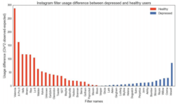
The graph is taken from a (publicly available) research paper on predicting depression from Instagram pictures. In short, the filter you use to prettify your Instagram pictures tells something about how you feel. Okay, to be more precise, there appears to be a correlation between the usage of certain filters and the mental health state of an Instagram user. You can see that in the graph above, but it’s not very clear. Let’s improve that!
Step 1: Readability
I’ve always learned that horizontal words are easier to read than vertical words. So, let’s turn all those words 90° to improve readability. In fact, why not rotate the entire graph? There’s no real added value in the current orientation.
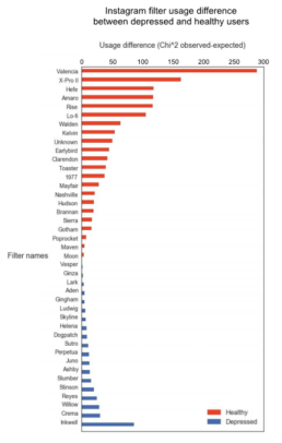
Hey, this just saved us from some serious neck injuries!

Read more:

Why I love matrix charts
This one is definitely in my top 5 of favourite chart types: a matrix chart! Super flexible, can provide some great insights into the data, and it will fit well into your beautiful report design.

Vreemde plaatsnamen in Vlaanderen
Iedereen kent wellicht 'Kontich' en 'Reet', maar in Vlaanderen hebben we nog veel meer merkwaardige, onverwachte, en vaak grappige plaatsnamen. Heb je bijvoorbeeld ooit al gehoord van Buitenland, Dikkebus, of Grote Homo?

Small multiples can save your chart
When you're dealing with a chart that has too much information on it, the most straightforward advice to follow is: break it down into multiple charts, each with less information on them. A powerful example of this is a so-called small multiple approach.

Can you use Excel to create a powerful chart?
Spreadsheet tools such as Microsoft Excel or Numbers might not be the first thing on your mind when considering data visualization tools, but they can be pretty solid choices to build data visuals. Don’t let anyone convince you that using Excel to create data visuals is unprofessional.

Choosing the right font for your data visual
Fonts evoke emotions: there are very sophisticated fonts, playful fonts, attention-grabbing fonts, and elegant handwritten fonts. Using the wrong type of font can have a lot of impact. In data visualization the implications of typography are mainly focused on readability. Labels and annotations can easily become so small they get hard to read. Above all else, we should choose a font which is readable at small sizes.

Three roles of colour in a data visual
Colour is one of the most crucial tools we have to turn a normal chart into a powerful chart with a clear message, a chart which tells a story rather than simply presenting the information.
We are really into visual communication!
Every now and then we send out a newsletter with latest work, handpicked inspirational infographics, must-read blog posts, upcoming dates for workshops and presentations, and links to useful tools and tips. Leave your email address here and we’ll add you to our mailing list of awesome people!
