
Research visuals: all the resources you'll ever need!
Research visuals: all the resources you'll ever need!
If you want to start creating clear and attractive visuals about your research, but don’t know where to start, this page is for you! Here’s a complete overview of tools, resources and inspiration you can use as a starting point for your designs.
Inspiration for your visuals
- Information is Beautiful: informationisbeautiful.net
- Information is Beautiful awards: informationisbeautifulawards.com
- Visual.ly: visual.ly/view
- Pinterest: pinterest.com
- Google Dataset Search: datasetsearch.research.google.com
- Dear data: dear-data.com
Digital tools to create visuals
- Canva: canva.com
- Infogram: infogram.com
- Piktochart: piktochart.com
- Venngage Infographic maker and Graph maker
- Whimsical: whimsical.com
- Adobe Illustrator: adobe.com
- Affinity Designer: affinity.serif.com
- Inkscape: inkscape.org
- BioRender (like Canva, but specifically for life sciences): biorender.com
- Free infographic templates in PowerPoint: hubspot.com/infographic-templates
- List of dataviz tools: creativebloq.com/design-tools/data-visualization
Inkscape tutorial videos
Photos to use in your visuals
- Burst: burst.shopify.com
- Flickr: flickr.com/
- Picography: picography.co
- Pixabay: pixabay.com
- Reshot: reshot.com
- Unsplash: unsplash.com
- Visual Hunt: visualhunt.com
Illustrations and icons to use in visuals
- Freepik: freepik.com
- The noun project: thenounproject.com
Photos and illustrations (specific themes)
- Cathopic, catholic pictures: cathopic.com
- Figshare, plant illustrations and more for biologists: figshare.com/authors/Plant_Illustrations
- Medical illustrations: smart.servier.com
Colour schemes for your visuals
- Adobe Color CC: color.adobe.com
- Coolors.co: coolors.co
- Pictaculous: digitalinspiration.com/color-palette-generator
- Website color schemes: canva.com/learn/website-color-schemes
- 100 brilliant color combinations: canva.com/learn/100-color-combinations
- Article: Your friendly guide to colors in data visualisation
Typography for your visuals
- Dafont: dafont.com
- Google Fonts: fonts.google.com
- FontSquirrel font identifier: fontsquirrel.com/matcherator
- Font Pairing: fontpair.co
Creating graphs
- Dataviz catalogue: datavizcatalogue.com
- Choose and design the perfect chart: chart.guide
- Choosing the right chart: infogram.com/page/choose-the-right-chart-data-visualization
- The Chartmaker Directory: chartmaker.visualisingdata.com
- The Data Viz Project: datavizproject.com
- Datawrapper: datawrapper.de
- Flourish: flourish.studio
- LocalFocus: localfocus.nl
- D3.js: d3js.org
Creating maps
- Snazzy maps (Google maps styles): snazzymaps.com
- Mapbox: mapbox.com
- Mapme: mapme.com/stories
- Datawrapper: datawrapper.de
- Leaflet JavaScript Library: leafletjs.com
- 3D maps with QGIS and Aerialod: statsmapsnpix.com
- Read our blogpost: Behind the maps
Books about visuals, infographics and data visualization
- Data visualisation, Andy Kirk
- Dear Data, Giorgia Lupi & Stefanie Posavec
- Information graphics, Taschen
- Infographic designers’ sketchbooks, Steven Heller & Rick Landers
- Storytelling with data, Cole Nussbaumer Knaflic
- The visual display of quantitative information, Edward Tufte
- Trees, maps and theorems, Jean-Luc Doumont
- Visual journalism, Gestalten
- Visual thinking, Willemien Brand
People on Twitter talking about infographics and data visualization
- Twitter list: Dataviz world leaders
Infographic blogs and online magazines
- Chartable (by the Datawrapper team)
- Cool Infographics (Randy Krum)
- Flowing Data (Nathan Yau)
- Infographics for the People (John Grimwade)
- The Information is Beautiful blog (David McCandless)
- Junk Charts (Kaiser Fung)
- Nightingale (by the Data Visualization Society)
- The Storytelling with Data blog (Cole Nussbaumer Knaflic)
- The Visme blog on infographics
- Visualising Data (Andy Kirk)
Podcasts on data visualization
Read more:
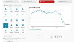
Data visualization tools: Datawrapper
If you are writing articles online and need to quickly insert beautiful, interactive charts, maps or tables, Datawrapper is the tool you are looking for.
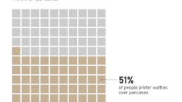
Uncommon chart types: Waffle charts
If you thought a pie chart was the only food-related chart type out there, think again! Waffle charts are a great alternative.

We are really into visual communication!
Every now and then we send out a newsletter with latest work, handpicked inspirational infographics, must-read blog posts, upcoming dates for workshops and presentations, and links to useful tools and tips. Leave your email address here and we’ll add you to our mailing list of awesome people!
