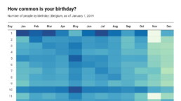
How common is your birthday?
How common is your birthday?
Not all birthdays are created equal… in fact, for most countries in the north temperate zone, more people are born in summer (May – August) than in winter (October – January). This heatmap allows you to check how popular your birth date is. It shows the number of people in Belgium for each specific birthday.
There are some interesting outliers: January 1st and July 1st are extra common, because people with an unknown birth data are commonly assigned these birthdays. The national holidays (May 1, July 21, August 15, November 1 and 11, December 25) are clearly visible as dips in the data. And obviously, February 29th is also not very popular!
We haven’t figured out why more people are born on the 1st, 5th, 10th, 15th, 20th and 25th of each month, but possibly this has some administrative reasons as well…

Read more:

Why I love matrix charts
This one is definitely in my top 5 of favourite chart types: a matrix chart! Super flexible, can provide some great insights into the data, and it will fit well into your beautiful report design.

Vreemde plaatsnamen in Vlaanderen
Iedereen kent wellicht 'Kontich' en 'Reet', maar in Vlaanderen hebben we nog veel meer merkwaardige, onverwachte, en vaak grappige plaatsnamen. Heb je bijvoorbeeld ooit al gehoord van Buitenland, Dikkebus, of Grote Homo?

Small multiples can save your chart
When you're dealing with a chart that has too much information on it, the most straightforward advice to follow is: break it down into multiple charts, each with less information on them. A powerful example of this is a so-called small multiple approach.

Can you use Excel to create a powerful chart?
Spreadsheet tools such as Microsoft Excel or Numbers might not be the first thing on your mind when considering data visualization tools, but they can be pretty solid choices to build data visuals. Don’t let anyone convince you that using Excel to create data visuals is unprofessional.

Choosing the right font for your data visual
Fonts evoke emotions: there are very sophisticated fonts, playful fonts, attention-grabbing fonts, and elegant handwritten fonts. Using the wrong type of font can have a lot of impact. In data visualization the implications of typography are mainly focused on readability. Labels and annotations can easily become so small they get hard to read. Above all else, we should choose a font which is readable at small sizes.

Three roles of colour in a data visual
Colour is one of the most crucial tools we have to turn a normal chart into a powerful chart with a clear message, a chart which tells a story rather than simply presenting the information.
We are really into visual communication!
Every now and then we send out a newsletter with latest work, handpicked inspirational infographics, must-read blog posts, upcoming dates for workshops and presentations, and links to useful tools and tips. Leave your email address here and we’ll add you to our mailing list of awesome people!

Visualizing Complexity: Dataviz book review
Visualizing Complexity: Dataviz book review
We love the smell of new dataviz books in the morning… and ‘Visualizing Complexity’ is about as new as it gets! Written by (super-cool) information design agency Superdot from Basel (Switzerland) and published in May 2022, it contains an excellent analytical overview of the modular design system they developed over the past 10 years.

The book
The book, which arrived with a nice and friendly signed postcard, is printed on heavy high-quality paper, with a sturdy cardboard cover. A bit smaller than we expected, at 23 by 16 centimeters, it has a compact and inviting look and feel. The colors, fonts and layout are very reminiscent of the famous Bauhaus design movement, and despite the very intense, saturated color scheme, the design rarely overpowers the actual content. To be honest: it’s been lying on our desk for a week now, just to show off its beautiful design 😇
The highly structured book is divided into five parts:
- Data dimensions: different ways of presenting and processing datasets
- Diagrammatical dimensions, visual dimensions and structuring dimensions: a total of 80 elements which can be used to create shapes, arrange them, and make them visually distinguishable based on the different data dimensions
- Multidimensional visualizations: examples of the Modular Information Design system breaking down powerful data visuals to show how they are built from combinations of these 80 elemental dimensions
The authors
Darjan Hill and Nicole Lachenmeier are the founders of information design agency Superdot (previously Yaay), which has grown into a well-known multidisciplinary team of information designers, developers and storytellers. They combine a background in Business Informatics (Darjan) and Visual Communication (Nicole) into a unique blend allowing them to approach information visualization challenges from a wide variety of perspectives.
Besides serving an impressive list of clients, winning many awards, and being involved in multiple teaching and mentoring program, Superdot is the initiator of the “On Data And Design” event series, and a pioneer in the field of DX – Data Experience Design.
The verdict
⭐⭐⭐⭐
With our background in science, the highly analytical approach of Visualizing Complexity resonates strongly with us. It is a welcome update of Jacques Bertin’s visual variables concept, with a bigger focus on combining different variables/elements to construct multidimensional and multi-layered visualizations.
The exactly 80 elements, consisting of 25 diagrammatical, 40 visual, and 15 structuring dimensions might feel a bit contrived at times, but on the other hand it is also a very complete overview. We’ll definitely browse through this book during future projects, to ensure we’ve covered as many different visual ideas as possible.
What we’re missing a little bit in this book is an evaluation of how powerful each of these elements are. In the many examples in the final section of the book, it is clear how some elements (e.g. color hue) are much more prominent than others (e.g. contour details). Therefore, some of them are very logical choices for certain data dimensions, and others are less logical or way too subtle to clearly tell the story we want to tell in our visual. This evaluation is left to the reader to experience as a part of experimentation process – which is probably a good thing, as it could be quite dependent on the exact data.
All in all, this is a book that has definitely earned a prominent place on our dataviz bookshelf – a must have for everyone who wishes to understand the analytical thought processes behind strong data visuals!
More dataviz book reviews? We have already covered:
- Dear Data
- Storytelling with Data
- Visualizing Complexity
Read more:
Why I love matrix charts
This one is definitely in my top 5 of favourite chart types: a matrix chart! Super flexible, can provide some great insights into the data, and it will fit well into your beautiful report design.
Vreemde plaatsnamen in Vlaanderen
Iedereen kent wellicht 'Kontich' en 'Reet', maar in Vlaanderen hebben we nog veel meer merkwaardige, onverwachte, en vaak grappige plaatsnamen. Heb je bijvoorbeeld ooit al gehoord van Buitenland, Dikkebus, of Grote Homo?
Small multiples can save your chart
When you're dealing with a chart that has too much information on it, the most straightforward advice to follow is: break it down into multiple charts, each with less information on them. A powerful example of this is a so-called small multiple approach.
Can you use Excel to create a powerful chart?
Spreadsheet tools such as Microsoft Excel or Numbers might not be the first thing on your mind when considering data visualization tools, but they can be pretty solid choices to build data visuals. Don’t let anyone convince you that using Excel to create data visuals is unprofessional.
Choosing the right font for your data visual
Fonts evoke emotions: there are very sophisticated fonts, playful fonts, attention-grabbing fonts, and elegant handwritten fonts. Using the wrong type of font can have a lot of impact. In data visualization the implications of typography are mainly focused on readability. Labels and annotations can easily become so small they get hard to read. Above all else, we should choose a font which is readable at small sizes.
Three roles of colour in a data visual
Colour is one of the most crucial tools we have to turn a normal chart into a powerful chart with a clear message, a chart which tells a story rather than simply presenting the information.
We are really into visual communication!
Every now and then we send out a newsletter with latest work, handpicked inspirational infographics, must-read blog posts, upcoming dates for workshops and presentations, and links to useful tools and tips. Leave your email address here and we’ll add you to our mailing list of awesome people!