

Data visualization podcasts 2025
Data visualization podcasts for 2025
At Baryon, we love a good podcast—especially when it’s about data visualization. They’re a great way to pick up new ideas, hear how others approach design and storytelling, and stay in touch with what’s happening in the field. Whether it’s a deep dive into visual communication, a fresh take on data exploration, or a candid chat about the challenges of bringing complex information to life, there’s always something to learn (and plenty to get inspired by).
Many shows feature conversations with people doing remarkable work—sometimes the big names you already know, sometimes voices you haven’t heard yet but will be glad you did.
Some of our go-tos are Data Stories, Storytelling with Data, and Data Viz Today, but there’s a whole world of great listening out there.
We’ve pulled together a regularly updated list of our favorite data visualization (and data science) podcasts on Notion. You’ll find them all in one place, with links to Spotify, Apple Podcasts, and Google Podcasts—ready for your next walk, commute, or coffee break.
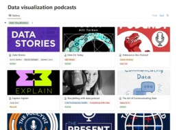
Read more:
Data visualization podcasts 2025
At Baryon, we’re huge fans of podcasts! Data visualization podcasts are a great way to stay up to date on the latest trends and techniques in data visualization.
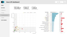
Tell me why… I don’t like dashboards
I don't like dashboards. Well, most dashboards at least. They're just trying too hard... to do everything, everywhere, all at once. Why is that? And is there a better solution?
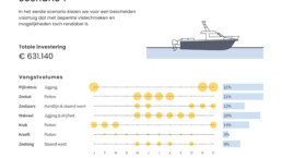
Why I love matrix charts
This one is definitely in my top 5 of favourite chart types: a matrix chart! Super flexible, can provide some great insights into the data, and it will fit well into your beautiful report design.
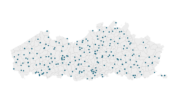
Vreemde plaatsnamen in Vlaanderen
Iedereen kent wellicht 'Kontich' en 'Reet', maar in Vlaanderen hebben we nog veel meer merkwaardige, onverwachte, en vaak grappige plaatsnamen. Heb je bijvoorbeeld ooit al gehoord van Buitenland, Dikkebus, of Grote Homo?
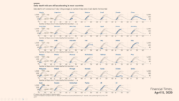
Small multiples can save your chart
When you're dealing with a chart that has too much information on it, the most straightforward advice to follow is: break it down into multiple charts, each with less information on them. A powerful example of this is a so-called small multiple approach.

Can you use Excel to create a powerful chart?
Spreadsheet tools such as Microsoft Excel or Numbers might not be the first thing on your mind when considering data visualization tools, but they can be pretty solid choices to build data visuals. Don’t let anyone convince you that using Excel to create data visuals is unprofessional.
We are really into visual communication!
Every now and then we send out a newsletter with latest work, handpicked inspirational infographics, must-read blog posts, upcoming dates for workshops and presentations, and links to useful tools and tips. Leave your email address here and we’ll add you to our mailing list of awesome people!

