
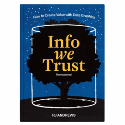
Review: Info We Trust
Review: Info We Trust (Remastered)
Info We Trust is an ambitious, visually stunning book that sits somewhere between philosophy, information design, and a collection of visual essays. It is clearly the product of many years of thinking, reading, and making. That depth and experience is both its greatest strength and, at times, its main challenge.
From a purely visual standpoint, the book is exceptional. Andrews is remarkably disciplined in his use of a limited color palette, and the combination of three colors with hand-drawn illustrations gives the book a distinctive and coherent visual identity. The drawings are both intentional and decorative, they are a pleasure to look at, page after page.
Content-wise, the book is dense with references. The marginal notes, quotations, and extensive bibliography leave no doubt about Andrews’ breadth of knowledge. Again and again, I found myself wanting to read the original sources and to follow the many intellectual threads Andrews lays out. In that sense, the book functions very well as a gateway to a much wider intellectual exploration.
At the same time, this abundance can be overwhelming. Especially in the earlier chapters, the book leans heavily into philosophical reflection. Ideas, metaphors, and quotations accumulate, but a clear argumentative trajectory is often hard to discern. Reading these chapters requires patience: each sentence needs to be savoured rather than devoured. For readers like me, who prefer an analytical, structured approach, this can make progress feel slow, even if the reading itself is never unpleasant. I must admit that I skipped most of the quotes and notes in the margins…
For me, the book truly comes into focus in the final chapters (roughly chapters 13–15). Here, Andrews becomes much more concrete, offering insight into his actual working process: how he frames problems, explores structure, reasons visually, and approaches projects as an information designer. These chapters are highly relatable and, I suspect, will resonate strongly with practitioners. They clarify retroactively what the earlier philosophical groundwork was aiming toward.
In the end, Info We Trust is not a manual or a step-by-step guide, and readers looking for quick, actionable takeaways may struggle with parts of it. But as a reflective, carefully crafted work about how we think with information, and how we might do so more responsibly, it is thoughtful, inspiring, and visually remarkable. Best approached slowly, selectively, and perhaps revisited over time rather than read straight through in one go.
Read this review, as well as many others, in our complete overview of data visualization books (work in progress).
Read more:

7 different goals for your chart
A crucial step in building a powerful chart is choosing the right type of chart. A lot of charts don’t work because they simply use the wrong type of chart. To avoid this trap, we must ask ourselves a basic question: what’s the ultimate goal of our data visual? What do we want to show with our data?

Making a data visual noise-free
Removing noise from a data visual is not only about taking things away such as gridlines, axes or legends. That’s just one part of it, which we could call removing physical noise. Improving the signal-to-noise ratio is often also about adding little things that help our audience better understand the visual. We are helping them by removing mental noise, or mental barriers.

Three tips to create powerful charts in Excel
Creating charts in Excel can be a very powerful tool for making sense of complex data sets, and for visualizing them. But the default options are not always the most pretty or effective ones. Here are our top three tips to create better Excel charts.

A powerful chart has a high signal-to-noise ratio
‘Less is more’. It’s a crucial principle in most of our communication, and in data visualization in particular. Because of my background as a physicist, I prefer to talk about the ‘signal-to-noise ratio’. The message - our signal - should be amplified as much as possible, giving it all of the attention. Everything that can distract from our message - the noise - should be removed.

A powerful chart tells a story
A powerful chart has a clear message. It should be short and meaningful, and obvious in the blink of an eye. If there’s only one thing our audience remembers at the end of the day, this should be it.

Navigating the landscape of powerful charts
Once we’ve decided to create a data visual or infographic, there are a lot of questions we should ask ourselves to determine the most suitable format. These considerations could include size, readability, possible interactive functionality, and the level of detail we need.
We are really into visual communication!
Every now and then we send out a newsletter with latest work, handpicked inspirational infographics, must-read blog posts, upcoming dates for workshops and presentations, and links to useful tools and tips. Leave your email address here and we’ll add you to our mailing list of awesome people!


Review: A History of Data Visualization and Graphic Communication
Review: A History of Data Visualization and Graphic Communication
Michael Friendly and Howard Wainer clearly love graphs. But A History of Data Visualization and Graphic Communication isn’t just about graphs — it’s about the stories behind them: the context, the people, the new measurements that made them necessary, and the discoveries they enabled. The authors don’t just show us the end result; they take us through the process that led there, often in a delightful amount of detail.
The structure of the book balances chronology with theme. This keeps the feeling of historical evolution intact, without falling into the trap of a dry timeline. We jump from 17th-century innovators to 20th-century pioneers, always with a clear narrative thread.
What stood out to me most was the variety of examples. While the book is clearly indebted to Edward Tufte’s work, it doesn’t recycle his canon. I encountered many visualizations I hadn’t seen before, and even familiar ones were presented with fresh insight. The ideas on how new data, collected with new measurement techniques, often prompt entirely new kinds of charts were particularly eye-opening for me. It’s a reminder that visualization doesn’t just explain data — it also adapts to it.
That idea was so powerful to me that I used it as one of the foundations for my keynote lecture, Graphs can save the world! This book helped me think more deeply about why visualizations matter — not just aesthetically or functionally, but historically and socially.
That said, not every chapter lands equally well. Some sections feel a bit scattered or lightweight, especially when they only briefly touch on developments that deserve more space. The final chapter, Graphs as Poetry, takes a more philosophical turn, but I wasn’t entirely sure what the authors were trying to argue there.
Also worth noting: while the book is visually rich, it’s a shame that most of it is printed in black and white. Some of the visual clarity and impact is lost as a result. And while the authors occasionally offer “reworked” versions of historical charts to show how they could be improved, these redesigns don’t always convince — sometimes the original speaks more eloquently in its own language.
Despite those minor critiques, this is a generous, well-researched, and deeply informative book. I’d recommend it to anyone interested in the intersection of data, history, and design. It’s a reminder that charts are tools, but also more than tools — they are artifacts of human thought, and sometimes, even acts of discovery.
Rating: ⭐⭐⭐⭐
Read this review, as well as many others, in our complete overview of data visualization books (work in progress).
Read more:
7 different goals for your chart
A crucial step in building a powerful chart is choosing the right type of chart. A lot of charts don’t work because they simply use the wrong type of chart. To avoid this trap, we must ask ourselves a basic question: what’s the ultimate goal of our data visual? What do we want to show with our data?
Making a data visual noise-free
Removing noise from a data visual is not only about taking things away such as gridlines, axes or legends. That’s just one part of it, which we could call removing physical noise. Improving the signal-to-noise ratio is often also about adding little things that help our audience better understand the visual. We are helping them by removing mental noise, or mental barriers.
Three tips to create powerful charts in Excel
Creating charts in Excel can be a very powerful tool for making sense of complex data sets, and for visualizing them. But the default options are not always the most pretty or effective ones. Here are our top three tips to create better Excel charts.
A powerful chart has a high signal-to-noise ratio
‘Less is more’. It’s a crucial principle in most of our communication, and in data visualization in particular. Because of my background as a physicist, I prefer to talk about the ‘signal-to-noise ratio’. The message - our signal - should be amplified as much as possible, giving it all of the attention. Everything that can distract from our message - the noise - should be removed.
A powerful chart tells a story
A powerful chart has a clear message. It should be short and meaningful, and obvious in the blink of an eye. If there’s only one thing our audience remembers at the end of the day, this should be it.
Navigating the landscape of powerful charts
Once we’ve decided to create a data visual or infographic, there are a lot of questions we should ask ourselves to determine the most suitable format. These considerations could include size, readability, possible interactive functionality, and the level of detail we need.
We are really into visual communication!
Every now and then we send out a newsletter with latest work, handpicked inspirational infographics, must-read blog posts, upcoming dates for workshops and presentations, and links to useful tools and tips. Leave your email address here and we’ll add you to our mailing list of awesome people!
Visualizing Complexity: Dataviz book review
Visualizing Complexity: Dataviz book review
We love the smell of new dataviz books in the morning… and ‘Visualizing Complexity’ is about as new as it gets! Written by (super-cool) information design agency Superdot from Basel (Switzerland) and published in May 2022, it contains an excellent analytical overview of the modular design system they developed over the past 10 years.
The book
The book, which arrived with a nice and friendly signed postcard, is printed on heavy high-quality paper, with a sturdy cardboard cover. A bit smaller than we expected, at 23 by 16 centimeters, it has a compact and inviting look and feel. The colors, fonts and layout are very reminiscent of the famous Bauhaus design movement, and despite the very intense, saturated color scheme, the design rarely overpowers the actual content. To be honest: it’s been lying on our desk for a week now, just to show off its beautiful design 😇
The highly structured book is divided into five parts:
- Data dimensions: different ways of presenting and processing datasets
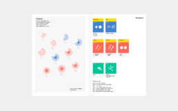
- Diagrammatical dimensions, visual dimensions and structuring dimensions: a total of 80 elements which can be used to create shapes, arrange them, and make them visually distinguishable based on the different data dimensions
- Multidimensional visualizations: examples of the Modular Information Design system breaking down powerful data visuals to show how they are built from combinations of these 80 elemental dimensions
The authors
Darjan Hill and Nicole Lachenmeier are the founders of information design agency Superdot (previously Yaay), which has grown into a well-known multidisciplinary team of information designers, developers and storytellers. They combine a background in Business Informatics (Darjan) and Visual Communication (Nicole) into a unique blend allowing them to approach information visualization challenges from a wide variety of perspectives.
Besides serving an impressive list of clients, winning many awards, and being involved in multiple teaching and mentoring program, Superdot is the initiator of the “On Data And Design” event series, and a pioneer in the field of DX – Data Experience Design.
The verdict
⭐⭐⭐⭐
With our background in science, the highly analytical approach of Visualizing Complexity resonates strongly with us. It is a welcome update of Jacques Bertin’s visual variables concept, with a bigger focus on combining different variables/elements to construct multidimensional and multi-layered visualizations.
The exactly 80 elements, consisting of 25 diagrammatical, 40 visual, and 15 structuring dimensions might feel a bit contrived at times, but on the other hand it is also a very complete overview. We’ll definitely browse through this book during future projects, to ensure we’ve covered as many different visual ideas as possible.
What we’re missing a little bit in this book is an evaluation of how powerful each of these elements are. In the many examples in the final section of the book, it is clear how some elements (e.g. color hue) are much more prominent than others (e.g. contour details). Therefore, some of them are very logical choices for certain data dimensions, and others are less logical or way too subtle to clearly tell the story we want to tell in our visual. This evaluation is left to the reader to experience as a part of experimentation process – which is probably a good thing, as it could be quite dependent on the exact data.
All in all, this is a book that has definitely earned a prominent place on our dataviz bookshelf – a must have for everyone who wishes to understand the analytical thought processes behind strong data visuals!
More dataviz book reviews? We have already covered:
- Dear Data
- Storytelling with Data
- Visualizing Complexity
Read more:
7 different goals for your chart
A crucial step in building a powerful chart is choosing the right type of chart. A lot of charts don’t work because they simply use the wrong type of chart. To avoid this trap, we must ask ourselves a basic question: what’s the ultimate goal of our data visual? What do we want to show with our data?
Making a data visual noise-free
Removing noise from a data visual is not only about taking things away such as gridlines, axes or legends. That’s just one part of it, which we could call removing physical noise. Improving the signal-to-noise ratio is often also about adding little things that help our audience better understand the visual. We are helping them by removing mental noise, or mental barriers.
Three tips to create powerful charts in Excel
Creating charts in Excel can be a very powerful tool for making sense of complex data sets, and for visualizing them. But the default options are not always the most pretty or effective ones. Here are our top three tips to create better Excel charts.
A powerful chart has a high signal-to-noise ratio
‘Less is more’. It’s a crucial principle in most of our communication, and in data visualization in particular. Because of my background as a physicist, I prefer to talk about the ‘signal-to-noise ratio’. The message - our signal - should be amplified as much as possible, giving it all of the attention. Everything that can distract from our message - the noise - should be removed.
A powerful chart tells a story
A powerful chart has a clear message. It should be short and meaningful, and obvious in the blink of an eye. If there’s only one thing our audience remembers at the end of the day, this should be it.
Navigating the landscape of powerful charts
Once we’ve decided to create a data visual or infographic, there are a lot of questions we should ask ourselves to determine the most suitable format. These considerations could include size, readability, possible interactive functionality, and the level of detail we need.
We are really into visual communication!
Every now and then we send out a newsletter with latest work, handpicked inspirational infographics, must-read blog posts, upcoming dates for workshops and presentations, and links to useful tools and tips. Leave your email address here and we’ll add you to our mailing list of awesome people!
Storytelling with Data: Dataviz book review
Storytelling with Data: Dataviz book review
The book
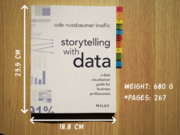
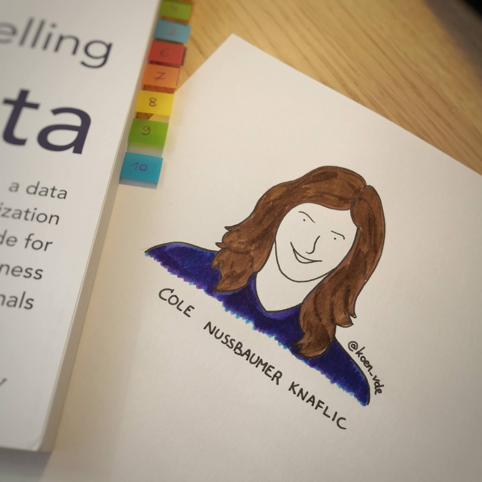
This dataviz book has been on my wishlist for a very long time! So many people have added it into their recommendations that I have lost track. It’s in nearly every list of ‘must read books on data visualization’ you will find. So it was about time for me to read, and review, Storytelling with Data by Cole Nussbaumer Knaflic.

Storytelling with Data, published in 2015, is presented as a practical guide for business professionals (think managers or consultants) who regularly need to present data, or findings based on data. People who have no prior experience with data visualization, except maybe for the occasional default bar or pie chart in Microsoft Excel.
Knaflic wrote this book to teach how – as Nancy Duarte described it in her review – it’s not about the data, it’s about the meaning of the data. Or, as Jean-Luc Doumont would put it: it’s not about the what, but about the so what.
This book offers hands-on advice to turn mind-numbing default charts into powerful, convincing graphs telling a story. This way, rather than just ‘looking fancy’, data visualization becomes a tool to actually change people’s minds.
The author
Cole Nussbaumer Knaflic is the perfect woman to teach us these techniques. Not only is she an excellent teacher in Information Visualization at the Maryland Institute College of Art, she also has an MBA and has worked as a manager on the Google People Analytics team for more than 5 years.
She is the founder and CEO of Storytelling with Data, where she has built a team to do exactly the things she describes in the book: she helps people and organizations to create graphs that tell compelling, action-inspiring stories.
In 2019 she wrote a companion book to this one, titled ‘Storytelling with Data: Let’s Practice‘, with even more examples, and with hands-on exercises.
The verdict
⭐⭐⭐
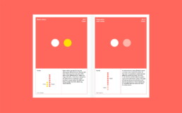
Storytelling with Data is definitely a dataviz book aimed at an audience of true business professionals, the kind of people you will find at large consulting firms, banks, or big tech companies, rather than die-hard fans of beautiful visualization art or information graphics. The author has (successfully) to convey the very simple, basic principles of building an excellent graph. She avoided adding complicated or jaw-droppingly beautiful examples, as this might discourage data visualization novices to try these principles for themselves.

This is the perfect book to pick up for your first encounter with data visualization. You will learn what’s wrong with default Excel charts and why they don’t work to convey your message. Knaflic shows how clever chart, font styling or color choices will dramatically improve the effectiveness of data visuals in your presentations. And she does it very well.
On the other hand, if you are a seasoned dataviz lover or admirer of infographics, this is not really the book for you. At times it will feel more like an academic syllabus or business report rather than a book you’ll read for fun or inspiration. But it could be the perfect gift for your colleague or friend who is just starting out and could use some basic, very practical advice!
Do you consider yourself a dataviz novice, or a true data wizard? What did you learn from this book?
And of course, if you have some data visualization challenges you think we could help you with, let me know as well – we are always happy to assist!
More dataviz book reviews? We have already covered:
- Dear Data
- Storytelling with Data
- Visualizing Complexity
Read more:
7 different goals for your chart
A crucial step in building a powerful chart is choosing the right type of chart. A lot of charts don’t work because they simply use the wrong type of chart. To avoid this trap, we must ask ourselves a basic question: what’s the ultimate goal of our data visual? What do we want to show with our data?
Making a data visual noise-free
Removing noise from a data visual is not only about taking things away such as gridlines, axes or legends. That’s just one part of it, which we could call removing physical noise. Improving the signal-to-noise ratio is often also about adding little things that help our audience better understand the visual. We are helping them by removing mental noise, or mental barriers.
Three tips to create powerful charts in Excel
Creating charts in Excel can be a very powerful tool for making sense of complex data sets, and for visualizing them. But the default options are not always the most pretty or effective ones. Here are our top three tips to create better Excel charts.
A powerful chart has a high signal-to-noise ratio
‘Less is more’. It’s a crucial principle in most of our communication, and in data visualization in particular. Because of my background as a physicist, I prefer to talk about the ‘signal-to-noise ratio’. The message - our signal - should be amplified as much as possible, giving it all of the attention. Everything that can distract from our message - the noise - should be removed.
A powerful chart tells a story
A powerful chart has a clear message. It should be short and meaningful, and obvious in the blink of an eye. If there’s only one thing our audience remembers at the end of the day, this should be it.
Navigating the landscape of powerful charts
Once we’ve decided to create a data visual or infographic, there are a lot of questions we should ask ourselves to determine the most suitable format. These considerations could include size, readability, possible interactive functionality, and the level of detail we need.
We are really into visual communication!
Every now and then we send out a newsletter with latest work, handpicked inspirational infographics, must-read blog posts, upcoming dates for workshops and presentations, and links to useful tools and tips. Leave your email address here and we’ll add you to our mailing list of awesome people!

Dear Data: Dataviz book review
Dear Data: Dataviz book review
The book
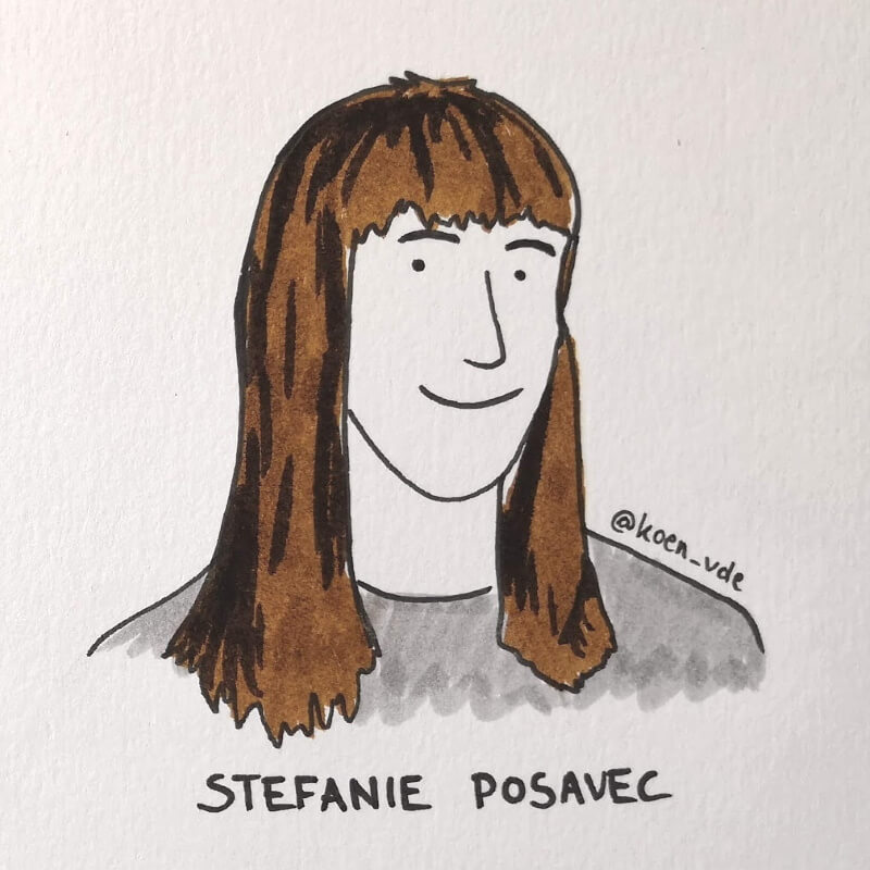
Last February, on a cold and rainy day, I received the Dear Data book as part of a Dataviz Drawing workshop by Stefanie Posavec. The workshop was hosted by Graphic Hunters in a beautiful space in central Amsterdam.
It is a pretty large and heavy book, containing nearly 300 pages on sturdy, qualitative paper. It is not the kind of book you would take with you into bed at night, but definitely one you could put on your coffee table to show off (which I did!). There are two alternative covers, one designed by Giorgia and one by Stefanie (this is the latter one).
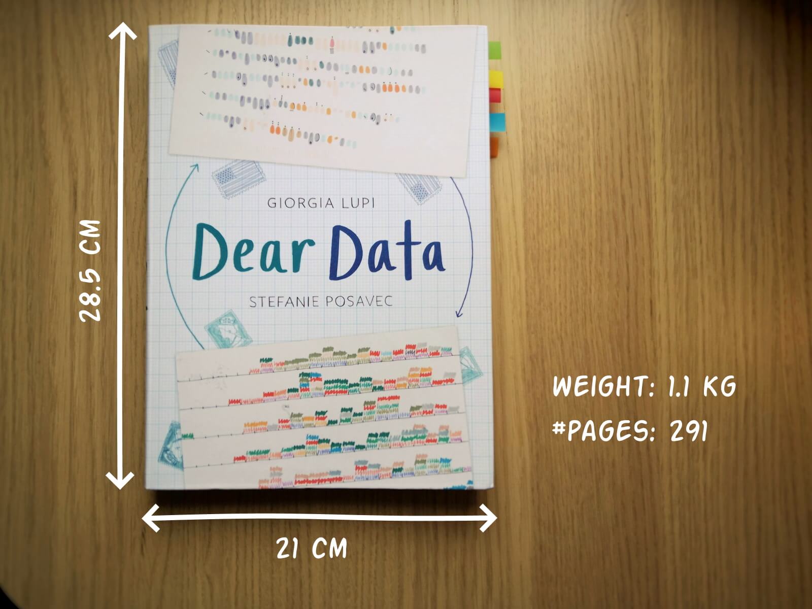
In Dear Data, Giorgia and Stefanie document their project of sending each other hand-drawn postcards, every week, over the course of an entire year (2014-15). Each week, they would decide on a topic on which they would gather personal data – ranging from the contents of their wardrobes, over the sounds they heared, to the emotions and desires they experienced that week.
At the end of the week, they both sat down with their data, drew it onto a postcard, wrote a detailed legend on how to interpret it, and sent it to each other (Stefanie lives in London, and Giorgia in New York).
This book is a summary of their one-year project, with high-quality images of each of the postcards, additional details about the (practical and thought) process behind it, and tips to create your own personal data drawings.
Oh yes, the project also has its own dedicated webpage.
The authors
Giorgia Lupi and Stefanie Posavec are two well-known names in data visualization, but their Dear Data project truly made them world-famous.
Giorgia Lupi (°1981), originally from Italy, founded the design firm Accurat in 2011. They worked for an impressive list of clients including Google, IBM, Starbucks, and the United Nations. She introduced the concept of Data Humanism. In short, we should not simply focus on numbers, technologies and algorithms, but on the underlying things they represent: people, stories and ideas. She has won several awards, including multiple Information is Beautiful Awards Gold Medals, and in 2019 she joined design firm Pentagram as a partner.

Stefanie Posavec (°1981) was born in Colorado (US) and later moved to London. In 2013 she was one of Facebook’s earliest Artists in Residence, creating the piece Relationship Dance Steps. She aims to make data accessible, memorable and impactful using highly original approaches. For example, she puts health data art on hospital walls as a form of interior design, or she creates jewellery from air pollution data.
In 2016, Dear Data was acquired by the Museum of Modern Art as a part of its permanent collection, so they are both official MoMA artists!
The verdict
⭐⭐⭐⭐
I absolutely love this crossover between a data visualization book and an art book. Definitely not something to read in one go, but a book to pick up from time to time to browse through the pages. I’m convinced it can be a great source of inspiration when you are stuck on a particular project and are looking for a novel, creative approach.
The differences between Giorgia’s more ‘technical’ and Stefanie’s more ‘artistic’ drawing is interesting, and throughout the project we see both evolving and experimenting in different directions. Personally I love unraveling Giorgia’s complicated legends and decyphering her complex diagrams, and I am amazed at how much information she can compress into a single small postcard. However, in certain weeks, the level of detail can become too complicated and cumbersome. Stefanie’s drawings are usually simpler to absorb, but this often leads to gorgeous patterns, designs or metaphors.

Despite being a collection of 104 hand-drawn postcards, it never gets boring. I especially appreciate how they manage to alternate between very light-hearted, practical topics (e.g. a week of drinks) and deeply emotional, personal topics (e.g. a week of negative thoughts).
The postcards are regulary interspersed with simple but adorable illustrations that make the book a bit easier to digest (too much data can be overwhelming!).
My personal favorites are:
- By Giorgia: a week of media and a week of urban wildlife (so many parameters!)
- By Stefanie: a week of indecision and a week of distractions (so simple, so strong!)
Applying the knowledge
Some of these stunning postcards are really inspiring to draw for myself. So I went ahead and collected some data. I chose to recreate Stefanie’s design for week eleven: a week of emotions.
Every hour during the past week, I have written down the main emotion I was experiencing at that moment. As we are in the midst of crazy pandemic times, you will notice some of my emotions are a bit, well, all over the place. 😬
So without further ado, here is the final result!


If you are also inspired, go ahead and start drawing your own data! And feel free to share it with me, or with the rest of the world! Looking forward to seeing what you are up to 😊
And of course, if you have some data visualization challenges you think we could help you with, let me know as well – we are always happy to assist!
More dataviz book reviews? We have already covered:
- Dear Data
- Storytelling with Data
- Visualizing Complexity
Read more:
7 different goals for your chart
A crucial step in building a powerful chart is choosing the right type of chart. A lot of charts don’t work because they simply use the wrong type of chart. To avoid this trap, we must ask ourselves a basic question: what’s the ultimate goal of our data visual? What do we want to show with our data?
Making a data visual noise-free
Removing noise from a data visual is not only about taking things away such as gridlines, axes or legends. That’s just one part of it, which we could call removing physical noise. Improving the signal-to-noise ratio is often also about adding little things that help our audience better understand the visual. We are helping them by removing mental noise, or mental barriers.
Three tips to create powerful charts in Excel
Creating charts in Excel can be a very powerful tool for making sense of complex data sets, and for visualizing them. But the default options are not always the most pretty or effective ones. Here are our top three tips to create better Excel charts.
A powerful chart has a high signal-to-noise ratio
‘Less is more’. It’s a crucial principle in most of our communication, and in data visualization in particular. Because of my background as a physicist, I prefer to talk about the ‘signal-to-noise ratio’. The message - our signal - should be amplified as much as possible, giving it all of the attention. Everything that can distract from our message - the noise - should be removed.
A powerful chart tells a story
A powerful chart has a clear message. It should be short and meaningful, and obvious in the blink of an eye. If there’s only one thing our audience remembers at the end of the day, this should be it.
Navigating the landscape of powerful charts
Once we’ve decided to create a data visual or infographic, there are a lot of questions we should ask ourselves to determine the most suitable format. These considerations could include size, readability, possible interactive functionality, and the level of detail we need.
We are really into visual communication!
Every now and then we send out a newsletter with latest work, handpicked inspirational infographics, must-read blog posts, upcoming dates for workshops and presentations, and links to useful tools and tips. Leave your email address here and we’ll add you to our mailing list of awesome people!