

Data visualization podcasts 2025
Data visualization podcasts for 2025
At Baryon, we love a good podcast—especially when it’s about data visualization. They’re a great way to pick up new ideas, hear how others approach design and storytelling, and stay in touch with what’s happening in the field. Whether it’s a deep dive into visual communication, a fresh take on data exploration, or a candid chat about the challenges of bringing complex information to life, there’s always something to learn (and plenty to get inspired by).
Many shows feature conversations with people doing remarkable work—sometimes the big names you already know, sometimes voices you haven’t heard yet but will be glad you did.
Some of our go-tos are Data Stories, Storytelling with Data, and Data Viz Today, but there’s a whole world of great listening out there.
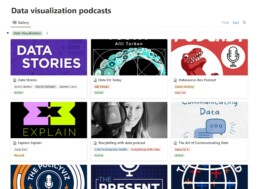
We’ve pulled together a regularly updated list of our favorite data visualization (and data science) podcasts on Notion. You’ll find them all in one place, with links to Spotify, Apple Podcasts, and Google Podcasts—ready for your next walk, commute, or coffee break.
Read more:

Infographic: Amazing facts about the brain
Did you know that our brain makes up 2% of our body weight, but consumers about 20% of our energy? Did you know that we have a second brain, located in our gut?
Our information designer Sofia made this insightful infographic, giving you an overview of eight amazing facts about the brain!
How common is your birthday?
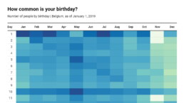
Not all birthdays are created equal... in fact, for most countries in the north temperate zone, more people are born in summer (May - August) than in winter (October - January). This heatmap allows you to check how popular your birth date is. It shows the number of people in Belgium for each specific birthday.
Visualizing Complexity: Dataviz book review
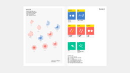
Visualizing Complexity is a great new data visualization book published by information design Superdot. Here's our verdict.

This chart is trying to trick you
The original chart in this example is trying to suggest a strong correlation between sugar intake and obesity in the US between 1980 and 2000. It does so by carefully choosing the vertical axis ranges and scaling so both lines nicely fall on top of each other.

Research visuals: all the resources you’ll ever need!
If you want to start creating clear and attractive visuals about your research, but don't know where to start, this page is for you! Here's a complete overview of tools, resources and inspiration you can use as a starting point for your designs.

Small datasets to practice your data visualization skills
When you're teaching data analysis or data visualization, or when you're learning new data visualization tools and techniques, you might be looking for datasets to practice with. Here are some great starting points.
We are really into visual communication!
Every now and then we send out a newsletter with latest work, handpicked inspirational infographics, must-read blog posts, upcoming dates for workshops and presentations, and links to useful tools and tips. Leave your email address here and we’ll add you to our mailing list of awesome people!

