
Can you use Excel to create a powerful chart?
Can you use Excel to create a powerful chart?
Spreadsheet tools such as Microsoft Excel or Numbers might not be the first thing on your mind when considering data visualization tools, but they can be pretty solid choices to build data visuals. Don’t let anyone convince you that using Excel to create data visuals is unprofessional. In my practice as an information designer I have created many charts in both Excel and PowerPoint, in particular for clients who wanted some degree of flexibility in modifying the visuals themselves.
Spreadsheet tools are more powerful than you might think
Spreadsheet applications allow us to create almost any type of chart in the family of bar charts, line charts and pie charts – including stacked bar charts, area charts, and so on. But even more ‘exotic’ alternatives such as treemaps, sunburst diagrams, candlestick charts, radar charts and waterfall charts are available.
The strength of spreadsheet tools lies more in building the charts than in polishing their design. We could use Excel to create the basic shapes that will make up the core of the data visual, and then export them to another, more design-oriented tool such as PowerPoint or Adobe Illustrator to further modify the colours, annotations and layout – or to combine multiple graphs into a single chart. Nevertheless, most of these things are possible in spreadsheet tools as well, although they might require a bit more tinkering and clicking around.
Move away from the defaults
The challenge in these situations is to move away from the default options. It takes some time and patience, and maybe some visual trickery, but it pays off!
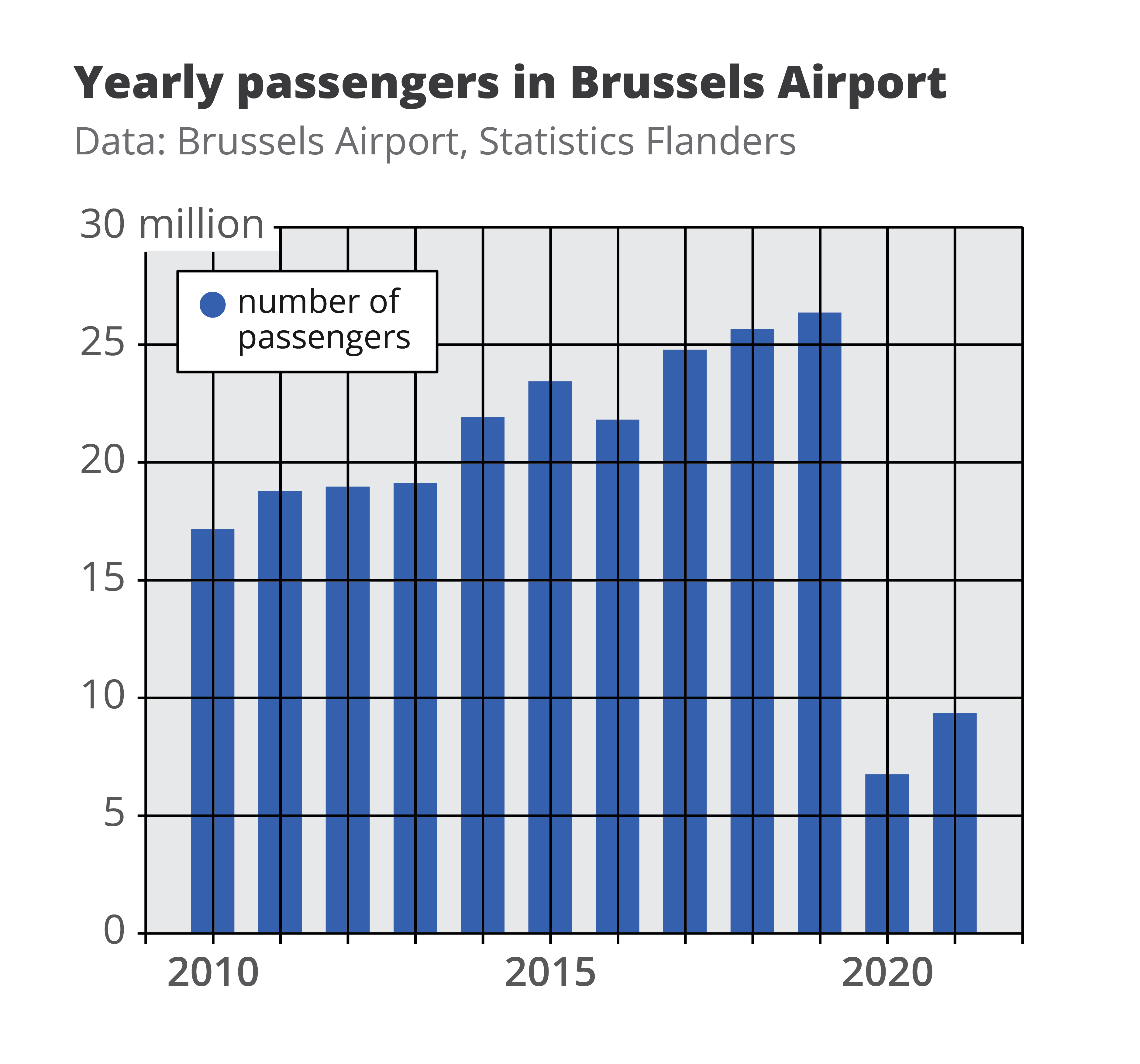
This is how a default visual might look like: it has no visual hierarchy, boring default colors, the legend takes up a lot of space, and the numbers are hard to read.
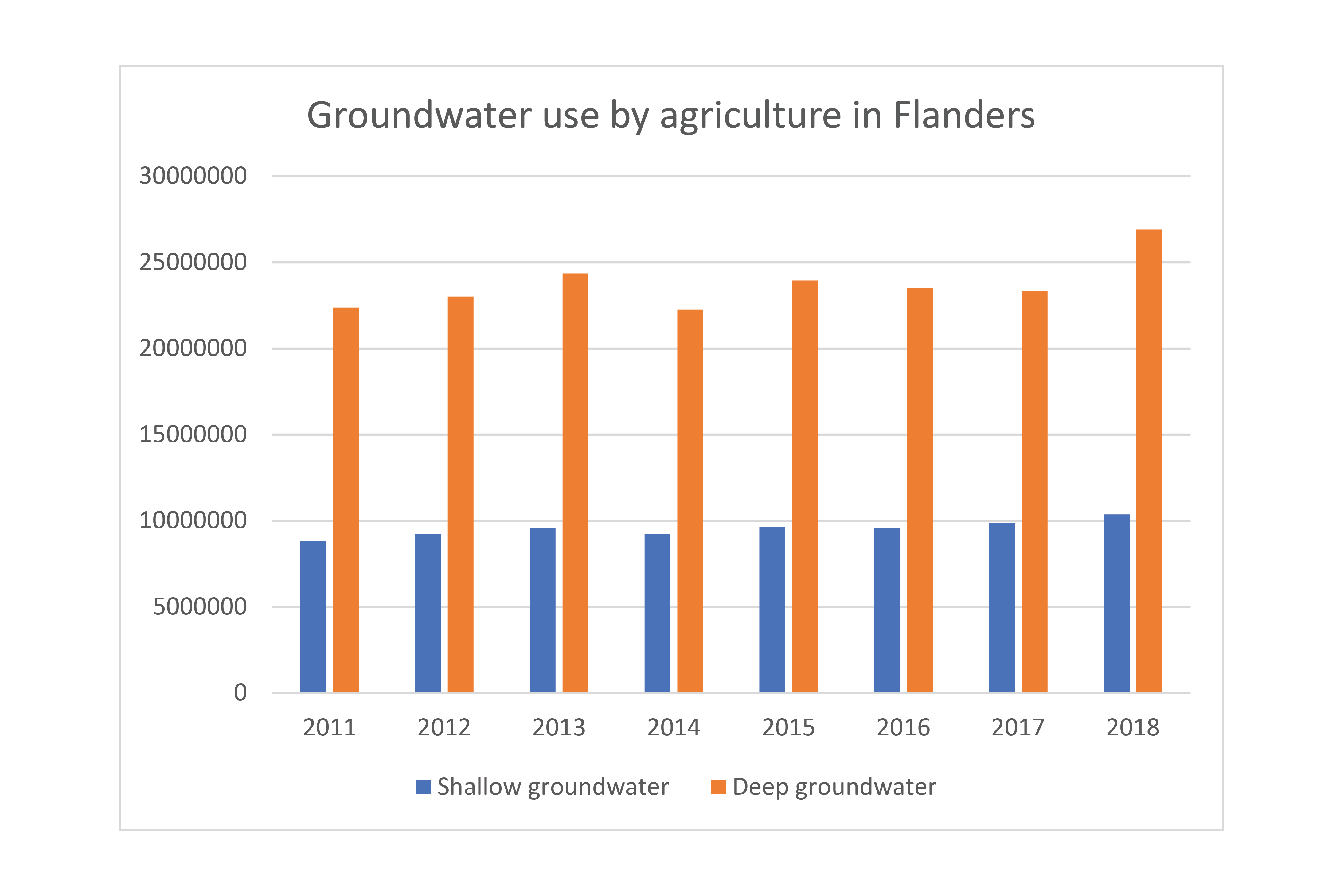
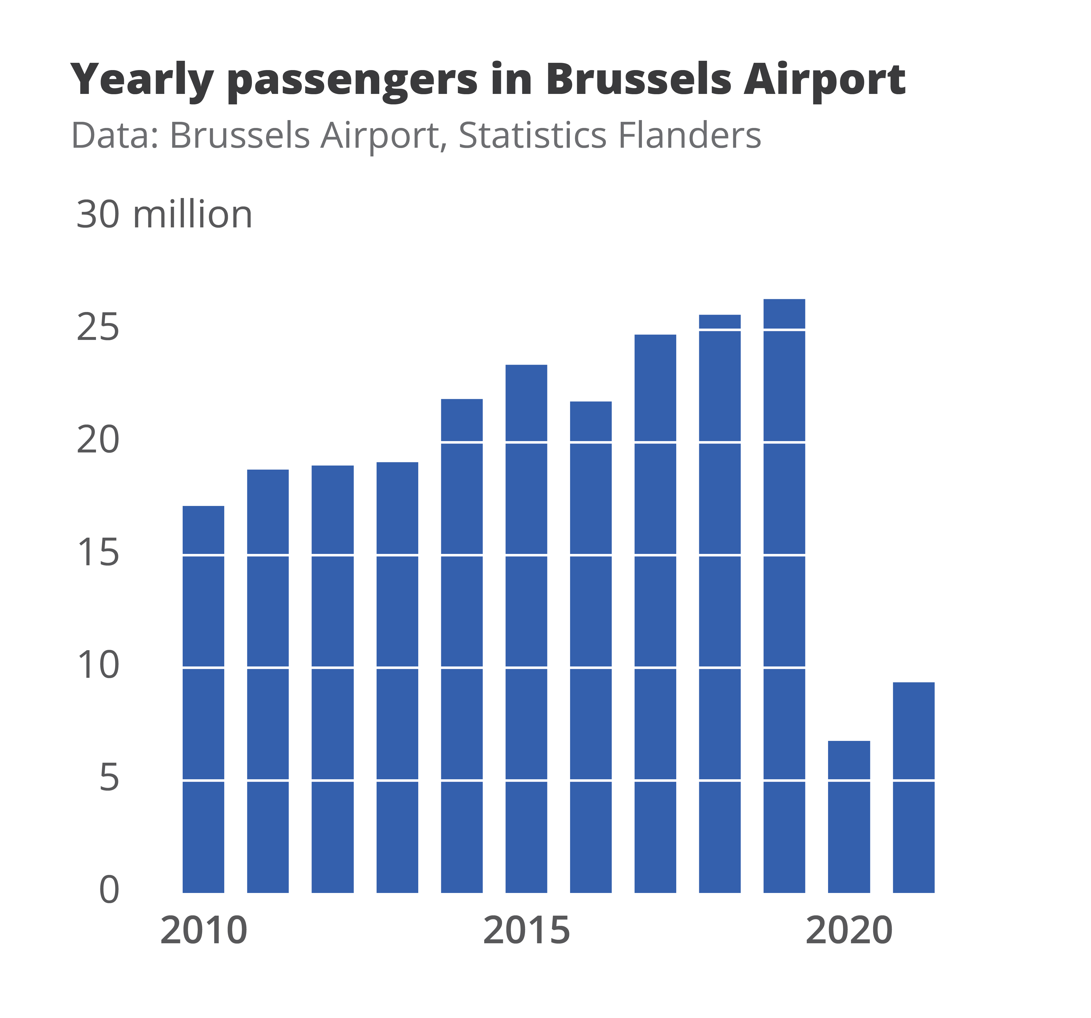
In the reworked visual below we changed the orientation of the bar chart from vertical to horizontal, we chose a better colour scheme, and we used direct labelling to remove the legend and gridlines. The end result contains exactly the same data as the default chart, but presented in a much clearer and more structured way.

Both of these charts were created from scratch using nothing but Microsoft Excel. Creating powerful charts is not about the tools you use, it’s all about applying the right principles!
If you want to know more about visualizing data in the right way, you can check out the other videos in this series. Or I invite you to read my book, Powerful Charts, that will give you actionable insights and practical guidelines to create data visuals that truly engage and inspire your audience.
Full video series
- 01. Why is data visualization so powerful?
- 02. Why is data visualization so challenging?
- 03. Navigating the landscape of powerful charts
- 04. A powerful chart tells a story
- 05. A powerful chart has a high signal-to-noise ratio
- 06. Making a data visual noise-free
- 07. 7 different goals for your chart
- 08. Three roles of colour in a data visual
- 09. Choosing the right font for your data visual
- 10. Can you use Excel to create a powerful chart?

Read more:

Why I love matrix charts
This one is definitely in my top 5 of favourite chart types: a matrix chart! Super flexible, can provide some great insights into the data, and it will fit well into your beautiful report design.

Vreemde plaatsnamen in Vlaanderen
Iedereen kent wellicht 'Kontich' en 'Reet', maar in Vlaanderen hebben we nog veel meer merkwaardige, onverwachte, en vaak grappige plaatsnamen. Heb je bijvoorbeeld ooit al gehoord van Buitenland, Dikkebus, of Grote Homo?

Small multiples can save your chart
When you're dealing with a chart that has too much information on it, the most straightforward advice to follow is: break it down into multiple charts, each with less information on them. A powerful example of this is a so-called small multiple approach.
Can you use Excel to create a powerful chart?
Spreadsheet tools such as Microsoft Excel or Numbers might not be the first thing on your mind when considering data visualization tools, but they can be pretty solid choices to build data visuals. Don’t let anyone convince you that using Excel to create data visuals is unprofessional.

Choosing the right font for your data visual
Fonts evoke emotions: there are very sophisticated fonts, playful fonts, attention-grabbing fonts, and elegant handwritten fonts. Using the wrong type of font can have a lot of impact. In data visualization the implications of typography are mainly focused on readability. Labels and annotations can easily become so small they get hard to read. Above all else, we should choose a font which is readable at small sizes.

Three roles of colour in a data visual
Colour is one of the most crucial tools we have to turn a normal chart into a powerful chart with a clear message, a chart which tells a story rather than simply presenting the information.
We are really into visual communication!
Every now and then we send out a newsletter with latest work, handpicked inspirational infographics, must-read blog posts, upcoming dates for workshops and presentations, and links to useful tools and tips. Leave your email address here and we’ll add you to our mailing list of awesome people!

Choosing the right font for your data visual
Choosing the right font for your data visual
Typography is a fascinating domain. Fonts evoke emotions: there are very sophisticated fonts, playful fonts, attention-grabbing fonts, and elegant handwritten fonts. Using the wrong type of font can have a lot of impact. In data visualization the implications of typography are mainly focused on readability. Labels and annotations can easily become so small they get hard to read. Above all else, we should choose a font which is readable at small sizes.
What influences readability?
The readability of a font at small sizes is mainly determined by three aspects: the x-height, the counter, and the serifs.
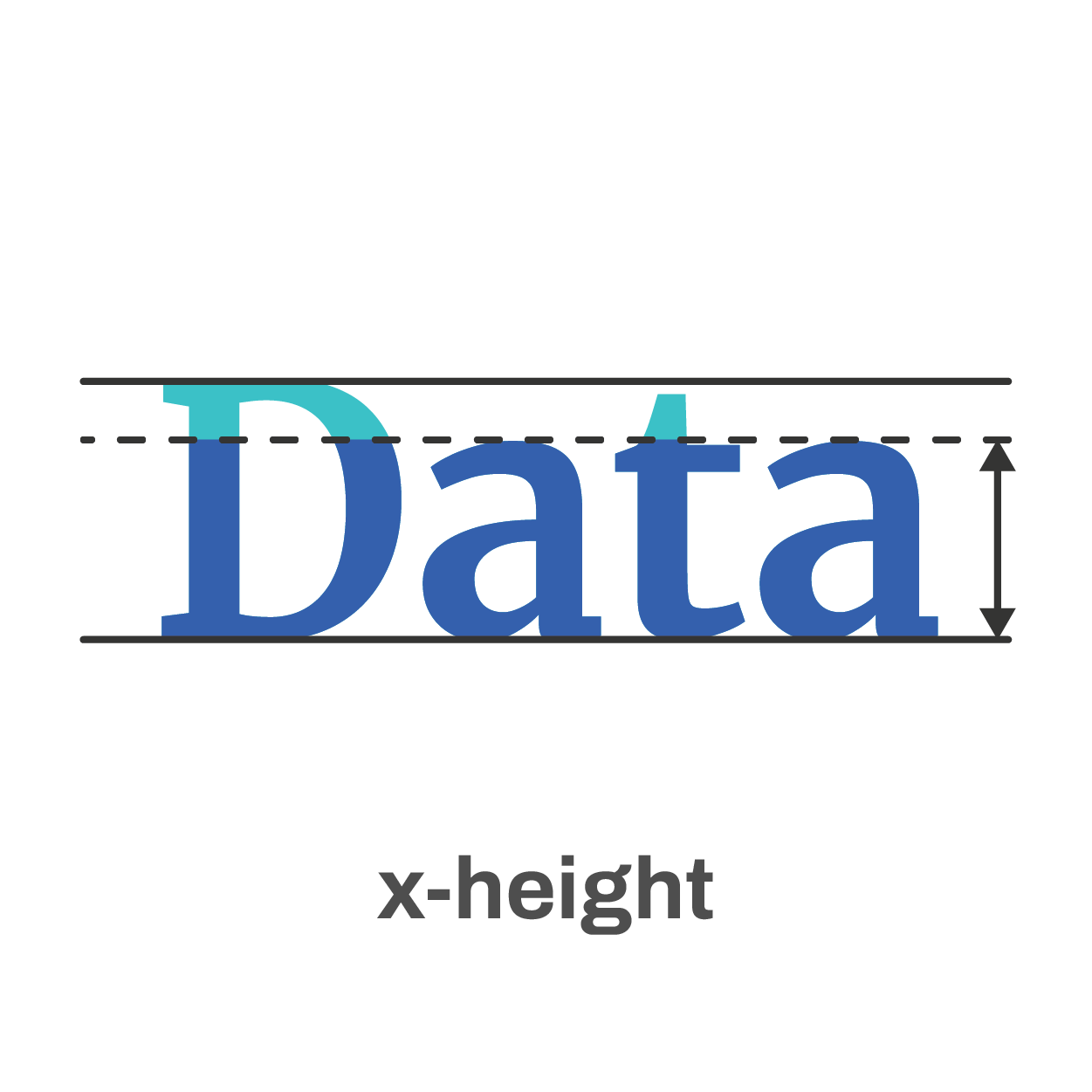
The x-height of a font is the height of the lowercase letters compared to the height of the line itself. Fonts with a lower x-height are more difficult to read than fonts with a higher x-height.
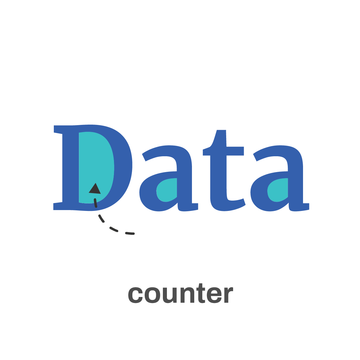
The counter is the enclosed space inside a letter, such as in the letters ‘o’, ‘a’ or ‘e’. The larger the counter size, the easier it becomes to read a font at small sizes.

Finally, the serifs. Sans-serif fonts are generally easier to read at small sizes than serif fonts. The different serifs – the small lines and strokes attached to the end of individual letters – make longer texts easier to read, because our brains can more easily distinguish different letters from each other. That’s why almost any book is set in a serif font. But for small text, the serifs get in the way and sans-serif fonts are the way to go.
Where to find the perfect font?
If you’re struggling to find the perfect font, a good website like Google Fonts can help you out. With over 1300 free font families, there’s always something for every situation. You can enter your own text and immediately see how it will look in all of these different fonts. You can filter by category or you can look specifically for very bold fonts, wide fonts, etc. Once you’ve found the perfect font, all you have to do is download it and install it on your computer.
The best fonts for data visualization
If you still find looking for the perfect font a daunting task, try some of the fonts developed specifically for readability:
Assistant | Lato | Noto Sans | Roboto | Source Sans
If you want to know more about visualizing data in the right way, you can check out the other videos in this series. Or I invite you to read my book, Powerful Charts, that will give you actionable insights and practical guidelines to create data visuals that truly engage and inspire your audience.
Full video series
- 01. Why is data visualization so powerful?
- 02. Why is data visualization so challenging?
- 03. Navigating the landscape of powerful charts
- 04. A powerful chart tells a story
- 05. A powerful chart has a high signal-to-noise ratio
- 06. Making a data visual noise-free
- 07. 7 different goals for your chart
- 08. Three roles of colour in a data visual
- 09. Choosing the right font for your data visual
- 10. Can you use Excel to create a powerful chart? (coming on January 09, 2023)
Read more:
Why I love matrix charts
This one is definitely in my top 5 of favourite chart types: a matrix chart! Super flexible, can provide some great insights into the data, and it will fit well into your beautiful report design.
Vreemde plaatsnamen in Vlaanderen
Iedereen kent wellicht 'Kontich' en 'Reet', maar in Vlaanderen hebben we nog veel meer merkwaardige, onverwachte, en vaak grappige plaatsnamen. Heb je bijvoorbeeld ooit al gehoord van Buitenland, Dikkebus, of Grote Homo?
Small multiples can save your chart
When you're dealing with a chart that has too much information on it, the most straightforward advice to follow is: break it down into multiple charts, each with less information on them. A powerful example of this is a so-called small multiple approach.
Can you use Excel to create a powerful chart?
Spreadsheet tools such as Microsoft Excel or Numbers might not be the first thing on your mind when considering data visualization tools, but they can be pretty solid choices to build data visuals. Don’t let anyone convince you that using Excel to create data visuals is unprofessional.
Choosing the right font for your data visual
Fonts evoke emotions: there are very sophisticated fonts, playful fonts, attention-grabbing fonts, and elegant handwritten fonts. Using the wrong type of font can have a lot of impact. In data visualization the implications of typography are mainly focused on readability. Labels and annotations can easily become so small they get hard to read. Above all else, we should choose a font which is readable at small sizes.
Three roles of colour in a data visual
Colour is one of the most crucial tools we have to turn a normal chart into a powerful chart with a clear message, a chart which tells a story rather than simply presenting the information.
We are really into visual communication!
Every now and then we send out a newsletter with latest work, handpicked inspirational infographics, must-read blog posts, upcoming dates for workshops and presentations, and links to useful tools and tips. Leave your email address here and we’ll add you to our mailing list of awesome people!
Three roles of colour in a data visual
Three roles of colour in a data visual
Colour is one of the most crucial tools we have to turn a normal chart into a powerful chart with a clear message, a chart which tells a story rather than simply presenting the information.
This Venn diagram shows the number of harmful pesticides, presented as dots, banned or phased out in four major economic regions (Brazil, the United States, Europe and China).

Notice how colour is used in three different ways here.
Background colours
Grey is used as a background colour– elements in grey are present and visible, but they will never be at the foreground of the visual, or get in the way of the key message. Used in a clever way, grey can help our viewer to distinguish between what’s most and what’s less important, and bring structure to the layout of the visual.
In fact, most of the time it’s a good idea to create the first version of your data visual purely in tints of grey. This will help you to quickly see if your design will work, and how your data visual will be perceived.
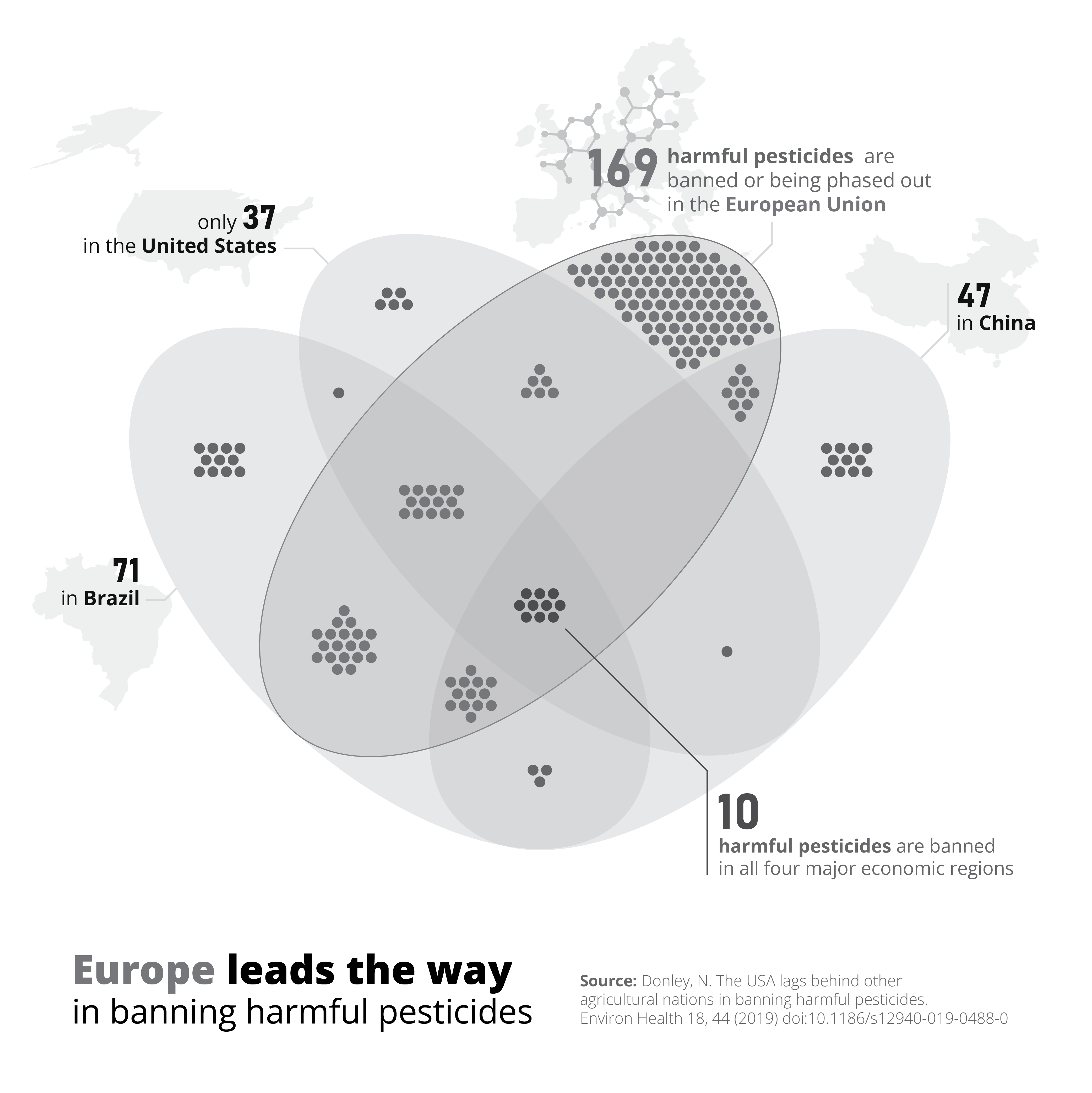
Thematic colours
Blue is used as a thematic colour – because we associate the European Union with the colour blue (because of its flag and logo), it is a logical choice to use this colour to indicate everything related to Europe. Blue is not only used for the dots and the Venn diagram, but also the number 169 in the label, and the words ‘Europe’ and ‘European Union’ in the title and label. This helps to tie all the different parts of the image – diagram, title and annotations – together in a logical, visual way.
Accent colours
Finally, red is used as an accent colour – it almost automatically draws our attention to the central part of the visual: the 10 harmful pesticides which are banned in all four major economic regions simultaneously. Make sure to use your accent colours sparingly. As they are so good at drawing attention, using too much of them will quickly overwhelm your audience – they won’t know where to look first! Highlight only the elements which are crucial to explain your key message.
If you want to know more about visualizing data in the right way, you can check out the other videos in this series. Or I invite you to read my book, Powerful Charts, that will give you actionable insights and practical guidelines to create data visuals that truly engage and inspire your audience.
Full video series
- 01. Why is data visualization so powerful?
- 02. Why is data visualization so challenging?
- 03. Navigating the landscape of powerful charts
- 04. A powerful chart tells a story
- 05. A powerful chart has a high signal-to-noise ratio
- 06. Making a data visual noise-free
- 07. 7 different goals for your chart
- 08. Three roles of colour in a data visual
- 09. Choosing the right font for your data visual
- 10. Can you use Excel to create a powerful chart? (coming on January 09, 2023)
Read more:
Why I love matrix charts
This one is definitely in my top 5 of favourite chart types: a matrix chart! Super flexible, can provide some great insights into the data, and it will fit well into your beautiful report design.
Vreemde plaatsnamen in Vlaanderen
Iedereen kent wellicht 'Kontich' en 'Reet', maar in Vlaanderen hebben we nog veel meer merkwaardige, onverwachte, en vaak grappige plaatsnamen. Heb je bijvoorbeeld ooit al gehoord van Buitenland, Dikkebus, of Grote Homo?
Small multiples can save your chart
When you're dealing with a chart that has too much information on it, the most straightforward advice to follow is: break it down into multiple charts, each with less information on them. A powerful example of this is a so-called small multiple approach.
Can you use Excel to create a powerful chart?
Spreadsheet tools such as Microsoft Excel or Numbers might not be the first thing on your mind when considering data visualization tools, but they can be pretty solid choices to build data visuals. Don’t let anyone convince you that using Excel to create data visuals is unprofessional.
Choosing the right font for your data visual
Fonts evoke emotions: there are very sophisticated fonts, playful fonts, attention-grabbing fonts, and elegant handwritten fonts. Using the wrong type of font can have a lot of impact. In data visualization the implications of typography are mainly focused on readability. Labels and annotations can easily become so small they get hard to read. Above all else, we should choose a font which is readable at small sizes.
Three roles of colour in a data visual
Colour is one of the most crucial tools we have to turn a normal chart into a powerful chart with a clear message, a chart which tells a story rather than simply presenting the information.
We are really into visual communication!
Every now and then we send out a newsletter with latest work, handpicked inspirational infographics, must-read blog posts, upcoming dates for workshops and presentations, and links to useful tools and tips. Leave your email address here and we’ll add you to our mailing list of awesome people!

7 different goals for your chart
7 different goals for your chart
A crucial step in building a powerful chart is choosing the right type of chart. A lot of charts don’t work because they simply use the wrong type of chart. To avoid this trap, we must ask ourselves a basic question: what’s the ultimate goal of our data visual? What do we want to show with our data?
Categories of graphical representation
As it turns out, there’s only a limited set of goals we might have for our chart. These goals, sometimes called ‘categories of graphical representation’, always boil down to the same seven categories.
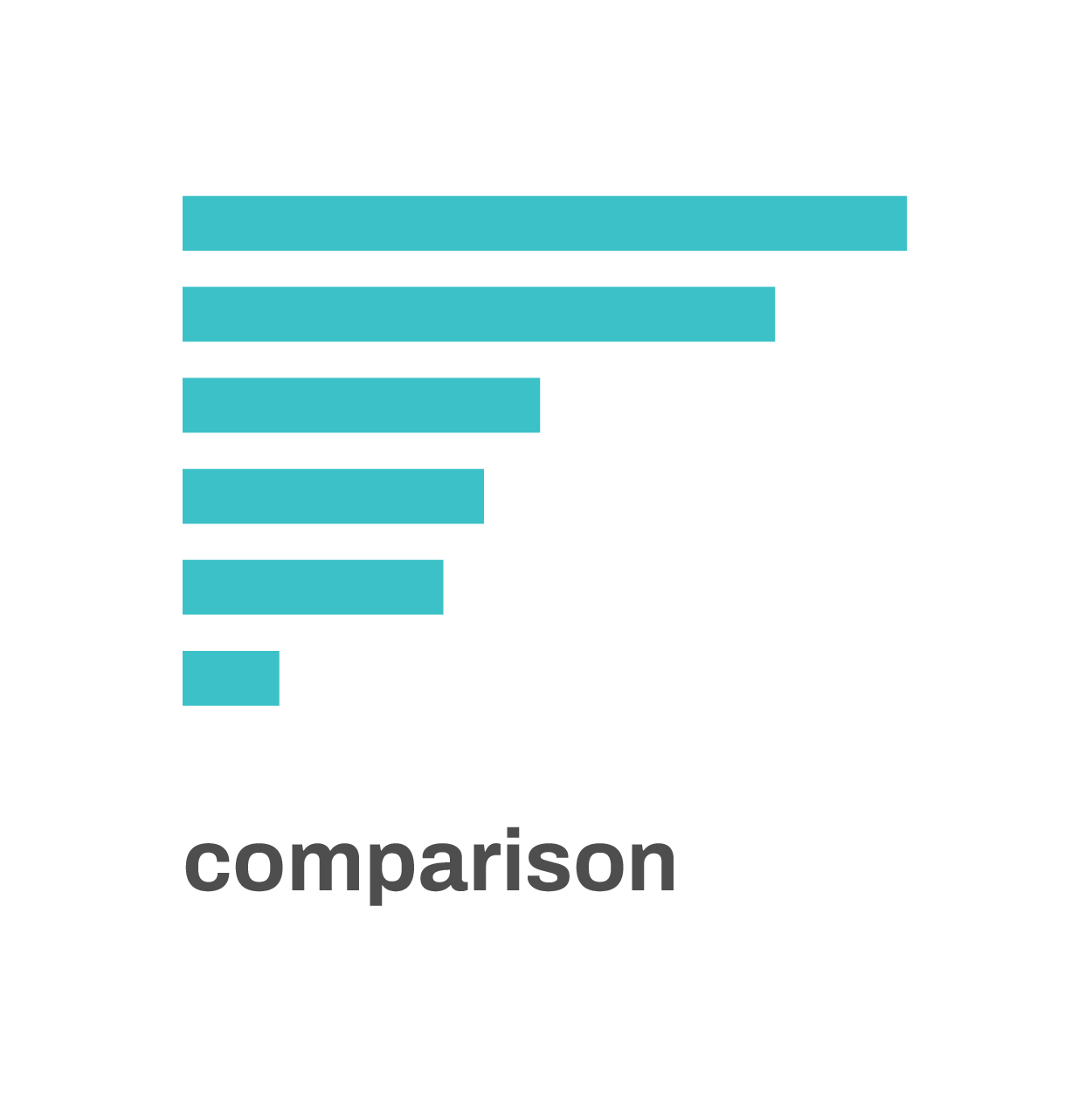
Comparison: in many cases, we want to compare different values for different categories with each other. A bar chart is perfect to do this: the length of the bars shows us the underlying data values, and makes it easy to compare them with each other.
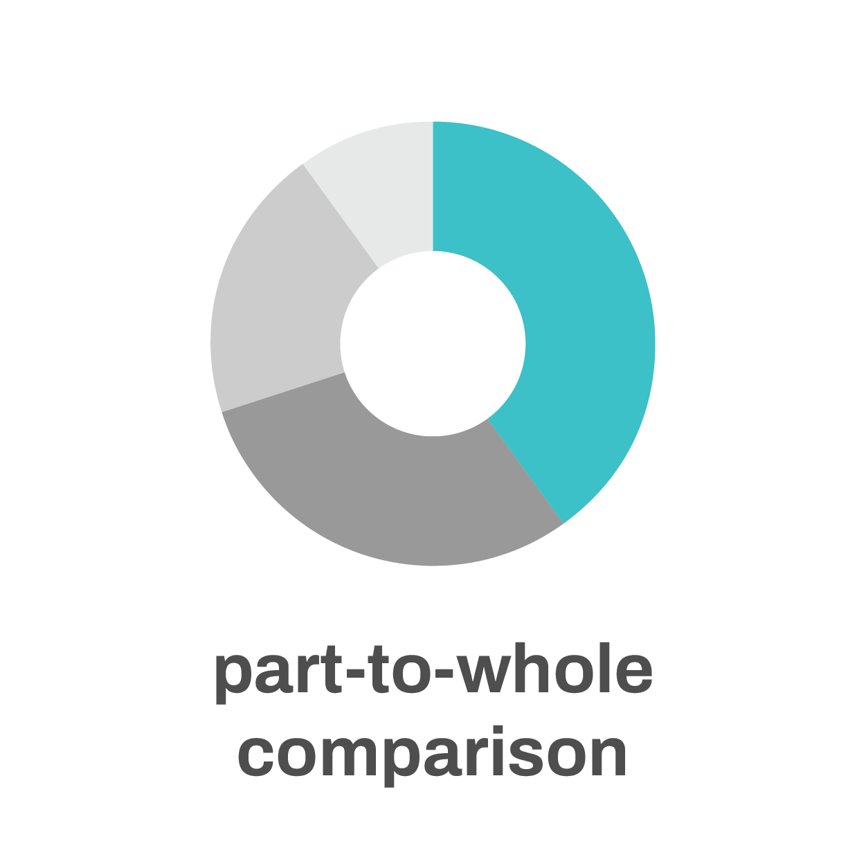
A part-to-whole comparison is comparison’s little brother. Rather than directly comparing categories with each other we’re comparing the size of a single category with the total size of all categories combined. Pie charts or stacked bar charts are ideal tools for this.
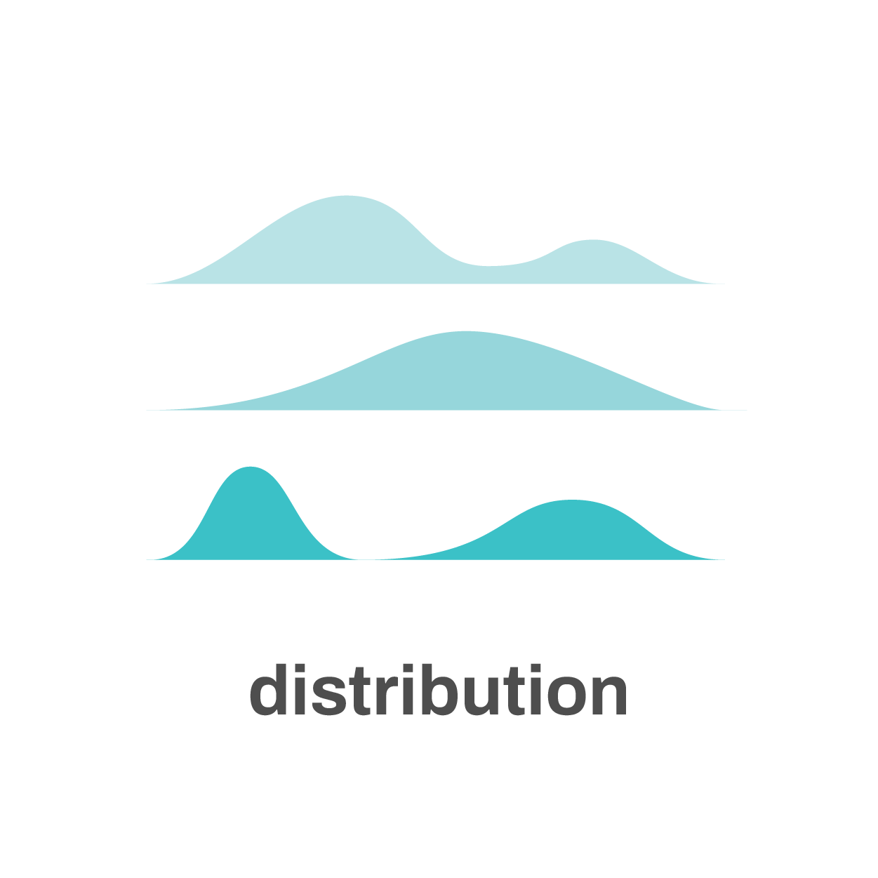
If our goal is to show a distribution, we want to get an impression of how data points are distributed along a certain parameter or dimension. Great charts to study or show distributions are histograms, box plots, density plots or ridgeline plots.
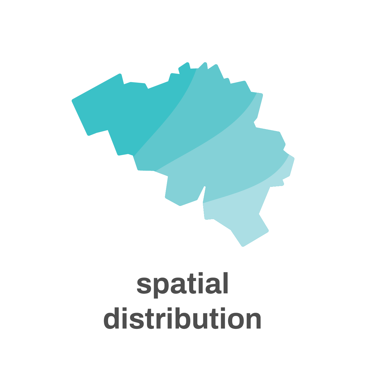
If the dimensions under consideration are spatial dimensions, such as latitude or longitude, we’re talking about a spatial distribution – the realm of maps.
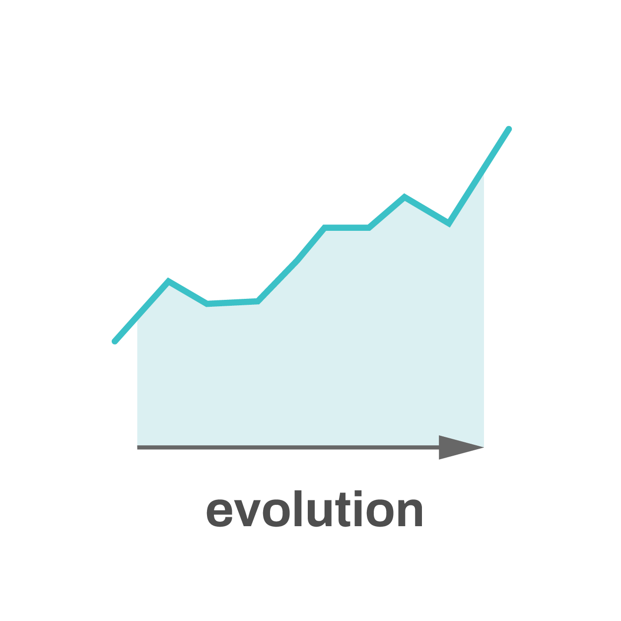
When one of the parameters in our dataset is time, we’re often interested in showing the evolution: how has a certain value changed over time?
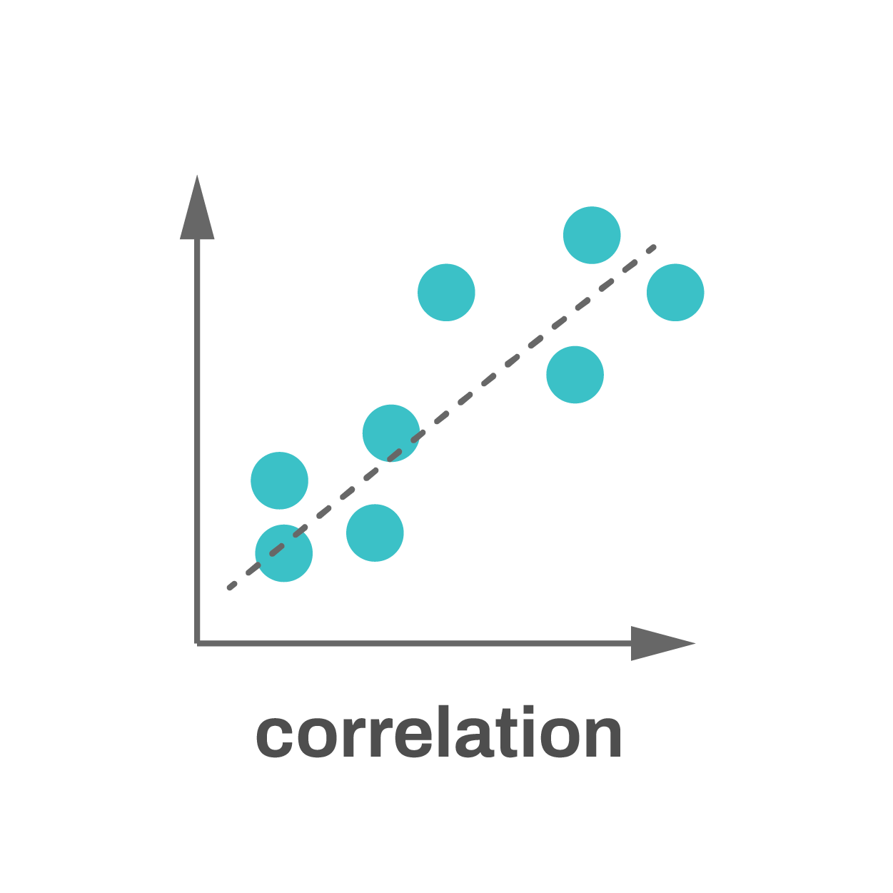
Correlation occurs when two parameters are related to each other. For example, if we take a large group of humans and have a look at their height and weight, we will find that, in general, taller people also have a larger weight. Typically scatter plots are used to study correlations, but there are other options as well.

Finally, hierarchy: we might want to show how different parts of a dataset are linked to each other. Maybe there’s a parent category with subcategories, and maybe those subcategories are again subdivided into even smaller categories. To show these hierarchies a sunburst diagram, treemap or network visualization might be what we need.
Start with the goal in mind
99% of all the charts we have to make fall into one of these seven categories. Clearly identifying our goal at the start of the creation process will help us find the most appropriate chart type, leading to the most powerful chart.
If you want to know more about visualizing data in the right way, you can check out the other videos in this series. Or I invite you to read my book, Powerful Charts, that will give you actionable insights and practical guidelines to create data visuals that truly engage and inspire your audience.
Full video series
- 01. Why is data visualization so powerful?
- 02. Why is data visualization so challenging?
- 03. Navigating the landscape of powerful charts
- 04. A powerful chart tells a story
- 05. A powerful chart has a high signal-to-noise ratio
- 06. Making a data visual noise-free
- 07. 7 different goals for your chart
- 08. Three roles of colour in a data visual
- 09. Choosing the right font for your data visual
- 10. Can you use Excel to create a powerful chart? (coming on January 09, 2023)
Read more:
Why I love matrix charts
This one is definitely in my top 5 of favourite chart types: a matrix chart! Super flexible, can provide some great insights into the data, and it will fit well into your beautiful report design.
Vreemde plaatsnamen in Vlaanderen
Iedereen kent wellicht 'Kontich' en 'Reet', maar in Vlaanderen hebben we nog veel meer merkwaardige, onverwachte, en vaak grappige plaatsnamen. Heb je bijvoorbeeld ooit al gehoord van Buitenland, Dikkebus, of Grote Homo?
Small multiples can save your chart
When you're dealing with a chart that has too much information on it, the most straightforward advice to follow is: break it down into multiple charts, each with less information on them. A powerful example of this is a so-called small multiple approach.
Can you use Excel to create a powerful chart?
Spreadsheet tools such as Microsoft Excel or Numbers might not be the first thing on your mind when considering data visualization tools, but they can be pretty solid choices to build data visuals. Don’t let anyone convince you that using Excel to create data visuals is unprofessional.
Choosing the right font for your data visual
Fonts evoke emotions: there are very sophisticated fonts, playful fonts, attention-grabbing fonts, and elegant handwritten fonts. Using the wrong type of font can have a lot of impact. In data visualization the implications of typography are mainly focused on readability. Labels and annotations can easily become so small they get hard to read. Above all else, we should choose a font which is readable at small sizes.
Three roles of colour in a data visual
Colour is one of the most crucial tools we have to turn a normal chart into a powerful chart with a clear message, a chart which tells a story rather than simply presenting the information.
We are really into visual communication!
Every now and then we send out a newsletter with latest work, handpicked inspirational infographics, must-read blog posts, upcoming dates for workshops and presentations, and links to useful tools and tips. Leave your email address here and we’ll add you to our mailing list of awesome people!

Making a data visual noise-free
Making a data visual noise-free
Removing noise from a data visual is not only about taking things away such as gridlines, axes or legends. That’s just one part of it, which we could call removing physical noise. Improving the signal-to-noise ratio is often also about adding little things that help our audience better understand the visual. We are helping them by removing mental noise, or mental barriers.
Towards a noise-free data visual
This visual is a concrete example from sports science. It’s a typical chart you could encounter in a scientific article or report. It does, however, contain a lot of noise.

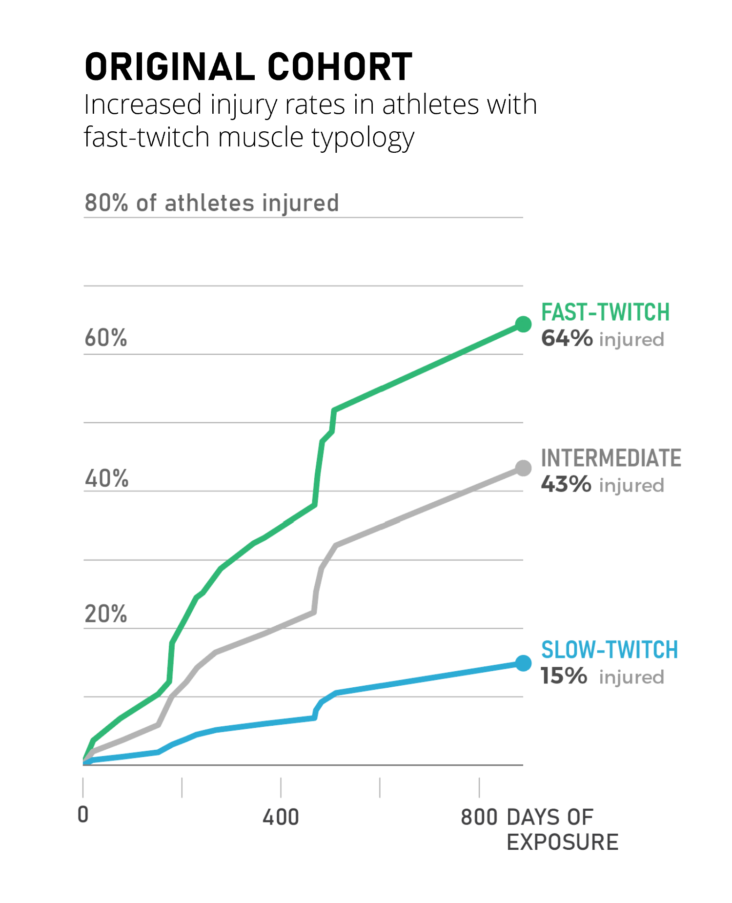
The improved visual on the right presents the same data in a much clearer way. To achieve this, we made a lot of small choices, all meant to remove mental noise and make the chart just a little bit easier to interpret.
A lot of tiny changes…
- First of all, the message is now loud and clear from the title: we see an increased injury rate in athletes with a specific muscle typology. Remember – a clear visual tells a story, it shouldn’t hide the story from our audience. ‘Original cohort’ is not a very insightful title.
- We flipped the chart around to talk about ‘injury rate’ rather than ‘cumulative survival’. The latter is a scientific term which might confuse audiences not familiar with it. Athletes are not dying, they are simply getting injured.
- Having a vertical axis makes the chart hard to read. To know the values, especially on the right-hand side of the chart, we need to take out a ruler to estimate them. The improved visual uses gridlines, making it much easier to see when lines cross a certain percentage.
- We also removed the legend and confusing abbreviations, and replaced them with direct labelling, clear colours, and explicitly showing the data values.
- Finally, in a more technical change we switched from stepwise interpolation to linear interpolation of the data points, giving us a more realistic approximation of the growing number of injuries.
…with a lot of impact
That’s a lot of tiny changes to improve the readability of the data visual. Individually, they are not very spectacular or groundbreaking. But together, they can turn a complex chart into a clean visual that’s much faster to interpret, with a much clearer message.
If you want to know more about visualizing data in the right way, you can check out the other videos in this series. Or I invite you to read my book, Powerful Charts, that will give you actionable insights and practical guidelines to create data visuals that truly engage and inspire your audience.
Full video series
- 01. Why is data visualization so powerful?
- 02. Why is data visualization so challenging?
- 03. Navigating the landscape of powerful charts
- 04. A powerful chart tells a story
- 05. A powerful chart has a high signal-to-noise ratio
- 06. Making a data visual noise-free
- 07. 7 different goals for your chart
- 08. Three roles of colour in a data visual
- 09. Choosing the right font for your data visual
- 10. Can you use Excel to create a powerful chart? (coming on January 09, 2023)
Read more:
Why I love matrix charts
This one is definitely in my top 5 of favourite chart types: a matrix chart! Super flexible, can provide some great insights into the data, and it will fit well into your beautiful report design.
Vreemde plaatsnamen in Vlaanderen
Iedereen kent wellicht 'Kontich' en 'Reet', maar in Vlaanderen hebben we nog veel meer merkwaardige, onverwachte, en vaak grappige plaatsnamen. Heb je bijvoorbeeld ooit al gehoord van Buitenland, Dikkebus, of Grote Homo?
Small multiples can save your chart
When you're dealing with a chart that has too much information on it, the most straightforward advice to follow is: break it down into multiple charts, each with less information on them. A powerful example of this is a so-called small multiple approach.
Can you use Excel to create a powerful chart?
Spreadsheet tools such as Microsoft Excel or Numbers might not be the first thing on your mind when considering data visualization tools, but they can be pretty solid choices to build data visuals. Don’t let anyone convince you that using Excel to create data visuals is unprofessional.
Choosing the right font for your data visual
Fonts evoke emotions: there are very sophisticated fonts, playful fonts, attention-grabbing fonts, and elegant handwritten fonts. Using the wrong type of font can have a lot of impact. In data visualization the implications of typography are mainly focused on readability. Labels and annotations can easily become so small they get hard to read. Above all else, we should choose a font which is readable at small sizes.
Three roles of colour in a data visual
Colour is one of the most crucial tools we have to turn a normal chart into a powerful chart with a clear message, a chart which tells a story rather than simply presenting the information.
We are really into visual communication!
Every now and then we send out a newsletter with latest work, handpicked inspirational infographics, must-read blog posts, upcoming dates for workshops and presentations, and links to useful tools and tips. Leave your email address here and we’ll add you to our mailing list of awesome people!

A powerful chart has a high signal-to-noise ratio
A powerful chart has a high signal-to-noise ratio
‘Less is more’. It’s a crucial principle in most of our communication, and in data visualization in particular. Because of my background as a physicist, I prefer to talk about the ‘signal-to-noise ratio’. The message – our signal – should be amplified as much as possible, giving it all of the attention. Everything that can distract from our message – the noise – should be removed.
Noise: the enemy of communication
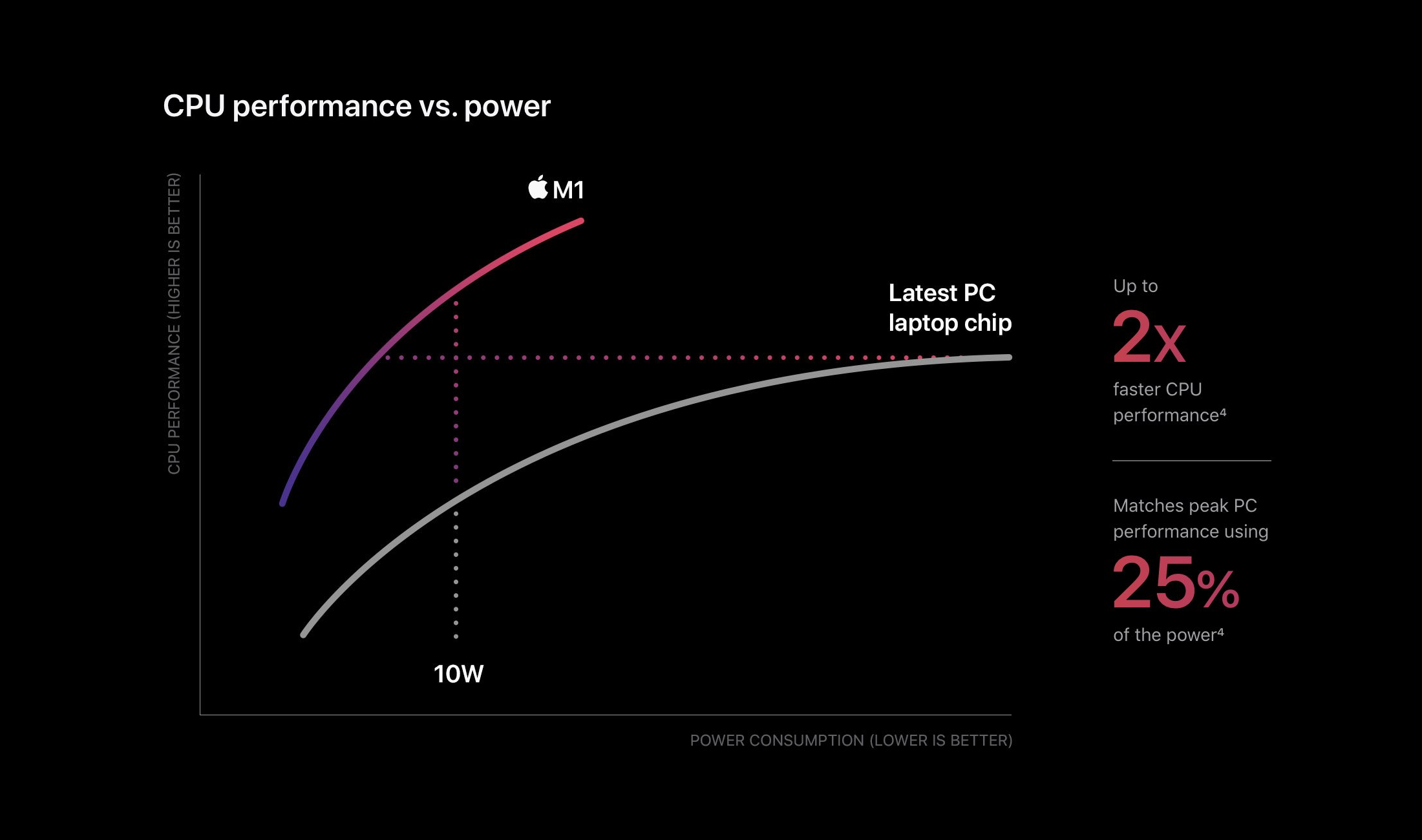
Maximizing the signal-to-noise is important for every form of communication. A company that applies this principle very well is Apple. In their presentation of the first iPhone, back in 2007, the signal-to-noise ratio is very high.
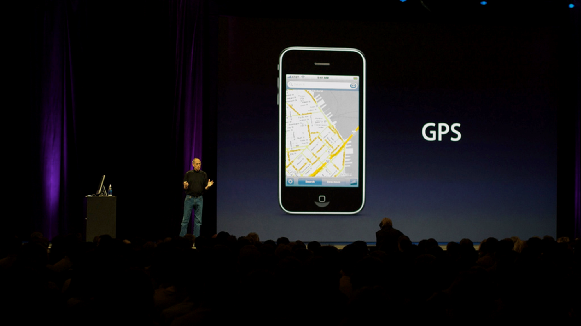
On the slide is just a picture of the iPhone with a single word: GPS. That’s what this part of the presentation is about: here’s our new phone, and it has GPS!
There’s nothing else on the slide – no slide numbers, dates or logos. Not even the Apple logo! Both the slide and the room have a dark background. Steve Jobs is not behind his desk, because it would be a barrier between him and the audience. He’s wearing neutral clothes, because anything too fancy might distract from the message. Every possible source of noise has been eliminated.
Noise in data visualization
Apple still does this today, and they do it in their data visualization as well. This very clean chart was a part of their 2020 presentation of the M1 chip. Again, it has a noise-free dark background. Everything unnecessary is removed. There are no gridlines or axis ticks. There is not even a legend!
Remove the unnecessary
Here’s another practical example of signal-to-noise ratio applied to data visuals. From this chart we can remove the coloured background, the gridlines, the legend, and even the horizontal and vertical axes. Removing these elements doesn’t harm the data or the message of the visual. In fact, it makes the data even more accessible. That means they were just noise! We end up with a much clearer visual, with a much higher signal-to-noise ratio.
If you want to know more about visualizing data in the right way, you can check out the other videos in this series. Or I invite you to read my book, Powerful Charts, that will give you actionable insights and practical guidelines to create data visuals that truly engage and inspire your audience.
Full video series
- 01. Why is data visualization so powerful?
- 02. Why is data visualization so challenging?
- 03. Navigating the landscape of powerful charts
- 04. A powerful chart tells a story
- 05. A powerful chart has a high signal-to-noise ratio
- 06. Making a data visual noise-free
- 07. 7 different goals for your chart
- 08. Three roles of colour in a data visual
- 09. Choosing the right font for your data visual
- 10. Can you use Excel to create a powerful chart? (coming on January 09, 2023)
Read more:
Why I love matrix charts
This one is definitely in my top 5 of favourite chart types: a matrix chart! Super flexible, can provide some great insights into the data, and it will fit well into your beautiful report design.
Vreemde plaatsnamen in Vlaanderen
Iedereen kent wellicht 'Kontich' en 'Reet', maar in Vlaanderen hebben we nog veel meer merkwaardige, onverwachte, en vaak grappige plaatsnamen. Heb je bijvoorbeeld ooit al gehoord van Buitenland, Dikkebus, of Grote Homo?
Small multiples can save your chart
When you're dealing with a chart that has too much information on it, the most straightforward advice to follow is: break it down into multiple charts, each with less information on them. A powerful example of this is a so-called small multiple approach.
Can you use Excel to create a powerful chart?
Spreadsheet tools such as Microsoft Excel or Numbers might not be the first thing on your mind when considering data visualization tools, but they can be pretty solid choices to build data visuals. Don’t let anyone convince you that using Excel to create data visuals is unprofessional.
Choosing the right font for your data visual
Fonts evoke emotions: there are very sophisticated fonts, playful fonts, attention-grabbing fonts, and elegant handwritten fonts. Using the wrong type of font can have a lot of impact. In data visualization the implications of typography are mainly focused on readability. Labels and annotations can easily become so small they get hard to read. Above all else, we should choose a font which is readable at small sizes.
Three roles of colour in a data visual
Colour is one of the most crucial tools we have to turn a normal chart into a powerful chart with a clear message, a chart which tells a story rather than simply presenting the information.
We are really into visual communication!
Every now and then we send out a newsletter with latest work, handpicked inspirational infographics, must-read blog posts, upcoming dates for workshops and presentations, and links to useful tools and tips. Leave your email address here and we’ll add you to our mailing list of awesome people!

A powerful chart tells a story
A powerful chart tells a story
A powerful chart has a clear message. It should be short and meaningful, and obvious in the blink of an eye. If there’s only one thing our audience remembers at the end of the day, this should be it.
Answering the ‘so what’ question
A visual without a clear key message might show the data, but it doesn’t show what’s interesting, surprising or noteworthy about the data. It leaves our audience guessing, they have to do all of the thinking work. Ideally, we want to create a visual that helps them to quickly see what’s important. A visual that not only answers the ‘what’ question, but more importantly also the ‘so what’ question.
Here’s one of my favourite examples to illustrate the importance of visual storytelling. This chart shows the evolution of meat consumption in the US since the 1960s. By itself, this chart is pretty clear. It shows us the data, in a way that is easy to understand. It answers the ‘what’ question. The design is satisfactory, with pleasing colours and good readability. But can it be improved?
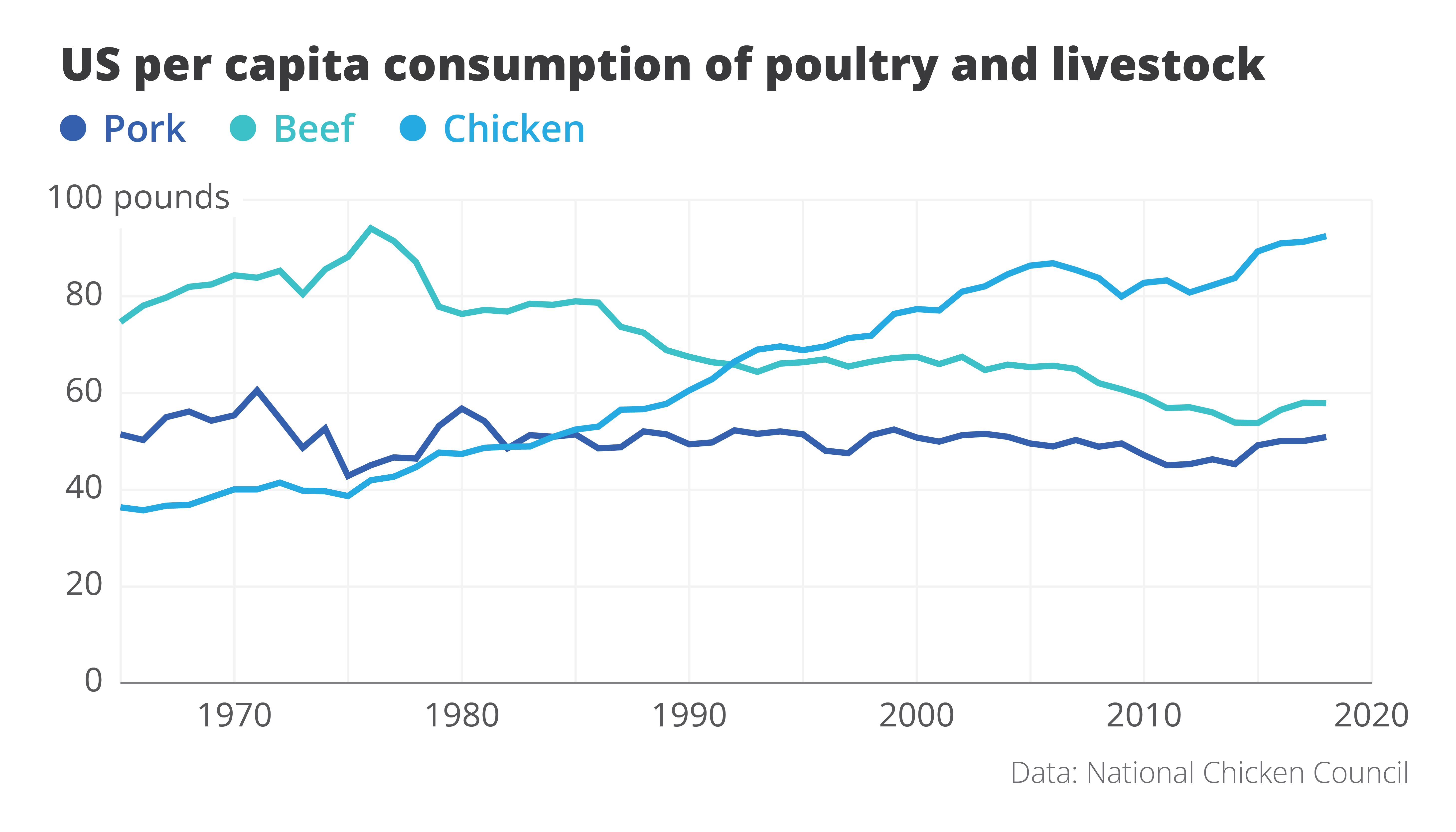
Here is an attempt at a rework. Even though we’re looking at exactly the same data – we wouldn’t want to lie to our audience! – the message in this new visual is loud and clear. It’s right there in the title: Americans are eating more chicken than ever before!
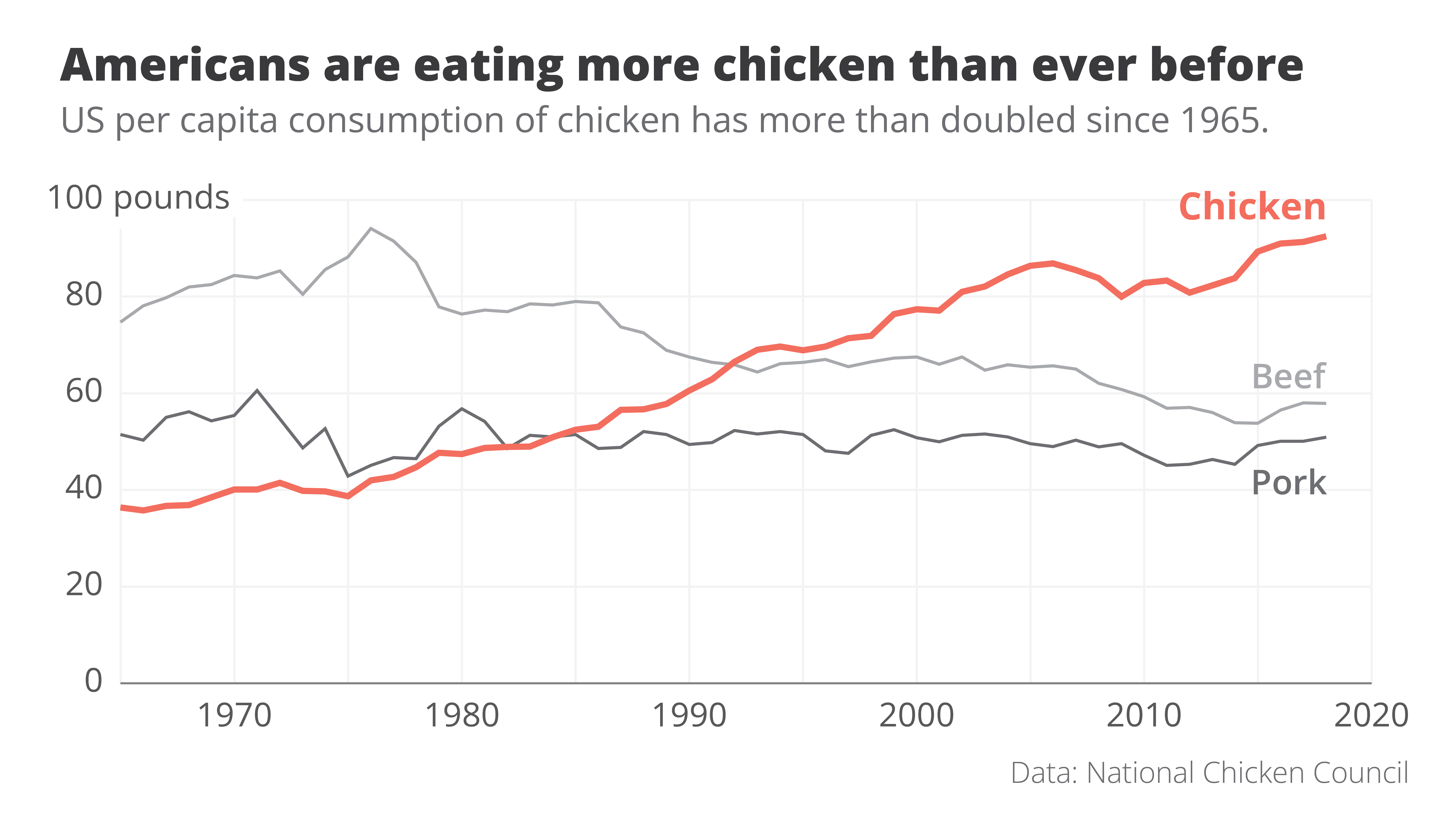
The power of data visualization at work
Two simple changes turned the original ‘what’ visual into this super-clear ‘so what’ visual.
- First of all, clever colour choices: the line that interests us – the one for chicken consumption – gets a bright orange colour, the other two become grey. They’re still there, but pushed a bit to the background.
- Secondly, clever text: the original title was very factual – ‘US per capita consumption of poultry and livestock’. All the thinking work is left for the reader. But what if we simply tell them the interesting part? The new title ‘Americans are eating more chicken than ever before’ is still 100% true, but now it tells us why this visual is actually quite surprising.
These two small but impactful changes turned the original visual, which simply shows the data, into a great visual that actually tells a story. For me, that’s the real power of data visualization at work.
If you want to know more about visualizing data in the right way, you can check out the other videos in this series. Or I invite you to read my book, Powerful Charts, that will give you actionable insights and practical guidelines to create data visuals that truly engage and inspire your audience.
Full video series
- 01. Why is data visualization so powerful?
- 02. Why is data visualization so challenging?
- 03. Navigating the landscape of powerful charts
- 04. A powerful chart tells a story
- 05. A powerful chart has a high signal-to-noise ratio
- 06. Making a data visual noise-free
- 07. 7 different goals for your chart
- 08. Three roles of colour in a data visual
- 09. Choosing the right font for your data visual
- 10. Can you use Excel to create a powerful chart? (coming on January 09, 2023)
Read more:
Why I love matrix charts
This one is definitely in my top 5 of favourite chart types: a matrix chart! Super flexible, can provide some great insights into the data, and it will fit well into your beautiful report design.
Vreemde plaatsnamen in Vlaanderen
Iedereen kent wellicht 'Kontich' en 'Reet', maar in Vlaanderen hebben we nog veel meer merkwaardige, onverwachte, en vaak grappige plaatsnamen. Heb je bijvoorbeeld ooit al gehoord van Buitenland, Dikkebus, of Grote Homo?
Small multiples can save your chart
When you're dealing with a chart that has too much information on it, the most straightforward advice to follow is: break it down into multiple charts, each with less information on them. A powerful example of this is a so-called small multiple approach.
Can you use Excel to create a powerful chart?
Spreadsheet tools such as Microsoft Excel or Numbers might not be the first thing on your mind when considering data visualization tools, but they can be pretty solid choices to build data visuals. Don’t let anyone convince you that using Excel to create data visuals is unprofessional.
Choosing the right font for your data visual
Fonts evoke emotions: there are very sophisticated fonts, playful fonts, attention-grabbing fonts, and elegant handwritten fonts. Using the wrong type of font can have a lot of impact. In data visualization the implications of typography are mainly focused on readability. Labels and annotations can easily become so small they get hard to read. Above all else, we should choose a font which is readable at small sizes.
Three roles of colour in a data visual
Colour is one of the most crucial tools we have to turn a normal chart into a powerful chart with a clear message, a chart which tells a story rather than simply presenting the information.
We are really into visual communication!
Every now and then we send out a newsletter with latest work, handpicked inspirational infographics, must-read blog posts, upcoming dates for workshops and presentations, and links to useful tools and tips. Leave your email address here and we’ll add you to our mailing list of awesome people!

Navigating the landscape of powerful charts
Navigating the landscape of powerful charts
Once we’ve decided to create a data visual or infographic, there are a lot of questions we should ask ourselves to determine the most suitable format. These considerations could include size, readability, possible interactive functionality, and the level of detail we need.
Consider your audience
Our audience is crucial in this: in the end, it’s all about them. Even when we have the most important message in the world, if our audience doesn’t understand it or they’re not interested, it’s all for nothing.
So, take a moment to consider what your audience is trying to achieve. Which decision are they trying to make? What data or information do they need in order to make this decision? And how much time do they have to do so?
The landscape of powerful charts
Depending on our answers to these questions, the charts we create can vary wildly. If time is of the essence, we should build charts which can be interpreted in the blink of an eye. These could be static charts for reports, animated online charts, or interactive charts in mobile applications.
On the other end of the spectrum we have a bit more time for visual storytelling. This includes infographics for print or social media, or maybe breathtaking interactive visual essays. We can take our audience by the hand and guide them, step by step, through a visual story.
In between these two extremes we can create reports or dashboards that can guide our audience through a collection of clearly presented key insights.

Don’t start your computer (yet)
Once we have figured out our place in this landscape of powerful charts, the production of our visual can start. However, I urge you not to open your computer at this point of the workflow. It’s a common mistake: we want to start creating as quickly as possible, so we open our favourite tool right away. But then it hits us – the blank screen is staring us in the face, and we start doubting. Where should we put the first line? What was it again we were trying to achieve?
We’re not there yet. It’s time to first define a clear message.
If you want to know more about visualizing data in the right way, you can check out the other videos in this series. Or I invite you to read my book, Powerful Charts, that will give you actionable insights and practical guidelines to create data visuals that truly engage and inspire your audience.
Full video series
- 01. Why is data visualization so powerful?
- 02. Why is data visualization so challenging?
- 03. Navigating the landscape of powerful charts
- 04. A powerful chart tells a story
- 05. A powerful chart has a high signal-to-noise ratio
- 06. Making a data visual noise-free
- 07. 7 different goals for your chart
- 08. Three roles of colour in a data visual
- 09. Choosing the right font for your data visual
- 10. Can you use Excel to create a powerful chart? (coming on January 09, 2023)
Read more:
Why I love matrix charts
This one is definitely in my top 5 of favourite chart types: a matrix chart! Super flexible, can provide some great insights into the data, and it will fit well into your beautiful report design.
Vreemde plaatsnamen in Vlaanderen
Iedereen kent wellicht 'Kontich' en 'Reet', maar in Vlaanderen hebben we nog veel meer merkwaardige, onverwachte, en vaak grappige plaatsnamen. Heb je bijvoorbeeld ooit al gehoord van Buitenland, Dikkebus, of Grote Homo?
Small multiples can save your chart
When you're dealing with a chart that has too much information on it, the most straightforward advice to follow is: break it down into multiple charts, each with less information on them. A powerful example of this is a so-called small multiple approach.
Can you use Excel to create a powerful chart?
Spreadsheet tools such as Microsoft Excel or Numbers might not be the first thing on your mind when considering data visualization tools, but they can be pretty solid choices to build data visuals. Don’t let anyone convince you that using Excel to create data visuals is unprofessional.
Choosing the right font for your data visual
Fonts evoke emotions: there are very sophisticated fonts, playful fonts, attention-grabbing fonts, and elegant handwritten fonts. Using the wrong type of font can have a lot of impact. In data visualization the implications of typography are mainly focused on readability. Labels and annotations can easily become so small they get hard to read. Above all else, we should choose a font which is readable at small sizes.
Three roles of colour in a data visual
Colour is one of the most crucial tools we have to turn a normal chart into a powerful chart with a clear message, a chart which tells a story rather than simply presenting the information.
We are really into visual communication!
Every now and then we send out a newsletter with latest work, handpicked inspirational infographics, must-read blog posts, upcoming dates for workshops and presentations, and links to useful tools and tips. Leave your email address here and we’ll add you to our mailing list of awesome people!

Why is data visualization so challenging?
Why is data visualization so challenging?
Data visualization is very powerful, but it can also be hard. That’s because a great data visual combines three different aspects simultaneously.
The three properties of a great data visual
- A great data visual is clear: it communicates a strong message and is easy to understand without too much additional explanation.
- A great data visual is correct: it presents the data in an accurate and appropriate way, and is unambiguous.
- A great data visual is beautiful: it is inviting to look at, and uses colour, typography and other design elements in the right way to support its message.
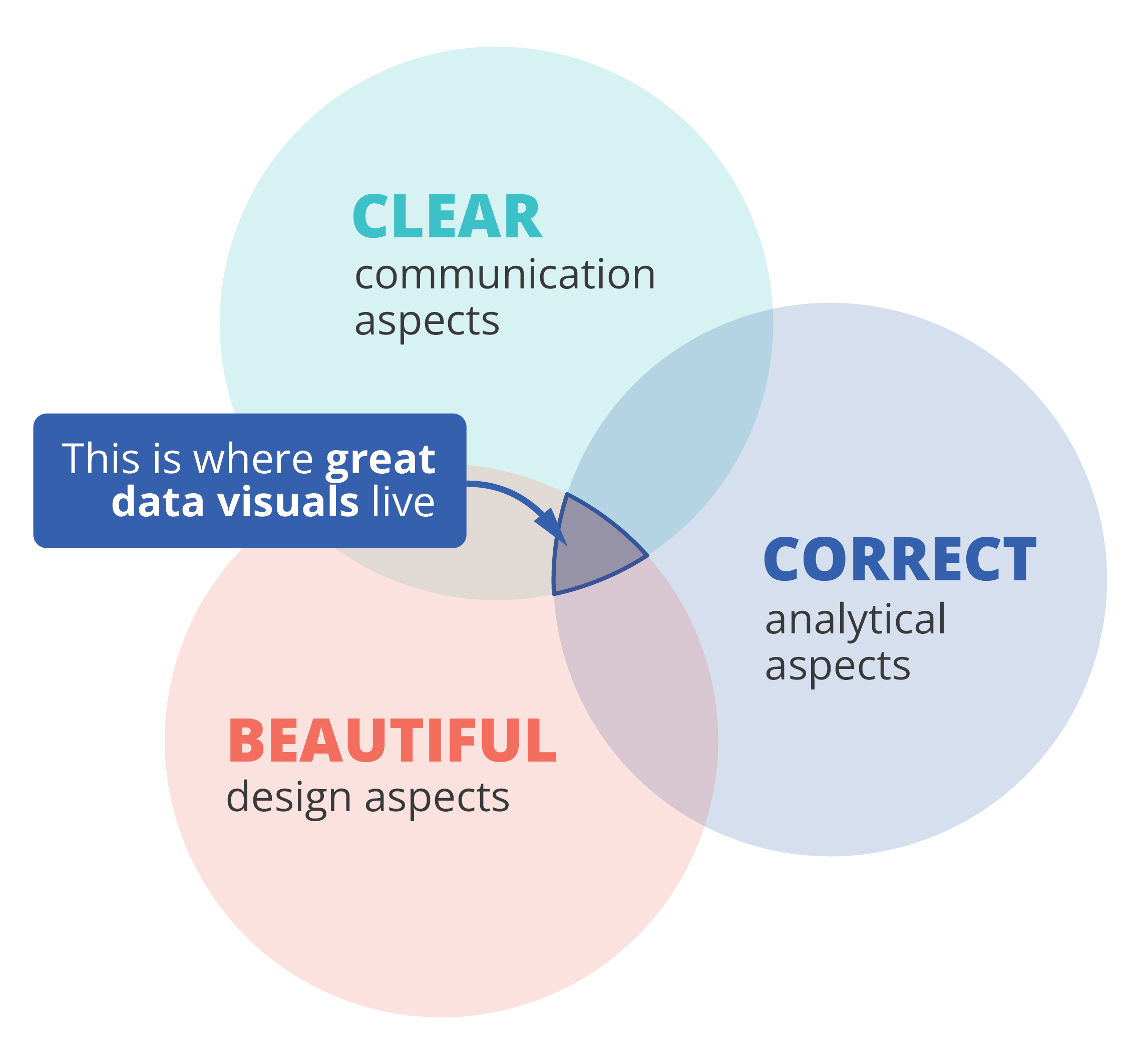
That also implies that we, as data visualizers, need to consider three different aspects when creating a data visual:
- the communication aspect, in order to make our visual clear,
- the analytical aspect, in order to make it correct, and
- the design aspect, in order to make it beautiful.
If one of these aspects is missing, we end up with a suboptimal chart. A chart can be beautiful and correct but confusing to navigate, causing the message to be lost. Or it can be very beautiful and clear, but fall apart because the underlying data or the representation of it is flawed. A lot of charts we encounter are clear and correct, but simply boring or uninviting to look at, because they were not designed to look good.
Three different skills
So, in order to create a powerful chart we must apply our communication, our analytical ánd our design skills. Most people feel comfortable with one or two of these skill sets, but not with all of them. Many people in analytical jobs, such as researchers, engineers or consultants, struggle with the design aspects of a visual. People with a role in communication, such as journalists or marketeers, often feel uncomfortable to dive into data analytics and the theoretical principles behind charts. And professional designers can make their visuals look beautiful, but don’t always succeed in crafting a crystal-clear message.
If you recognize yourself in one of these worries, fear not! I am convinced that anyone can create great data visuals on the intersection of clarity, correctness and beauty.
If you want to know more about visualizing data in the right way, you can check out the other videos in this series. Or I invite you to read my book, Powerful Charts, that will give you actionable insights and practical guidelines to create data visuals that truly engage and inspire your audience.
Full video series
- 01. Why is data visualization so powerful?
- 02. Why is data visualization so challenging?
- 03. Navigating the landscape of powerful charts
- 04. A powerful chart tells a story
- 05. A powerful chart has a high signal-to-noise ratio
- 06. Making a data visual noise-free
- 07. 7 different goals for your chart
- 08. Three roles of colour in a data visual
- 09. Choosing the right font for your data visual
- 10. Can you use Excel to create a powerful chart? (coming on January 09, 2023)
Read more:
Why I love matrix charts
This one is definitely in my top 5 of favourite chart types: a matrix chart! Super flexible, can provide some great insights into the data, and it will fit well into your beautiful report design.
Vreemde plaatsnamen in Vlaanderen
Iedereen kent wellicht 'Kontich' en 'Reet', maar in Vlaanderen hebben we nog veel meer merkwaardige, onverwachte, en vaak grappige plaatsnamen. Heb je bijvoorbeeld ooit al gehoord van Buitenland, Dikkebus, of Grote Homo?
Small multiples can save your chart
When you're dealing with a chart that has too much information on it, the most straightforward advice to follow is: break it down into multiple charts, each with less information on them. A powerful example of this is a so-called small multiple approach.
Can you use Excel to create a powerful chart?
Spreadsheet tools such as Microsoft Excel or Numbers might not be the first thing on your mind when considering data visualization tools, but they can be pretty solid choices to build data visuals. Don’t let anyone convince you that using Excel to create data visuals is unprofessional.
Choosing the right font for your data visual
Fonts evoke emotions: there are very sophisticated fonts, playful fonts, attention-grabbing fonts, and elegant handwritten fonts. Using the wrong type of font can have a lot of impact. In data visualization the implications of typography are mainly focused on readability. Labels and annotations can easily become so small they get hard to read. Above all else, we should choose a font which is readable at small sizes.
Three roles of colour in a data visual
Colour is one of the most crucial tools we have to turn a normal chart into a powerful chart with a clear message, a chart which tells a story rather than simply presenting the information.
We are really into visual communication!
Every now and then we send out a newsletter with latest work, handpicked inspirational infographics, must-read blog posts, upcoming dates for workshops and presentations, and links to useful tools and tips. Leave your email address here and we’ll add you to our mailing list of awesome people!

Why is data visualization so powerful?
Why is data visualization so powerful?
The amount of data coming our way is growing exponentially. In 2021 alone, it is estimated that humankind generated 74 zettabytes of data – that’s about 10,000 GB per person. How on earth are we going to keep this manageable?
Visualization: our most powerful tool
Visualization is one of the key solutions to cope with the endless stream of data, content and information – together with other strategies such as filtering and organization. Visualization might very well be the most powerful tool we have to turn complex information into manageable insights. But why is that?
There are three important reasons why data visualization is a very strong way to present information:
- its information density is extremely high,
- it attracts the attention of your audience, and
- visual information is easier to process and memorize.
Reason 1: information density
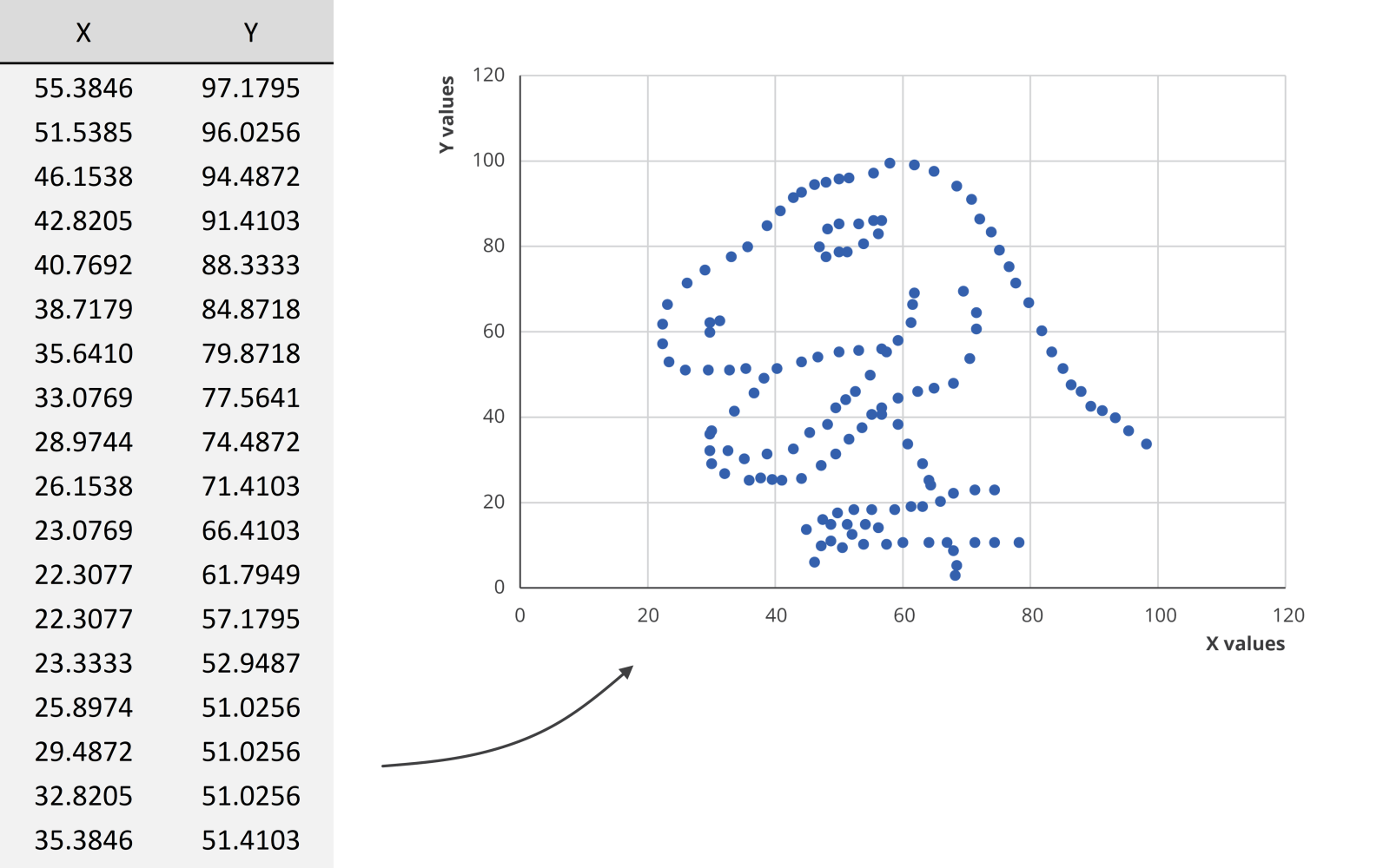
Researchers at MIT have shown that we can detect the meaning of a picture in as little as 13 milliseconds – that’s extremely fast.
We could spend hours looking at this dataset for example, created by visual journalism professor Alberto Cairo, without learning anything. But as soon as we turn the data into a scatter plot, it’s obvious that we’re looking at a dinosaur. In the blink of an eye!
Reason 2: attractiveness
Visual information is also attractive. Not in the sense that it is beautiful to look at (although that’s often also our goal), but literally: it attracts the attention of your audience. In a book or newspaper, people will often look for the pictures first, before they start reading all of the text.
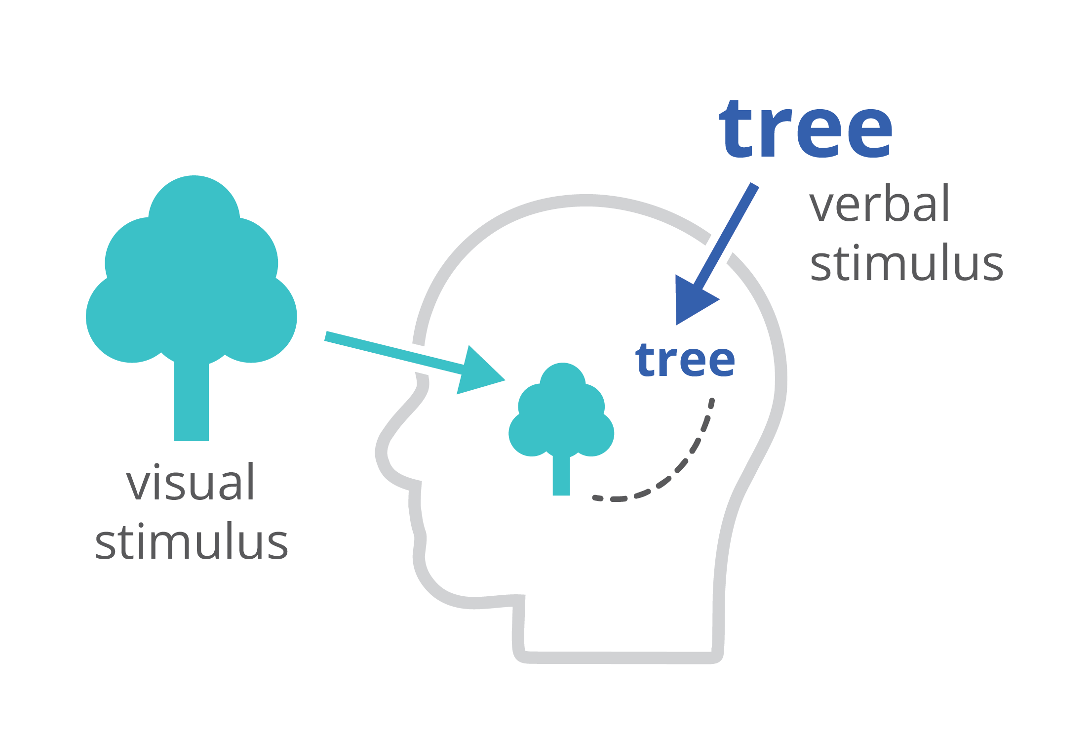
Reason 3: easier to process
Finally, charts and infographics are easier to process than written text. The dual-coding theory, developed by Allan Paivio, states that our brains process information both in a visual, as well as a verbal way. If we only get verbal stimuli, only a part of our brain is working. That’s why during a long phone call we automatically start doodling – the visual brain is bored and looking for things to do. By providing our audience with a combination of text and images, the entire brain is stimulated, leading to better focus, better understanding, and better memorization.
Harnessing the power of data visualization
So in summary, data visualization is powerful because it combines a high information density, attractiveness, and easier processing and memorization.
If you want to know more about visualizing data in the right way, you can check out the other videos in this series. Or I invite you to read my book, Powerful Charts, that will give you actionable insights and practical guidelines to create data visuals that truly engage and inspire your audience.
Full video series
- 01. Why is data visualization so powerful?
- 02. Why is data visualization so challenging?
- 03. Navigating the landscape of powerful charts
- 04. A powerful chart tells a story
- 05. A powerful chart has a high signal-to-noise ratio
- 06. Making a data visual noise-free
- 07. 7 different goals for your chart
- 08. Three roles of colour in a data visual
- 09. Choosing the right font for your data visual
- 10. Can you use Excel to create a powerful chart? (coming on January 09, 2023)
Read more:
Why I love matrix charts
This one is definitely in my top 5 of favourite chart types: a matrix chart! Super flexible, can provide some great insights into the data, and it will fit well into your beautiful report design.
Vreemde plaatsnamen in Vlaanderen
Iedereen kent wellicht 'Kontich' en 'Reet', maar in Vlaanderen hebben we nog veel meer merkwaardige, onverwachte, en vaak grappige plaatsnamen. Heb je bijvoorbeeld ooit al gehoord van Buitenland, Dikkebus, of Grote Homo?
Small multiples can save your chart
When you're dealing with a chart that has too much information on it, the most straightforward advice to follow is: break it down into multiple charts, each with less information on them. A powerful example of this is a so-called small multiple approach.
Can you use Excel to create a powerful chart?
Spreadsheet tools such as Microsoft Excel or Numbers might not be the first thing on your mind when considering data visualization tools, but they can be pretty solid choices to build data visuals. Don’t let anyone convince you that using Excel to create data visuals is unprofessional.
Choosing the right font for your data visual
Fonts evoke emotions: there are very sophisticated fonts, playful fonts, attention-grabbing fonts, and elegant handwritten fonts. Using the wrong type of font can have a lot of impact. In data visualization the implications of typography are mainly focused on readability. Labels and annotations can easily become so small they get hard to read. Above all else, we should choose a font which is readable at small sizes.
Three roles of colour in a data visual
Colour is one of the most crucial tools we have to turn a normal chart into a powerful chart with a clear message, a chart which tells a story rather than simply presenting the information.
We are really into visual communication!
Every now and then we send out a newsletter with latest work, handpicked inspirational infographics, must-read blog posts, upcoming dates for workshops and presentations, and links to useful tools and tips. Leave your email address here and we’ll add you to our mailing list of awesome people!