

Avoiding abbreviations
Avoiding abbreviations
People are lazy. Make it as easy as possible for them to see what you are trying to show. “Mental noise” is my name for ‘work’ your audience has to do before they can actually see what they want to see. In a graph, it can be taking out a ruler to measure a distance, but also tilting the page to read non-horizontal text, or having to look up jargon.
There are tons of ways to reduce mental noise in your charts, but one of the easiest is avoiding abbreviations. Of course, space constraints, general usage, and the specific nature of the abbreviation don’t always make this possible (I wouldn’t replace DNA by deoxyribonucleic acid everywhere), but a specific case where I tend to avoid abbrevations at all costs are countries.
Yes, countries do have official abbreviations — standardized by the ISO 3166 guidelines. There are even 2-letter ánd 3-letter abbrevations for each country. For example, Belgium’s alpha-2 code is BE, and its alpha-3 code is BEL. In most official documents, such as reports by the European Union, the alpha-2 codes are most commonly used. Lack of space is often the main reason, in charts where 27 countries need to be shown.

But these alpha-2 abbrevations are not always as straightforward as in the case of Belgium. Most people will recognize FR, NL or IT. If you know your languages, DE or ES will also make sense. And with some effort, we can decypher SK or AT, even though they don’t always make sense. Some of the lesser known ones are probably EE (Estonia – local name Eesti), HR (Croatia – local name Hrvatska) or EL (Greece – local name Elláda or Ελλάδα).
If you’re looking at 27 EU countries in a list of graph, that’s quite a lot of cognitive load to untangle and recall all of them. Your audience needs quite some background knowledge in order to fully understand your chart. Some people might not even bother looking up country codes they don’t recognize, which of course lowers the relevance of our entire graph. For this reason, I will almost always avoid country abbreviations, and write their names in full. That doesn’t even have to take up much more space:

By avoiding these abbreviations, we ensure that readers don’t have to look up anything. They can stay engaged with the chart and get to the point much more quickly. And that’s of course what it’s all about.
Source: I encountered a version of this visual on VRT NWS, in an article on the number of political mandates per country (in Dutch). Most of their data was collected from a flash Eurobarometer report “Local politicians of the EU and the future of Europe” by the European Committee of the Regions.
Read more:
How to create a graphical abstract
Graphical abstracts are becoming more and more important. Journal publishers such as Elsevier encourage you to create a concise visual summary of the main findings of your research. But where to start? What steps should you follow to create the perfect graphical abstract for your article? What tools can you use?
Behind the maps
In the 30-day Map Challenge, you are challenged to design a new map every day around a certain topic. I participated in November 2020, and wrote this post to share my thought processes, data sources, tools and results!

Data visualization resources: all the links you’ll ever need!
You want to start creating clear and attractive data visuals, but don't know where to start? No worries, here's a complete overview of tools, resources and inspiration you can use as a starting point for your designs.
Storytelling with Data: Dataviz book review
The Storytelling with Data book has been on my wishlist as long as I can remember, because so many people recommend it as one of the must read dataviz books. So let's see what the fuzz is all about - here's my review!
Uncommon chart types: Slopegraphs
Slopegraphs appear in 'serious' newspapers, but they are very easy to create yourself. Use them if you want to compare how values have changed between two different points in time!
Data visualization in a time of pandemic – #6: Viral scrollytelling
In this final chapter, we’ll dive deeper into some of the insightful stories which have been published about the novel coronavirus and the COVID-19 pandemic. Rather than looking at single charts, we’ll highlight some long-form stories about the origin of the virus, how it works, and how it spread.
We are really into visual communication!
Every now and then we send out a newsletter with latest work, handpicked inspirational infographics, must-read blog posts, upcoming dates for workshops and presentations, and links to useful tools and tips. Leave your email address here and we’ll add you to our mailing list of awesome people!


The uncomfortable relationship between scientific illustrations and AI
The uncomfortable relationship between scientific illustrations and AI
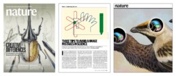
Scientific journal Nature devoted the headline of its 23 July 2026 issue to “the human art of scientific illustration in the age of artificial intelligence”. Of course, that sparked my attention. Three complementary articles, one occasioned by the journal’s own history of cover art, from the earliest sketches and black-and-white photographs to the 150th-anniversary cover that turned 88,000 citation links into an image. But it’s the other two pieces that stuck with me: a practical guide on avoiding AI mistakes in scientific figures, and a set of interviews with five scientific illustrators about where AI actually fits into their process.
Together they made me think harder than I expected about a question that gets asked too loosely: what is the impact of AI on the field of scientific visualization?
The wrong question
I’ll be honest: the debate whether scientists and designers should use AI tools or not isn’t that interesting to me. AI tools are already assisting researchers with illustration, and that’s not going to reverse. The interesting question isn’t whether, but where, and how, and how much oversight is needed.
Kuukua Wilson, a medical illustrator interviewed in the piece, recalls a professor’s line from her master’s degree:
“People used to worry that illustrators would be replaced by the camera. But if a camera takes a photo of a surgery, you don’t see anything, just blood. You still need a medical illustrator to draw everything else.”
Illustration was never actually competing with photography. It does something photography can’t: show what’s obscured, too abstract, or not visible.
I think that’s the right lens for AI, too. Not “will it replace illustrators” but “what is illustration actually for, and where does that purpose hold up against a tool that’s extremely convincing, and occasionally wrong”.
Proof versus explanation
Here’s my take. Some scientific images exist to prove something — a photograph, a microscopy image, a western blot, a data graph. Their entire job is faithful representation of something that happened or was measured. Other images exist to explain — a graphical abstract, a flowchart, a timeline, a schematic. Their job is to make something understood, not to serve as evidence for it.
I’d never use AI to touch a proof-image. The risk of distortion, even the most subtle, is exactly what we can’t afford when the image is the evidence. For explanatory images, though, such as flowcharts or timelines or illustrations, I think AI can be a genuinely good assistant. In those situations, a human is making deliberate design decisions and oversight is straightforward.
“When talking about AI-generated images, people usually think of art and illustrations. But scientific graphics can also include schematics, visual abstracts, figures that depict a study’s data and images used as evidence. The ethical issues are very different, if you’re using images as evidence or using them to explain things.”
— Ethicist Sebastian Porsdam Mann
This is close to what the Nature technology piece calls out directly: the ethicist Sebastian Porsdam Mann notes that the ethical questions differ sharply depending on whether an image is being used as evidence or used to explain. The clearest cautionary tale for the evidence side is well-known: in April 2026 a biologist generated a full set of convincing-looking western blots from a single ChatGPT prompt, just to demonstrate how easy fabrication has become. Another paper was retracted from the New England Journal of Medicine after an AI-adjusted image left behind a telltale error in a tape measure’s numbering.
So, what should you do? Are AI tools allowable when creating scientific visuals? It’s good to know that publishers don’t agree on any of this. PLOS allows AI-generated images with disclosure. Cell Reports bans AI graphical abstracts outright. Springer Nature (Nature’s own publisher) prohibits generative AI images except when an article is specifically about AI. So whatever your own ethical line is, check your target journal’s policy before you touch a figure with an AI tool.
And what about graphs?
The one place I disagree with the article is graphs, of course my favorite subject. Marc-Oliver Gewaltig, co-founder of the academic-writing consultancy Thesify, suggests plotting your data yourself, then asking AI to make the figure more polished. His argument is that you already know what the chart should look like, so validation is easy.
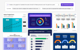
But a graph’s entire purpose is to be a faithful encoding of data: position, length, angle mapped directly to numbers. That’s a much tighter constraint than “make it look nice,” and it’s exactly where a small, well-intentioned AI edit could shift an axis, round a value, or smooth a line in a way that changes what’s on the chart without changing how it looks. It’s easy to visually verify the contents of a flowchart, but it’s hard to see whether a chart shows all the data points in the correct position. The same reasoning that makes AI dangerous for evidence-images in general is even sharper for graphs, because a chart’s whole credibility rests on its precision.
What scientific illustrators actually do
What surprised me most, reading the interviews, is that even for images squarely on the explain side of our own line — where we’d expect AI assistance to be less controversial — the illustrators themselves are still very cautious. Every one of the five interviewed said they avoid AI in finished work. Not because oversight is impossible, but because they see illustration itself as a long sequence of judgment calls: what’s known, what’s uncertain, what a specific audience needs, how to represent that honestly. Melissa Weiss put it well: she uses AI tools the way she’d use a brush or an eraser — for small cleanup, never to build the core of an image, specifically to keep her authority over the result intact.
Ella Marushchenko, a journal-cover artist, flagged a subtler effect I see in my own practice as well: AI hasn’t just changed how images get made, it’s changed the brief. Researchers now often arrive with an AI-generated concept image instead of a rough sketch. That’s mainly a positive evolution: it helps scientists to explain what they would actually like to see. But it also carries a risk, by pushing illustrators into a direction that might not be the best fit for the subject or the article.
The strongest argument against AI on the explain side came from Shehryar Saharan, who this year illustrated the innervation of the clitoris and vulva, anatomy mapped at high resolution only in the past year, and relevant to surgeries that can otherwise sever those nerves. There was nothing for an AI model to draw on; the accurate source material didn’t exist until very recently, and its absence for so long reflects a real history of medical neglect. Sometimes an “explanatory” image is the first accurate representation of something.
Where that leaves us
The proof/explain distinction still holds up, I believe, as the right first cut for where AI belongs in scientific images. But two things complicate it in practice: graphs sit closer to the proof side than most people treat them, and even on the explain side, the actual craft and judgment calls of illustration resist automation for reasons that have nothing to do with accuracy.
Which brings me back to the camera. Illustration survived photography not because illustrators outcompeted the lens, but because they were never really playing the same game. I suspect AI-generated imagery will settle into science the same way: not as a replacement for judgment, but as one more tool that still needs someone to decide what the picture is actually for.
Credentials: I’m an information designer and PhD in Physics from Belgium, often helping scientists by creating graphs, graphical abstracts, and infographics. Feel free to connect with me on LinkedIn. This blog post is also available on Medium.
Read more:
How to create a graphical abstract
Graphical abstracts are becoming more and more important. Journal publishers such as Elsevier encourage you to create a concise visual summary of the main findings of your research. But where to start? What steps should you follow to create the perfect graphical abstract for your article? What tools can you use?
Behind the maps
In the 30-day Map Challenge, you are challenged to design a new map every day around a certain topic. I participated in November 2020, and wrote this post to share my thought processes, data sources, tools and results!
Data visualization resources: all the links you’ll ever need!
You want to start creating clear and attractive data visuals, but don't know where to start? No worries, here's a complete overview of tools, resources and inspiration you can use as a starting point for your designs.
Storytelling with Data: Dataviz book review
The Storytelling with Data book has been on my wishlist as long as I can remember, because so many people recommend it as one of the must read dataviz books. So let's see what the fuzz is all about - here's my review!
Uncommon chart types: Slopegraphs
Slopegraphs appear in 'serious' newspapers, but they are very easy to create yourself. Use them if you want to compare how values have changed between two different points in time!
Data visualization in a time of pandemic – #6: Viral scrollytelling
In this final chapter, we’ll dive deeper into some of the insightful stories which have been published about the novel coronavirus and the COVID-19 pandemic. Rather than looking at single charts, we’ll highlight some long-form stories about the origin of the virus, how it works, and how it spread.
We are really into visual communication!
Every now and then we send out a newsletter with latest work, handpicked inspirational infographics, must-read blog posts, upcoming dates for workshops and presentations, and links to useful tools and tips. Leave your email address here and we’ll add you to our mailing list of awesome people!

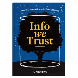
Review: Info We Trust
Review: Info We Trust (Remastered)
Info We Trust is an ambitious, visually stunning book that sits somewhere between philosophy, information design, and a collection of visual essays. It is clearly the product of many years of thinking, reading, and making. That depth and experience is both its greatest strength and, at times, its main challenge.
From a purely visual standpoint, the book is exceptional. Andrews is remarkably disciplined in his use of a limited color palette, and the combination of three colors with hand-drawn illustrations gives the book a distinctive and coherent visual identity. The drawings are both intentional and decorative, they are a pleasure to look at, page after page.
Content-wise, the book is dense with references. The marginal notes, quotations, and extensive bibliography leave no doubt about Andrews’ breadth of knowledge. Again and again, I found myself wanting to read the original sources and to follow the many intellectual threads Andrews lays out. In that sense, the book functions very well as a gateway to a much wider intellectual exploration.
At the same time, this abundance can be overwhelming. Especially in the earlier chapters, the book leans heavily into philosophical reflection. Ideas, metaphors, and quotations accumulate, but a clear argumentative trajectory is often hard to discern. Reading these chapters requires patience: each sentence needs to be savoured rather than devoured. For readers like me, who prefer an analytical, structured approach, this can make progress feel slow, even if the reading itself is never unpleasant. I must admit that I skipped most of the quotes and notes in the margins…
For me, the book truly comes into focus in the final chapters (roughly chapters 13–15). Here, Andrews becomes much more concrete, offering insight into his actual working process: how he frames problems, explores structure, reasons visually, and approaches projects as an information designer. These chapters are highly relatable and, I suspect, will resonate strongly with practitioners. They clarify retroactively what the earlier philosophical groundwork was aiming toward.
In the end, Info We Trust is not a manual or a step-by-step guide, and readers looking for quick, actionable takeaways may struggle with parts of it. But as a reflective, carefully crafted work about how we think with information, and how we might do so more responsibly, it is thoughtful, inspiring, and visually remarkable. Best approached slowly, selectively, and perhaps revisited over time rather than read straight through in one go.
Read this review, as well as many others, in our complete overview of data visualization books (work in progress).
Read more:
How to create a graphical abstract
Graphical abstracts are becoming more and more important. Journal publishers such as Elsevier encourage you to create a concise visual summary of the main findings of your research. But where to start? What steps should you follow to create the perfect graphical abstract for your article? What tools can you use?
Behind the maps
In the 30-day Map Challenge, you are challenged to design a new map every day around a certain topic. I participated in November 2020, and wrote this post to share my thought processes, data sources, tools and results!
Data visualization resources: all the links you’ll ever need!
You want to start creating clear and attractive data visuals, but don't know where to start? No worries, here's a complete overview of tools, resources and inspiration you can use as a starting point for your designs.
Storytelling with Data: Dataviz book review
The Storytelling with Data book has been on my wishlist as long as I can remember, because so many people recommend it as one of the must read dataviz books. So let's see what the fuzz is all about - here's my review!
Uncommon chart types: Slopegraphs
Slopegraphs appear in 'serious' newspapers, but they are very easy to create yourself. Use them if you want to compare how values have changed between two different points in time!
Data visualization in a time of pandemic – #6: Viral scrollytelling
In this final chapter, we’ll dive deeper into some of the insightful stories which have been published about the novel coronavirus and the COVID-19 pandemic. Rather than looking at single charts, we’ll highlight some long-form stories about the origin of the virus, how it works, and how it spread.
We are really into visual communication!
Every now and then we send out a newsletter with latest work, handpicked inspirational infographics, must-read blog posts, upcoming dates for workshops and presentations, and links to useful tools and tips. Leave your email address here and we’ll add you to our mailing list of awesome people!
Gridlines are better than axes
Gridlines are better than axes
Almost always, gridlines are better than axes. At least for vertical axes.
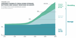
I admit, vertical axes are the default option, and they have been around for centuries, so they are very well known. But your typical vertical axis also has some downsides. My biggest problem with vertical axes is that they’re often so far away from where the action is really happening. Take a typical chart like this, were nothing is really happening on the left (all the values are zero), but the growth is really big on the right hand side of the visual:
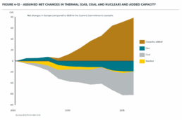
If you want to know the data values near the end of the chart, in 2036 in this case, we almost have to take out a ruler to measure, but the lack of axis ticks (the little horizontal lines next to the numbers) and the distance make that hard to do:

A simple compromise is to move the axis to the right hand side of the visual, where it’s much closer to the ‘action’ — the values we’re actually most interested in:

We had to move the legend to the left in order to free up some space for the axis, but it actually worked out really well. Notice also how we’ve added some explicit tick lines to increase the precision of the visual.
However, moving the vertical axis to the right hand side is not always an option. Often, we’ll have some direct labels or annotations on that side that make it harder to fit in the axis. It would create too much of a barrier between the data and the text. Take this visual for example:
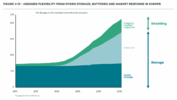
This is a really clean, strong visual thanks to the use of direct labels and some helpful annotations to the right. The only thing I don’t really like is that lonely vertical axis sticking out like a sore thumb at the left side of the visual. However, these labels and annotations are in the way when we want to move the axis to the right:
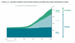
I’m probably just nitpicking, but that doesn’t look so great to me! In these situations, I will always prefer to switch to gridlines. Yes, they take up more space and create more ‘stuff’ in the visual, but they have two major benefits:
✅ more precision if you’re trying to estimate data values
✅ this precision boost impacts all parts of the visual: left, middle, and right
Here’s how that looks like for the visual above:
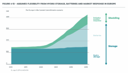
I’ve made the colored areas a little bit transparent, so you can still see the gridlines clearly enough. Notice how you can quite easily see that the total value is growing to 200 GW by 2025, and reaching 300 GW by 2030. These intermediate values were quite hard to read in the original visual!
Some final cleanup things we can do:
- nicely align the subtitle and the note with the rest of the visual
- add ticks to the horizontal axis as well
- optimize the annotation to the right, brackets would make more sense here than arrows I think
- add explicit data values for the different categories in 2035 to further increase precision
- move the ‘GW’ label to the tick label
This is how the end result looks like:

Finally, a small bonus tip. If for some reason you’re tight on space, and you have to squeeze your chart a bit to make everything fit, you don’t have to make your gridlines go all the way from left to right. You could consider only having them show up when they’re needed. That would give you some extra whitespace to fit, for example, your title and subtitle:
Of course, that’s something not every #dataviz tool will allow, so that’s only for when you’re willing to make some final custom modifications for your report.
Here’s the full comparison between our original visual, and the reworked chart:

Note: visuals taken from Elia’s ‘Adequacy and flexibility study for Belgium, 2026–2036’, which you can access here: Adequacy and flexibility study for Belgium (2026–2036) by Elia Group — Issuu
Read more:
How to create a graphical abstract
Graphical abstracts are becoming more and more important. Journal publishers such as Elsevier encourage you to create a concise visual summary of the main findings of your research. But where to start? What steps should you follow to create the perfect graphical abstract for your article? What tools can you use?
Behind the maps
In the 30-day Map Challenge, you are challenged to design a new map every day around a certain topic. I participated in November 2020, and wrote this post to share my thought processes, data sources, tools and results!
Data visualization resources: all the links you’ll ever need!
You want to start creating clear and attractive data visuals, but don't know where to start? No worries, here's a complete overview of tools, resources and inspiration you can use as a starting point for your designs.
Storytelling with Data: Dataviz book review
The Storytelling with Data book has been on my wishlist as long as I can remember, because so many people recommend it as one of the must read dataviz books. So let's see what the fuzz is all about - here's my review!
Uncommon chart types: Slopegraphs
Slopegraphs appear in 'serious' newspapers, but they are very easy to create yourself. Use them if you want to compare how values have changed between two different points in time!
Data visualization in a time of pandemic – #6: Viral scrollytelling
In this final chapter, we’ll dive deeper into some of the insightful stories which have been published about the novel coronavirus and the COVID-19 pandemic. Rather than looking at single charts, we’ll highlight some long-form stories about the origin of the virus, how it works, and how it spread.
We are really into visual communication!
Every now and then we send out a newsletter with latest work, handpicked inspirational infographics, must-read blog posts, upcoming dates for workshops and presentations, and links to useful tools and tips. Leave your email address here and we’ll add you to our mailing list of awesome people!
Review: A History of Data Visualization and Graphic Communication
Review: A History of Data Visualization and Graphic Communication
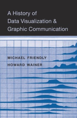
Michael Friendly and Howard Wainer clearly love graphs. But A History of Data Visualization and Graphic Communication isn’t just about graphs — it’s about the stories behind them: the context, the people, the new measurements that made them necessary, and the discoveries they enabled. The authors don’t just show us the end result; they take us through the process that led there, often in a delightful amount of detail.
The structure of the book balances chronology with theme. This keeps the feeling of historical evolution intact, without falling into the trap of a dry timeline. We jump from 17th-century innovators to 20th-century pioneers, always with a clear narrative thread.
What stood out to me most was the variety of examples. While the book is clearly indebted to Edward Tufte’s work, it doesn’t recycle his canon. I encountered many visualizations I hadn’t seen before, and even familiar ones were presented with fresh insight. The ideas on how new data, collected with new measurement techniques, often prompt entirely new kinds of charts were particularly eye-opening for me. It’s a reminder that visualization doesn’t just explain data — it also adapts to it.
That idea was so powerful to me that I used it as one of the foundations for my keynote lecture, Graphs can save the world! This book helped me think more deeply about why visualizations matter — not just aesthetically or functionally, but historically and socially.
That said, not every chapter lands equally well. Some sections feel a bit scattered or lightweight, especially when they only briefly touch on developments that deserve more space. The final chapter, Graphs as Poetry, takes a more philosophical turn, but I wasn’t entirely sure what the authors were trying to argue there.
Also worth noting: while the book is visually rich, it’s a shame that most of it is printed in black and white. Some of the visual clarity and impact is lost as a result. And while the authors occasionally offer “reworked” versions of historical charts to show how they could be improved, these redesigns don’t always convince — sometimes the original speaks more eloquently in its own language.
Despite those minor critiques, this is a generous, well-researched, and deeply informative book. I’d recommend it to anyone interested in the intersection of data, history, and design. It’s a reminder that charts are tools, but also more than tools — they are artifacts of human thought, and sometimes, even acts of discovery.
Rating: ⭐⭐⭐⭐
Read this review, as well as many others, in our complete overview of data visualization books (work in progress).
Read more:
How to create a graphical abstract
Graphical abstracts are becoming more and more important. Journal publishers such as Elsevier encourage you to create a concise visual summary of the main findings of your research. But where to start? What steps should you follow to create the perfect graphical abstract for your article? What tools can you use?
Behind the maps
In the 30-day Map Challenge, you are challenged to design a new map every day around a certain topic. I participated in November 2020, and wrote this post to share my thought processes, data sources, tools and results!
Data visualization resources: all the links you’ll ever need!
You want to start creating clear and attractive data visuals, but don't know where to start? No worries, here's a complete overview of tools, resources and inspiration you can use as a starting point for your designs.
Storytelling with Data: Dataviz book review
The Storytelling with Data book has been on my wishlist as long as I can remember, because so many people recommend it as one of the must read dataviz books. So let's see what the fuzz is all about - here's my review!
Uncommon chart types: Slopegraphs
Slopegraphs appear in 'serious' newspapers, but they are very easy to create yourself. Use them if you want to compare how values have changed between two different points in time!
Data visualization in a time of pandemic – #6: Viral scrollytelling
In this final chapter, we’ll dive deeper into some of the insightful stories which have been published about the novel coronavirus and the COVID-19 pandemic. Rather than looking at single charts, we’ll highlight some long-form stories about the origin of the virus, how it works, and how it spread.
We are really into visual communication!
Every now and then we send out a newsletter with latest work, handpicked inspirational infographics, must-read blog posts, upcoming dates for workshops and presentations, and links to useful tools and tips. Leave your email address here and we’ll add you to our mailing list of awesome people!

Report visuals don't have to suck
Report visuals don’t have to suck
Lots of reports have boring, ugly visuals. Or, even worse, visuals which are really, really hard to understand. The reports by CREG, the Belgian Federal Commission for Electricity and Gas Regulation, are completely different. For example, just browsing through the Monitoring Report — their yearly study on the functioning and price evolution of the Belgian wholesale electricity market — you can immediately see that it’s full of really thought-through visuals and graphs. There are three key principles they apply to bring their visuals to the next level.
Principle 1: add helpful annotations
Sometimes it’s in the small things, like adding a simple arrow to show that the yellow area is equal to the gray area between the grid load and the total load:
The total load and grid load in these curves have very strong seasonal patterns, making it hard to spot whether the delta between them also has seasonal patterns or not. Duplicating that delta at the bottom of the graph — nicely aligned with the horizontal axis — is the best way of making such patterns visual. In this case, there is some seasonality (the delta is slightly lower in winter), but much less pronounced than the seasonal patterns of the loads.
Principle 2: use small multiples to untangle complicated stories
When charts feel complicated, it’s often because they try to explain to many things at once. Different key stories in the data are fighting for our attention. Rather than just eliminating information to make a chart simpler, a helpful technique is to break it up into multiple smaller copies, each of which tells a single part of the story: a ‘small multiples’ approach.

The visual above shows the evolutions for four different countries over a 10-year time period in a small multiples arrangement. Comparing the exact values for the different countries side-by-side is a bit harder, because the bars are a bit further apart from each other than in a traditional clustered bar chart. But comparing the patterns between countries is now easy to do, and that’s the main objective of this chart — to show how different the electricity flow is among Belgium’s different borders.
Principle 3: don’t be afraid to use less common chart types
Not everything has to be a bar, line or pie chart. There are 100+ chart types available to us (if you want an extensive overview, you could check out the Data Viz Project or Data Visualisation Catalogue). Different chart types of course have similar things they can do, but each chart type does have its own strengths and weaknesses when it comes to highlighting certain aspects of your story. If you have an important key message to share, it’s worth considering a few different chart types and choosing the one that shows your message the most clearly.

In the CREG report, you will find bump charts, variable width bar charts (or Marimekko charts if you want to sound fancy), heatmaps, slopegraphs, waterfall charts, and ridgeline plots sprinkled in between the more traditional line and scatter plots. These more exotic charts are added on purpose, with a clear goal in mind, not just to make the report a little bit more fancy (although that is also an effect of chart variety: less boring reports).
Benefits of using better charts
The result of all of this? A 150-page report that doesn’t feel like a chore to read. There is variety, and everything is well explained. Thanks to the clear titles, subtitles and annotations every visual is its own self-contained mini-story — it’s not always necessary to read all the text before and after the figure to understand what’s going on. And most important of all: the graphs are clear and transparent. CREG gets its message across flawlessly, without being hampered by chart clutter, noise, or unnecessary complications. A clear, correct ánd beautiful presentation of the information — that’s what we should all strive for!
Disclaimer
I was (unfortunately!) not involved in the creation of these beautiful graphs. All visuals were created by Senior CREG Advisor Nico Schoutteet. You can read the report on the CREG website.
Read more:
How to create a graphical abstract
Graphical abstracts are becoming more and more important. Journal publishers such as Elsevier encourage you to create a concise visual summary of the main findings of your research. But where to start? What steps should you follow to create the perfect graphical abstract for your article? What tools can you use?
Behind the maps
In the 30-day Map Challenge, you are challenged to design a new map every day around a certain topic. I participated in November 2020, and wrote this post to share my thought processes, data sources, tools and results!
Data visualization resources: all the links you’ll ever need!
You want to start creating clear and attractive data visuals, but don't know where to start? No worries, here's a complete overview of tools, resources and inspiration you can use as a starting point for your designs.
Storytelling with Data: Dataviz book review
The Storytelling with Data book has been on my wishlist as long as I can remember, because so many people recommend it as one of the must read dataviz books. So let's see what the fuzz is all about - here's my review!
Uncommon chart types: Slopegraphs
Slopegraphs appear in 'serious' newspapers, but they are very easy to create yourself. Use them if you want to compare how values have changed between two different points in time!
Data visualization in a time of pandemic – #6: Viral scrollytelling
In this final chapter, we’ll dive deeper into some of the insightful stories which have been published about the novel coronavirus and the COVID-19 pandemic. Rather than looking at single charts, we’ll highlight some long-form stories about the origin of the virus, how it works, and how it spread.
We are really into visual communication!
Every now and then we send out a newsletter with latest work, handpicked inspirational infographics, must-read blog posts, upcoming dates for workshops and presentations, and links to useful tools and tips. Leave your email address here and we’ll add you to our mailing list of awesome people!

Data visualization podcasts 2025
Data visualization podcasts for 2025
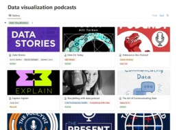
At Baryon, we love a good podcast—especially when it’s about data visualization. They’re a great way to pick up new ideas, hear how others approach design and storytelling, and stay in touch with what’s happening in the field. Whether it’s a deep dive into visual communication, a fresh take on data exploration, or a candid chat about the challenges of bringing complex information to life, there’s always something to learn (and plenty to get inspired by).
Many shows feature conversations with people doing remarkable work—sometimes the big names you already know, sometimes voices you haven’t heard yet but will be glad you did.
Some of our go-tos are Data Stories, Storytelling with Data, and Data Viz Today, but there’s a whole world of great listening out there.
We’ve pulled together a regularly updated list of our favorite data visualization (and data science) podcasts on Notion. You’ll find them all in one place, with links to Spotify, Apple Podcasts, and Google Podcasts—ready for your next walk, commute, or coffee break.
Read more:
How to create a graphical abstract
Graphical abstracts are becoming more and more important. Journal publishers such as Elsevier encourage you to create a concise visual summary of the main findings of your research. But where to start? What steps should you follow to create the perfect graphical abstract for your article? What tools can you use?
Behind the maps
In the 30-day Map Challenge, you are challenged to design a new map every day around a certain topic. I participated in November 2020, and wrote this post to share my thought processes, data sources, tools and results!
Data visualization resources: all the links you’ll ever need!
You want to start creating clear and attractive data visuals, but don't know where to start? No worries, here's a complete overview of tools, resources and inspiration you can use as a starting point for your designs.
Storytelling with Data: Dataviz book review
The Storytelling with Data book has been on my wishlist as long as I can remember, because so many people recommend it as one of the must read dataviz books. So let's see what the fuzz is all about - here's my review!
Uncommon chart types: Slopegraphs
Slopegraphs appear in 'serious' newspapers, but they are very easy to create yourself. Use them if you want to compare how values have changed between two different points in time!
Data visualization in a time of pandemic – #6: Viral scrollytelling
In this final chapter, we’ll dive deeper into some of the insightful stories which have been published about the novel coronavirus and the COVID-19 pandemic. Rather than looking at single charts, we’ll highlight some long-form stories about the origin of the virus, how it works, and how it spread.
We are really into visual communication!
Every now and then we send out a newsletter with latest work, handpicked inspirational infographics, must-read blog posts, upcoming dates for workshops and presentations, and links to useful tools and tips. Leave your email address here and we’ll add you to our mailing list of awesome people!
Tell me why... I don't like dashboards
Tell me why... I don't like dashboards
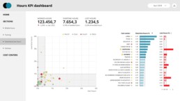
😶 I don’t like dashboards. There, I said it.
Ok, some nuance: I don’t like _most_ dashboards. The main reason: they’re trying to do everything, everywhere, all at once.
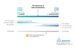
On the spectrum of data visualization, two main clusters of powerful visuals exist:
1️⃣ Data visuals for analysis: useful for data analysts, who have time to explore the data in full detail, with lots of filters, offering many different perspectives on the data. Their goal: extracting the insights from the data.
2️⃣ Data visuals for communication: useful for managers, or a more general audience. They don’t have a lot of time and want to know the major insights, fast, loud and clear. For more complicated stuff, we can craft a strong narrative to guide them through the major insights.
What most dashboards are trying to do, is both of these things simultaneously: raw data goes in, crystal-clear insights come out – or so people expect.
The solution? We make a full-fledged dashboard for the analysts, and a dedicated light-weight version for the management, showing only what they need to know for their decision-making. Or we do our analysis first, and translate those insights into an engaging visual storytelling piece, or an attractive visual report.
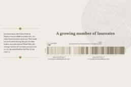
As always, we have to think about the audience and their goals. Not just dump the data on top of them, and hope they will figure it out!
Read more:
How to create a graphical abstract
Graphical abstracts are becoming more and more important. Journal publishers such as Elsevier encourage you to create a concise visual summary of the main findings of your research. But where to start? What steps should you follow to create the perfect graphical abstract for your article? What tools can you use?
Behind the maps
In the 30-day Map Challenge, you are challenged to design a new map every day around a certain topic. I participated in November 2020, and wrote this post to share my thought processes, data sources, tools and results!
Data visualization resources: all the links you’ll ever need!
You want to start creating clear and attractive data visuals, but don't know where to start? No worries, here's a complete overview of tools, resources and inspiration you can use as a starting point for your designs.
Storytelling with Data: Dataviz book review
The Storytelling with Data book has been on my wishlist as long as I can remember, because so many people recommend it as one of the must read dataviz books. So let's see what the fuzz is all about - here's my review!
Uncommon chart types: Slopegraphs
Slopegraphs appear in 'serious' newspapers, but they are very easy to create yourself. Use them if you want to compare how values have changed between two different points in time!
Data visualization in a time of pandemic – #6: Viral scrollytelling
In this final chapter, we’ll dive deeper into some of the insightful stories which have been published about the novel coronavirus and the COVID-19 pandemic. Rather than looking at single charts, we’ll highlight some long-form stories about the origin of the virus, how it works, and how it spread.
We are really into visual communication!
Every now and then we send out a newsletter with latest work, handpicked inspirational infographics, must-read blog posts, upcoming dates for workshops and presentations, and links to useful tools and tips. Leave your email address here and we’ll add you to our mailing list of awesome people!
Why I love matrix charts
Why I love matrix charts
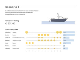
🥰 This one is definitely in my top 5 of favourite chart types: a matrix chart!
🤔 What is it? A matrix chart is similar to a heatmap, and it has the same compact design. But rather than relying on color differences, we use bubbles with different sizes to show the data. It is cleaner and less visually cluttered than a heatmap, making it easier to fit in a stylish report design.
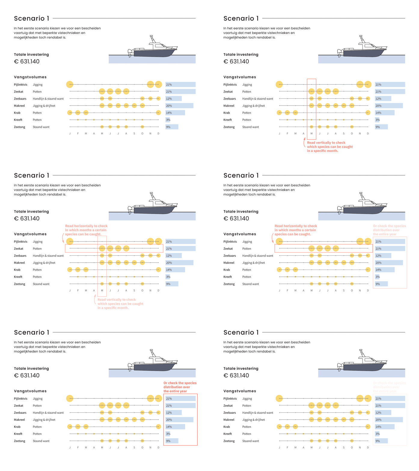
⚠️ Potential downside: this chart type works well only when there is sufficient variation between the data points. Otherwise it will be hard to see small differences between the bubble sizes.
💡 Worth noting: not everyone uses the term ‘matrix chart’. Some people prefer ‘proportional area chart’, or in this specific example – because the horizontal axis represents time – a ‘bubble timeline’. I like the term ‘matrix chart’ because it is a visual matrix of data, and it is also how RAWGraphs – my favourite tool to create these charts – calls it.
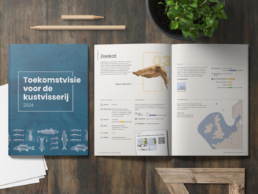
🐟 Example from the report ‘Toekomstvisie voor de kustvisserij 2024’ (Vision for the future of inshore fishing 2024) that we made for ILVO earlier this year.
Read more:
How to create a graphical abstract
Graphical abstracts are becoming more and more important. Journal publishers such as Elsevier encourage you to create a concise visual summary of the main findings of your research. But where to start? What steps should you follow to create the perfect graphical abstract for your article? What tools can you use?
Behind the maps
In the 30-day Map Challenge, you are challenged to design a new map every day around a certain topic. I participated in November 2020, and wrote this post to share my thought processes, data sources, tools and results!
Data visualization resources: all the links you’ll ever need!
You want to start creating clear and attractive data visuals, but don't know where to start? No worries, here's a complete overview of tools, resources and inspiration you can use as a starting point for your designs.
Storytelling with Data: Dataviz book review
The Storytelling with Data book has been on my wishlist as long as I can remember, because so many people recommend it as one of the must read dataviz books. So let's see what the fuzz is all about - here's my review!
Uncommon chart types: Slopegraphs
Slopegraphs appear in 'serious' newspapers, but they are very easy to create yourself. Use them if you want to compare how values have changed between two different points in time!
Data visualization in a time of pandemic – #6: Viral scrollytelling
In this final chapter, we’ll dive deeper into some of the insightful stories which have been published about the novel coronavirus and the COVID-19 pandemic. Rather than looking at single charts, we’ll highlight some long-form stories about the origin of the virus, how it works, and how it spread.
We are really into visual communication!
Every now and then we send out a newsletter with latest work, handpicked inspirational infographics, must-read blog posts, upcoming dates for workshops and presentations, and links to useful tools and tips. Leave your email address here and we’ll add you to our mailing list of awesome people!
Vreemde plaatsnamen in Vlaanderen
Vreemde plaatsnamen in Vlaanderen
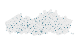
Iedereen kent wellicht ‘Kontich’ en ‘Reet’, maar in Vlaanderen hebben we nog veel meer merkwaardige, onverwachte, en vaak grappige plaatsnamen. Heb je bijvoorbeeld ooit al gehoord van Buitenland, Dikkebus, of Grote Homo?
In dit kaartje zetten we de vreemdste namen van Vlaamse gemeenten, dorpen of gehuchten voor jou op een rijtje. Veel zoekplezier!
Ontbreekt er nog een merkwaardige plaatsnaam? Laat het me dan zeker weten op koen@baryon.be.
Read more:
How to create a graphical abstract
Graphical abstracts are becoming more and more important. Journal publishers such as Elsevier encourage you to create a concise visual summary of the main findings of your research. But where to start? What steps should you follow to create the perfect graphical abstract for your article? What tools can you use?
Behind the maps
In the 30-day Map Challenge, you are challenged to design a new map every day around a certain topic. I participated in November 2020, and wrote this post to share my thought processes, data sources, tools and results!
Data visualization resources: all the links you’ll ever need!
You want to start creating clear and attractive data visuals, but don't know where to start? No worries, here's a complete overview of tools, resources and inspiration you can use as a starting point for your designs.
Storytelling with Data: Dataviz book review
The Storytelling with Data book has been on my wishlist as long as I can remember, because so many people recommend it as one of the must read dataviz books. So let's see what the fuzz is all about - here's my review!
Uncommon chart types: Slopegraphs
Slopegraphs appear in 'serious' newspapers, but they are very easy to create yourself. Use them if you want to compare how values have changed between two different points in time!
Data visualization in a time of pandemic – #6: Viral scrollytelling
In this final chapter, we’ll dive deeper into some of the insightful stories which have been published about the novel coronavirus and the COVID-19 pandemic. Rather than looking at single charts, we’ll highlight some long-form stories about the origin of the virus, how it works, and how it spread.
We are really into visual communication!
Every now and then we send out a newsletter with latest work, handpicked inspirational infographics, must-read blog posts, upcoming dates for workshops and presentations, and links to useful tools and tips. Leave your email address here and we’ll add you to our mailing list of awesome people!