

How powerful charts can boost your career
How powerful charts can boost your career
An American accountant managed – as the youngest ever! – to win a crucial election in Los Angeles – thanks to the power of data visualization.
Kenneth Mejia, a 32-year-old accountant of Filipino descent, is very committed to issues of poverty, affordable housing and mobility. In the 2022 elections he ran for “City Controller”, a sort of treasurer, for his hometown of Los Angeles. It’s a department with responsibilities almost as big as those of the city’s mayor and chief justice. For example, the City Controller can commission audits to evaluate the effectiveness of city departments.
Data visualization as election propaganda
Kenneth took a remarkably creative and unusual approach in the run-up to the election: he made imported data about the city instantly accessible and visible. On his campaign website, for example, he created a whole series of interactive maps, reports and searchable databases. He even put up billboards showing with graphs what the anticipated city budget will be used for in 2022-2023.
That transparent communication did not miss its mark. Kenneth won, as the youngest city controller ever. This approach shows how powerful data visualization is to unlock information, which may seem difficult and unfathomable to the general public, in a very accessible way. As a result, citizens not only gain insight but also become more engaged in politics. They become better informed and can vote more knowledgeably.
You too can make a difference thanks to powerful data visualization
Whether you have political ambitions, want to present your scientific research comprehensibly or convince your management of your brilliant ideas… Would you also like to learn how to create powerful graphics that can inform, convince and engage your audience? Charts that not only accurately represent the numbers, but also have a clear message and are attractive to look at?
In the book “Powerful Charts” physicist and Baryon founder Koen Van den Eeckhout explains in an accessible and practical way how this can be done. An indispensable guide for anyone who communicates with and about figures.
This brand new book is available now at Owl Press.
Read more:

Choosing the right font for your data visual
Fonts evoke emotions: there are very sophisticated fonts, playful fonts, attention-grabbing fonts, and elegant handwritten fonts. Using the wrong type of font can have a lot of impact. In data visualization the implications of typography are mainly focused on readability. Labels and annotations can easily become so small they get hard to read. Above all else, we should choose a font which is readable at small sizes.
Three roles of colour in a data visual
Colour is one of the most crucial tools we have to turn a normal chart into a powerful chart with a clear message, a chart which tells a story rather than simply presenting the information.

7 different goals for your chart
A crucial step in building a powerful chart is choosing the right type of chart. A lot of charts don’t work because they simply use the wrong type of chart. To avoid this trap, we must ask ourselves a basic question: what’s the ultimate goal of our data visual? What do we want to show with our data?

Making a data visual noise-free
Removing noise from a data visual is not only about taking things away such as gridlines, axes or legends. That’s just one part of it, which we could call removing physical noise. Improving the signal-to-noise ratio is often also about adding little things that help our audience better understand the visual. We are helping them by removing mental noise, or mental barriers.
Three tips to create powerful charts in Excel
Creating charts in Excel can be a very powerful tool for making sense of complex data sets, and for visualizing them. But the default options are not always the most pretty or effective ones. Here are our top three tips to create better Excel charts.

A powerful chart has a high signal-to-noise ratio
‘Less is more’. It’s a crucial principle in most of our communication, and in data visualization in particular. Because of my background as a physicist, I prefer to talk about the ‘signal-to-noise ratio’. The message - our signal - should be amplified as much as possible, giving it all of the attention. Everything that can distract from our message - the noise - should be removed.
We are really into visual communication!
Every now and then we send out a newsletter with latest work, handpicked inspirational infographics, must-read blog posts, upcoming dates for workshops and presentations, and links to useful tools and tips. Leave your email address here and we’ll add you to our mailing list of awesome people!



Why is data visualization so challenging?
Why is data visualization so challenging?
Data visualization is very powerful, but it can also be hard. That’s because a great data visual combines three different aspects simultaneously.
The three properties of a great data visual
- A great data visual is clear: it communicates a strong message and is easy to understand without too much additional explanation.
- A great data visual is correct: it presents the data in an accurate and appropriate way, and is unambiguous.
- A great data visual is beautiful: it is inviting to look at, and uses colour, typography and other design elements in the right way to support its message.
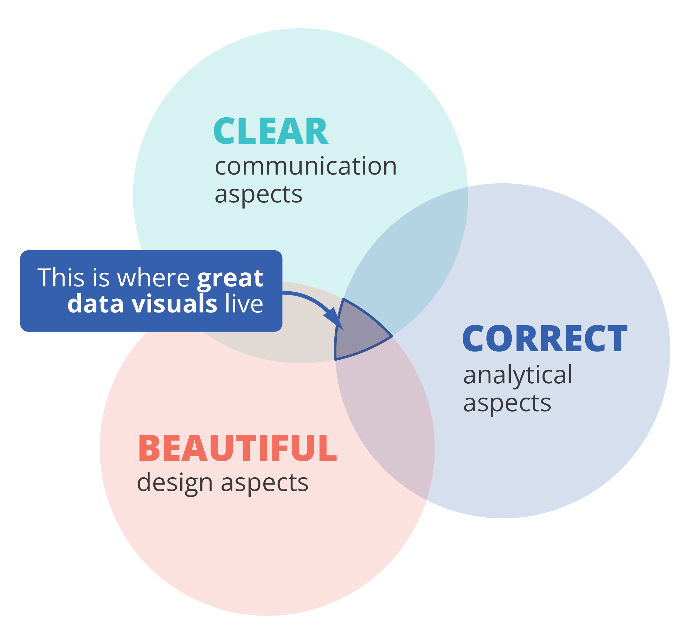
That also implies that we, as data visualizers, need to consider three different aspects when creating a data visual:
- the communication aspect, in order to make our visual clear,
- the analytical aspect, in order to make it correct, and
- the design aspect, in order to make it beautiful.
If one of these aspects is missing, we end up with a suboptimal chart. A chart can be beautiful and correct but confusing to navigate, causing the message to be lost. Or it can be very beautiful and clear, but fall apart because the underlying data or the representation of it is flawed. A lot of charts we encounter are clear and correct, but simply boring or uninviting to look at, because they were not designed to look good.
Three different skills
So, in order to create a powerful chart we must apply our communication, our analytical ánd our design skills. Most people feel comfortable with one or two of these skill sets, but not with all of them. Many people in analytical jobs, such as researchers, engineers or consultants, struggle with the design aspects of a visual. People with a role in communication, such as journalists or marketeers, often feel uncomfortable to dive into data analytics and the theoretical principles behind charts. And professional designers can make their visuals look beautiful, but don’t always succeed in crafting a crystal-clear message.
If you recognize yourself in one of these worries, fear not! I am convinced that anyone can create great data visuals on the intersection of clarity, correctness and beauty.
If you want to know more about visualizing data in the right way, you can check out the other videos in this series. Or I invite you to read my book, Powerful Charts, that will give you actionable insights and practical guidelines to create data visuals that truly engage and inspire your audience.
Full video series
- 01. Why is data visualization so powerful?
- 02. Why is data visualization so challenging?
- 03. Navigating the landscape of powerful charts
- 04. A powerful chart tells a story
- 05. A powerful chart has a high signal-to-noise ratio
- 06. Making a data visual noise-free
- 07. 7 different goals for your chart
- 08. Three roles of colour in a data visual
- 09. Choosing the right font for your data visual
- 10. Can you use Excel to create a powerful chart? (coming on January 09, 2023)

Read more:
Choosing the right font for your data visual
Fonts evoke emotions: there are very sophisticated fonts, playful fonts, attention-grabbing fonts, and elegant handwritten fonts. Using the wrong type of font can have a lot of impact. In data visualization the implications of typography are mainly focused on readability. Labels and annotations can easily become so small they get hard to read. Above all else, we should choose a font which is readable at small sizes.
Three roles of colour in a data visual
Colour is one of the most crucial tools we have to turn a normal chart into a powerful chart with a clear message, a chart which tells a story rather than simply presenting the information.
7 different goals for your chart
A crucial step in building a powerful chart is choosing the right type of chart. A lot of charts don’t work because they simply use the wrong type of chart. To avoid this trap, we must ask ourselves a basic question: what’s the ultimate goal of our data visual? What do we want to show with our data?
Making a data visual noise-free
Removing noise from a data visual is not only about taking things away such as gridlines, axes or legends. That’s just one part of it, which we could call removing physical noise. Improving the signal-to-noise ratio is often also about adding little things that help our audience better understand the visual. We are helping them by removing mental noise, or mental barriers.
Three tips to create powerful charts in Excel
Creating charts in Excel can be a very powerful tool for making sense of complex data sets, and for visualizing them. But the default options are not always the most pretty or effective ones. Here are our top three tips to create better Excel charts.
A powerful chart has a high signal-to-noise ratio
‘Less is more’. It’s a crucial principle in most of our communication, and in data visualization in particular. Because of my background as a physicist, I prefer to talk about the ‘signal-to-noise ratio’. The message - our signal - should be amplified as much as possible, giving it all of the attention. Everything that can distract from our message - the noise - should be removed.
We are really into visual communication!
Every now and then we send out a newsletter with latest work, handpicked inspirational infographics, must-read blog posts, upcoming dates for workshops and presentations, and links to useful tools and tips. Leave your email address here and we’ll add you to our mailing list of awesome people!

Data visualization resources: all the links you\'ll ever need!
Information design resources
Here you’ll find a curated collection of tools, templates, articles, and ideas to help you design and communicate information with clarity. Whether you’re working on a data-heavy report, an engaging infographic, or an interactive chart, these resources are here to guide, inspire, and save you time.
I’ve gathered what I use in my own projects, alongside practical tips and examples you can adapt to your own work. Browse around, take what’s useful, and feel free to share with others who value thoughtful, well-crafted information design.
Finding useful datasets
Looking for reliable, well-structured datasets to jump-start your next data visualization project? Here are some of my favorite starting points:
- Google Dataset Search: datasetsearch.research.google.com
- Kaggle: kaggle.com – they also have a list of beginner-friendly datasets
- data.world: data.world datasets
- Our World in Data
- The NASA Open Data Portal
Looking for more? Read our blogpost: Small datasets to practice your data visualization skills
Inspiration for data visualization
- Information is Beautiful: informationisbeautiful.net
- Information is Beautiful awards: informationisbeautifulawards.com
- Visual.ly: visual.ly/view
- Pinterest: pinterest.com
- Dear data: dear-data.com
Digital tools to create infographics and data visuals
- Canva: canva.com
- Infogram: infogram.com
- Piktochart: piktochart.com
- Visme: visme.co
- Venngage Infographic maker and Graph maker
- Whimsical: whimsical.com
- Adobe Illustrator: adobe.com
- Affinity Designer: affinity.serif.com
- Flowchart tool: draw.io
- BioRender (like Canva, but specifically for life sciences): biorender.com
- List of dataviz tools: creativebloq.com/design-tools/data-visualization
- ggplot2 cheat sheet: https://www.maths.usyd.edu.au/u/UG/SM/STAT3022/r/current/Misc/data-visualization-2.1.pdf
Inkscape tutorials
Learning how to create and edit vector images (rather than bitmap images) is one of the key steps in unlocking your full information design power. Inkscape is a powerful free tool to help you do just that. I personally found the following tutorials very useful, not too long, and to-the-point:
Illustrations and icons
- Freepik: freepik.com
- The noun project: thenounproject.com
Colours
It is undeniable that Lisa Charlotte Muth (Head of Communications at Datawrapper) is the ultimate expert when it comes to color use in data visualization. The list of articles about color on the Datawrapper blog is the best source you’ll ever find on the topic. In particular, the following articles are very worthwhile:
- What to consider when choosing colors for data visualization
- How to find & create good color palettes
- What to consider when visualizing data for colorblind readers
If you’re looking for tools and inspirational places that can help you create color combinations for your visuals, here are some of my favorites:
- Adobe Color CC: color.adobe.com
- Coolors.co: coolors.co
- Pictaculous: digitalinspiration.com/color-palette-generator
- Website color schemes: canva.com/learn/website-color-schemes
- 100 brilliant color combinations: canva.com/learn/100-color-combinations
- Python Color Palette Finder
- Data Viz Color Palette Generator
- ColorBrewer
- Chroma.js Color Palette Helper
Typography
- Dafont: dafont.com
- Google Fonts: fonts.google.com
- FontSquirrel font identifier: fontsquirrel.com/matcherator
- Font Pairing: fontpair.co
Creating graphs
- Dataviz catalogue: datavizcatalogue.com
- Choose and design the perfect chart: chart.guide
- Choosing the right chart: infogram.com/page/choose-the-right-chart-data-visualization
- The Chartmaker Directory: chartmaker.visualisingdata.com
- The Data Viz Project: datavizproject.com
- Datawrapper: datawrapper.de
- Flourish: flourish.studio
- LocalFocus: localfocus.nl
- D3.js: d3js.org
- Notion now has a feature to create charts
Creating maps
- Snazzy maps (Google maps styles): snazzymaps.com
- Mapbox: mapbox.com
- Mapme: mapme.com/stories
- Datawrapper: datawrapper.de
- Leaflet JavaScript Library: leafletjs.com
- 3D maps with QGIS and Aerialod: statsmapsnpix.com
- Read our blogpost: Behind the maps
Creating tables
- The Ultimate Guide to Designing Data Tables
- Table inspiration: fivethirtyeight.com
Ethics in data visualization
- Dealing with outliers
- Visualizing projections and missing data
- Spurious correlations
- About dynamite plots
- Alternatives to box plots
- Visualizing the uncertainty in data (Flowing Data)
- Visualizing uncertainty (Claus Wilke)
Books about infographics and data visualization
Here are some of the books that were foundational for my own career path in data visualization and information design:
- Data visualisation, Andy Kirk
- Dear Data, Giorgia Lupi & Stefanie Posavec
- Information graphics, Taschen
- Infographic designers’ sketchbooks, Steven Heller & Rick Landers
- Storytelling with data, Cole Nussbaumer Knaflic
- The visual display of quantitative information, Edward Tufte
- Trees, maps and theorems, Jean-Luc Doumont
- Visual journalism, Gestalten
- Visual thinking, Willemien Brand
If you’re looking for more, make sure to check our complete list of data visualization books!
People on social media talking about data
- Twitter list: Dataviz world leaders
- Bluesky list: Data visualization community
Videos about data visualization
- The beauty of data visualization (David McCandless)
- Journalism in the age of data (Geoff McGhee)
- Datafest Tbilisi (dozens of free talks)
- Outlier 2021 (62 free talks)
Dataviz blogs and online magazines
- Chartable (by the Datawrapper team)
- Cool Infographics (Randy Krum)
- Flowing Data (Nathan Yau)
- Infographics for the People (John Grimwade)
- The Information is Beautiful blog (David McCandless)
- Junk Charts (Kaiser Fung)
- Nightingale (by the Data Visualization Society)
- The Storytelling with Data blog (Cole Nussbaumer Knaflic)
- The Visme blog on infographics
- Visualising Data (Andy Kirk)
Dataviz podcasts
- Data Journalism Conversations
- Datasaurus Rex
- Data Stories
- Data Viz Today
- Explore Explain
- Storytelling with Data
- The Data Journalism Podcast
These are some of my personal favorites. Looking for more? We have a complete list of podcasts on data visualization and information design!
Read more:
Choosing the right font for your data visual
Fonts evoke emotions: there are very sophisticated fonts, playful fonts, attention-grabbing fonts, and elegant handwritten fonts. Using the wrong type of font can have a lot of impact. In data visualization the implications of typography are mainly focused on readability. Labels and annotations can easily become so small they get hard to read. Above all else, we should choose a font which is readable at small sizes.
Three roles of colour in a data visual
Colour is one of the most crucial tools we have to turn a normal chart into a powerful chart with a clear message, a chart which tells a story rather than simply presenting the information.
7 different goals for your chart
A crucial step in building a powerful chart is choosing the right type of chart. A lot of charts don’t work because they simply use the wrong type of chart. To avoid this trap, we must ask ourselves a basic question: what’s the ultimate goal of our data visual? What do we want to show with our data?
Making a data visual noise-free
Removing noise from a data visual is not only about taking things away such as gridlines, axes or legends. That’s just one part of it, which we could call removing physical noise. Improving the signal-to-noise ratio is often also about adding little things that help our audience better understand the visual. We are helping them by removing mental noise, or mental barriers.
Three tips to create powerful charts in Excel
Creating charts in Excel can be a very powerful tool for making sense of complex data sets, and for visualizing them. But the default options are not always the most pretty or effective ones. Here are our top three tips to create better Excel charts.
A powerful chart has a high signal-to-noise ratio
‘Less is more’. It’s a crucial principle in most of our communication, and in data visualization in particular. Because of my background as a physicist, I prefer to talk about the ‘signal-to-noise ratio’. The message - our signal - should be amplified as much as possible, giving it all of the attention. Everything that can distract from our message - the noise - should be removed.
We are really into visual communication!
Every now and then we send out a newsletter with latest work, handpicked inspirational infographics, must-read blog posts, upcoming dates for workshops and presentations, and links to useful tools and tips. Leave your email address here and we’ll add you to our mailing list of awesome people!
Why is data visualization so powerful?
Why is data visualization so powerful?
The amount of data coming our way is growing exponentially. In 2021 alone, it is estimated that humankind generated 74 zettabytes of data – that’s about 10,000 GB per person. How on earth are we going to keep this manageable?
Visualization: our most powerful tool
Visualization is one of the key solutions to cope with the endless stream of data, content and information – together with other strategies such as filtering and organization. Visualization might very well be the most powerful tool we have to turn complex information into manageable insights. But why is that?
There are three important reasons why data visualization is a very strong way to present information:
- its information density is extremely high,
- it attracts the attention of your audience, and
- visual information is easier to process and memorize.
Reason 1: information density
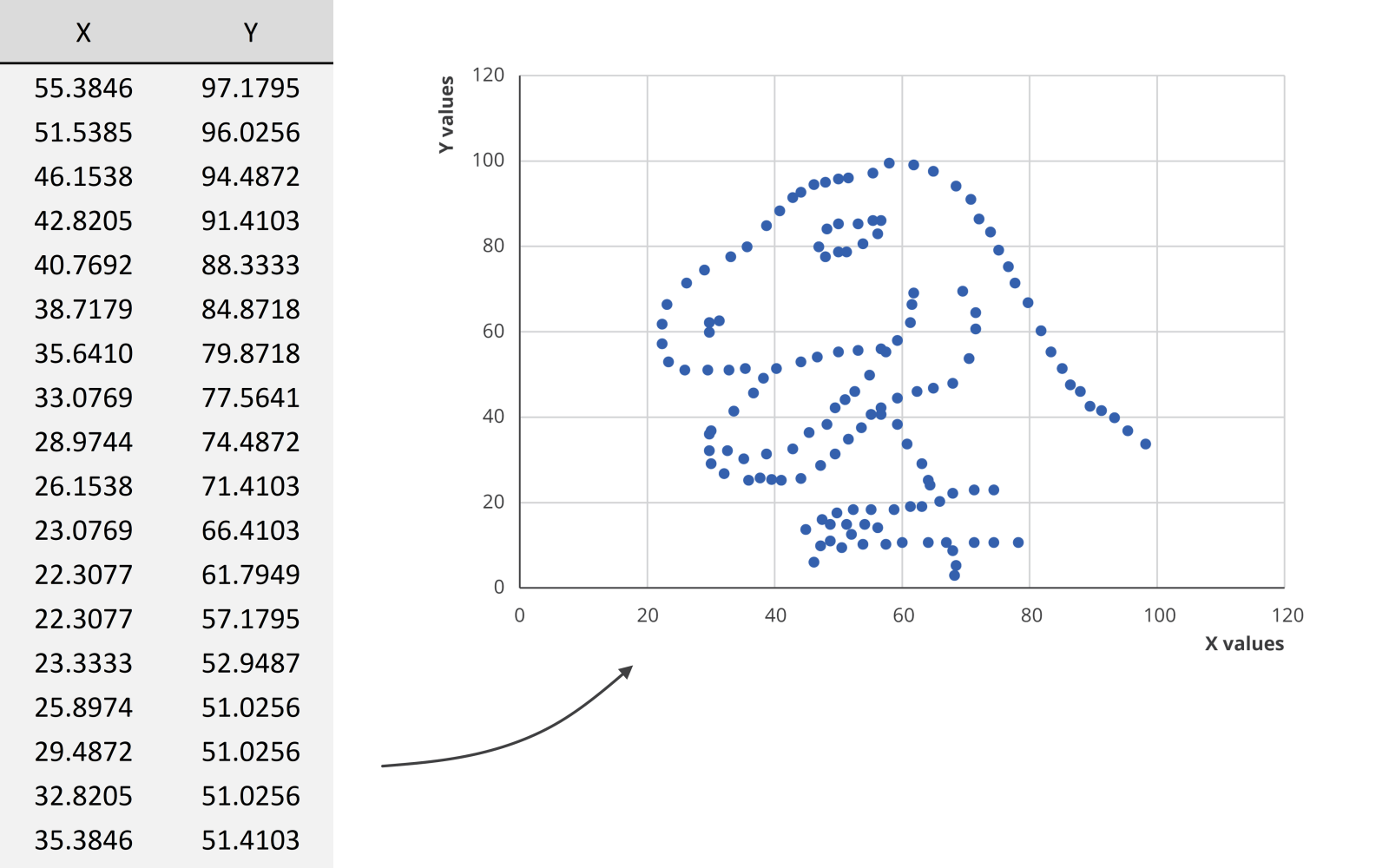
Researchers at MIT have shown that we can detect the meaning of a picture in as little as 13 milliseconds – that’s extremely fast.
We could spend hours looking at this dataset for example, created by visual journalism professor Alberto Cairo, without learning anything. But as soon as we turn the data into a scatter plot, it’s obvious that we’re looking at a dinosaur. In the blink of an eye!
Reason 2: attractiveness
Visual information is also attractive. Not in the sense that it is beautiful to look at (although that’s often also our goal), but literally: it attracts the attention of your audience. In a book or newspaper, people will often look for the pictures first, before they start reading all of the text.
Reason 3: easier to process
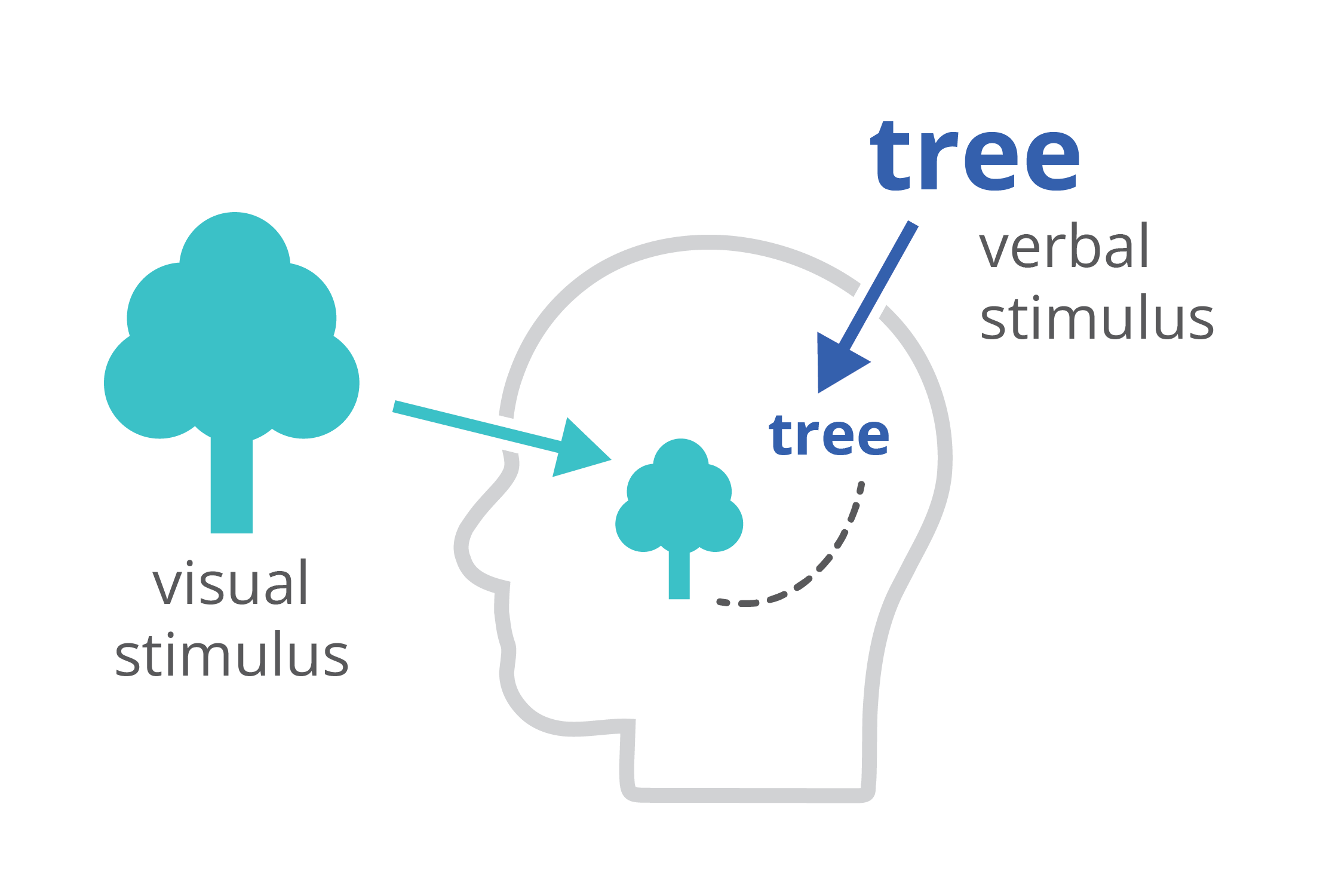
Finally, charts and infographics are easier to process than written text. The dual-coding theory, developed by Allan Paivio, states that our brains process information both in a visual, as well as a verbal way. If we only get verbal stimuli, only a part of our brain is working. That’s why during a long phone call we automatically start doodling – the visual brain is bored and looking for things to do. By providing our audience with a combination of text and images, the entire brain is stimulated, leading to better focus, better understanding, and better memorization.
Harnessing the power of data visualization
So in summary, data visualization is powerful because it combines a high information density, attractiveness, and easier processing and memorization.
If you want to know more about visualizing data in the right way, you can check out the other videos in this series. Or I invite you to read my book, Powerful Charts, that will give you actionable insights and practical guidelines to create data visuals that truly engage and inspire your audience.
Full video series
- 01. Why is data visualization so powerful?
- 02. Why is data visualization so challenging?
- 03. Navigating the landscape of powerful charts
- 04. A powerful chart tells a story
- 05. A powerful chart has a high signal-to-noise ratio
- 06. Making a data visual noise-free
- 07. 7 different goals for your chart
- 08. Three roles of colour in a data visual
- 09. Choosing the right font for your data visual
- 10. Can you use Excel to create a powerful chart? (coming on January 09, 2023)
Read more:
Choosing the right font for your data visual
Fonts evoke emotions: there are very sophisticated fonts, playful fonts, attention-grabbing fonts, and elegant handwritten fonts. Using the wrong type of font can have a lot of impact. In data visualization the implications of typography are mainly focused on readability. Labels and annotations can easily become so small they get hard to read. Above all else, we should choose a font which is readable at small sizes.
Three roles of colour in a data visual
Colour is one of the most crucial tools we have to turn a normal chart into a powerful chart with a clear message, a chart which tells a story rather than simply presenting the information.
7 different goals for your chart
A crucial step in building a powerful chart is choosing the right type of chart. A lot of charts don’t work because they simply use the wrong type of chart. To avoid this trap, we must ask ourselves a basic question: what’s the ultimate goal of our data visual? What do we want to show with our data?
Making a data visual noise-free
Removing noise from a data visual is not only about taking things away such as gridlines, axes or legends. That’s just one part of it, which we could call removing physical noise. Improving the signal-to-noise ratio is often also about adding little things that help our audience better understand the visual. We are helping them by removing mental noise, or mental barriers.
Three tips to create powerful charts in Excel
Creating charts in Excel can be a very powerful tool for making sense of complex data sets, and for visualizing them. But the default options are not always the most pretty or effective ones. Here are our top three tips to create better Excel charts.
A powerful chart has a high signal-to-noise ratio
‘Less is more’. It’s a crucial principle in most of our communication, and in data visualization in particular. Because of my background as a physicist, I prefer to talk about the ‘signal-to-noise ratio’. The message - our signal - should be amplified as much as possible, giving it all of the attention. Everything that can distract from our message - the noise - should be removed.
We are really into visual communication!
Every now and then we send out a newsletter with latest work, handpicked inspirational infographics, must-read blog posts, upcoming dates for workshops and presentations, and links to useful tools and tips. Leave your email address here and we’ll add you to our mailing list of awesome people!

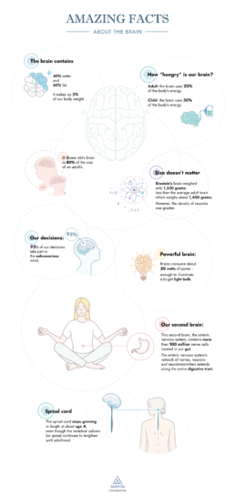
Infographic: Amazing facts about the brain
Infographic
Amazing facts about the brain
🧠 Did you know that our brain makes up 2% of our body weight, but consumes as much as 20% of our energy? Did you know that we have a second brain, located in our gut?
Our information designer Sofia is very passionate about our brain and how it works. She made this insightful brain infographic, giving you an overview of eight amazing facts about the brain!
If you’re looking for your own infographic to share a fascinating story with your audience, we’re here to help! Find out what we can do for you.
Read more:
Choosing the right font for your data visual
Fonts evoke emotions: there are very sophisticated fonts, playful fonts, attention-grabbing fonts, and elegant handwritten fonts. Using the wrong type of font can have a lot of impact. In data visualization the implications of typography are mainly focused on readability. Labels and annotations can easily become so small they get hard to read. Above all else, we should choose a font which is readable at small sizes.
Three roles of colour in a data visual
Colour is one of the most crucial tools we have to turn a normal chart into a powerful chart with a clear message, a chart which tells a story rather than simply presenting the information.
7 different goals for your chart
A crucial step in building a powerful chart is choosing the right type of chart. A lot of charts don’t work because they simply use the wrong type of chart. To avoid this trap, we must ask ourselves a basic question: what’s the ultimate goal of our data visual? What do we want to show with our data?
Making a data visual noise-free
Removing noise from a data visual is not only about taking things away such as gridlines, axes or legends. That’s just one part of it, which we could call removing physical noise. Improving the signal-to-noise ratio is often also about adding little things that help our audience better understand the visual. We are helping them by removing mental noise, or mental barriers.
Three tips to create powerful charts in Excel
Creating charts in Excel can be a very powerful tool for making sense of complex data sets, and for visualizing them. But the default options are not always the most pretty or effective ones. Here are our top three tips to create better Excel charts.
A powerful chart has a high signal-to-noise ratio
‘Less is more’. It’s a crucial principle in most of our communication, and in data visualization in particular. Because of my background as a physicist, I prefer to talk about the ‘signal-to-noise ratio’. The message - our signal - should be amplified as much as possible, giving it all of the attention. Everything that can distract from our message - the noise - should be removed.
We are really into visual communication!
Every now and then we send out a newsletter with latest work, handpicked inspirational infographics, must-read blog posts, upcoming dates for workshops and presentations, and links to useful tools and tips. Leave your email address here and we’ll add you to our mailing list of awesome people!
How common is your birthday?
How common is your birthday?
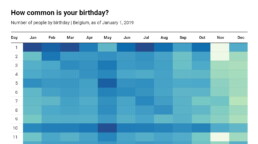
Not all birthdays are created equal… in fact, for most countries in the north temperate zone, more people are born in summer (May – August) than in winter (October – January). This heatmap allows you to check how popular your birth date is. It shows the number of people in Belgium for each specific birthday.
There are some interesting outliers: January 1st and July 1st are extra common, because people with an unknown birth data are commonly assigned these birthdays. The national holidays (May 1, July 21, August 15, November 1 and 11, December 25) are clearly visible as dips in the data. And obviously, February 29th is also not very popular!
We haven’t figured out why more people are born on the 1st, 5th, 10th, 15th, 20th and 25th of each month, but possibly this has some administrative reasons as well…

Read more:
Choosing the right font for your data visual
Fonts evoke emotions: there are very sophisticated fonts, playful fonts, attention-grabbing fonts, and elegant handwritten fonts. Using the wrong type of font can have a lot of impact. In data visualization the implications of typography are mainly focused on readability. Labels and annotations can easily become so small they get hard to read. Above all else, we should choose a font which is readable at small sizes.
Three roles of colour in a data visual
Colour is one of the most crucial tools we have to turn a normal chart into a powerful chart with a clear message, a chart which tells a story rather than simply presenting the information.
7 different goals for your chart
A crucial step in building a powerful chart is choosing the right type of chart. A lot of charts don’t work because they simply use the wrong type of chart. To avoid this trap, we must ask ourselves a basic question: what’s the ultimate goal of our data visual? What do we want to show with our data?
Making a data visual noise-free
Removing noise from a data visual is not only about taking things away such as gridlines, axes or legends. That’s just one part of it, which we could call removing physical noise. Improving the signal-to-noise ratio is often also about adding little things that help our audience better understand the visual. We are helping them by removing mental noise, or mental barriers.
Three tips to create powerful charts in Excel
Creating charts in Excel can be a very powerful tool for making sense of complex data sets, and for visualizing them. But the default options are not always the most pretty or effective ones. Here are our top three tips to create better Excel charts.
A powerful chart has a high signal-to-noise ratio
‘Less is more’. It’s a crucial principle in most of our communication, and in data visualization in particular. Because of my background as a physicist, I prefer to talk about the ‘signal-to-noise ratio’. The message - our signal - should be amplified as much as possible, giving it all of the attention. Everything that can distract from our message - the noise - should be removed.
We are really into visual communication!
Every now and then we send out a newsletter with latest work, handpicked inspirational infographics, must-read blog posts, upcoming dates for workshops and presentations, and links to useful tools and tips. Leave your email address here and we’ll add you to our mailing list of awesome people!
Visualizing Complexity: Dataviz book review
Visualizing Complexity: Dataviz book review
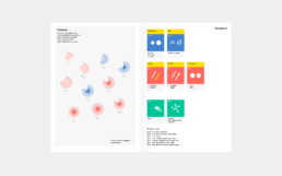
We love the smell of new dataviz books in the morning… and ‘Visualizing Complexity’ is about as new as it gets! Written by (super-cool) information design agency Superdot from Basel (Switzerland) and published in May 2022, it contains an excellent analytical overview of the modular design system they developed over the past 10 years.

The book
The book, which arrived with a nice and friendly signed postcard, is printed on heavy high-quality paper, with a sturdy cardboard cover. A bit smaller than we expected, at 23 by 16 centimeters, it has a compact and inviting look and feel. The colors, fonts and layout are very reminiscent of the famous Bauhaus design movement, and despite the very intense, saturated color scheme, the design rarely overpowers the actual content. To be honest: it’s been lying on our desk for a week now, just to show off its beautiful design 😇
The highly structured book is divided into five parts:
- Data dimensions: different ways of presenting and processing datasets
- Diagrammatical dimensions, visual dimensions and structuring dimensions: a total of 80 elements which can be used to create shapes, arrange them, and make them visually distinguishable based on the different data dimensions
- Multidimensional visualizations: examples of the Modular Information Design system breaking down powerful data visuals to show how they are built from combinations of these 80 elemental dimensions
The authors
Darjan Hill and Nicole Lachenmeier are the founders of information design agency Superdot (previously Yaay), which has grown into a well-known multidisciplinary team of information designers, developers and storytellers. They combine a background in Business Informatics (Darjan) and Visual Communication (Nicole) into a unique blend allowing them to approach information visualization challenges from a wide variety of perspectives.
Besides serving an impressive list of clients, winning many awards, and being involved in multiple teaching and mentoring program, Superdot is the initiator of the “On Data And Design” event series, and a pioneer in the field of DX – Data Experience Design.
The verdict
⭐⭐⭐⭐
With our background in science, the highly analytical approach of Visualizing Complexity resonates strongly with us. It is a welcome update of Jacques Bertin’s visual variables concept, with a bigger focus on combining different variables/elements to construct multidimensional and multi-layered visualizations.
The exactly 80 elements, consisting of 25 diagrammatical, 40 visual, and 15 structuring dimensions might feel a bit contrived at times, but on the other hand it is also a very complete overview. We’ll definitely browse through this book during future projects, to ensure we’ve covered as many different visual ideas as possible.
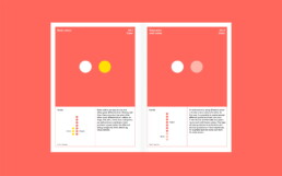
What we’re missing a little bit in this book is an evaluation of how powerful each of these elements are. In the many examples in the final section of the book, it is clear how some elements (e.g. color hue) are much more prominent than others (e.g. contour details). Therefore, some of them are very logical choices for certain data dimensions, and others are less logical or way too subtle to clearly tell the story we want to tell in our visual. This evaluation is left to the reader to experience as a part of experimentation process – which is probably a good thing, as it could be quite dependent on the exact data.
All in all, this is a book that has definitely earned a prominent place on our dataviz bookshelf – a must have for everyone who wishes to understand the analytical thought processes behind strong data visuals!
More dataviz book reviews? We have already covered:
- Dear Data
- Storytelling with Data
- Visualizing Complexity
Read more:
Choosing the right font for your data visual
Fonts evoke emotions: there are very sophisticated fonts, playful fonts, attention-grabbing fonts, and elegant handwritten fonts. Using the wrong type of font can have a lot of impact. In data visualization the implications of typography are mainly focused on readability. Labels and annotations can easily become so small they get hard to read. Above all else, we should choose a font which is readable at small sizes.
Three roles of colour in a data visual
Colour is one of the most crucial tools we have to turn a normal chart into a powerful chart with a clear message, a chart which tells a story rather than simply presenting the information.
7 different goals for your chart
A crucial step in building a powerful chart is choosing the right type of chart. A lot of charts don’t work because they simply use the wrong type of chart. To avoid this trap, we must ask ourselves a basic question: what’s the ultimate goal of our data visual? What do we want to show with our data?
Making a data visual noise-free
Removing noise from a data visual is not only about taking things away such as gridlines, axes or legends. That’s just one part of it, which we could call removing physical noise. Improving the signal-to-noise ratio is often also about adding little things that help our audience better understand the visual. We are helping them by removing mental noise, or mental barriers.
Three tips to create powerful charts in Excel
Creating charts in Excel can be a very powerful tool for making sense of complex data sets, and for visualizing them. But the default options are not always the most pretty or effective ones. Here are our top three tips to create better Excel charts.
A powerful chart has a high signal-to-noise ratio
‘Less is more’. It’s a crucial principle in most of our communication, and in data visualization in particular. Because of my background as a physicist, I prefer to talk about the ‘signal-to-noise ratio’. The message - our signal - should be amplified as much as possible, giving it all of the attention. Everything that can distract from our message - the noise - should be removed.
We are really into visual communication!
Every now and then we send out a newsletter with latest work, handpicked inspirational infographics, must-read blog posts, upcoming dates for workshops and presentations, and links to useful tools and tips. Leave your email address here and we’ll add you to our mailing list of awesome people!
This chart is trying to trick you
This chart is trying to trick you
⚠ Warning: this chart is lying to you!
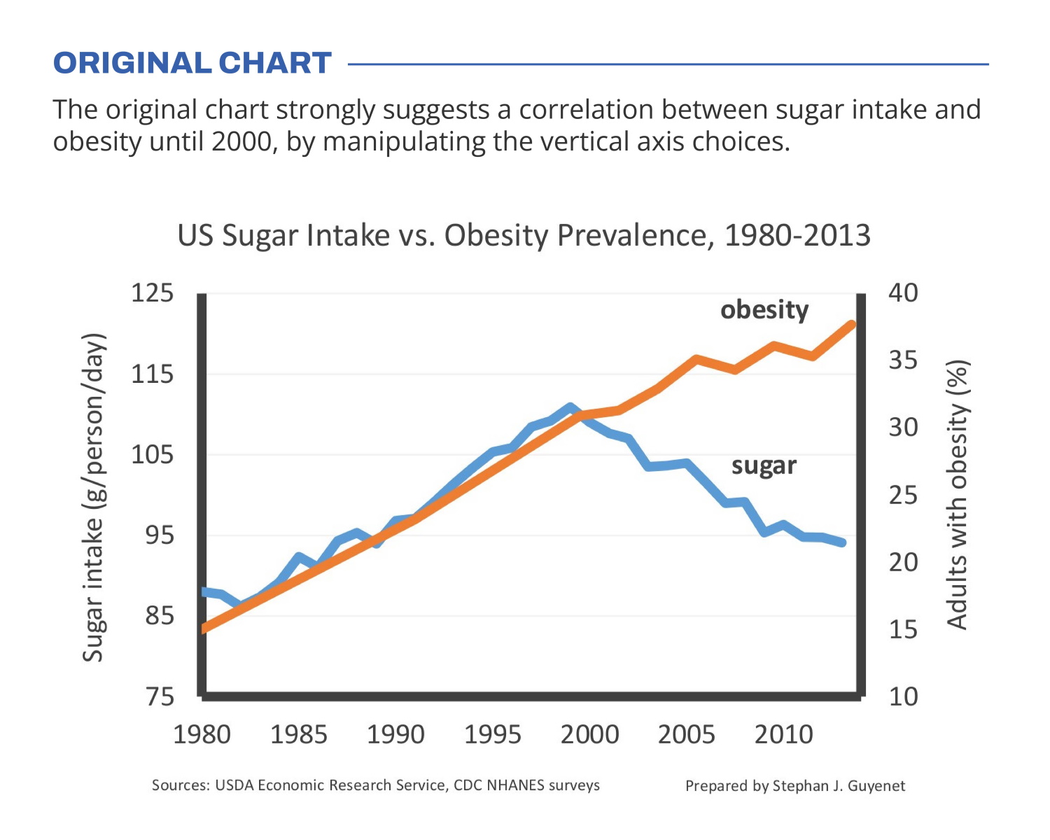
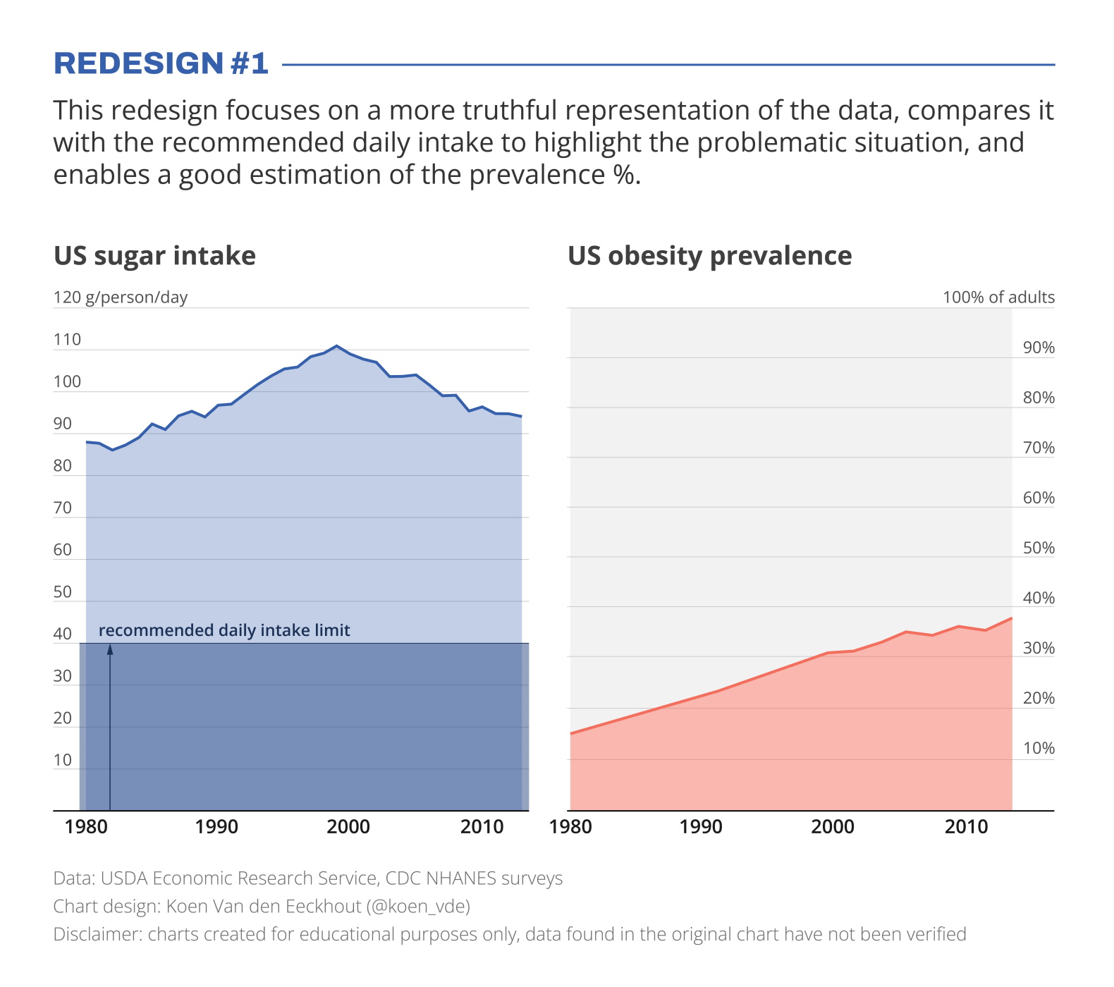
🍬 The original chart in this example is trying to suggest a strong correlation between sugar intake and obesity in the US between 1980 and 2000. It does so by carefully choosing the vertical axis ranges and scaling so both lines nicely fall on top of each other.
But with a closer look we can see something else is going on. Sugar intake levels are rising by 30% (from 85g to 110g), while obesity prevalence is rising by 164% (from 14% to 37% of the population). For an accurate comparison, these lines shouldn’t nicely align at all!
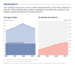
I’ve created two redesigns to present some better solutions for this visualization. In redesign 1 we focus on a presentation which is as truthful as possible, comparing the data with the recommended intake level, and enabling an accurate estimation of the prevalence %.
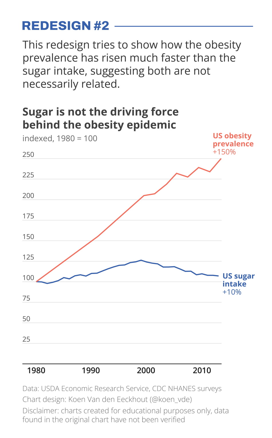
In redesign 2 we focus on showing how much faster the obesity prevalence has grown compared to the sugar intake, which has remained relatively stable.
Depending on the message you want to bring, one presentation might be preferable above the other. But in any case, manipulating your vertical axes to suggest a strong correlation which might not be there, is not very nice!
Still struggling with telling a strong visual message using truthful charts? Find out how we can help you, or reach out to us directly.
Read more:
Choosing the right font for your data visual
Fonts evoke emotions: there are very sophisticated fonts, playful fonts, attention-grabbing fonts, and elegant handwritten fonts. Using the wrong type of font can have a lot of impact. In data visualization the implications of typography are mainly focused on readability. Labels and annotations can easily become so small they get hard to read. Above all else, we should choose a font which is readable at small sizes.
Three roles of colour in a data visual
Colour is one of the most crucial tools we have to turn a normal chart into a powerful chart with a clear message, a chart which tells a story rather than simply presenting the information.
7 different goals for your chart
A crucial step in building a powerful chart is choosing the right type of chart. A lot of charts don’t work because they simply use the wrong type of chart. To avoid this trap, we must ask ourselves a basic question: what’s the ultimate goal of our data visual? What do we want to show with our data?
Making a data visual noise-free
Removing noise from a data visual is not only about taking things away such as gridlines, axes or legends. That’s just one part of it, which we could call removing physical noise. Improving the signal-to-noise ratio is often also about adding little things that help our audience better understand the visual. We are helping them by removing mental noise, or mental barriers.
Three tips to create powerful charts in Excel
Creating charts in Excel can be a very powerful tool for making sense of complex data sets, and for visualizing them. But the default options are not always the most pretty or effective ones. Here are our top three tips to create better Excel charts.
A powerful chart has a high signal-to-noise ratio
‘Less is more’. It’s a crucial principle in most of our communication, and in data visualization in particular. Because of my background as a physicist, I prefer to talk about the ‘signal-to-noise ratio’. The message - our signal - should be amplified as much as possible, giving it all of the attention. Everything that can distract from our message - the noise - should be removed.
We are really into visual communication!
Every now and then we send out a newsletter with latest work, handpicked inspirational infographics, must-read blog posts, upcoming dates for workshops and presentations, and links to useful tools and tips. Leave your email address here and we’ll add you to our mailing list of awesome people!
Research visuals: all the resources you'll ever need!
Research visuals: all the resources you'll ever need!
If you want to start creating clear and attractive visuals about your research, but don’t know where to start, this page is for you! Here’s a complete overview of tools, resources and inspiration you can use as a starting point for your designs.
Inspiration for your visuals
- Information is Beautiful: informationisbeautiful.net
- Information is Beautiful awards: informationisbeautifulawards.com
- Visual.ly: visual.ly/view
- Pinterest: pinterest.com
- Google Dataset Search: datasetsearch.research.google.com
- Dear data: dear-data.com
Digital tools to create visuals
- Canva: canva.com
- Infogram: infogram.com
- Piktochart: piktochart.com
- Venngage Infographic maker and Graph maker
- Whimsical: whimsical.com
- Adobe Illustrator: adobe.com
- Affinity Designer: affinity.serif.com
- Inkscape: inkscape.org
- BioRender (like Canva, but specifically for life sciences): biorender.com
- Free infographic templates in PowerPoint: hubspot.com/infographic-templates
- List of dataviz tools: creativebloq.com/design-tools/data-visualization
Inkscape tutorial videos
Photos to use in your visuals
- Burst: burst.shopify.com
- Flickr: flickr.com/
- Picography: picography.co
- Pixabay: pixabay.com
- Reshot: reshot.com
- Unsplash: unsplash.com
- Visual Hunt: visualhunt.com
Illustrations and icons to use in visuals
- Freepik: freepik.com
- The noun project: thenounproject.com
Photos and illustrations (specific themes)
- Cathopic, catholic pictures: cathopic.com
- Figshare, plant illustrations and more for biologists: figshare.com/authors/Plant_Illustrations
- Medical illustrations: smart.servier.com
Colour schemes for your visuals
- Adobe Color CC: color.adobe.com
- Coolors.co: coolors.co
- Pictaculous: digitalinspiration.com/color-palette-generator
- Website color schemes: canva.com/learn/website-color-schemes
- 100 brilliant color combinations: canva.com/learn/100-color-combinations
- Article: Your friendly guide to colors in data visualisation
Typography for your visuals
- Dafont: dafont.com
- Google Fonts: fonts.google.com
- FontSquirrel font identifier: fontsquirrel.com/matcherator
- Font Pairing: fontpair.co
Creating graphs
- Dataviz catalogue: datavizcatalogue.com
- Choose and design the perfect chart: chart.guide
- Choosing the right chart: infogram.com/page/choose-the-right-chart-data-visualization
- The Chartmaker Directory: chartmaker.visualisingdata.com
- The Data Viz Project: datavizproject.com
- Datawrapper: datawrapper.de
- Flourish: flourish.studio
- LocalFocus: localfocus.nl
- D3.js: d3js.org
Creating maps
- Snazzy maps (Google maps styles): snazzymaps.com
- Mapbox: mapbox.com
- Mapme: mapme.com/stories
- Datawrapper: datawrapper.de
- Leaflet JavaScript Library: leafletjs.com
- 3D maps with QGIS and Aerialod: statsmapsnpix.com
- Read our blogpost: Behind the maps
Books about visuals, infographics and data visualization
- Data visualisation, Andy Kirk
- Dear Data, Giorgia Lupi & Stefanie Posavec
- Information graphics, Taschen
- Infographic designers’ sketchbooks, Steven Heller & Rick Landers
- Storytelling with data, Cole Nussbaumer Knaflic
- The visual display of quantitative information, Edward Tufte
- Trees, maps and theorems, Jean-Luc Doumont
- Visual journalism, Gestalten
- Visual thinking, Willemien Brand
People on Twitter talking about infographics and data visualization
- Twitter list: Dataviz world leaders
Infographic blogs and online magazines
- Chartable (by the Datawrapper team)
- Cool Infographics (Randy Krum)
- Flowing Data (Nathan Yau)
- Infographics for the People (John Grimwade)
- The Information is Beautiful blog (David McCandless)
- Junk Charts (Kaiser Fung)
- Nightingale (by the Data Visualization Society)
- The Storytelling with Data blog (Cole Nussbaumer Knaflic)
- The Visme blog on infographics
- Visualising Data (Andy Kirk)
Podcasts on data visualization
Read more:
Choosing the right font for your data visual
Fonts evoke emotions: there are very sophisticated fonts, playful fonts, attention-grabbing fonts, and elegant handwritten fonts. Using the wrong type of font can have a lot of impact. In data visualization the implications of typography are mainly focused on readability. Labels and annotations can easily become so small they get hard to read. Above all else, we should choose a font which is readable at small sizes.
Three roles of colour in a data visual
Colour is one of the most crucial tools we have to turn a normal chart into a powerful chart with a clear message, a chart which tells a story rather than simply presenting the information.
7 different goals for your chart
A crucial step in building a powerful chart is choosing the right type of chart. A lot of charts don’t work because they simply use the wrong type of chart. To avoid this trap, we must ask ourselves a basic question: what’s the ultimate goal of our data visual? What do we want to show with our data?
Making a data visual noise-free
Removing noise from a data visual is not only about taking things away such as gridlines, axes or legends. That’s just one part of it, which we could call removing physical noise. Improving the signal-to-noise ratio is often also about adding little things that help our audience better understand the visual. We are helping them by removing mental noise, or mental barriers.
Three tips to create powerful charts in Excel
Creating charts in Excel can be a very powerful tool for making sense of complex data sets, and for visualizing them. But the default options are not always the most pretty or effective ones. Here are our top three tips to create better Excel charts.
A powerful chart has a high signal-to-noise ratio
‘Less is more’. It’s a crucial principle in most of our communication, and in data visualization in particular. Because of my background as a physicist, I prefer to talk about the ‘signal-to-noise ratio’. The message - our signal - should be amplified as much as possible, giving it all of the attention. Everything that can distract from our message - the noise - should be removed.
We are really into visual communication!
Every now and then we send out a newsletter with latest work, handpicked inspirational infographics, must-read blog posts, upcoming dates for workshops and presentations, and links to useful tools and tips. Leave your email address here and we’ll add you to our mailing list of awesome people!

Small datasets to practice your data visualization skills
Small datasets to practice your data visualization skills
When you’re teaching data analysis or data visualization, or when you’re learning new data visualization tools and techniques, you might be looking for datasets to practice with.
But such datasets are not always easy to find. They should be sufficiently small, so they are manageable with common analysis tools for beginners, such as Microsoft Excel. On the other hand, they should have sufficient depth to allow you to find interesting insights – the data should have at least a few different parameters and dimensions. Finally, the data should cover an interesting topic to keep your students (or yourself) engaged throughout the practice.
This page gives you some starting points to find interesting small datasets, which you can use for data analysis and data visualization teaching and practicing!
General dataset sources
- The wonderful chart creation tool RAWGraphs has an interesting set of data samples from various sources. Topics include wine aromas, cat classification, FIFA players statistics, letter frequency, and much more.
- Kaggle user Rachael Tatman has compiled a list of fun, beginner-friendly datasets specifically suited for statistical testing, but they can be used for data visualization as well.
- The weekly Makeover Monday challenge (initiated by the Tableau community) has generated an extensive list of datasets covering a wide variety of topics. Most of them are hosted on data.world.
- Looking for global, trustworthy data on societal topics such as health, education, food, or development? Our World In Data is the place to be – all of there (great!) data visuals have the option to download the raw data.
Some personal favorites

Here are some of the datasets I regularly use in my data analytics and visualization teaching and trainings:
- The Titanic Disaster Dataset listing, among other parameters, the age, gender and travel class of this famous ship’s passengers – including whether they survived the event or not.
- A list of Nobel Prize laureates from 1901 to 2020, including information on gender, country, age and category. I often use this as part of a Datawrapper exercise – you can see the finished visual at the bottom of this page!
- The results of the annual Stack Overflow Developer surveys. This is a pretty extensive dataset (over 83.000 rows and 49 columns) providing information on salary, tools used, level of experience, and much, much more.
- An overview of Summer Olympics medal winners, unfortunately only between 1976 and 2008, with information on discipline, country, gender, and type of medal received.
- Responses to the Ask a Manager Salary Survey 2021, with lots of opportunities for practicing data cleaning techniques.
- A pretty extensive but fictituous spreadsheet of US Regional Sales Data, excellent to demonstrate and practice basic data analysis techniques.
- I use this Makeover Monday dataset of 40 Years of Music Industry Sales often during my trainings as a way to demonstrate RAWGraphs.
What are your personal favorite datasets to use in data analytics or data visualization teaching? Let us know, and we’ll add them to this list!
Read more:
Choosing the right font for your data visual
Fonts evoke emotions: there are very sophisticated fonts, playful fonts, attention-grabbing fonts, and elegant handwritten fonts. Using the wrong type of font can have a lot of impact. In data visualization the implications of typography are mainly focused on readability. Labels and annotations can easily become so small they get hard to read. Above all else, we should choose a font which is readable at small sizes.
Three roles of colour in a data visual
Colour is one of the most crucial tools we have to turn a normal chart into a powerful chart with a clear message, a chart which tells a story rather than simply presenting the information.
7 different goals for your chart
A crucial step in building a powerful chart is choosing the right type of chart. A lot of charts don’t work because they simply use the wrong type of chart. To avoid this trap, we must ask ourselves a basic question: what’s the ultimate goal of our data visual? What do we want to show with our data?
Making a data visual noise-free
Removing noise from a data visual is not only about taking things away such as gridlines, axes or legends. That’s just one part of it, which we could call removing physical noise. Improving the signal-to-noise ratio is often also about adding little things that help our audience better understand the visual. We are helping them by removing mental noise, or mental barriers.
Three tips to create powerful charts in Excel
Creating charts in Excel can be a very powerful tool for making sense of complex data sets, and for visualizing them. But the default options are not always the most pretty or effective ones. Here are our top three tips to create better Excel charts.
A powerful chart has a high signal-to-noise ratio
‘Less is more’. It’s a crucial principle in most of our communication, and in data visualization in particular. Because of my background as a physicist, I prefer to talk about the ‘signal-to-noise ratio’. The message - our signal - should be amplified as much as possible, giving it all of the attention. Everything that can distract from our message - the noise - should be removed.
We are really into visual communication!
Every now and then we send out a newsletter with latest work, handpicked inspirational infographics, must-read blog posts, upcoming dates for workshops and presentations, and links to useful tools and tips. Leave your email address here and we’ll add you to our mailing list of awesome people!