Gridlines are better than axes
Gridlines are better than axes
Almost always, gridlines are better than axes. At least for vertical axes.
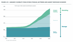
I admit, vertical axes are the default option, and they have been around for centuries, so they are very well known. But your typical vertical axis also has some downsides. My biggest problem with vertical axes is that they’re often so far away from where the action is really happening. Take a typical chart like this, were nothing is really happening on the left (all the values are zero), but the growth is really big on the right hand side of the visual:
If you want to know the data values near the end of the chart, in 2036 in this case, we almost have to take out a ruler to measure, but the lack of axis ticks (the little horizontal lines next to the numbers) and the distance make that hard to do:

A simple compromise is to move the axis to the right hand side of the visual, where it’s much closer to the ‘action’ — the values we’re actually most interested in:

We had to move the legend to the left in order to free up some space for the axis, but it actually worked out really well. Notice also how we’ve added some explicit tick lines to increase the precision of the visual.
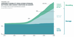
However, moving the vertical axis to the right hand side is not always an option. Often, we’ll have some direct labels or annotations on that side that make it harder to fit in the axis. It would create too much of a barrier between the data and the text. Take this visual for example:
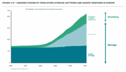
This is a really clean, strong visual thanks to the use of direct labels and some helpful annotations to the right. The only thing I don’t really like is that lonely vertical axis sticking out like a sore thumb at the left side of the visual. However, these labels and annotations are in the way when we want to move the axis to the right:
I’m probably just nitpicking, but that doesn’t look so great to me! In these situations, I will always prefer to switch to gridlines. Yes, they take up more space and create more ‘stuff’ in the visual, but they have two major benefits:
✅ more precision if you’re trying to estimate data values
✅ this precision boost impacts all parts of the visual: left, middle, and right
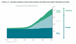
Here’s how that looks like for the visual above:
I’ve made the colored areas a little bit transparent, so you can still see the gridlines clearly enough. Notice how you can quite easily see that the total value is growing to 200 GW by 2025, and reaching 300 GW by 2030. These intermediate values were quite hard to read in the original visual!
Some final cleanup things we can do:
- nicely align the subtitle and the note with the rest of the visual
- add ticks to the horizontal axis as well
- optimize the annotation to the right, brackets would make more sense here than arrows I think
- add explicit data values for the different categories in 2035 to further increase precision
- move the ‘GW’ label to the tick label
This is how the end result looks like:

Finally, a small bonus tip. If for some reason you’re tight on space, and you have to squeeze your chart a bit to make everything fit, you don’t have to make your gridlines go all the way from left to right. You could consider only having them show up when they’re needed. That would give you some extra whitespace to fit, for example, your title and subtitle:
Of course, that’s something not every #dataviz tool will allow, so that’s only for when you’re willing to make some final custom modifications for your report.
Here’s the full comparison between our original visual, and the reworked chart:

Note: visuals taken from Elia’s ‘Adequacy and flexibility study for Belgium, 2026–2036’, which you can access here: Adequacy and flexibility study for Belgium (2026–2036) by Elia Group — Issuu
Read more:

Gridlines are better than axes
Almost always, gridlines are better than axes. Vertical axes are the default option, and they have been around for centuries, so they are very well known. But they also have downsides. My biggest problem with vertical axes is that they’re often so far away from where the action is really happening.

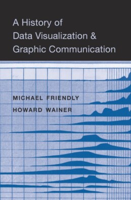
Review: A History of Data Visualization and Graphic Communication
Michael Friendly and Howard Wainer clearly love graphs. But A History of Data Visualization and Graphic Communication isn’t just about graphs — it’s about the stories behind them: the context, the people, the new measurements that made them necessary, and the discoveries they enabled.

Report visuals don’t have to suck
Discover how CREG, Belgium’s electricity regulator, turns complex data into clear and engaging visuals. From smart annotations to small multiples and uncommon chart types, their Monitoring Report shows how thoughtful data visualization makes technical reports easier to read and understand.

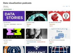
Data visualization podcasts 2025
At Baryon, we’re huge fans of podcasts! Data visualization podcasts are a great way to stay up to date on the latest trends and techniques in data visualization.

Tell me why… I don’t like dashboards
I don't like dashboards. Well, most dashboards at least. They're just trying too hard... to do everything, everywhere, all at once. Why is that? And is there a better solution?

Why I love matrix charts
This one is definitely in my top 5 of favourite chart types: a matrix chart! Super flexible, can provide some great insights into the data, and it will fit well into your beautiful report design.
We are really into visual communication!
Every now and then we send out a newsletter with latest work, handpicked inspirational infographics, must-read blog posts, upcoming dates for workshops and presentations, and links to useful tools and tips. Leave your email address here and we’ll add you to our mailing list of awesome people!


Review: A History of Data Visualization and Graphic Communication
Review: A History of Data Visualization and Graphic Communication
Michael Friendly and Howard Wainer clearly love graphs. But A History of Data Visualization and Graphic Communication isn’t just about graphs — it’s about the stories behind them: the context, the people, the new measurements that made them necessary, and the discoveries they enabled. The authors don’t just show us the end result; they take us through the process that led there, often in a delightful amount of detail.
The structure of the book balances chronology with theme. This keeps the feeling of historical evolution intact, without falling into the trap of a dry timeline. We jump from 17th-century innovators to 20th-century pioneers, always with a clear narrative thread.
What stood out to me most was the variety of examples. While the book is clearly indebted to Edward Tufte’s work, it doesn’t recycle his canon. I encountered many visualizations I hadn’t seen before, and even familiar ones were presented with fresh insight. The ideas on how new data, collected with new measurement techniques, often prompt entirely new kinds of charts were particularly eye-opening for me. It’s a reminder that visualization doesn’t just explain data — it also adapts to it.
That idea was so powerful to me that I used it as one of the foundations for my keynote lecture, Graphs can save the world! This book helped me think more deeply about why visualizations matter — not just aesthetically or functionally, but historically and socially.
That said, not every chapter lands equally well. Some sections feel a bit scattered or lightweight, especially when they only briefly touch on developments that deserve more space. The final chapter, Graphs as Poetry, takes a more philosophical turn, but I wasn’t entirely sure what the authors were trying to argue there.
Also worth noting: while the book is visually rich, it’s a shame that most of it is printed in black and white. Some of the visual clarity and impact is lost as a result. And while the authors occasionally offer “reworked” versions of historical charts to show how they could be improved, these redesigns don’t always convince — sometimes the original speaks more eloquently in its own language.
Despite those minor critiques, this is a generous, well-researched, and deeply informative book. I’d recommend it to anyone interested in the intersection of data, history, and design. It’s a reminder that charts are tools, but also more than tools — they are artifacts of human thought, and sometimes, even acts of discovery.
Rating: ⭐⭐⭐⭐
Read this review, as well as many others, in our complete overview of data visualization books (work in progress).
Read more:
Gridlines are better than axes
Almost always, gridlines are better than axes. Vertical axes are the default option, and they have been around for centuries, so they are very well known. But they also have downsides. My biggest problem with vertical axes is that they’re often so far away from where the action is really happening.
Review: A History of Data Visualization and Graphic Communication
Michael Friendly and Howard Wainer clearly love graphs. But A History of Data Visualization and Graphic Communication isn’t just about graphs — it’s about the stories behind them: the context, the people, the new measurements that made them necessary, and the discoveries they enabled.
Report visuals don’t have to suck
Discover how CREG, Belgium’s electricity regulator, turns complex data into clear and engaging visuals. From smart annotations to small multiples and uncommon chart types, their Monitoring Report shows how thoughtful data visualization makes technical reports easier to read and understand.
Data visualization podcasts 2025
At Baryon, we’re huge fans of podcasts! Data visualization podcasts are a great way to stay up to date on the latest trends and techniques in data visualization.
Tell me why… I don’t like dashboards
I don't like dashboards. Well, most dashboards at least. They're just trying too hard... to do everything, everywhere, all at once. Why is that? And is there a better solution?
Why I love matrix charts
This one is definitely in my top 5 of favourite chart types: a matrix chart! Super flexible, can provide some great insights into the data, and it will fit well into your beautiful report design.
We are really into visual communication!
Every now and then we send out a newsletter with latest work, handpicked inspirational infographics, must-read blog posts, upcoming dates for workshops and presentations, and links to useful tools and tips. Leave your email address here and we’ll add you to our mailing list of awesome people!

Report visuals don't have to suck
Report visuals don’t have to suck
Lots of reports have boring, ugly visuals. Or, even worse, visuals which are really, really hard to understand. The reports by CREG, the Belgian Federal Commission for Electricity and Gas Regulation, are completely different. For example, just browsing through the Monitoring Report — their yearly study on the functioning and price evolution of the Belgian wholesale electricity market — you can immediately see that it’s full of really thought-through visuals and graphs. There are three key principles they apply to bring their visuals to the next level.
Principle 1: add helpful annotations
Sometimes it’s in the small things, like adding a simple arrow to show that the yellow area is equal to the gray area between the grid load and the total load:
The total load and grid load in these curves have very strong seasonal patterns, making it hard to spot whether the delta between them also has seasonal patterns or not. Duplicating that delta at the bottom of the graph — nicely aligned with the horizontal axis — is the best way of making such patterns visual. In this case, there is some seasonality (the delta is slightly lower in winter), but much less pronounced than the seasonal patterns of the loads.
Principle 2: use small multiples to untangle complicated stories
When charts feel complicated, it’s often because they try to explain to many things at once. Different key stories in the data are fighting for our attention. Rather than just eliminating information to make a chart simpler, a helpful technique is to break it up into multiple smaller copies, each of which tells a single part of the story: a ‘small multiples’ approach.

The visual above shows the evolutions for four different countries over a 10-year time period in a small multiples arrangement. Comparing the exact values for the different countries side-by-side is a bit harder, because the bars are a bit further apart from each other than in a traditional clustered bar chart. But comparing the patterns between countries is now easy to do, and that’s the main objective of this chart — to show how different the electricity flow is among Belgium’s different borders.
Principle 3: don’t be afraid to use less common chart types
Not everything has to be a bar, line or pie chart. There are 100+ chart types available to us (if you want an extensive overview, you could check out the Data Viz Project or Data Visualisation Catalogue). Different chart types of course have similar things they can do, but each chart type does have its own strengths and weaknesses when it comes to highlighting certain aspects of your story. If you have an important key message to share, it’s worth considering a few different chart types and choosing the one that shows your message the most clearly.

In the CREG report, you will find bump charts, variable width bar charts (or Marimekko charts if you want to sound fancy), heatmaps, slopegraphs, waterfall charts, and ridgeline plots sprinkled in between the more traditional line and scatter plots. These more exotic charts are added on purpose, with a clear goal in mind, not just to make the report a little bit more fancy (although that is also an effect of chart variety: less boring reports).
Benefits of using better charts
The result of all of this? A 150-page report that doesn’t feel like a chore to read. There is variety, and everything is well explained. Thanks to the clear titles, subtitles and annotations every visual is its own self-contained mini-story — it’s not always necessary to read all the text before and after the figure to understand what’s going on. And most important of all: the graphs are clear and transparent. CREG gets its message across flawlessly, without being hampered by chart clutter, noise, or unnecessary complications. A clear, correct ánd beautiful presentation of the information — that’s what we should all strive for!
Disclaimer
I was (unfortunately!) not involved in the creation of these beautiful graphs. All visuals were created by Senior CREG Advisor Nico Schoutteet. You can read the report on the CREG website.
Read more:
Gridlines are better than axes
Almost always, gridlines are better than axes. Vertical axes are the default option, and they have been around for centuries, so they are very well known. But they also have downsides. My biggest problem with vertical axes is that they’re often so far away from where the action is really happening.
Review: A History of Data Visualization and Graphic Communication
Michael Friendly and Howard Wainer clearly love graphs. But A History of Data Visualization and Graphic Communication isn’t just about graphs — it’s about the stories behind them: the context, the people, the new measurements that made them necessary, and the discoveries they enabled.
Report visuals don’t have to suck
Discover how CREG, Belgium’s electricity regulator, turns complex data into clear and engaging visuals. From smart annotations to small multiples and uncommon chart types, their Monitoring Report shows how thoughtful data visualization makes technical reports easier to read and understand.
Data visualization podcasts 2025
At Baryon, we’re huge fans of podcasts! Data visualization podcasts are a great way to stay up to date on the latest trends and techniques in data visualization.
Tell me why… I don’t like dashboards
I don't like dashboards. Well, most dashboards at least. They're just trying too hard... to do everything, everywhere, all at once. Why is that? And is there a better solution?
Why I love matrix charts
This one is definitely in my top 5 of favourite chart types: a matrix chart! Super flexible, can provide some great insights into the data, and it will fit well into your beautiful report design.
We are really into visual communication!
Every now and then we send out a newsletter with latest work, handpicked inspirational infographics, must-read blog posts, upcoming dates for workshops and presentations, and links to useful tools and tips. Leave your email address here and we’ll add you to our mailing list of awesome people!
Data visualization podcasts 2025
Data visualization podcasts for 2025
At Baryon, we love a good podcast—especially when it’s about data visualization. They’re a great way to pick up new ideas, hear how others approach design and storytelling, and stay in touch with what’s happening in the field. Whether it’s a deep dive into visual communication, a fresh take on data exploration, or a candid chat about the challenges of bringing complex information to life, there’s always something to learn (and plenty to get inspired by).
Many shows feature conversations with people doing remarkable work—sometimes the big names you already know, sometimes voices you haven’t heard yet but will be glad you did.
Some of our go-tos are Data Stories, Storytelling with Data, and Data Viz Today, but there’s a whole world of great listening out there.
We’ve pulled together a regularly updated list of our favorite data visualization (and data science) podcasts on Notion. You’ll find them all in one place, with links to Spotify, Apple Podcasts, and Google Podcasts—ready for your next walk, commute, or coffee break.
Read more:
Gridlines are better than axes
Almost always, gridlines are better than axes. Vertical axes are the default option, and they have been around for centuries, so they are very well known. But they also have downsides. My biggest problem with vertical axes is that they’re often so far away from where the action is really happening.
Review: A History of Data Visualization and Graphic Communication
Michael Friendly and Howard Wainer clearly love graphs. But A History of Data Visualization and Graphic Communication isn’t just about graphs — it’s about the stories behind them: the context, the people, the new measurements that made them necessary, and the discoveries they enabled.
Report visuals don’t have to suck
Discover how CREG, Belgium’s electricity regulator, turns complex data into clear and engaging visuals. From smart annotations to small multiples and uncommon chart types, their Monitoring Report shows how thoughtful data visualization makes technical reports easier to read and understand.
Data visualization podcasts 2025
At Baryon, we’re huge fans of podcasts! Data visualization podcasts are a great way to stay up to date on the latest trends and techniques in data visualization.
Tell me why… I don’t like dashboards
I don't like dashboards. Well, most dashboards at least. They're just trying too hard... to do everything, everywhere, all at once. Why is that? And is there a better solution?
Why I love matrix charts
This one is definitely in my top 5 of favourite chart types: a matrix chart! Super flexible, can provide some great insights into the data, and it will fit well into your beautiful report design.
We are really into visual communication!
Every now and then we send out a newsletter with latest work, handpicked inspirational infographics, must-read blog posts, upcoming dates for workshops and presentations, and links to useful tools and tips. Leave your email address here and we’ll add you to our mailing list of awesome people!
Tell me why... I don't like dashboards
Tell me why... I don't like dashboards
😶 I don’t like dashboards. There, I said it.
Ok, some nuance: I don’t like _most_ dashboards. The main reason: they’re trying to do everything, everywhere, all at once.
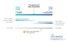
On the spectrum of data visualization, two main clusters of powerful visuals exist:
1️⃣ Data visuals for analysis: useful for data analysts, who have time to explore the data in full detail, with lots of filters, offering many different perspectives on the data. Their goal: extracting the insights from the data.
2️⃣ Data visuals for communication: useful for managers, or a more general audience. They don’t have a lot of time and want to know the major insights, fast, loud and clear. For more complicated stuff, we can craft a strong narrative to guide them through the major insights.
What most dashboards are trying to do, is both of these things simultaneously: raw data goes in, crystal-clear insights come out – or so people expect.
The solution? We make a full-fledged dashboard for the analysts, and a dedicated light-weight version for the management, showing only what they need to know for their decision-making. Or we do our analysis first, and translate those insights into an engaging visual storytelling piece, or an attractive visual report.
As always, we have to think about the audience and their goals. Not just dump the data on top of them, and hope they will figure it out!
Read more:
Gridlines are better than axes
Almost always, gridlines are better than axes. Vertical axes are the default option, and they have been around for centuries, so they are very well known. But they also have downsides. My biggest problem with vertical axes is that they’re often so far away from where the action is really happening.
Review: A History of Data Visualization and Graphic Communication
Michael Friendly and Howard Wainer clearly love graphs. But A History of Data Visualization and Graphic Communication isn’t just about graphs — it’s about the stories behind them: the context, the people, the new measurements that made them necessary, and the discoveries they enabled.
Report visuals don’t have to suck
Discover how CREG, Belgium’s electricity regulator, turns complex data into clear and engaging visuals. From smart annotations to small multiples and uncommon chart types, their Monitoring Report shows how thoughtful data visualization makes technical reports easier to read and understand.
Data visualization podcasts 2025
At Baryon, we’re huge fans of podcasts! Data visualization podcasts are a great way to stay up to date on the latest trends and techniques in data visualization.
Tell me why… I don’t like dashboards
I don't like dashboards. Well, most dashboards at least. They're just trying too hard... to do everything, everywhere, all at once. Why is that? And is there a better solution?
Why I love matrix charts
This one is definitely in my top 5 of favourite chart types: a matrix chart! Super flexible, can provide some great insights into the data, and it will fit well into your beautiful report design.
We are really into visual communication!
Every now and then we send out a newsletter with latest work, handpicked inspirational infographics, must-read blog posts, upcoming dates for workshops and presentations, and links to useful tools and tips. Leave your email address here and we’ll add you to our mailing list of awesome people!

Why I love matrix charts
Why I love matrix charts
🥰 This one is definitely in my top 5 of favourite chart types: a matrix chart!
🤔 What is it? A matrix chart is similar to a heatmap, and it has the same compact design. But rather than relying on color differences, we use bubbles with different sizes to show the data. It is cleaner and less visually cluttered than a heatmap, making it easier to fit in a stylish report design.
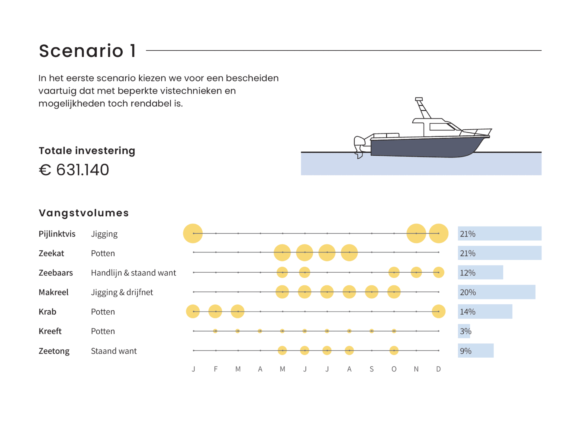
⚠️ Potential downside: this chart type works well only when there is sufficient variation between the data points. Otherwise it will be hard to see small differences between the bubble sizes.
💡 Worth noting: not everyone uses the term ‘matrix chart’. Some people prefer ‘proportional area chart’, or in this specific example – because the horizontal axis represents time – a ‘bubble timeline’. I like the term ‘matrix chart’ because it is a visual matrix of data, and it is also how RAWGraphs – my favourite tool to create these charts – calls it.
🐟 Example from the report ‘Toekomstvisie voor de kustvisserij 2024’ (Vision for the future of inshore fishing 2024) that we made for ILVO earlier this year.

Read more:
Gridlines are better than axes
Almost always, gridlines are better than axes. Vertical axes are the default option, and they have been around for centuries, so they are very well known. But they also have downsides. My biggest problem with vertical axes is that they’re often so far away from where the action is really happening.
Review: A History of Data Visualization and Graphic Communication
Michael Friendly and Howard Wainer clearly love graphs. But A History of Data Visualization and Graphic Communication isn’t just about graphs — it’s about the stories behind them: the context, the people, the new measurements that made them necessary, and the discoveries they enabled.
Report visuals don’t have to suck
Discover how CREG, Belgium’s electricity regulator, turns complex data into clear and engaging visuals. From smart annotations to small multiples and uncommon chart types, their Monitoring Report shows how thoughtful data visualization makes technical reports easier to read and understand.
Data visualization podcasts 2025
At Baryon, we’re huge fans of podcasts! Data visualization podcasts are a great way to stay up to date on the latest trends and techniques in data visualization.
Tell me why… I don’t like dashboards
I don't like dashboards. Well, most dashboards at least. They're just trying too hard... to do everything, everywhere, all at once. Why is that? And is there a better solution?
Why I love matrix charts
This one is definitely in my top 5 of favourite chart types: a matrix chart! Super flexible, can provide some great insights into the data, and it will fit well into your beautiful report design.
We are really into visual communication!
Every now and then we send out a newsletter with latest work, handpicked inspirational infographics, must-read blog posts, upcoming dates for workshops and presentations, and links to useful tools and tips. Leave your email address here and we’ll add you to our mailing list of awesome people!

Vreemde plaatsnamen in Vlaanderen
Vreemde plaatsnamen in Vlaanderen
Iedereen kent wellicht ‘Kontich’ en ‘Reet’, maar in Vlaanderen hebben we nog veel meer merkwaardige, onverwachte, en vaak grappige plaatsnamen. Heb je bijvoorbeeld ooit al gehoord van Buitenland, Dikkebus, of Grote Homo?
In dit kaartje zetten we de vreemdste namen van Vlaamse gemeenten, dorpen of gehuchten voor jou op een rijtje. Veel zoekplezier!
Ontbreekt er nog een merkwaardige plaatsnaam? Laat het me dan zeker weten op koen@baryon.be.
Read more:
Gridlines are better than axes
Almost always, gridlines are better than axes. Vertical axes are the default option, and they have been around for centuries, so they are very well known. But they also have downsides. My biggest problem with vertical axes is that they’re often so far away from where the action is really happening.
Review: A History of Data Visualization and Graphic Communication
Michael Friendly and Howard Wainer clearly love graphs. But A History of Data Visualization and Graphic Communication isn’t just about graphs — it’s about the stories behind them: the context, the people, the new measurements that made them necessary, and the discoveries they enabled.
Report visuals don’t have to suck
Discover how CREG, Belgium’s electricity regulator, turns complex data into clear and engaging visuals. From smart annotations to small multiples and uncommon chart types, their Monitoring Report shows how thoughtful data visualization makes technical reports easier to read and understand.
Data visualization podcasts 2025
At Baryon, we’re huge fans of podcasts! Data visualization podcasts are a great way to stay up to date on the latest trends and techniques in data visualization.
Tell me why… I don’t like dashboards
I don't like dashboards. Well, most dashboards at least. They're just trying too hard... to do everything, everywhere, all at once. Why is that? And is there a better solution?
Why I love matrix charts
This one is definitely in my top 5 of favourite chart types: a matrix chart! Super flexible, can provide some great insights into the data, and it will fit well into your beautiful report design.
We are really into visual communication!
Every now and then we send out a newsletter with latest work, handpicked inspirational infographics, must-read blog posts, upcoming dates for workshops and presentations, and links to useful tools and tips. Leave your email address here and we’ll add you to our mailing list of awesome people!

Small multiples can save your chart
Small multiples can save your chart
When you’re dealing with a chart that has too much information on it, the most straightforward advice to follow is: break it down into multiple charts, each with less information on them.
A powerful example of this is a so-called small multiple approach, in which we repeat (a small version) of a chart multiple times, but each time we highlight a different series. This makes it much easier for your audience to find the data they are looking for, so your chart becomes a lot more powerful. Especially in line charts with lots of lines, small multiples are extremely useful.
Line chart spaghetti
Line charts are pretty straightforward, and there’s not a lot that can go wrong with them. However, they have one major drawback: as soon as we have four or more lines on a single line chart, it quickly becomes messy. It’s suddenly very difficult to distinguish between the different lines, and also to find a color scheme suitable to help you make this distinction (while still being pleasing to look at). This is often called a ‘line chart spaghetti’:
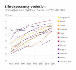
Looking at the above chart: if someone would ask you to order the countries from lowest to highest life expectancy, or what the life expectancy was in Indonesia in 2000, it would be pretty hard to find this information.
A clever and helpful solution to this spaghetti problem is the ‘small multiple’ approach, in which we repeat the same chart multiple times, but each time we highlight a different line. We can do this by making all of our lines gray to send them to the background, and making one of the lines a bit bolder and giving it an accent color. If we repeat this for each of the lines individually, and arrange all these different versions side by side, we get the following result:

Ah, much clearer! We can easily see that the life expectancy in Indonesia grew from 40 years in 1950 to around 72 in 2019, and it was around 65 years in 2000.
Small multiples in real life
A small multiples approach might be somewhat cumbersome and is an inevitable compromise: we’re losing some details by reducing the size of the individual charts, but on the other hand it’s much easier to retrieve the information we need. In many actual cases, the ability to (quickly) retrieve data is more important than having a lot of detail! As a real-life example, at the start of the COVID-19 pandemic, the Financial Times was leading the way in creating insightful data visuals about the spread of the virus in different countries. They used a line chart for this, with a logarithmic vertical axis in order to show exponential growth.
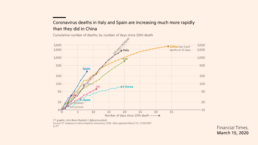
While this approach worked in the early days of the pandemic (when only countries like China, Italy and Spain were dealing with cases), it quickly became unmanageable when the number of countries to visualize grew. After a few weeks it became impossible to find individual countries in the line chart.
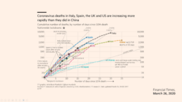
The team at the Financial Times realized this, and quickly changed to a – you guessed it – small multiples approach. The result is a chart with a lot less detail, but now it is very easy for our audience to do what they have to do: find the country they are interested in, and quickly compare its trend with the other countries:
Advantages of a small multiple approach
In summary, a small multiple approach is often the best way to avoid an overloaded chart. Simply create multiple copies of the same chart, and each time highlight one of the series, while sending the other series to the background by making them light grey.
It will be much easier for your audience to find the data they’re interested in, to spot trends and patterns, and to quickly compare the data for a specific series with the ensemble of other series.
What’s not to like?
Read more:
Gridlines are better than axes
Almost always, gridlines are better than axes. Vertical axes are the default option, and they have been around for centuries, so they are very well known. But they also have downsides. My biggest problem with vertical axes is that they’re often so far away from where the action is really happening.
Review: A History of Data Visualization and Graphic Communication
Michael Friendly and Howard Wainer clearly love graphs. But A History of Data Visualization and Graphic Communication isn’t just about graphs — it’s about the stories behind them: the context, the people, the new measurements that made them necessary, and the discoveries they enabled.
Report visuals don’t have to suck
Discover how CREG, Belgium’s electricity regulator, turns complex data into clear and engaging visuals. From smart annotations to small multiples and uncommon chart types, their Monitoring Report shows how thoughtful data visualization makes technical reports easier to read and understand.
Data visualization podcasts 2025
At Baryon, we’re huge fans of podcasts! Data visualization podcasts are a great way to stay up to date on the latest trends and techniques in data visualization.
Tell me why… I don’t like dashboards
I don't like dashboards. Well, most dashboards at least. They're just trying too hard... to do everything, everywhere, all at once. Why is that? And is there a better solution?
Why I love matrix charts
This one is definitely in my top 5 of favourite chart types: a matrix chart! Super flexible, can provide some great insights into the data, and it will fit well into your beautiful report design.
We are really into visual communication!
Every now and then we send out a newsletter with latest work, handpicked inspirational infographics, must-read blog posts, upcoming dates for workshops and presentations, and links to useful tools and tips. Leave your email address here and we’ll add you to our mailing list of awesome people!

Can you use Excel to create a powerful chart?
Can you use Excel to create a powerful chart?
Spreadsheet tools such as Microsoft Excel or Numbers might not be the first thing on your mind when considering data visualization tools, but they can be pretty solid choices to build data visuals. Don’t let anyone convince you that using Excel to create data visuals is unprofessional. In my practice as an information designer I have created many charts in both Excel and PowerPoint, in particular for clients who wanted some degree of flexibility in modifying the visuals themselves.
Spreadsheet tools are more powerful than you might think
Spreadsheet applications allow us to create almost any type of chart in the family of bar charts, line charts and pie charts – including stacked bar charts, area charts, and so on. But even more ‘exotic’ alternatives such as treemaps, sunburst diagrams, candlestick charts, radar charts and waterfall charts are available.
The strength of spreadsheet tools lies more in building the charts than in polishing their design. We could use Excel to create the basic shapes that will make up the core of the data visual, and then export them to another, more design-oriented tool such as PowerPoint or Adobe Illustrator to further modify the colours, annotations and layout – or to combine multiple graphs into a single chart. Nevertheless, most of these things are possible in spreadsheet tools as well, although they might require a bit more tinkering and clicking around.
Move away from the defaults
The challenge in these situations is to move away from the default options. It takes some time and patience, and maybe some visual trickery, but it pays off!
This is how a default visual might look like: it has no visual hierarchy, boring default colors, the legend takes up a lot of space, and the numbers are hard to read.
In the reworked visual below we changed the orientation of the bar chart from vertical to horizontal, we chose a better colour scheme, and we used direct labelling to remove the legend and gridlines. The end result contains exactly the same data as the default chart, but presented in a much clearer and more structured way.

Both of these charts were created from scratch using nothing but Microsoft Excel. Creating powerful charts is not about the tools you use, it’s all about applying the right principles!
If you want to know more about visualizing data in the right way, you can check out the other videos in this series. Or I invite you to read my book, Powerful Charts, that will give you actionable insights and practical guidelines to create data visuals that truly engage and inspire your audience.
Full video series
- 01. Why is data visualization so powerful?
- 02. Why is data visualization so challenging?
- 03. Navigating the landscape of powerful charts
- 04. A powerful chart tells a story
- 05. A powerful chart has a high signal-to-noise ratio
- 06. Making a data visual noise-free
- 07. 7 different goals for your chart
- 08. Three roles of colour in a data visual
- 09. Choosing the right font for your data visual
- 10. Can you use Excel to create a powerful chart?

Read more:
Gridlines are better than axes
Almost always, gridlines are better than axes. Vertical axes are the default option, and they have been around for centuries, so they are very well known. But they also have downsides. My biggest problem with vertical axes is that they’re often so far away from where the action is really happening.
Review: A History of Data Visualization and Graphic Communication
Michael Friendly and Howard Wainer clearly love graphs. But A History of Data Visualization and Graphic Communication isn’t just about graphs — it’s about the stories behind them: the context, the people, the new measurements that made them necessary, and the discoveries they enabled.
Report visuals don’t have to suck
Discover how CREG, Belgium’s electricity regulator, turns complex data into clear and engaging visuals. From smart annotations to small multiples and uncommon chart types, their Monitoring Report shows how thoughtful data visualization makes technical reports easier to read and understand.
Data visualization podcasts 2025
At Baryon, we’re huge fans of podcasts! Data visualization podcasts are a great way to stay up to date on the latest trends and techniques in data visualization.
Tell me why… I don’t like dashboards
I don't like dashboards. Well, most dashboards at least. They're just trying too hard... to do everything, everywhere, all at once. Why is that? And is there a better solution?
Why I love matrix charts
This one is definitely in my top 5 of favourite chart types: a matrix chart! Super flexible, can provide some great insights into the data, and it will fit well into your beautiful report design.
We are really into visual communication!
Every now and then we send out a newsletter with latest work, handpicked inspirational infographics, must-read blog posts, upcoming dates for workshops and presentations, and links to useful tools and tips. Leave your email address here and we’ll add you to our mailing list of awesome people!

Choosing the right font for your data visual
Choosing the right font for your data visual
Typography is a fascinating domain. Fonts evoke emotions: there are very sophisticated fonts, playful fonts, attention-grabbing fonts, and elegant handwritten fonts. Using the wrong type of font can have a lot of impact. In data visualization the implications of typography are mainly focused on readability. Labels and annotations can easily become so small they get hard to read. Above all else, we should choose a font which is readable at small sizes.
What influences readability?
The readability of a font at small sizes is mainly determined by three aspects: the x-height, the counter, and the serifs.
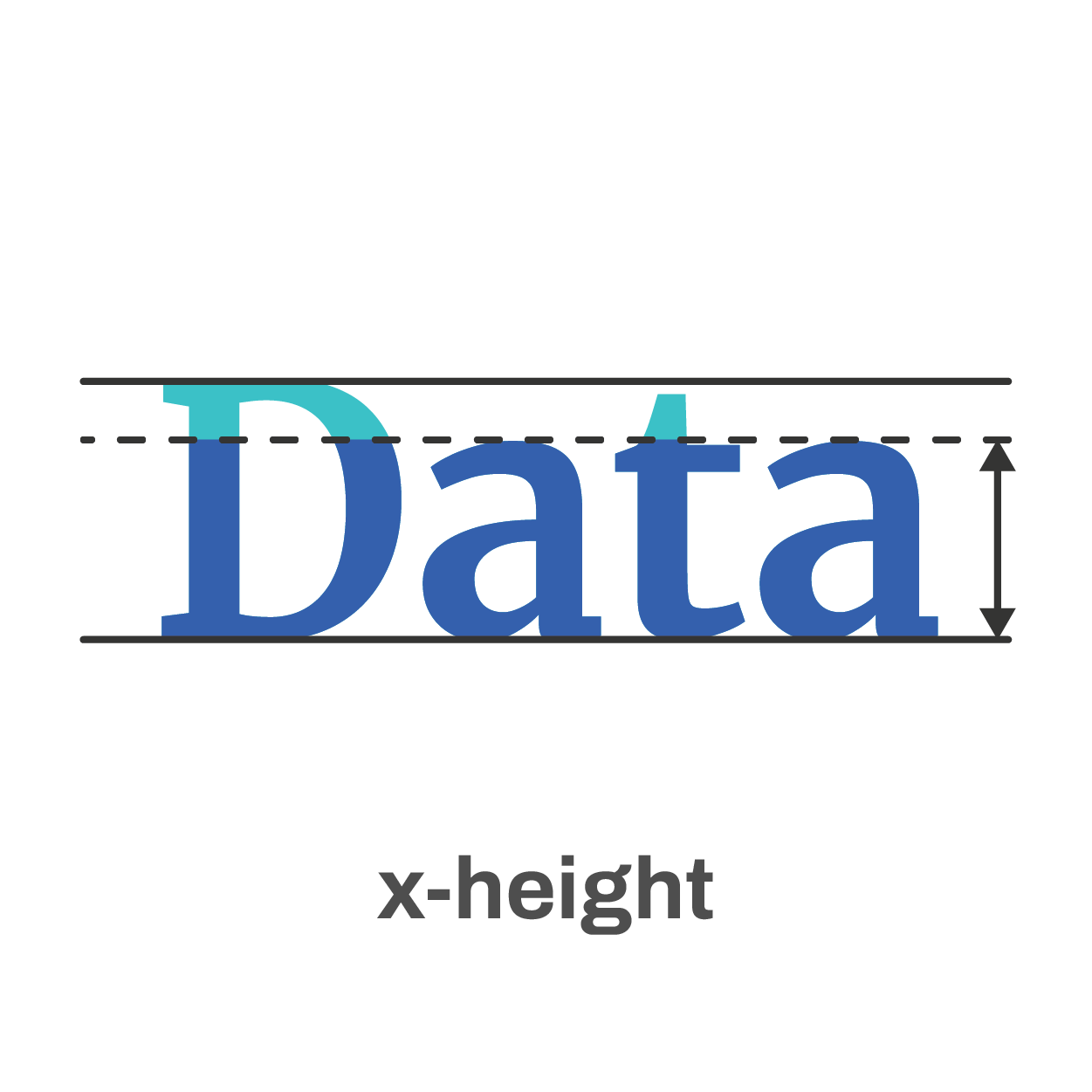
The x-height of a font is the height of the lowercase letters compared to the height of the line itself. Fonts with a lower x-height are more difficult to read than fonts with a higher x-height.
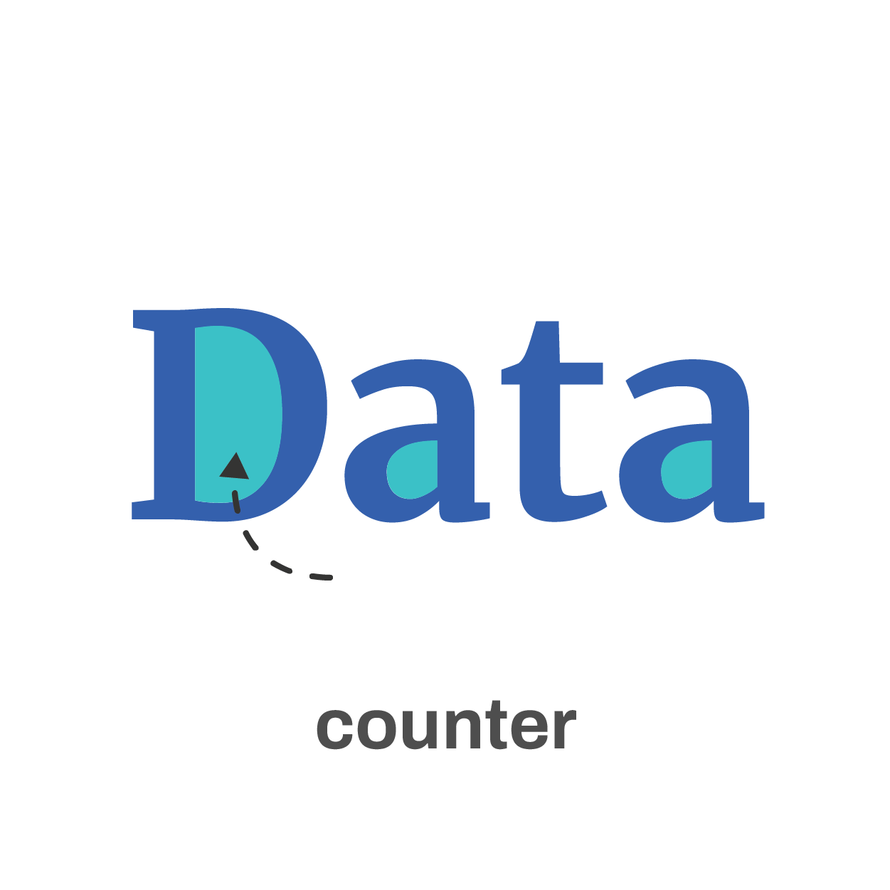
The counter is the enclosed space inside a letter, such as in the letters ‘o’, ‘a’ or ‘e’. The larger the counter size, the easier it becomes to read a font at small sizes.

Finally, the serifs. Sans-serif fonts are generally easier to read at small sizes than serif fonts. The different serifs – the small lines and strokes attached to the end of individual letters – make longer texts easier to read, because our brains can more easily distinguish different letters from each other. That’s why almost any book is set in a serif font. But for small text, the serifs get in the way and sans-serif fonts are the way to go.
Where to find the perfect font?
If you’re struggling to find the perfect font, a good website like Google Fonts can help you out. With over 1300 free font families, there’s always something for every situation. You can enter your own text and immediately see how it will look in all of these different fonts. You can filter by category or you can look specifically for very bold fonts, wide fonts, etc. Once you’ve found the perfect font, all you have to do is download it and install it on your computer.
The best fonts for data visualization
If you still find looking for the perfect font a daunting task, try some of the fonts developed specifically for readability:
Assistant | Lato | Noto Sans | Roboto | Source Sans
If you want to know more about visualizing data in the right way, you can check out the other videos in this series. Or I invite you to read my book, Powerful Charts, that will give you actionable insights and practical guidelines to create data visuals that truly engage and inspire your audience.
Full video series
- 01. Why is data visualization so powerful?
- 02. Why is data visualization so challenging?
- 03. Navigating the landscape of powerful charts
- 04. A powerful chart tells a story
- 05. A powerful chart has a high signal-to-noise ratio
- 06. Making a data visual noise-free
- 07. 7 different goals for your chart
- 08. Three roles of colour in a data visual
- 09. Choosing the right font for your data visual
- 10. Can you use Excel to create a powerful chart? (coming on January 09, 2023)
Read more:
Gridlines are better than axes
Almost always, gridlines are better than axes. Vertical axes are the default option, and they have been around for centuries, so they are very well known. But they also have downsides. My biggest problem with vertical axes is that they’re often so far away from where the action is really happening.
Review: A History of Data Visualization and Graphic Communication
Michael Friendly and Howard Wainer clearly love graphs. But A History of Data Visualization and Graphic Communication isn’t just about graphs — it’s about the stories behind them: the context, the people, the new measurements that made them necessary, and the discoveries they enabled.
Report visuals don’t have to suck
Discover how CREG, Belgium’s electricity regulator, turns complex data into clear and engaging visuals. From smart annotations to small multiples and uncommon chart types, their Monitoring Report shows how thoughtful data visualization makes technical reports easier to read and understand.
Data visualization podcasts 2025
At Baryon, we’re huge fans of podcasts! Data visualization podcasts are a great way to stay up to date on the latest trends and techniques in data visualization.
Tell me why… I don’t like dashboards
I don't like dashboards. Well, most dashboards at least. They're just trying too hard... to do everything, everywhere, all at once. Why is that? And is there a better solution?
Why I love matrix charts
This one is definitely in my top 5 of favourite chart types: a matrix chart! Super flexible, can provide some great insights into the data, and it will fit well into your beautiful report design.
We are really into visual communication!
Every now and then we send out a newsletter with latest work, handpicked inspirational infographics, must-read blog posts, upcoming dates for workshops and presentations, and links to useful tools and tips. Leave your email address here and we’ll add you to our mailing list of awesome people!